I’m a creature of habit. This is evident in a lot of areas of my life, but in looking through old screenshots of my iPhone’s home screen:
Wallpapers: 2011 | 2013 | 2016
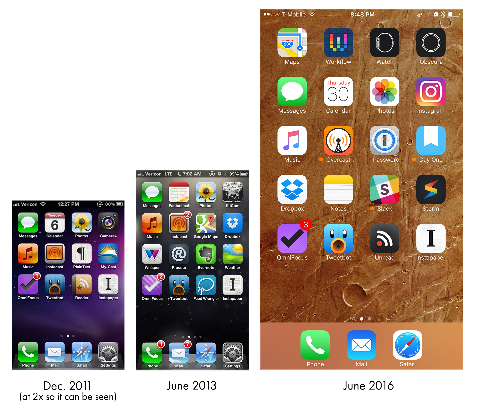
In addition to how hilariously small old iPhones seem compared to my 6S Plus, the thing that jumped out at me the most is how little turnover there is over time in apps and their placement.
For example, OmniFocus, Tweetbot, an RSS client and Instapaper have anchored my bottom row for as long as I can remember. During times of sin, I’ve used Remember the Milk or Todoist, having them take over the “GTD spot” in that row.
My music and my podcast players have always been next to each other, with a weather app has always been on the right. Messages, a calendar app, photos and a camera app have always been at the top, until the Plus forced me to add another row above them.
The three-app Dock is new as of a year ago, when I was talked into it by a podcast. Settings is now a resident of my second screen.
Of course, I can’t post this image without commenting on how the design trends in iOS have changed over the years. That 2011 screenshot is pretty painful now, but there is something charming about iOS 6 there in the middle. All in all, though, I have to say I like the current look the best. There’s plenty of color and personality still, but everything looks a little more grown up.