While most people think of Mac OS X 10.3 Panther or some drunken loser when they hear the term “brushed metal” in the context of UI design, the interface is far older than either of those two things.
Think back to the summer of 1999. People were canning fruits and vegetables in preparation of Y2K, Cher was on the radio everywhere, and people could walk around in denim vests without living in fear of being punched in the face.
1999 was a very interesting time to be an Apple fan. The Five Flavors were the machines of choice for many, and the Newton had been dead for little over a year. Mac OS 8.6 has just shipped, with OS 9 still several months away.
In these days, Apple released Brushed Metal in to the world. While eventually the UI would take over just about everything, its beginnings were quite humble: QuickTime 4.0.
From the technical perspective, QuickTime 4 seems basic now, but at the time, it was a nice little update. Here are the features added in the update:
- Graphics exporter components, which could write some of the same formats that the previously introduced importers could read. (GIF support was omitted, possibly because of the LZW patent.)
- Support for the QDesign Music 2 and MPEG–1 Layer 3 audio (MP3)
- QuickTime 4 was the first version to support streaming. It was accompanied by the release of the free QuickTime Streaming Server version 1.0.
- QuickTime 4 Player introduced brushed metal to the Macintosh user interface.
- Support for files larger than 2.0 GB in Mac OS 9.
- Variable bit rate (VBR) support for MPEG–1 Layer 3 (MP3) audio
- Support for Synchronized Multimedia Integration Language (SMIL)
- Introduction of AppleScript support in Mac OS
Additionally, QuickTime 4.1 dropped support for Motorola 68k Macintosh systems. Many users complained that the new application was slow, but with some fancy footwork, QuickTime 2.5 users could use all of the above features.
The feature that’s most remembered, of course, is its UI. Gone was the Platinum look that graced almost every single window in MacOS, replaced with a slick UI with embedded buttons, dials and more:
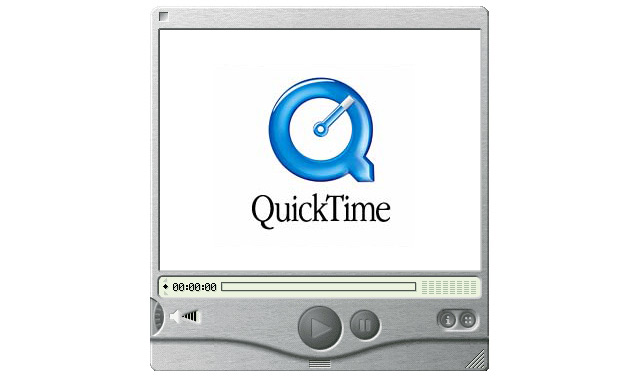
Image via Daily Apple Quiz
In hindsight, QuickTime 4 might be one of the best trojan horses Apple ever released. Everyone was so distracted by the new look, no one noticed when it crept in and killed everyone.
To be fair, mass murder was never Apple’s plan when it came to Brushed Metal. In its Human Interface Guidelines, Apple laid out its expectations when it came to Brushed Metal:
Windows have two distinct looks in Mac OS X. There is the standard default look of windows, as shown in the examples so far. There is also a brushed metal look available, shown in Figure 8–11. You can use a brushed metal window if your application:
- Provides an interface for a digital peripheral, such as a camera, or an interface for managing data shared with digital peripherals — iPhoto or iSync, for example
- Strives to re-create a familiar physical device — Calculator or DVD Player, for example
- Provides a source list to navigate information — for example, iTunes or the Finder
Don’t use the brushed metal look indiscriminately. Although it works well for some types of applications, some applications appear too heavy when using this look. For example, it works well for the iSync application window, but it does not work very well for the TextEdit document window.
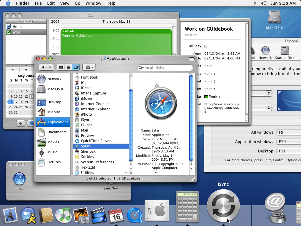
Of course, over time, developers — and Apple itself — ignored the HIG and went crazy with the stuff. I mean, just look at this screenshot of Panther:
Over the coming months (years), I’ll be looking at the growth of Brushed Metal, as well as its eventual demise. It should be fun. Hopefully, we won’t re-popularize the look.