Say what you will about how Chrysler ended up, the Pentastar logo is a part of American history. I’ll miss seeing it on buildings and tractor trailers driving down the highway.
WatchKit Expectations ⇢
File this away for the complaining we’ll all hear later this month.
Come Grocery Shopping with me ⇢
I missed recording yesterday, but episode 12 of Connected is a good one:
This week Federico and Myke talk a little about photo storage solutions, before discussing the widgets in their Today Views, what’s on Federico’s iPad home screen and his impressions of the iPad Air 2.
It was made possible by these awesome companies:
Review: the Kindle Voyage
These days, it’s hard to argue in favor of dedicated devices.
Smartphones have taken the place of consumer video recorders, point-n-shoot cameras and even the iPod.
Fitness bands — despite several recent product announcements from Jawbone, Fitbit and Microsoft — will seem silly once the Apple Watch hits shelves early next year.
In this world, Amazon continues to release e-ink Kindles each year, despite themselves making an entire line of iPad-style tablets.
The iPod-vs-iPhone comparison is impossible not to make. Apple’s venerable music player slowly faded away because the iPhone was simply a better way to enjoy music on the go. It did video better, had a built-in connection to the iTunes Store and was already in everyone’s pocket. Carrying a dedicated music player in the other pocket stopped make sense to the vast majority of consumers, so the iPod went away.
I don’t think that’s the case for the e-ink Kindle quite yet. Reading on a Kindle Fire or iPad Air is a fine enough experience, but it lacks in something only the e-ink Kindles can provide: a tactile experience while reading.
E-ink does its best to mimic honest-to-goodness, made-from-dead-trees paper. There’s a quality to reading on these displays that’s just better than reading on an LCD, no matter the resolution.
There’s also the fact that no matter how much stuff Amazon crams into the OS that runs on their e-ink devices, a Kindle isn’t going to chime with an incoming email or Slack notification.
However, is that experience enough to save keep the e-ink Kindle line alive? How does the new Kindle Voyage stack up to previous generations?
Hardware
I’ve reviewed two previous Kindles: the 2011 base model and the first-generation Kindle Paperwhite.

The Voyage is much less of a leap forward than that original Paperwhite was, but the collection of improvements leads to a better experience.
Screen
The Voyage retains the front-lit screen from the Paperwhite, but there’s no hint of dark spots or uneven lighting that plagued early models.
The backlight is far less yellow tinted than the Paperwhite. The LEDs are cooler in appearance, but not so much that the lighting is harsh. I actually prefer the color temperature on the Voyage, as it helps things feel more crisp.
The biggest improvement to the backlight on the new Kindle, however, is its ability to auto-adjust based on ambient brightness. While the manual controls are still present, I haven’t had the need to adjust things myself. Amazon’s gotten auto-adjust right.
The screen itself is now flush with the bezel around it, making the depression seen on previous models a thing of the past.
That’s not to say the text on the screen appears on the surface of the display, like on the laminated displays Apple uses on the iPhone and iPad Air 2. There is an air gap between the screen and the cover, but it’s miles better than the sunken-in displays of Kindles past.
The screen is now 300 ppi, up from the 212 ppi found on the still-for-sale Paperwhite. While the increase in pixel density may not dramatic on paper, in practice, the Voyage is far more pleasant to read. Letterforms are clearer, curves are less jagged, and everything is just more crisp.
The Voyage’s screen is now covered in micro-etched glass, which Amazon says reduces glare and more closely matches the feel of paper than previous screens.
Glare is better on the Voyage, but I wasn’t complaining about it on my Paperwhite. The texture can be felt if you rub your fingers across the display, but unless you have a stack of old Kindles at your disposal, it’s hard to tell the difference from memory.
Buttons!
In my Paperwhite review, I wrote this, regarding the touch screen:
Touches are precise and register quickly, but in my brief time using the device, I haven’t gotten used to poking the screen. But that’s not the fault of the Kindle, but rather my own years of use.
Two years with the Paperwhite were enough for me to get used to touching the screen to change pages, but not enough for me to like touching the screen to change pages.
It’s too easy to fire some other interaction on the touch screen, and if you’re in bed, jockeying your hands around to be able to hold the device comfortably and tap the screen is annoying.
Thankfully, the Kindle Voyage sort of brings back the page-turn buttons of old.
I say sort of because the page control mechanism isn’t a physical button like before, but instead, a set of force sensors that turn the page when the side bezel is squeezed. Amazon calls this “PagePress” and it’s not nearly as awkward as it seems on paper:
PagePress is a custom-designed force sensor made of carbon and silver, which reacts to a subtle increase of pressure, triggers a page-turn, and provides a haptic response only your thumb can perceive. Because PagePress has no moving parts, the haptics provide you with the most minimal indication that you have pressed the button, to reduce distraction from reading.
In practice, this is the best page-turning mechanism Amazon’s shipped on a Kindle. It takes just enough force where it’s intentional, but not tiring, and like previous generation-Kindles, both forward and back controls are present on each side.
The Kindle’s software lets you fine-tune the pressure needed to trigger a page turn and the amount of haptic feedback that’s given from the device. Additionally, the whole thing can be turned off, giving users the biggest range of options ever presented on a Kindle for page control.
Body
Size-wise, the Voyage is slightly shorter and noticeably thinner than the Paperwhite. The Kindle logo on the front is more subdued, but the back of the device is radically different.
The soft-touch material is still present, but it’s now neighbors with a hard plastic section at the top, and the whole thing is divided into angled sections. This makes the Kindle Voyage feel thinner than it actually is, but I prefer the look of the Paperwhite’s back.
(As before, the back is a fingerprint magnet. Human grease is gross.)

The power button has been moved from the bottom lip of the device to the back, ending our long national nightmare of accidentally putting our Kindles to sleep by bumping them against something. The micro USB port is still present at the bottom, as is the LED showing charging status.
The Case
Amazon’s $59 case for the Kindle Voyage — dubbed the Leather Origami Cover, but named “Amazon Protective Leather Cover for Kindle Voyage” on Amazon’s webpage is the weirdest case for any device I’ve ever used.
The Kindle snaps onto the back part of the case using magnets, and the cover comes in from the top — not the side — like an old reporter’s notebook.

The cover itself is divided into five sections, making it look like Batman-style body armor. These panels can be folded into a stand when flipped backwards, making the Origami case a type of mini-easel for the Kindle.
While I like the idea of this, in practice, it’s far too fiddly. I can’t ever seem to remember which way to manipulate the case to make it stay together, and the contact point created by the cover-turned-tripod-foot is far too small, allowing the Kindle to tip over if used on a soft surface like a bed.

The relative uselessness of the case, coupled with the fact that it’s just plain bulky is too much for me. I’ve been using it to house my Kindle in while stashed in my messenger bag, but if I’m reading, I flip back the cover and pry the Kindle off the case’s magnetic back. My desire for a naked robotic core — a device that’s best used without adornment, but can be transported in something bigger — has never been true for a Kindle before now.
Software
The Kindle Voyage does a lot of things I ignore. While an occasional trip to the dictionary is nice, I don’t take advantage of most of the software features Amazon has packed into this thing. X-Ray is mostly a novelty to me, as I can keep up with references in a book without an issue, I don’t share on Goodreads and I don’t take notes as I read.
Thankfully, the Kindle’s core experience of just reading can be enjoyed without worrying about these services and features.
Conclusion
At $199 (or $289 if you spring for 3G and no ads) the Kindle Voyage is expensive compared to the $119 Kindle Paperwhite or $79 Kindle. There’s no real way around that.
The question at hand is this: is the extra dough for the Voyage worth it? In my experience — coming from a first-generation Paperwhite — the answer is yes, if you use your Kindle heavily. If you don’t, or if you don’t mind the display you’ve already got, the Voyage may be worth skipping.
I view this sort of like the iPad upgrade problem. Year-over-year improvements may not be worth the money for most people, but there compelling reasons to upgrade every few years for almost everyone.
As far as the future of dedicated devices, I think the Kindle is safe for now. I still prefer reading on my Kindle over my Retina iPad mini and I enjoy using and care about the Kindle, but I can’t help but think I’m in a shrinking minority.
The Tools and Toys Christmas Catalog ⇢
If you have a nerd on your shopping list this year, start with this post.
Six
Three years ago, I wrote this.
It may be one of the best things I’ve ever published on this site. I honestly don’t know, as I haven’t read it in quite some time.
It’s been a weird three years since publishing that letter.

If the first three years of Josiah’s life were marked by white-knuckle panic and the fear of the unknown, the most recent three have been marked by periods of normalcy punctured with reminders of how serious his condition — and how fragile his life — really is.
The symmetry isn’t lost on me. Today, Josiah turns six; he was six months old when diagnosed. My wife and I have been together for 12 years; I remarked yesterday that we’ve had Josiah for half of our entire relationship.

In April 2013, Josiah was awarded his Make-A-Wish trip — a week spent at Disney World and Give Kids the World. It was an unforgettable gift, and one whose memories we will always treasure.

The rest of 2013 wasn’t as relaxing as that trip, unfortunately. Over the summer and into the fall, Josiah’s seizure activity — which had been kept at bay for years by medication — skyrocketed. We descended into a circular pattern of seizure-caused trips to the local children’s hospital (usually by ambulance) and ever-increasing doses of seizure medication.

Almost exactly a year ago, Josiah spent nearly a week in the Epilepsy Monitoring Unit, hooked up to an EEG around the clock. As the week went on, doctors weaned Josiah off his meds, trying to induce a seizure so they could catch on with the computer. That ultimately didn’t take place, but Josiah’s doctors still recommended an operation to ease his seizures. In many patients, a temporal lobectomy can ease seizures like the one Josiah was having.

In the run up to his resection surgery, an MRI showed what looked like tumor growth in the region in question. The operation, it was decided, would kill two birds with one stone: help with the seizures and provide sample to test for cancer cells.
The news of potential tumor growth is what Merri and I had been dreading since Josiah came off chemotherapy in 2010. It was a whirlwind of additional tests and procedures, including putting a new port in Josiah’s chest to receive chemo as soon as he was strong enough post-surgery.
In hindsight, it’s amazing we handled it so well. Perhaps it was the time spent in therapy after falling apart at the end of 2010, but I felt relatively calm and in control of my emotions and thoughts. We were both afraid as Josiah’s December 18 surgery date rushed down upon us, but we were all in the moment, together, without the haze of my depression fogging my mind.
Two days before his surgery, I had to buzz Josiah’s head. We had not given him a haircut since his hair had come back after treatment, and it just about broke my wife’s heart. Josiah wasn’t happy about it, but after I let him help Merri do my head as well, he was a little more on board.
Josiah’s surgery went very well. He woke up aware of his surroundings, and didn’t take too large of a hit in his physical and occupational therapy.
Most remarkably, the tissue samples showed no clear signs of tumor growth. We had geared up for chemo, walking up to the threshold of everything it entails, but didn’t have to step back into that world. We felt relieved, but it took a while for the adrenaline and the fight to drain away.
We were home for Christmas, and enjoyed a quiet holiday. It was a sweet time with the four of us.
As time has moved on, we’ve seen the effects of this operation unfold over time. It didn’t end Josiah’s seizures, but it did help. Over the last 9 months or so, however, they have creeped back in, and while things aren’t as serious as they were a year ago, Josiah’s still on a lot of anti-seizure medication.
Several months ago, Josiah’s oncologist — the man who has guided Josiah’s care for five and a half years — reminded my wife and I that increased seizure activity didn’t mean increased tumor involvement. It’s a conversation I hang on to every time we deal with it.

Earlier this year, my wife started homeschooling Josiah for kindergarten. It’s been challenging; between the medicine and the short-term memory issues, Josiah has good days and bad days in the classroom.
When I think about this, it breaks my heart. I don’t know what Josiah’s future holds, but I know that it will include challenges and hardships caused by his cancer. It’s unfair, and it makes me angry, but Josiah’s the kindest, funniest person I know, which helps offset my fear.

Josiah’s sweet spirit has never been so clear as it is when he interacts with his siblings. He and Allison, our 4-year-old daughter are best friends. They spend all day together, often in their own world.
Six weeks ago, my wife gave birth to our third child and Josiah now has a little sister and a little brother. Jude Stephen’s namesake should be clear. Many times, I’ve caught Josiah standing next to Jude’s bed, singing to him as he sleeps. He sang “Happy Birthday” to Jude the first time he saw him in the hospital.
That picture — of my six-year old son singing to my newborn — is everything you need to know about Josiah. The universe has been unbelievably cruel to him with a rare, aggressive cancer diagnosis, but his life is full of love and hope and music.
Happy birthday, buddy. I need to hear your voice as long as I possibly can.
Keep singing.
RSS Sponsor: Badass Bookkeeping Software for Your Biz ⇢
Automate your bookkeeping tasks for your small business, setup takes 10 minutes. Join the tens of thousands of business owners that gave up on spreadsheets and quickbooks and decided to give LessAccounting a try. Let us show you a less stressful way to handle bookkeeping and make your accountant happy. 14 day trial, 30 day money back promise, stop wasting time with bookkeeping and get back to being a badass.
On Evernote’s new Context feature, and why it’s a problem
In today’s iOS and Mac update, Evernote added a new feature for premium users named Context. Here’s the description from the release notes:
Premium feature: Context
- Context displays notes, articles, and people related to what you’re working on
- View related articles from The Wall Street Journal and other sources and related people from LinkedIn and your business
That first bullet point isn’t all that new. For a while now, Evernote has been able to show related notes in the Mac app, but pulling in data from the web is new. Here’s a list of sources that can appear in Evernote based on the content of the current note:

Clearly, this is a business move by Evernote to diversify its income past selling premium memberships, and I don’t disparage the company trying to do that.
However, there is no situation in which I want content from the Internet appearing alongside the endless amounts of information about work clients, home projects and my business I store within Evernote.
Of course, it’s foolish to think Evernote — as a corporation — doesn’t have the ability to see what I store in its applications. However, on its “Three Laws of Data Protection” webpage, Evernote’s CEO Phil Libin writes:
Everything you put into Evernote is private by default. We are not a “big data” company and do not try to make money from your content. Our systems automatically analyze your data in order to power Evernote features, such as search and related notes, and to tell you about important features and products that we think will enhance your Evernote experience, but we never give or sell your content to any third party for advertising purposes.
bold emphasis his, not mine
While Context may not officially break this “law of data protection,” it sure feels icky.
As of today — October 31, 2014 — the term context does not appear in Evernote’s Terms of Service, but it does in the company’s Privacy Policy:
With our Context feature, the Evernote Service uses a number of technologies to show you relevant content. The content we show you may include Notes from your own account, Notes from accounts you are connected to through Evernote Business or Work Chat, and third party content that you have elected to receive. We believe features like these, which work automatically without any person at Evernote reviewing your Content, will enhance your experience using the Service. Context is turned on by default in applications where the feature is offered, but you can choose to turn it off. Context appears as “related results” in our Web Clipper, a feature which is turned on by default for our Business users.
While I’m glad humans aren’t looking at my notes, I don’t want content from the web being pulled into Evernote.
To disable the Context feature, you have to take a trip into Evernote’s application settings on each device. On the Mac app, the verbiage makes me think that Context can’t be turned off, just hidden:

Clicking the “Manage Context Sources” button loads the Evernote web app, where sources can be turned off:

These settings do sync with the iOS device, which is nice, but again, it’s unclear if this feature can be disabled completely.
This is another example of Evernote spreading itself past its primary scope. I want Evernote sync to be fast and reliable, and I want their apps to be world-class. That’s not true today, and until it is, additions like Context have me wondering if its time to move on from the service.
Ruining Lives With Perspective ⇢
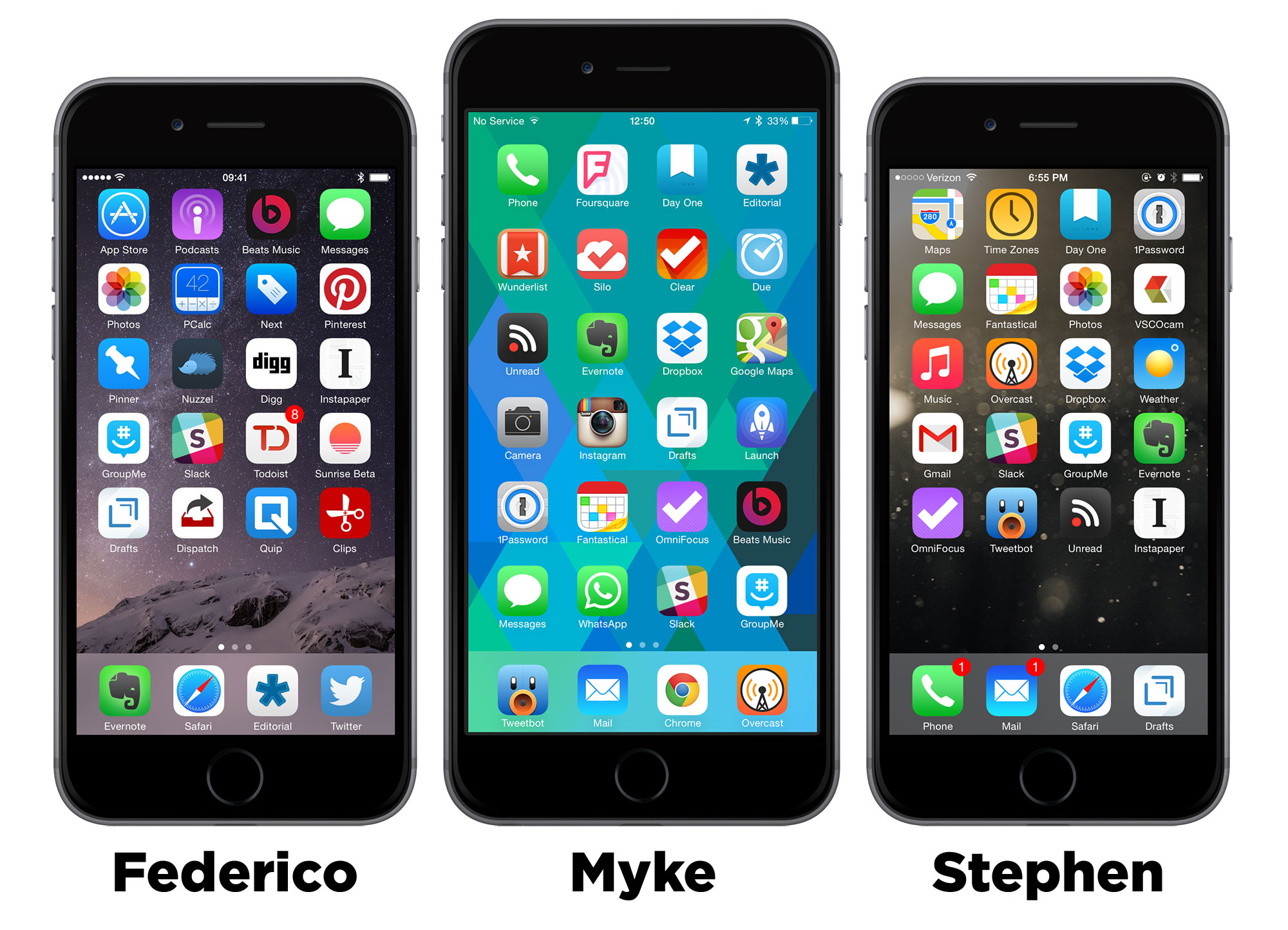
Connected 11:
This week, after saving Greenland, Federico, Stephen and Myke compare and contrast what’s on their iPhone home screens.
This episode was sponsored by:
- Backblaze: Online backup made easy, for just $5/month.
- Igloo: An intranet you’ll actually like, free for up to 10 people.
Please take a moment to help us out by filling out our listener survey, and you could win a $100 Amazon gift card.
Tim Cook: This is my brick ⇢
Tim Cook’s essay in Businessweek is too important and too well-written to block quote just part of it.
More on SugarString ⇢
T.C. Sottek at The Verge:
For now, it’s easy to shrug off Sugarstring as just another hilariously dumb attempt to make a corporate brand look cool. Its format is somewhere between Digg, BuzzFeed, and Verizon’s corporate blog. It appears to gather much of its content from Reddit. It’s powered by WordPress. It inexplicably has 74,000 Twitter followers. It publishes headlines like “Can you survive without chatting at work?” and “Three reasons Neil DeGrasse Tyson is wrong about innovation.”
But in the broader context, Sugarstring is frightening. It resembles a future where enormous corporations that own the pipes through which speech travels also own that speech. Hell, that’s not even a vision of the future; Comcast already owns NBC, and its promises for good behavior as a vertically integrated superpower have an expiration date.
So far we’ve been worried about the subtle effects of corporate control of the internet — stuff like data caps, and throttling, and “fast lanes.” Sugarstring is something entirely different. It’s brazen, disrespectful, and deeply cynical. There can only be two possibilities for its existence: Verizon thinks people aren’t paying attention, or they’re just too stupid to get it.
SugarString
Verizon is getting into the news business. What could go wrong?
The most-valuable, second-richest telecommunications company in the world is bankrolling a technology news site called SugarString.com. The publication, which is now hiring its first full-time editors and reporters, is meant to rival major tech websites like Wired and the Verge while bringing in a potentially giant mainstream audience to beat those competitors at their own game.
I have no problem whatsoever with publications having advertisers. If you’re reading this on my site, you’ll see both a graphic ad and a text ad. Once a week, I post sponsored content in my RSS feed.
The difference between what I — and countless others — do and what Verizon is doing with SugarString is a clear divide between content and advertising. SugarString screams Verizon, from the red colors to the bold text. Oh, and the Verizon logo. And the “PRESENTED BY VERIZON” graphic at the bottom of the page.
Then there’s this:
There’s just one catch: In exchange for the major corporate backing, tech reporters at SugarString are expressly forbidden from writing about American spying or net neutrality around the world, two of the biggest issues in tech and politics today.
Verizon is one of the worst offenders at trying to limit net neutrality and has taken a major hit in the press over this year’s shocking news about programs like the NSA’s Prism. To help counter this, SugarString editors are allowed to cover these issues outside the US, but not inside. Just check out this article on Hungary’s plan to tax Internet traffic:
It’s every government’s responsibility to keep internet charges as low as possible, so access to high-quality information isn’t limited to the rich. By artificially increasing the price of internet access, Hungary’s government would punish users who were trying to contribute to the world’s knowledge and economy. If they managed to force providers to bear the costs, they’d be punishing those companies any time they grew, discouraging them from increasing bandwidth or improving their services. An internet traffic tax is an innovation tax, and any such tax, no matter how small, would be philosophically devastating.
All that about advertising and content being intermixed is small in my eyes compared to this. SugarString is condemning Hungary for doing what its parent company Verizon has been lobbying for — sometimes in terrible ways — for years.
SugarString isn’t bad journalism; it’s not journalism at all. It’s just plain, old-fashioned PR bullshit that is brazen even for a company as tone deaf as Verizon.