RSS Sponsor: Squarespace →

Thanks to Squarespace for sponsoring the 512 Pixels RSS feed this week! — SH


Design a visually rich website with magazine-quality layouts that scales to any screen size – all without touching a line of code. Squarespace 6 is a revolutionary new website creation platform with over 50 new features. Squarespace’s breakthrough LayoutEngine technology allows anyone to create visually-rich pages with any configuration of text, images, or blocks by dragging items exactly where you want them.

The platform comes equipped with 20 new, fully customizable templates and offers sophisticated media management, a robust blogging engine, deep social network integration, real-time statistics, multiple author support, and more.

Try Squarespace 6 today – free 14-day trial.

Sponsorship by The Syndicate

Memphis Ranked Second Most Charitable City →

Awesome. With companies like FedEx and AutoZone that back many public and private projects (like the one I’m employed on), this isn’t surprising. Couple with the fact that many great organizations like St. Jude call Memphis home, I’m proud of the Bluff City for making this list.

Welcome Back

Late last week, I announced that I had moved 512 Pixels to Squarespace’s platform. The move went smoothly; their import tool sucked in all my content and placed it with no trouble whatsoever. After the move, however, I started getting email about broken links on the site.

After several emails back and forth with Squarespace’s support team and some digging on my own, it was discovered that the issue was a result of my changing my permalink structure in WordPress several weeks ago. The resulting change made old links unreachable from inside or outside the Squarespace version of the site.

The error was my own. Squarespace’s tools really are as good as the ads say. Their support staff has been helpful and quick to respond.

All that said, 512 Pixels is back on WordPress for now. I’m not ruling out attempting the move again, but doing so will require a bit more work on my end, again, due to the change I implemented.

What’s awkward about this is that Squarespace is a sponsor of my podcast and my site, both via Fusion and The Syndicate. However, I paid the full sticker price for my Squarespace plan. While my move back to WordPress shouldn’t be seen a failure on Squarespace’s part, I also need to be clear that they didn’t ask me to write this, nor did they approve it before I posted it. I keep a wide line between my editorial content and advertising messages, and that will continue to be the case no matter where my site is hosted.

On a related note, while the RSS feeds should be working properly, not everyone can hit 512pixels.net in their browser at this time. This is simply a result of the way DNS propagation works. If you see a Squarespace error page or your browser simply times out, your ISP simply hasn’t picked up the change yet. This should improve over the next 24–48 hours.

I’d like to apologize for the crazy test posts and the general confusion I might have created over the last 72 hours. It should be smooth sailing from here on out.

On That Dock Placement Thing

Earlier today, I posted a rather tongue-in-cheek piece about where I prefer the Dock to be on my Mac.

Then the Internet exploded. All day, I’ve gotten a flood of tweets and emails explaining why I’m an idiot for putting my Dock where I have it. Many people have asked that I explain why my Dock on the right, pinned to the bottom, so I thought I would explain.

Before I do, however, it’s important to remember that Dock placement is all about personal preference. There’s no real right or wrong way to do it, no matter how strong your personal convictions may be.

Lots of factors should be considered when thinking about Dock placement. Number of screens, screen resolution and real estate and number of apps in the Dock are just a few of the things that should be weighed when making this apparently life-changing decision.

To understand why I have my Dock on the right, you have to understand how I use my Desktop. I — like many Mac users — keep very little on my Desktop. In fact, the only thing there right now is “Macintosh HD,” my Time Machine drive and a file server in our office, named “Pack Mule.”

I do, however, use my Desktop to store files and folders on temporarily through the day. These are items that I might open and close several times in the course of just a few hours, so I want them handy.

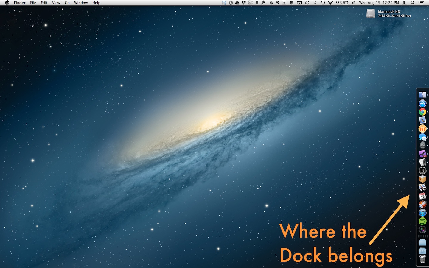
Having my Dock on the right side (pinned to the bottom) creates an area where these icons can live and I can see them, as I don’t allow application or Finder windows to cross behind the Dock. (This isn’t as true when I’m using my 27″ Apple external display, but when just on my MacBook Pro, it works great.)

2017 Update: Sadly, pinning the Dock has been removed from macOS.

I also just like the way it looks on the right side. I feel like having it on the left (with Desktop icons on the right) makes everything feel far away from everything else. The Bottom Dock is a waste of precious vertical space, no matter how handsome the new Mountain Lion version is.

The number one thing I heard today about it being pinned on the bottom is that as additional apps are opened, the Dock slides up, meaning my apps aren’t stationary targets. As I bounce between using my laptop and using it with an external display, I’m already used to the Dock being slightly different sizes (relative to the entire display), so it’s not a big deal. What’s far more important to me is the order in which my applications live in the Dock. I’ve spent years perfecting the order for how I work, and I can easily find what I’m looking for, no matter what else is going on.

I keep my Dock visible because I use it as an application launcher and as a way to see what’s running. I really dislike it being hidden — I feel lost without it.

When it comes to Dock placement, the key is understanding. I won’t hate the stupid way you do things, if you won’t hate the stupid way I do things.