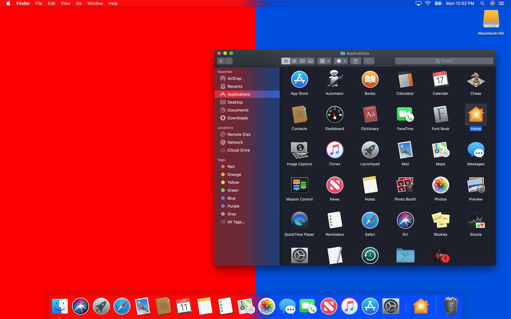
The most obvious change to macOS coming later this year is in the inclusion of Dark Mode.
When Apple redesigned macOS back in 2014 with Yosemite, it included a less ambitious version of the feature. Here’s a bit from my review:
To say that Yosemite comes with a “Dark Theme” is vastly over-stating the “Dark menu bar and Dock” option found in the “General” preference pane:
As shown above, OS X’s new dark mode only affects the menu bar, Command+Tab UI, drop-down menus, the Dock and Spotlight. Everything else — from Finder windows to built-in apps — remain their normal, bright selves, no matter what System Preferences says.

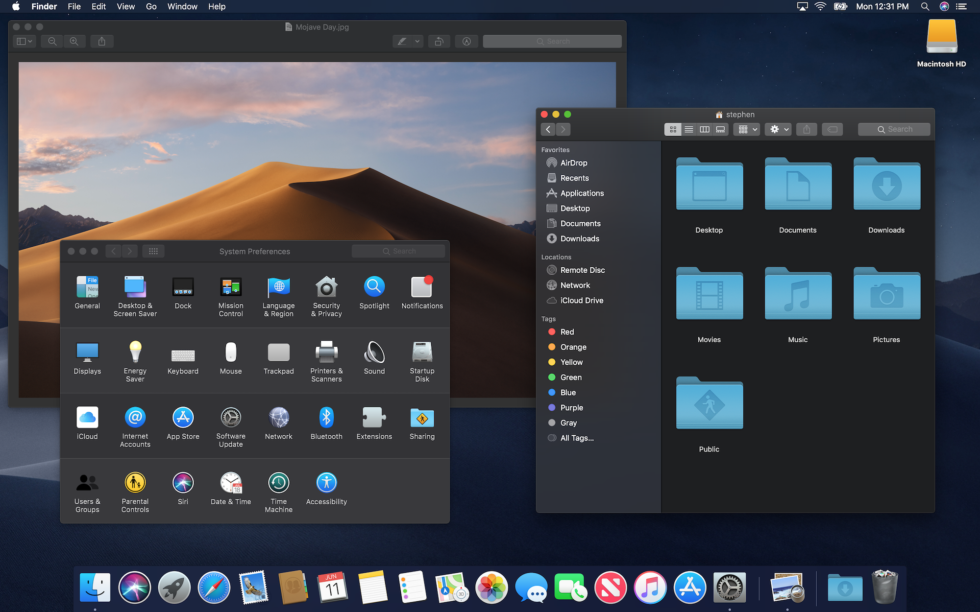
With macOS Mojave, Apple has gone much further with Dark Mode, as you can see:
Why Dark Mode?
In its “Introducing Dark Mode” session at WWDC, Apple gave three broad guidelines for Dark Mode:
- Dark interfaces are cool.
- Dark interfaces are not just inverted.
- Dark Mode is content-focused.
The first point is hard to argue with, so I will let it stand.
The second point is interesting. If you have never inverted the macOS UI, take a trip into the Appearances System Preferences pane and flip it on. In short, everything is strictly inverted, and things get weird. Here’s a shot of it in High Sierra:
Clearly that’s no way to build any sort of Dark Mode for millions of people to use every day.
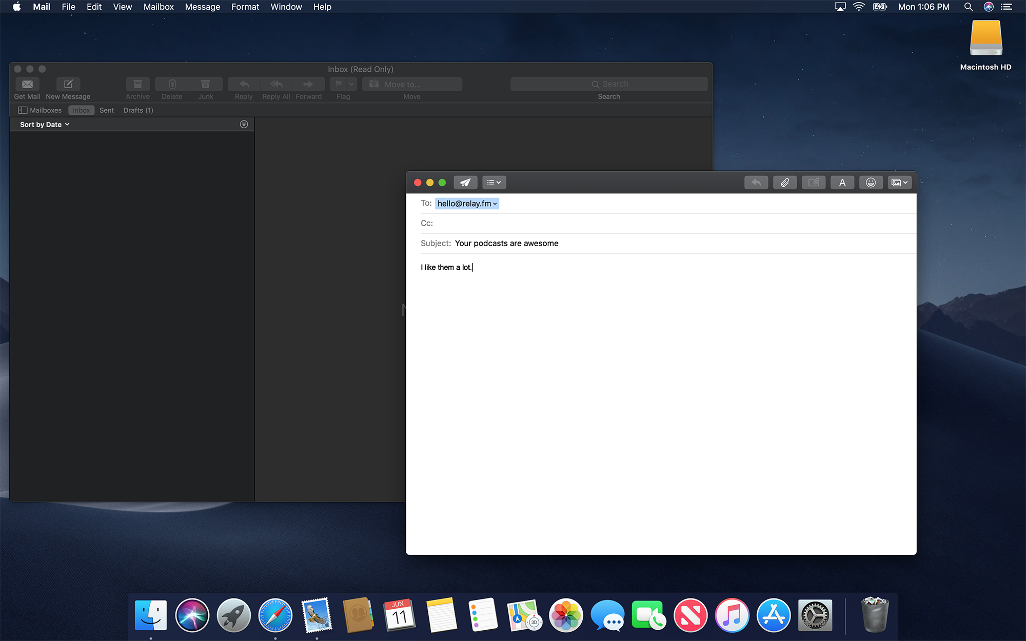
The last point, “Dark Mode is content-focused” should sound familiar to anyone who was around during the iOS 7 transition, or who was paying attention when OS X Yosemite was introduced. Apple’s modern design language, the company is fond of saying, is made to get out of the way, allowing users’ content to shine through.
Apple has returned to that well with Dark Mode, and I think it works.
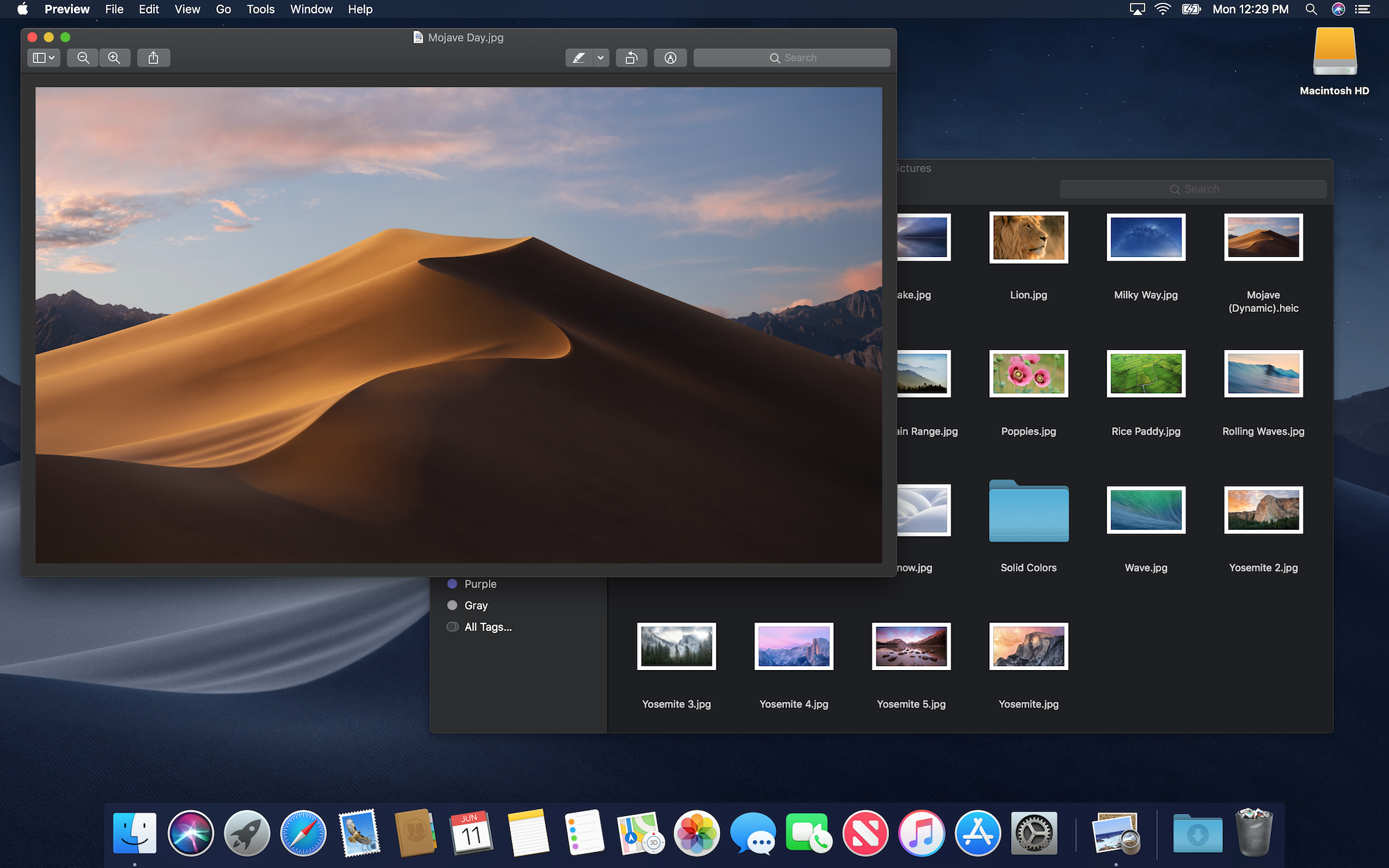
Your eye is naturally drawn to the thumbnails in Finder, and Preview’s window chrome doesn’t compete with the open document.
There’s a reason that pro apps like Final Cut Pro and Logic come with dark modes; now everyone can enjoy the UI fading into the background.
(Don’t miss the dark new Trash Can!)
Under the Covers
To achieve this Apple has introduced an entire new Appearance to macOS. “Light Mode,” which we’ve all been using since 2001 is known as .aqua in NSAppearance. In a no-nonsense fashion, the new Dark Mode is dubbed .darkaqua.
As we’ve seen, this is far from a mere inversion of the default Appearance. Apple has gone through and fine-tuned the smallest details to make this work.
For example, the window shadows are different between the Light and Dark Appearance. In Dark Mode, they are a little crisper and slightly more opaque, complete with an inner stroke around the edges of windows to help them appear more defined.
Another example of this is Desktop Tinting, a technique Aqua uses to alter the grays used in Dark Mode to be more harmonious with the current Desktop picture.
In this over-the-top example, you can see that the color temperature of the two windows is tweaked by the wallpaper beneath them:
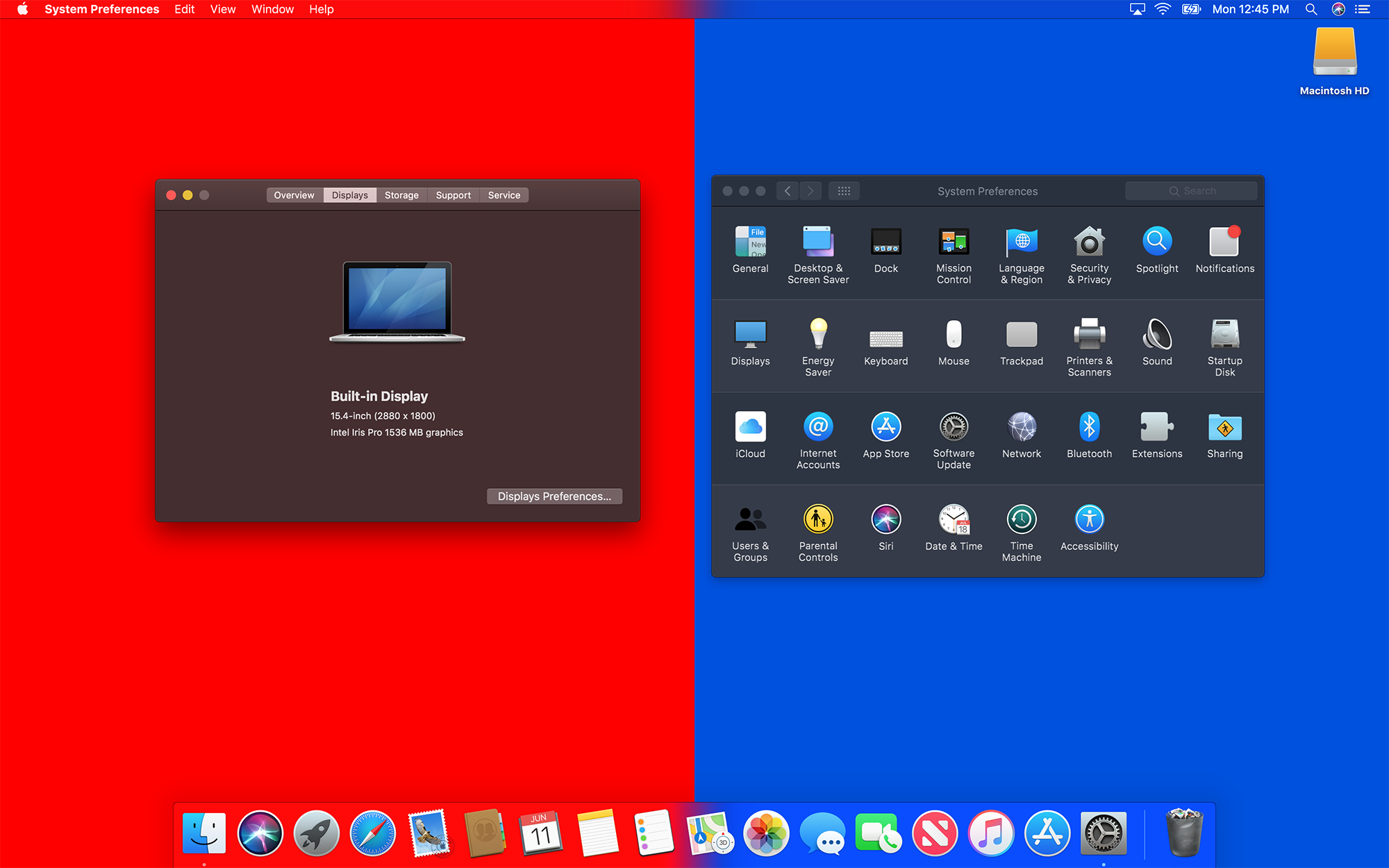
It’s subtle, but I think it is nice. Desktop Tinting is automatically applied to NSWindow and related classes
Note that this is not the same as Vibrancy, which allows a lot more of the background color through the material used in places like Finder’s sidebar, Spotlight, Notification Center and more:
As you may imagine, Apple has a bunch of helpful tips for developers in the Dark Mode sessions and the What’s New in Cocoa for macOS session on the WWDC website.
There were a few that jumped out at me, however.
The biggest is that not all apps should always follow the Appearance that has been set by the user. As before, Apple believes that media-focused tools should be dark at all times. I don’t foresee something like Final Cut Pro X gaining a light theme anytime soon.
Apple has also given developers the ability to use the Light Appearance in sections of their applications. One example is Mail, which can use the Light Appearance for messages, but the Dark Appearance for its window chrome, matching the system:
This lets text and attachments be viewed more easily for some users. I think it’s a nice nod to accessibility for text-heavy apps, and I hope third-party developers take advantage of this ability.
A Note on Accents
macOS Mojave also introduces the concept of Accents.
This has led to some changes in the General preferences pane:
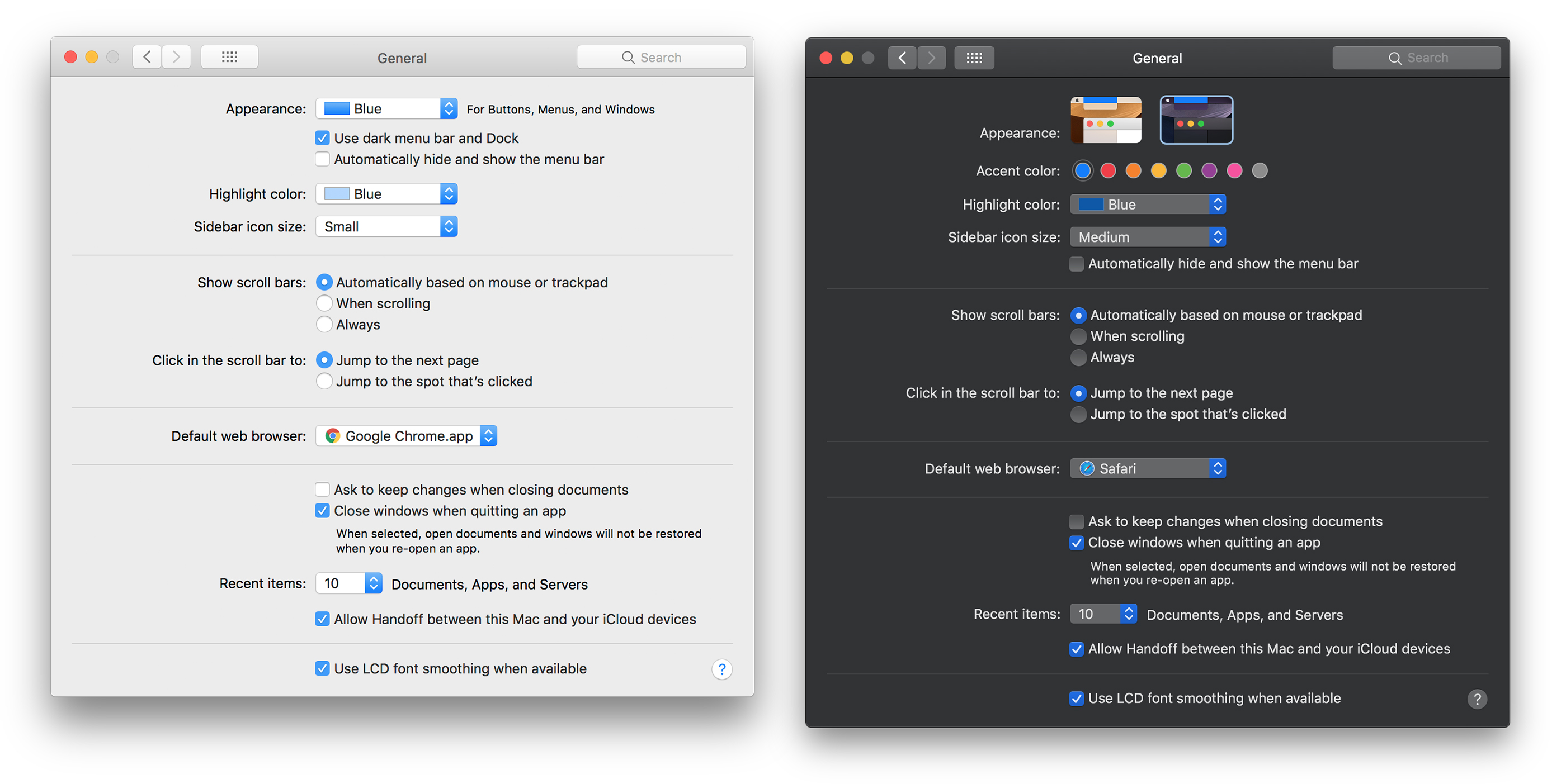
The old “Blue” and “Graphite” Appearances are gone, replaced by the Light and Dark Appearances. Of course, that means the “Use dark menu bar and Dock” checkbox is also a thing of the past.1
The eight Accent colors are really an expansion of the old version of Appearances; these options change the look of things like drop-down menus, checkboxes and more. They are available in both the Light and Dark Appearances, and can really change the feel of macOS:
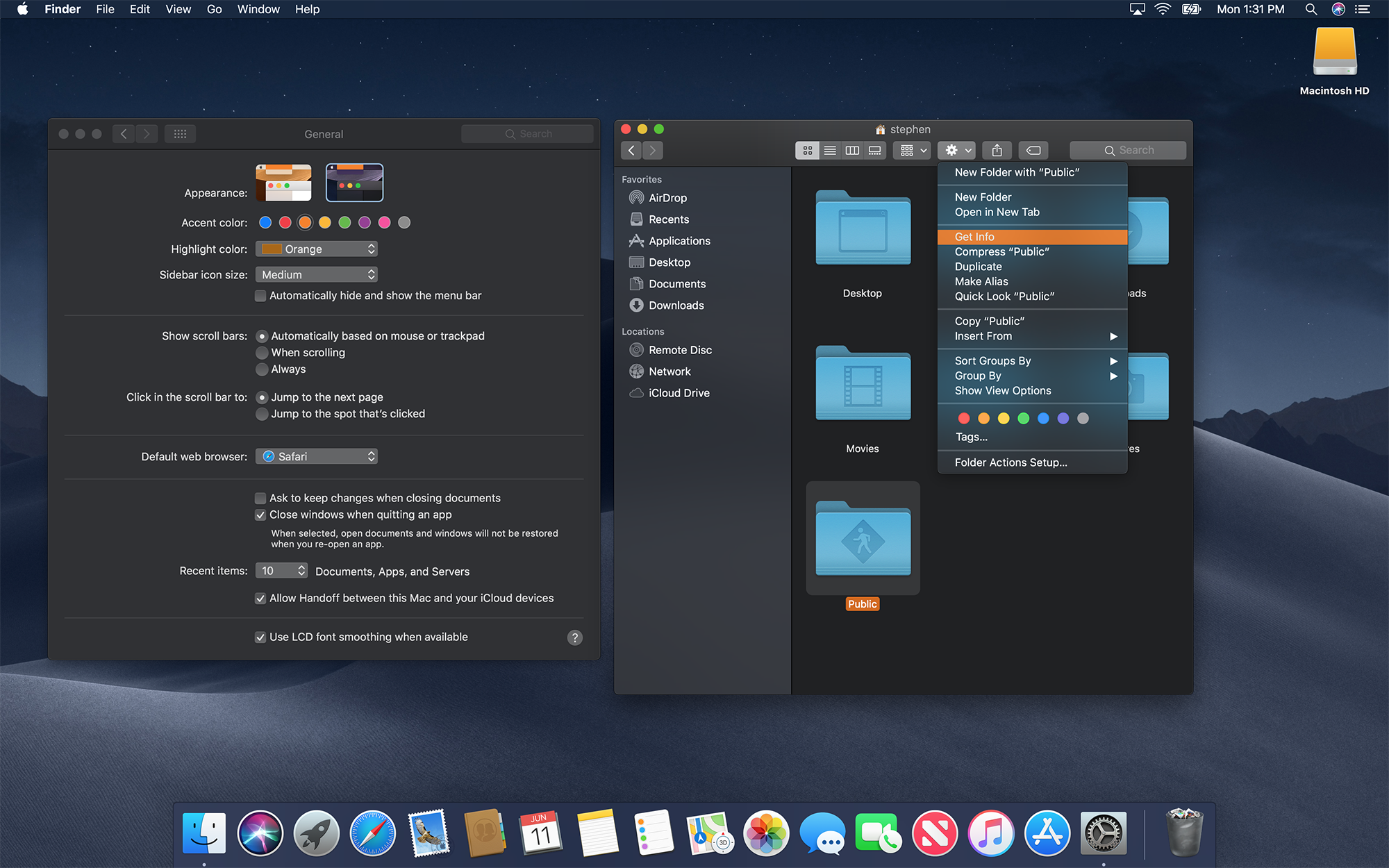
The Highlight color is unchanged from previous versions of macOS; it is used for text selection as always.
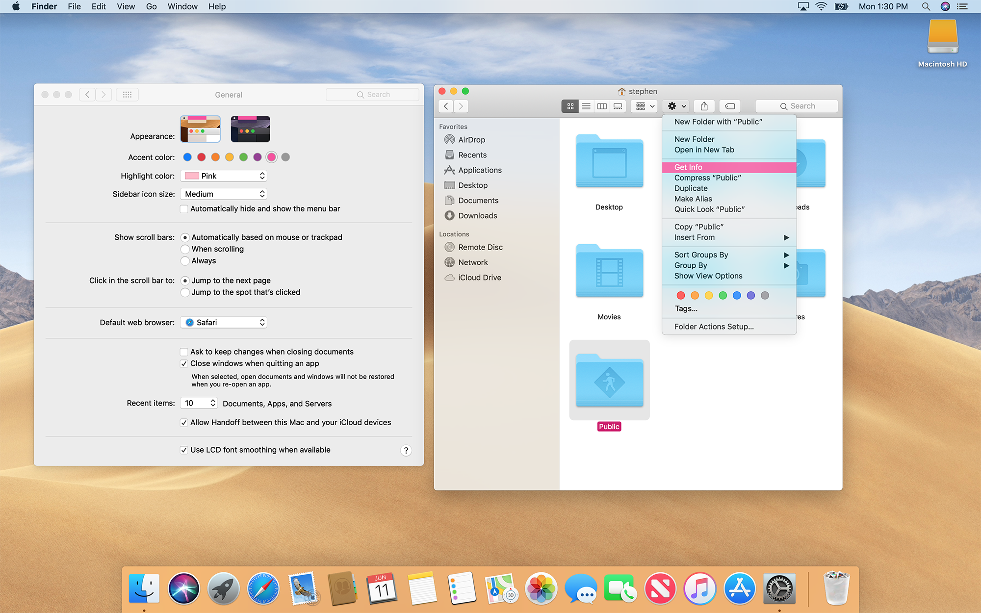
The Special Case of Graphite
Out of the eight Accents, only the last one, Graphite, triggers the gray window controls. The other seven retain the red, yellow and green “stoplight” look from the previous Blue Appearance.
This Accent is also supposed to disable Desktop Tinting, but that doesn’t seem to be working in the first developer beta of Mojave.
As a long-time Graphite user, I am conflicted. I really like how the Dark Appearance looks with several of the Accents, but I’ve never been a fan of the red, yellow and green look for the window controls. I think I’m going to have to get used to them.
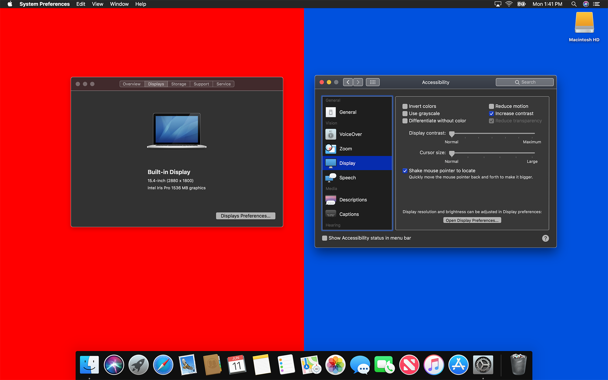
Accessibility Modes
macOS Mojave retains High Sierra’s various Accessibility display settings.
On any Apple device where it is an option, I enable Reduced Transparency mode. I think Apple’s Vibrant materials look great in screenshots, but in practice, I find them distracting. In Mojave, clicking “Reduce transparency” in the Accessibility preference pane disables Vibrancy as before, and lessens the impact of Desktop Tinting, but doesn’t banish it altogether. Like High Sierra, it also makes the Dock and Menu Bar much more opaque:
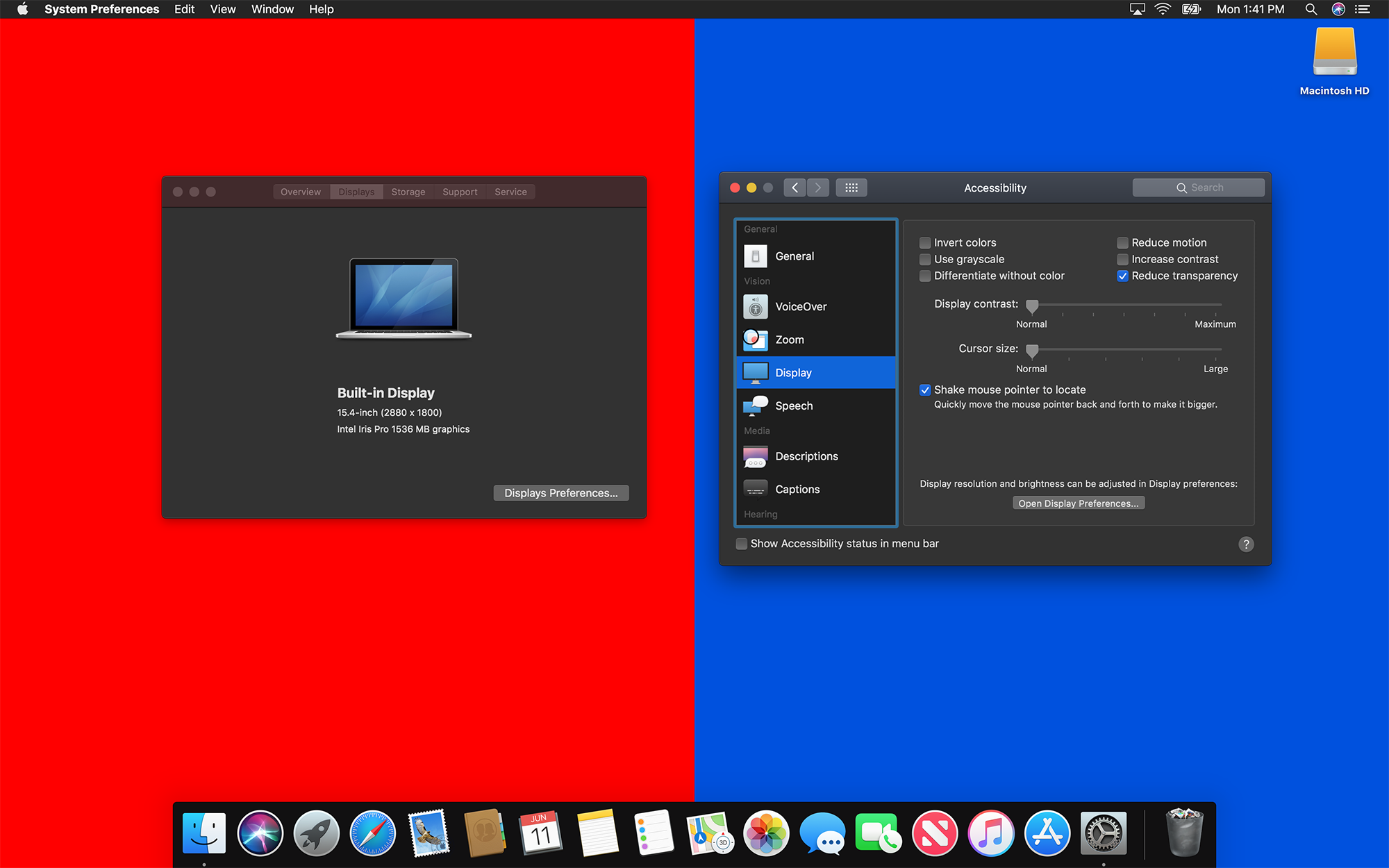
The “Increase contrast” option is also present when running the Dark Appearance. Like before, it outlines windows, controls and more:
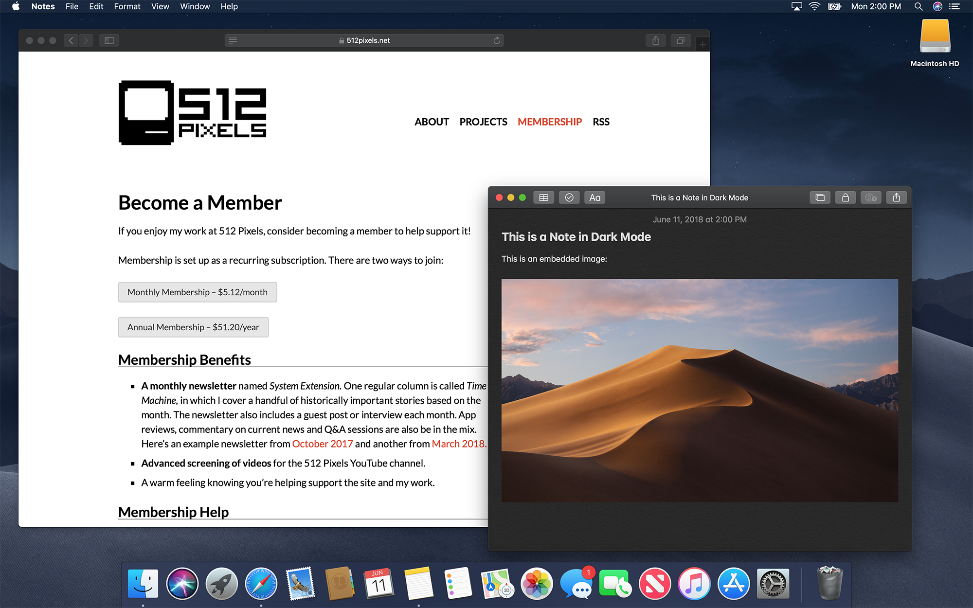
Final Thoughts
The Dark Appearance, of course, will not make everything dark on the system. Some apps won’t make the change, and much of the web — this website included — looks shockingly bright in the context of macOS Mojave:
At the end of the day, Dark Mode isn’t a brave new era for macOS, but it is a welcome addition to the system. It’s an option that I’m already enjoying on my test system, and I think I’ll move to it full-time this fall when macOS Mojave ships. It’s clear that Apple has put a lot of thought into the feature, and I think most Mac developers will be onboard with what it means for their applications.
- “Automatically hide and show the menu bar” is still a thing, but I don’t think I have ever used it. A Mac without a menu bar is a weird place for me to be. ↩