Alex Vadukul, writing at The New York Times:
In 1974, his small New York-based design firm, Danne & Blackburn, was barely a year old and eager for a big project when he and his partner, Richard Danne, were approached by the Federal Graphics Improvement Program to rebrand NASA’s classic logo, which depicted a patriotic red chevron soaring across the stars. Known as “the meatball,” it wasn’t exactly cutting edge, instead evoking a vintage sensibility of space travel seen in science-fiction comics like Buck Rogers. With the eyes of the world suddenly upon the agency in 1969 after the moon landing, NASA wanted to embrace a modern image.
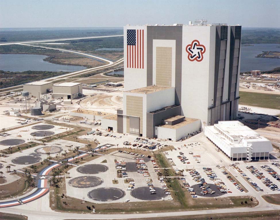
In addition to designing the worm, Mr. Blackburn worked on another big federal commission in the 1970s, creating the symbol for the American Revolution’s Bicentennial celebration. His design — a soft star composed of red, white, and blue stripes that combined a modern aesthetic with patriotic themes — was ubiquitous by 1976, appearing on everything from stamps to coffee mugs to government buildings.
While NASA switched back to the “meatball” logo in the late 1980s, the worm has shown up a bit recently and doesn’t seem to be going anywhere anytime soon.
Do not miss the Graphics Standards Manual, which dictated how the worm was to be used on everything from spacecraft and pickup trucks to patches and spacesuits.
Speaking of NASA, another one of Blackburn’s famous pieces of work adorned the side of the Vehicle Assembly Building for over 20 years before being painted over with — you guessed it — the meatball.