Yesterday, I picked up my new truck, a 2023 Toyota Tundra. Coming from an older Tacoma, this truck is amazing, and that includes the large 14-inch screen. The truck has wireless CarPlay, and I noticed something right away: CarPlay’s UI doesn’t stretch very gracefully for these larger displays.
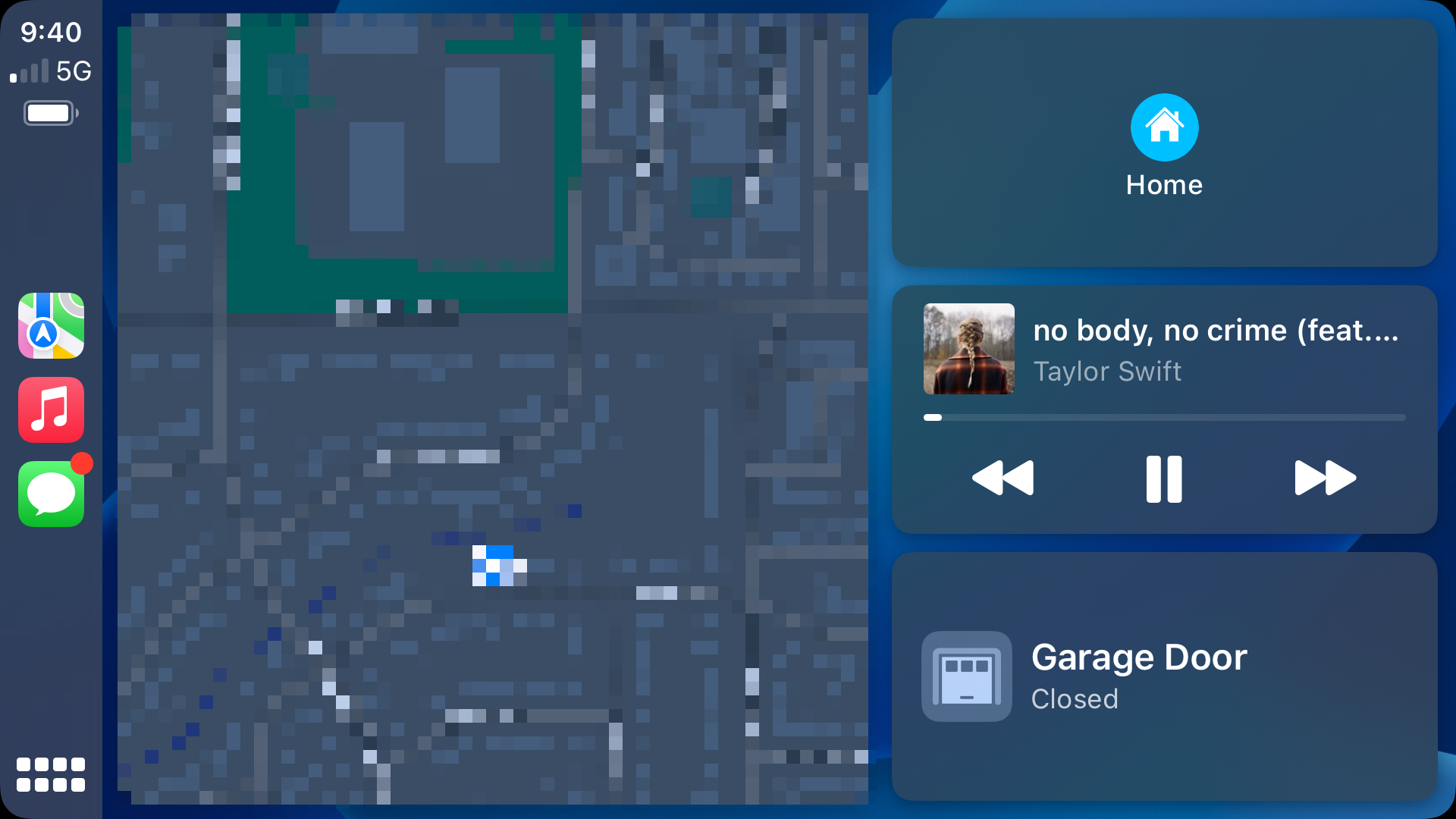
The home screen actually looks pretty good, with a giant map and nice large buttons:
Sadly, it’s the best-looking screen at this size.
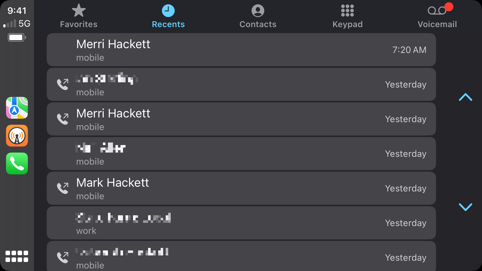
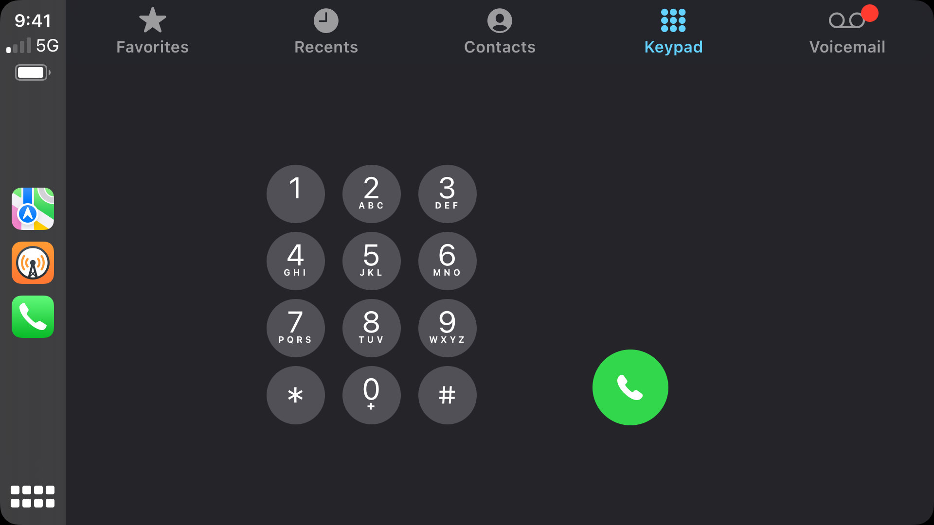
The phone app is okay but the full-width cells in that table view are a bit odd. I also have no idea why the dialer looks the way it does.
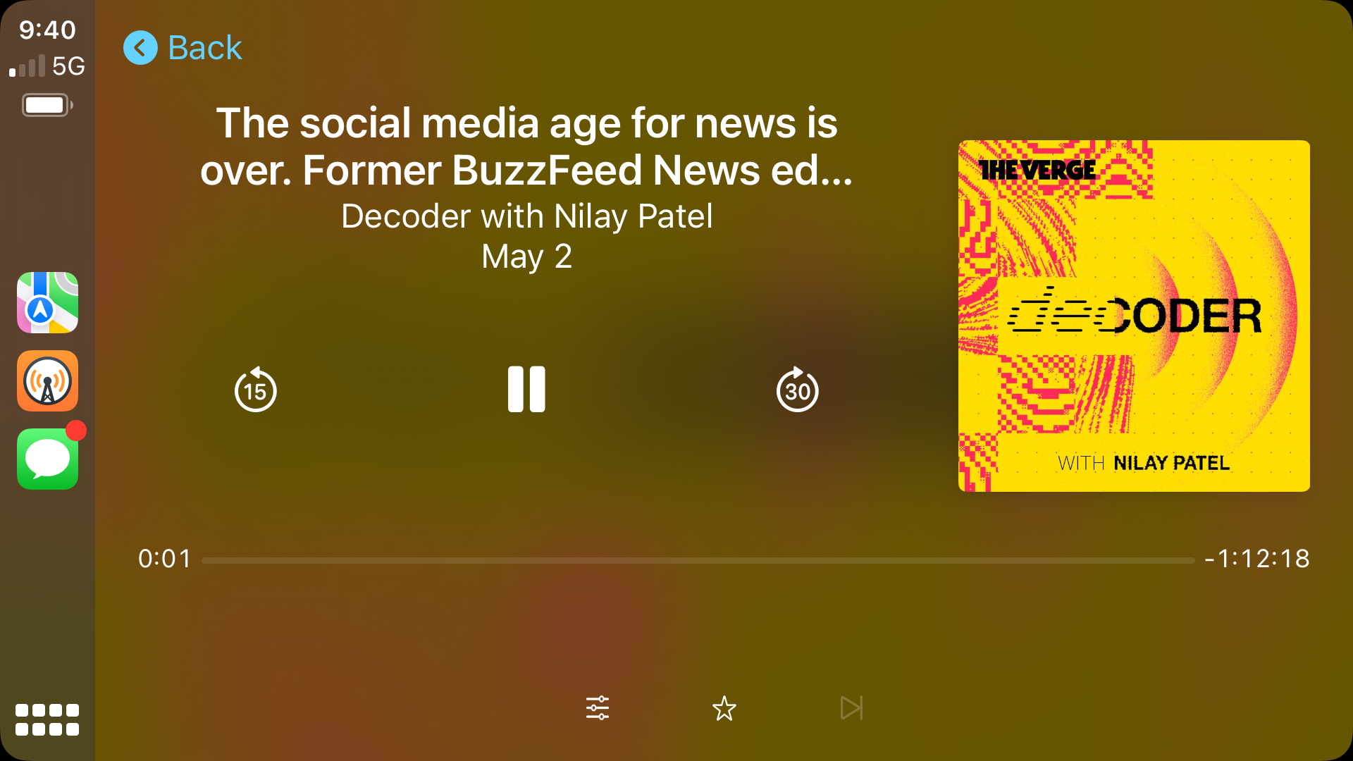
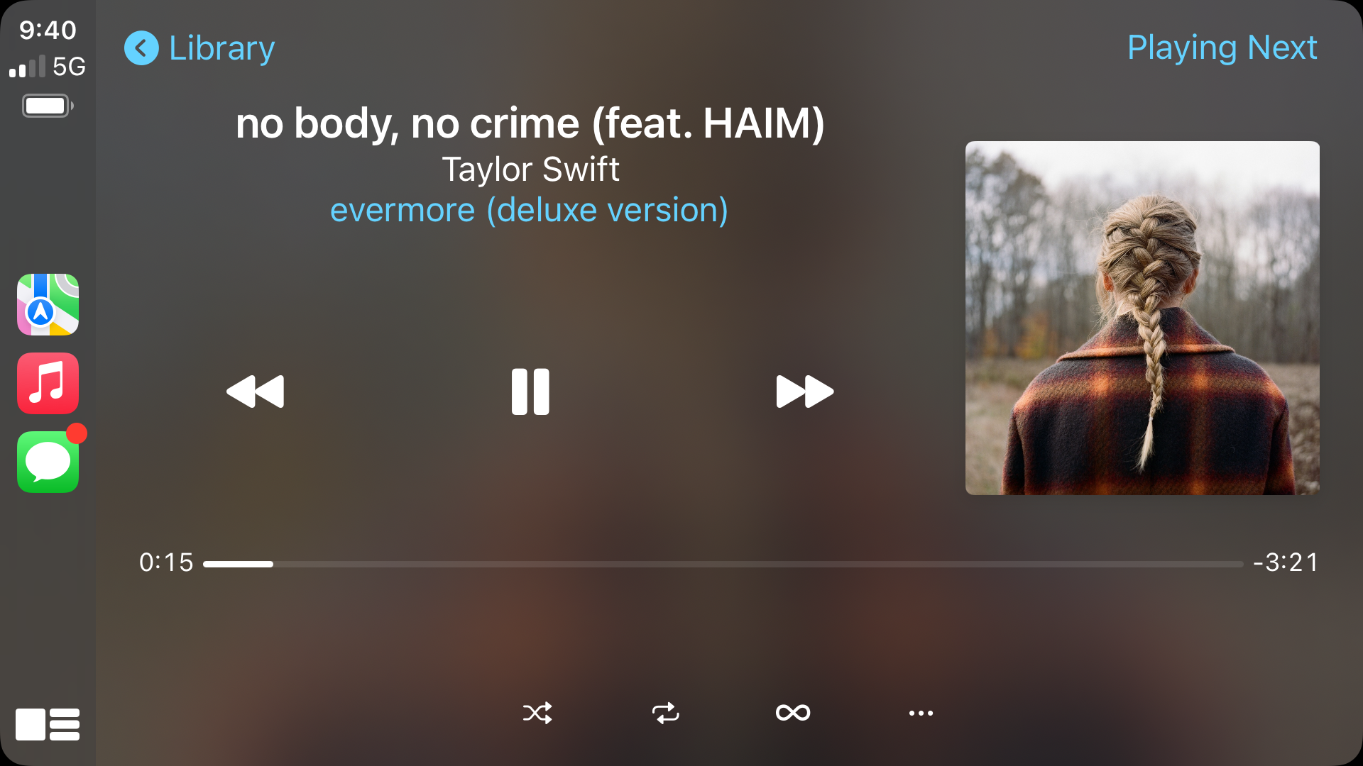
Full-screen media playback is perhaps the worst of the screens, with both Overcast and Apple Music showing how much work Apple needs to do here:
At WWDC last year, Apple showed off the future of CarPlay. I love their vision for the future of the car, but I hope we don’t have to wait for that to see improvements for those of us living in the present.