In the wake of Apple’s Liquid Glass announcements at WWDC, I took some time and rewatched the Macworld San Francisco Keynote from 2000, when Steve Jobs introduced the world to the Aqua user interface:
Here’s how Apple PR wrote about it at the time:
“Mac OS X will delight consumers with its simplicity and amaze professionals with its power,” said Steve Jobs, Apple’s iCEO. “Apple’s innovation is leading the way in personal computer operating systems once again.”
The new technology Aqua, created by Apple, is a major advancement in personal computer user interfaces. Aqua features the “Dock” — a revolutionary new way to organize everything from applications and documents to web sites and streaming video. Aqua also features a completely new Finder which dramatically simplifies the storing, organizing and retrieving of files—and unifies these functions on the host computer and across local area networks and the Internet. Aqua offers a stunning new visual appearance, with luminous and semi-transparent elements such as buttons, scroll bars and windows, and features fluid animation to enhance the user’s experience. Aqua is a major advancement in personal computer user interfaces, from the same company that started it all in 1984 with the original Macintosh.
On the page for the OS X Public Beta, Apple wrote:
The Aqua interface brings your Mac to life with color, depth, translucence and fluid motion — and keeps you on top of things with continuous visual feedback.
If you’ve never seen the early versions of Mac OS X, I have a whole collection of screenshots for your enjoyment.
Here are a couple of Apple’s press images from the release of Mac OS X:
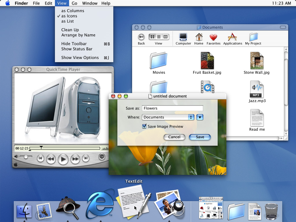

By the time OS X actually shipped a year after Aqua’s introduction, Apple had made some changes to the interface, including an updated Dock.
Liquid Glass feels like it harkens back to this era, but it is amazing how well Aqua has held up over time. The overall structure of OS X’s user interface is basically intact today, some two and a half decades later. The Dock, menu bar, and the various views in Finder are all still here today. They have evolved over the last 25 years, but not as much as you might have thought they would back in 2000.
Beyond the sheer consistency of the Mac’s interface, what really struck me about this video is how relatable it all feels. Steve Jobs is clearly proud of the work his team had done, but his comments are about how their work was going to make users’ lives better. They took what was great about the Mac’s previous interface and married it with what was great about OPENSTEP, all with a new look and feel. There was a reason for everything, even it was just because something was cool.
Jobs was at his best in these moments, and while I like a lot about Liquid Glass, it’s hard to argue that its introduction holds a candle to Aqua’s.
In this video, Alan Dye explains a lot about how the new design works, but is light on the why. I think part of it is the pace. The video is less than four a half minutes long. Nothing has any room to breathe, and at no point does Dye show any emotion about the work.
This all makes me miss live keynotes. I know Apple likes the control it has over pre-recorded introductions, but its announcements deserve live demos, off-the-cuff remarks, and the humanity that was once more prevalent at things like WWDC or iPhone introductions.