
John Gruber, responding to my article celebrating Tahoe Beta 2’s new Finder icon:
I’m going to strongly disagree here. The Tahoe beta 2 Finder icon is slightly better, but seeing it this way makes it obvious that the problem with the Tahoe Finder icon isn’t whether it’s dark/light or light/dark from left to right. It’s that with this Tahoe design it’s not 50/50. It’s the appliqué — the right side (the face in profile) looks like something stuck on top of a blue face tile. That’s not the Finder logo.
The Finder logo is the Mac logo. The Macintosh is the platform that held Apple together when, by all rights, the company should have fallen apart. It’s a great logo, period, and the second-most-important logo Apple owns, after the Apple logo itself.
Reading through the articles (and the replies to those articles) about Beta 2’s icon, I realize I may be in the minority in liking the current icon:

I see what John and others are saying, though: Beta 2’s icon does break the meaning of the Finder icon. My assumption from the start of all of this is that Apple wasn’t going to go back to previous look with the lighter color going all the way to the edges of the icon, so I had written that off as a possibility.
If Apple does want to align the new new Finder icon with its history even more, they should mimic Michael Flarup’s design that John linked to:
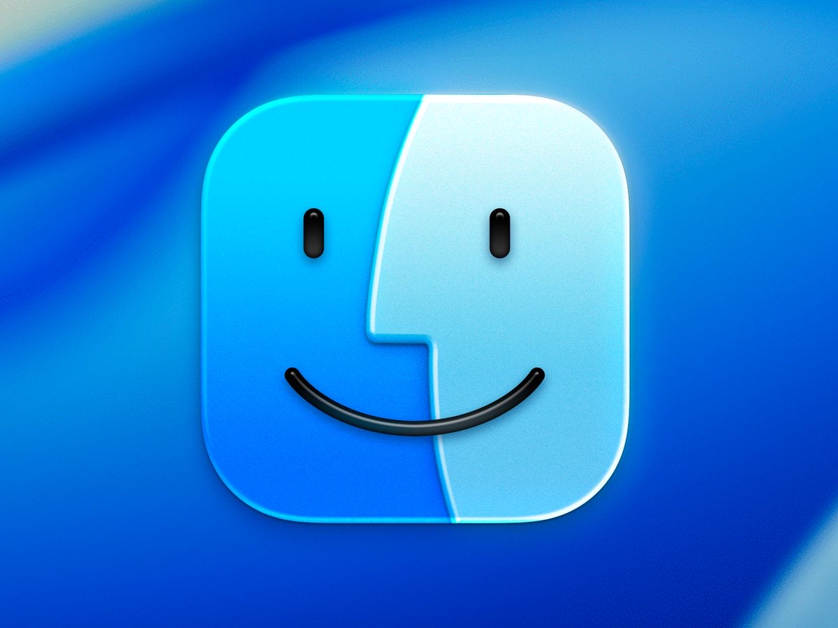
(I also like Louie Mantia’s example that returns some purple to the icon.)
I don’t know if Apple is going to revise Tahoe’s Finder icon again. I would happy if they do, but I am also okay if they don’t. The appliqué design fits pretty well with what Apple is doing with Liquid Glass, and the colors being on the correct side was the biggest sin of the original Tahoe design.