The guys learn how their predictions fared, talk about some of the news from WWDC25, and someone gets a trophy.
The guys learn how their predictions fared, talk about some of the news from WWDC25, and someone gets a trophy.
It seems to me that Apple is learning its lesson about announcing things too early, even as it tries to (somewhat defensively) distance its future features from those shipping already by the likes of Google and OpenAI.
Apple’s 2025 WWDC was jam-packed, from a new design system across its operating systems to updated iPad multitasking, a plethora of updates to apps like Messages and Phone, and new features for CarPlay. David and I break it all down on this episode of MPU.
Looks like Finder isn’t the only Mac application to see big icon changes in macOS Tahoe. Poor Otto had his arms, legs, and pipe taken away:

macOS Tahoe will be the last release for Intel-based Mac computers. Those systems will continue to receive security updates for 3 years.
Rosetta was designed to make the transition to Apple silicon easier, and we plan to make it available for the next two major macOS releases – through macOS 27 – as a general-purpose tool for Intel apps to help developers complete the migration of their apps. Beyond this timeframe, we will keep a subset of Rosetta functionality aimed at supporting older unmaintained gaming titles, that rely on Intel-based frameworks.
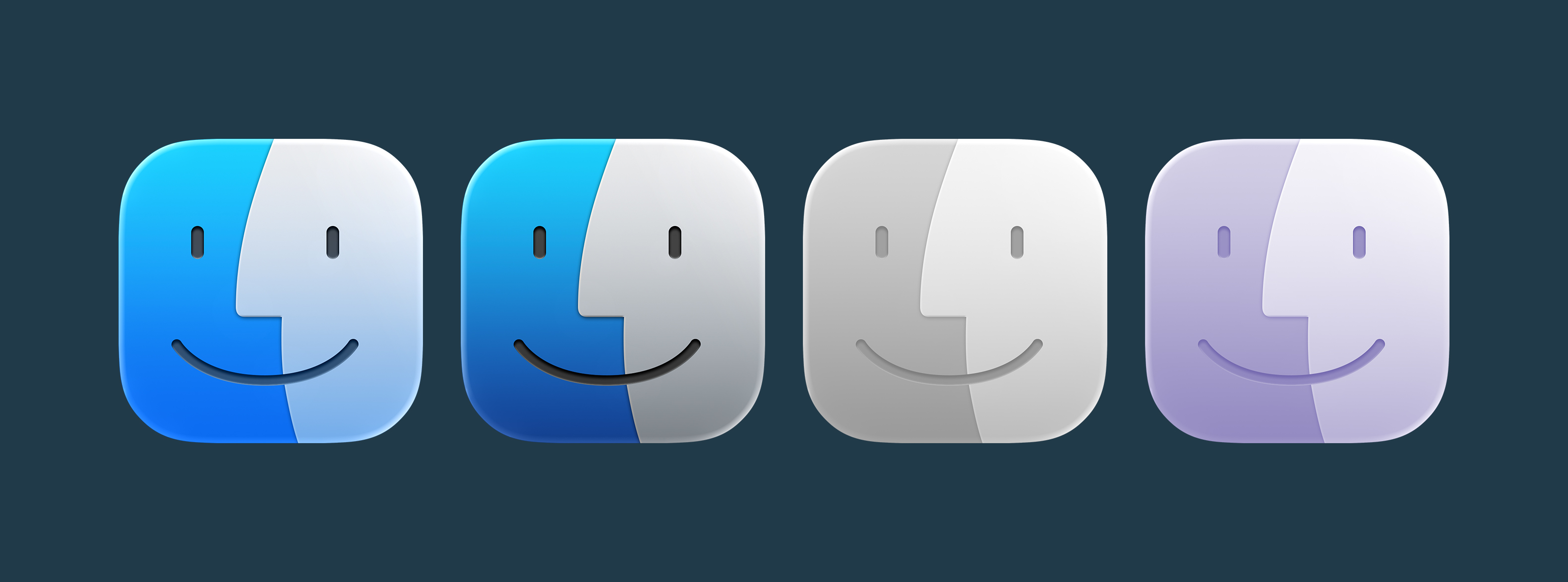
Something jumped out at me in the macOS Tahoe segment of the WWDC keynote today: the Finder icon is reversed.
You can see that in the image below. On the left is macOS Sequoia, and on the right is macOS Tahoe:

I know I am going to sound old and fussy, but Apple needs to roll this back.
The Finder logo has changed over the years, but the dark side has been on the left forever. Here it is on the boot screen on System 7.5.3, which shipped in 1996, an early version of the logo in color:

And in the About This Computer screen in Mac OS 8:

This same basic design survived the move to Mac OS X, as can be seen here in the Public Beta from 2000. The only real change was the addition of a little sheen to make it fit in better with the Aqua user interface:

Here you can see it in Mac OS X Panther which shipped three years later:

The Finder then transitioned to the Retina era in 2012 with OS X Lion:

The logo was updated with the redesign that was ushered in with OS X Yosemite in 2014, then tweaked again for macOS Big Sur in 2020:


The Big Sur Finder icon has been with us ever since,1 and I hope Apple reverses course here. I understand that the new icon is meant to be in sync with the new Liquid Glass user interface, but some things are just tradition.
For kicks, I ran the current Finder icon through Apple’s new Icon Composer app, and I think it looks pretty good with Liquid Glass, even in the clear and tinted modes:
This has been filed with Apple as Feedback FB17840162. Yes, seriously.
Update: Apple fixed this in Tahoe Developer Beta 2.
As is tradition, I’ve snagged the default wallpapers out of the new macOS beta. You can download them at the links below:


Download full-sized copies here:
Apple’s video about Liquid Glass is up, and it’s really interesting to hear the thought that went into the new design. I’ve got the betas on a secondary phone and laptop, and uhhhh, it’s going to take some getting used to.
Apple’s OS preview pages are up, and with them, updated compatibility lists for iOS and iPadOS.

On the iOS front, here is what can run 26:
I am surprised to the see the iPhone SE still on the list, given its square display and the presence of the Home button.
And here is what can run iPadOS 26:
For watchOS 26, you’ll need:

As expected, this release of macOS does drop some older Intel machines from the line. This is what is supported:
These machines supported macOS Sequoia, but have been dropped this time around:
In the State of the Union, Apple announced macOS 27 will require Apple silicon and shared that Rosetta will end in macOS 28 via documentation.
These are always fun:


Unite 6 is here — and it’s more than just an upgrade. It’s a new way to bring your favorite websites into your macOS workflow. Whether you’re crafting a minimalist Gmail client, a multi-tab ChatGPT hub, or a lightweight Discord alternative, Unite 6 gives you complete control and a beautifully native experience.
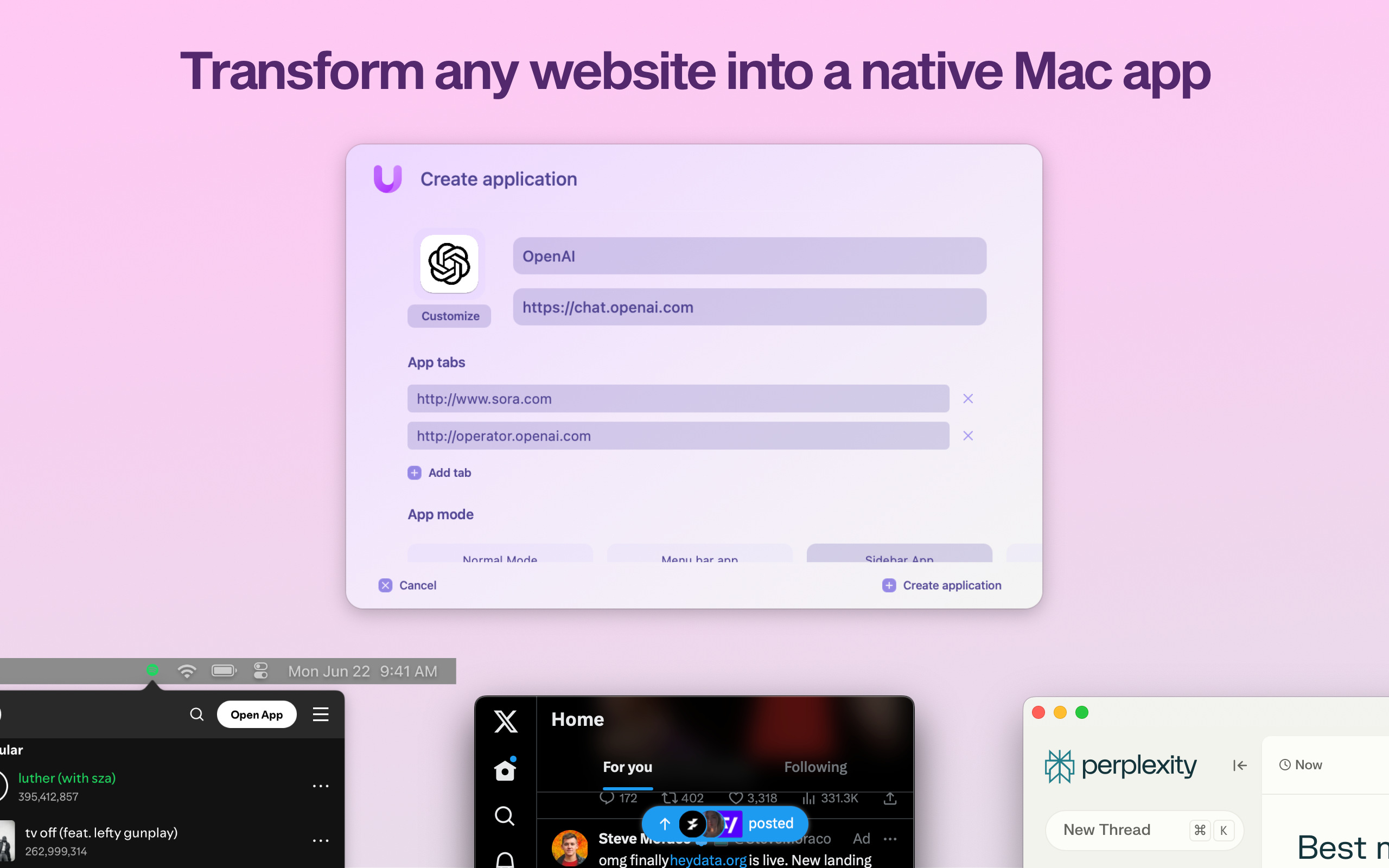
What’s New in Unite 6?
💾 App Sharing: For the first time, share Unite apps across Macs with Unite—just send a file.
🧭 Advanced Tab Control: Pin, rename, lock, and isolate tabs like a power user.
🔐 Smart Toolbar & Touch ID: A more secure, distraction-free browsing experience.
💻 Smarter Sidebar Mode: Customize and pin tabs, now with persistent layout options.
Unite doesn’t just wrap a website in a window—it transforms it into a real Mac app with full system integration, global shortcuts, and no bloat.
Want a distraction-free Notion window? A smarter way to use Figma, Slack, or your finance dashboard? Unite 6 is built for that.
512 Pixels readers get 20% off all licenses this week — just use promo code 512Pixels at checkout or visit: bzgapps.com/unite512.
You can also try Unite 6 for free for 14 days or find it in your Setapp subscription.