The Tools and Toys MacBook review

Nate Barham:

On first impression, the MacBook states its design goals clearly to the user. This computer is thin and light. It aims to do more with less. Weighing a half-pound less than even the smallest MacBook Air, there is literally less machine, less matter, less physical object. It is thin enough to make even the “fits in an office envelope” trick of the original Air seem mundane and unimpressive.

Be sure to click through to see the amazing photos of the notebook.

Apple updates 15-inch MacBook Pro and iMac 5k

The 15-inch MacBook Pro now ships with a Force Touch trackpad, better internals and a bump in battery life. The high-end model is now shipping with an updated AMD video chipset. One of these will be my next Mac.

Update: It looks like these machines are still powered by Haswell-class chips, not Broadwell. I will probably roll the dice and wait for new chipsets and hope the MacBook keyboard isn’t added at the same time.

Apple also introduced a new, second model of the iMac 5K. Priced at just $1999, it comes with a less powerful video card and a spinning hard drive, while the $2299 machine comes with a Fusion Drive. If I were in the market for an iMac, I’d drop the money to go pure SSD.

It’s interesting to note that USB-C is still only on the new MacBook, and that the butterfly keyboard Apple touted as being better than its old one isn’t on the new notebooks. The entire Pro line has been updated since that MacBook event. My guess is that there’s a bigger release on the horizon somewhere.

Kbase Article of the Week: Mac notebooks: Key placement and functions

In my ‘Kbase Article of the Week’ series, I highlight a random Apple support document — old or new — that is interesting or odd. Maybe I need a hobby besides this stuff.


Article HT201181, named “Mac notebooks: Key placement and functions” opens with this:

Over time the layout and placement of special keys on the Mac notebook’s keyboards have changed. Learn about the key placement and functions on Mac notebook computers.

This document was last updated May 18, 2015, and includes renderings of a bunch of keyboards that Apple has shipped over the years on Intel Macs. It’s interesting to look and see how the company has consolidated some things, added new items and even drop some things, like media eject and the “Video Mode Toggle key” as time has passed.

‘An element of luxury’

“Should I buy an Apple Watch?” “Will it be as big as smartphones?” “Can it do anything my phone can’t do?”

If you — like me — are asked those questions about Apple Watch, I think David Chartier’s answer is pretty good:

Apple Watch feels like an extension of convenience, though certainly with more of an element of luxury. I don’t think everyone will need a smartwatch the same way they need broadband in the 21st century (or rather, it should be a fundamental right) and some kind of computing device, be it a phone or basic PC. But if you have the money and a busy life, Apple Watch is a tremendously stylish, worthwhile way to simplify some of it and spend more time with the things that matter. As with any platform, if Apple Watch grows, our time spent with things that matter will hopefully grow with it.

On Apple Watch faces

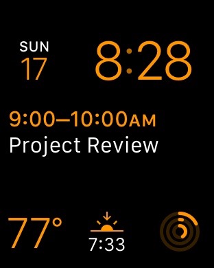
I’ve been wearing my Apple Watch for a couple of weeks, and while I’m still churning on my review, I wanted to share my thoughts on the ten watch faces that come with the device. While having so many options is great, many of the faces have frustrating limitations in the ways they can be customized or used.

Editor’s Note: Don’t judge me for my Activity Rings. My Watch was on the dresser most of the day, as I didn’t want to smash it while moving rocks around in the yard.


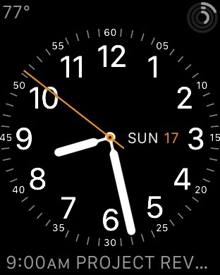
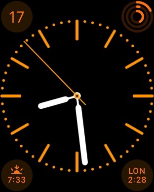
The Utility watch face seems to be a favorite of many people on Twitter, and for good reason.

Pros: There are lots of options for levels of detail, lots of colors and three places for complications. I like how the smaller labels are the embedded in the ring of minute marks.

Cons: It’s not unique to this watch face, but the ALL CAPS event info is annoying, and the complication shows “NO MORE EVENTS” after the last calendar item has passed. 


On the face of it (sigh), Modular seems like a huge winner. Why take up space faking being a real timepiece when the watch is digital?

Pros: Big, easy-to-read text with lots of flexibility.

Cons: The time is locked to the upper-right corner; I’d love to have it be the biggest thing on the Watch face. Having three complications across the bottom is nice, but can feel a bit cramped.


Simple is the watch face I’m using most of the time. 

Pros: With four complication areas, (one more than “Utility”) the name is weird, but I like the way this face looks. There’s a lot of information, but in a nice package. 

The ring around the watch face can be hidden all together, but I find it hard to read the time without some tick marks.

Cons: The only thing I don’t like about this face is that it can’t put the day next to the date, like Utility and others.


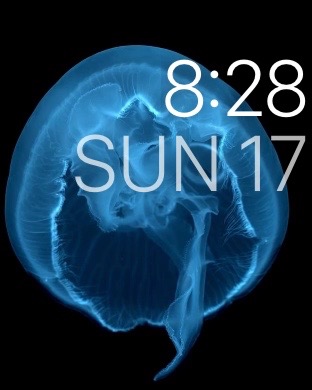
While the imagery on the Motion watch faces is very impressive, this one just isn’t for me. I need more information than this watch face can give me.

Pros: It is beautiful.

Cons: It’s mostly useless.


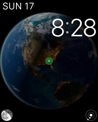
As much as I love space, it pains me that I can’t use Astronomy as my go-to watch face. Tapping the icons to go between the Earth’s current place in the solar system, the moon’s current phase and your current location on the planet (complete with sunshine and darkness information) is stunning. I love that twisting the Digital Crown affects the imagery in time, despite it being a weird UI break from the rest of the watch faces.

When I demo the Watch to people, this is something I show off, but day-to-day, it doesn’t offer what I need in the way of complication support.


More than any other watch face, Color seems like a throw-away. Four complication areas are nice, but the level of detail around the watch face can’t be edited like Simple, and the color backgrounds behind the complications are pretty bad looking on almost every option.

Color does have the unique ability to show a monogram, set in the Apple Watch app, but it’s not enough to save it, in my opinion. If this watch face went away, I wouldn’t miss it.


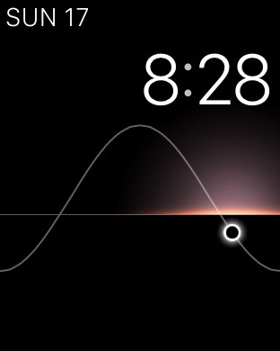
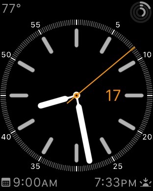
Solar is very much a cousin to Astronomy, with its conceptual theme and easy-to-read digital face.

Pros: The colors used to highlight the position of the sun are beautiful. In fact, I grabbed all of the screenshots in the evening to highlight that.

Cons: Like Astronomy, the Digital Crown can be used to change time’s effect on the watch face, but I wish it could be turned off here. I would use Solar as my default if it offered better complication support. As it is, it only comes out on weekends.


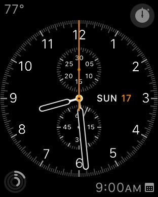
While I know some people love Chronograph, I don’t care for it all that much. I am sure that never having owned an actual chronograph watch before Apple Watch can be blamed for that.

Like its real-world inspiration, this watch face has a stopwatch in the upper-right hand area at all times, but I don’t find myself in need of one all that often. Thus, the trade-offs of three complication areas and a design I don’t particularly care for aren’t worth it.


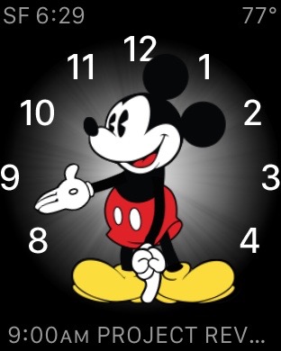
Mickey is just a barrel of fun. His foot taps as the seconds roll by, and the three complication areas make this face more customizable than I would have guessed, but our ALL CAPS friend appears again, which makes me sad.

I haven’t yet used Mickey, but my kids think he’s awesome, so that’s a win in my book.

Also, I totally want this watch face with WALL•E telling me the time.


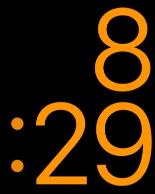
The X-Large watch face does what it says on the tin: it makes the time as large and as easy to read as possible. 

There are no complications, but there are plenty of colors to choose from here. I’ve used this face while working outside in the yard, as the huge numbers are very easy to read, even in direct sunlight.

More importantly, this watch face is a great addition for those Apple’s vision impaired customers. I’m glad it’s here in version 1 of the Watch OS.

The Click Wheel iOS keyboard

Dante D’Orazio:

The third-party iOS keyboard brings the past to life, and is complete with authentic iPod scrolling sounds. Fancy. Now you, too, can scroll through one letter at a time as you compose your next great tweet. Even better, the keyboard includes all of those hundreds of emoji included in iOS 8.3. Just keep on scrolling, you’ll find those dancing sisters eventually.

This keyboard is kind of the opposite of this idea:

PowerPCs in space

Turns out, the PowerPC G3 chips that powered Macs for years are still powering hardware, albeit in space:

The RAD750 is a radiation-hardened single board computer manufactured by BAE Systems Electronics, Intelligence & Support. The successor of the RAD6000, the RAD750 is for use in high radiation environments experienced on board satellites and spacecraft. The RAD750 was released in 2001, with the first units launched into space in 2005.

As Thomas Brand points out, the RAD750 can be found in all sorts of cool missions include the Deep Impact comet chaser, Mars Reconnaissance Orbiter, Kepler space telescope and Mars Curiosity rover.

I bet my Clamshell iBook would do okay in space. That thing is crazy durable.

Day One launches sync service

The best way to journal on your Mac or iOS device just got a new, first-party sync option:

Day One Sync is a fast and reliable alternative to iCloud and Dropbox for backing up and synchronizing your Day One journal between all of your devices.

Beyond syncing, this service is vital to the future of the Day One platform. It lays the foundation for numerous features in the future, including:

  • Multiple journals
  • Web-based version of Day One
  • Shared journals
  • Multiple photos
  • Journaling via email
  • API and IFTTT integration

I switched over to it, and I have to say, it’s way faster than Dropbox was. I love Day One, and am excited to see it gaining more powerful features.

The end of ‘OS X’

Jason Snell:

They’re going to collide eventually. iOS is on track for version 9 this year, and if Apple continues incrementing OS X versions, we’ll be heading for 10.11. And, again barring any change in philosophy, in the summer of 2016 we’ll be talking about iOS 10 and OS X and things will get weird.

But this is an era where Apple appears to be amenable to change on many fronts. Tacking the lowercase letter i on the front of product names appears to be a thing of the past—hello, Apple Watch. (And while it would be bold for Apple to change the name of iOS to Apple OS, I can’t see it—it’s powering the iPhone and iPad, and those names aren’t changing anytime soon.)

So let me make a proposal. As long as Apple is showing a willingness to change, let’s get off 10 and take this one to eleven.

Going to something “Mac OS Santa Cruz” sure has a nice ring to it. While I’d miss this type of banter, I agree with Jason: it’s time to move on.

On Verizon’s acquisition of AOL

This morning, news broke that Verizon is purchasing AOL. Here’s Peter Kafka:

Earlier this year, AOL CEO Tim Armstrong said there was no truth to reports that he was selling his company to Verizon. It’s a different story now: The telco is buying the Internet publisher and subscription service for $4.4 billion.

Verizon, which will pay $50 a share for AOL, says the deal will help its “wireless video and OTT (over-the-top video) strategy.” Verizon says the transaction should close this summer.

Armstrong, who left the top sales job at Google to run AOL in 2009, will stay on to run the business after the deal closes, Verizon says.

$4.4 billion for video advertising tech seems … bold. Clearly Verizon is trying to generate income in markets beyond the ones it exists in as an ISP.

Honestly, I don’t care to much about this. I’ve been a paying Verizon customer for years, and while all ISPs are creepy, I can deal with Verizon’s shenanigans.

However, what AOL is best know for, at least in our circles, are properties like Autoblog, TUAW, TechCrunch and Engadget. That’s where this purchase gets interesting, and possibly troubling.

I’ve gotten to know several people at these sites over the years, and they are all good people. My concerns aren’t with the people reporting, but with the business situation these properties have been thrusted into with this acquisition.

While it has since shuttered the site, Verizon made headlines last year trying to blur the lines between tech coverage and corporate messaging.

As I wrote then, there’s a clear difference between running ads to pay for content and having news be shaped by a parent organization.

Of course, having corporate ownership isn’t anything new. In his editorial about the purchase, Verge boss Nilay Patel writes:

Full disclosure: I used to work at Engadget, as did many of The Verge’s founders; we left AOL to start this site. I never felt any editorial pressure at AOL, but huge corporate news like this would frequently leave us spinning without real answers for months at a time. And Comcast Ventures is an investor in Vox Media, The Verge’s parent company, but it should be abundantly clear that we have complete editorial independence from that relationship.

However, it’s possible that these blogs don’t end up as part of Verizon’s empire. Here’s Kafka again:

One scenario we’ve heard is that Verizon intends to spin out some or all of its content operations, like HuffPo, with a third partner, perhaps German publisher Axel Springer.

In an interview with Re/code, Armstrong didn’t address that scenario directly, though he seemed to leave the door open. “We’ve spoken to partners about content and scaling,” he said. “Obviously we’ve seen a lot of interest in the content brands we have. So over the course of the summer, stay tuned.”

Kara Swisher reports that the Huffington Post at least may be spun off as part of the deal.

Late today, Tim Armstrong spoke on this very topic:

TechCrunch is not getting sold off. There will be editorial independence. And from a distribution and resource standpoint, it’s probably the most exciting deal we could have done.

The interview this is pulled from is an interesting look at the acquisition, but I’m sure it won’t be the last word on the marriage of Verizon and AOL. This one will be interesting to watch for a while.