512 Pixels

Moleskine Holds IPO⇢

Om Malik:

If you work in technology and still like to take notes, write, draw and imagine, then you are quite familiar with the Moleskine brand. What was once a cool but obscure brand of notebooks has become a product so ubiquitous that you can find it in swag bags for conferences, and venture capital firms hand them out like candy.

In other words, it is very mainstream and very big. And that is why Moleskine went public today on the Milan Stock Exchange. Its shares were priced at 2.30 euros a share. The company raised 245 million euros, or roughly $314 million. It is valued at roughly $626 million. Moleskin had revenues of 78.1 million euros and a profit of about 18.1 million euros in 2012. The stock jumped 3.9 percent today before falling slightly.

Holy cow.

Old Mac of the Month: The iMac G5

This month’s post is by Jordan Merrick, a freelance writer and web designer who runs Sparsebundle, a UK-based blog about technology, Apple, web design, video games.


This year celebrates the fifteenth anniversary of the iMac. You’d think that if we looked over the lineage of the iMac, we’d see a number of major design changes as time went on. But that’s not the case and, in fact, since the introduction of the iMac in 1998 it has had only two major design changes. Sure, it’s had a coat of paint, a change of clothes and it’s gotten bigger whilst losing weight, but the fundamental form factor of the iMac that we see today has been unchanged for almost ten years, a chinned display with (up until recently) a side-mounted optical drive. It’s a form factor that owes its beginnings to the iMac G5.

The original iMac, a CRT housed in a translucent case, saved Apple and cemented itself into popular culture that is, even today, still an iconic design. The iMac G3 bowed out after three years before the next iteration arrived.

The iMac G4 (referred to by some as the iLamp) was the first major redesign of the iMac as Apple switched to LCD screens and was a radical departure to the original iMac’s design. The iMac G3’s design had to focus around the sheer volume of a CRT. Although that limitation had gone, Apple still focused on the display and took a very original approach to mounting it on a swing arm. It was certainly unique and, love it or hate it, proved to be very popular. That form factor lasted just over two years.

On August 31 2004 at the Apple Expo in Paris, Phil Schiller took to the stage to announce “one more thing” - a complete redesign of their flagship Mac. It was the day that Apple introduced the iMac G5.

image via Apple PR

The iMac G5 was far more mature in comparison to its predecessors. This machine was simply a neutral white rectangle, less than 2” thick, held aloft by a single piece of aluminum. Gone were the cutesy colors and childish nature of the infant iMac G3 as well as the nose and lip piercings of the teenage iMac G4 that made sure it stood out of a crowd. The iMac G5 had finally grown up, moved out and got a job. It was the deliberate lack of any ostentatious characteristics in the iMac G5 that would pave the way for Apple’s minimalistic design choices over the next decade.

The iMac had finally reached adulthood.

The design was reminiscent of the iPod, and the fact was pushed by Apple in its advertising.

Aside from the design change, the big news was that iMac was finally able to benefit from a G5 processor. The G5 had found a home in the PowerMac over a year ago but due to heat and cost constraints, the iMac had been trundling along with the G4 that had already been showing signs of age. This meant that the iMac rocketed from a rather pedestrian 1.25 GHz G4 to a blisteringly hot 1.8 GHz G5 processor. The system bus speed increased accordingly, from a lowly 167 MHz to a much more sprightly 600 MHz. Throw in the addition of Serial-ATA and the iMac was now a serious alternative for the PowerMac G5, at least for those who didn’t need PCI cards.

These G5 processors ran hot, and I mean hot. The iMac G5 housed three fans in its thin frame. The iMac was ingeniously designed for heat dissipation. Along the bottom of the iMac ran a grille (behind which Apple hid the speakers) that allowed cool air to be drawn in by the fans. The top of the iMac had a thin vent that provided an escape route for rising hot air caused by the heat inside. Within the iMac ran a series of plastic channels that artificially directed the air flow. The act of the heat rising out of the iMac caused a convection current, a pressure difference in the air within, which would draw cool air in without the need of a high-speed fan. This meant the iMac could run near silent since the fans would only need to run at a minimal speed for many tasks. It might sound incredibly boring but it allowed the near-molten G5 to be fitted inside a Mac that was much closer to being a laptop than a desktop.

What was surprising about the iMac G5 was just how much was carried over from the previous iMac G4. While everyone was distracted by the change in form factor and the introduction of the G5 in its second Mac family, not a whole lot changed under the hood. It still had three USB ports, two FireWire ports, Mini-VGA, Ethernet, a 56k modem and AirPort Extreme and Bluetooth as optional components. The graphics card remained the same Nvidia GeForce FX 5200 that the iMac G4 shipped with and even the 17” and 20” LCD displays were the exact same panels Apple had already been using.

The iMac G5 was the most user-serviceable machine Apple shipped under Steve Jobs’ second reign.

Apple would often send service parts out to customers who reported a problem. This meant the customer didn’t need to find somewhere to repair it since the Apple Store hadn’t been around much at the time. At one point there was a repair program for the power supply which meant Apple provided a free service to affected customers with an iMac G5 that met certain criteria. Many customers who reported the issue were sent the service part to fit themselves, again to save the customer the hassle of visiting a service centre. I even met one customer on the Genius Bar who had been sent a logic board by Apple.

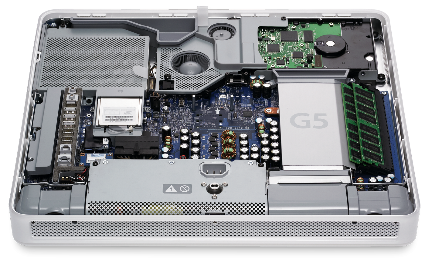
The iMac G5 had the optional Bluetooth and AirPort Extreme cards, but adding them was something customers could do themselves. You didn’t need to drag your iMac G5 to the nearest service centre, you could just buy the kit and fit it yourself. Better still, if you wanted to upgrade the RAM or hard drive in your iMac G5, no problem — go right ahead.

To upgrade or service the iMac G5, you simply lay it face-down and loosened three screws. The whole back would then pivot away like the hood of a car to reveal what must be the most exceptionally designed internals that had ever graced a computer. Everything was modular and almost everything was designed to be user-serviceable, from the hard drive to the logic board. It meant experienced technicians could do entire logic board replacements in about 15 minutes and replacing the optical drive or hard drive could be done in less than five.

image via Apple PR

As a former Apple technician, the iMac G5 will always have a special place in my heart.

This easy-open design came in handy, as the iMac G5 would be plagued with video and power issues, stemming from capacitors on the logic board and in the power supply that would burst:

Apple would end up opening a wide-reaching repair program to cover machines that were out of warranty, but afflicted with the problem.

The iMac G5 was eventually replaced just over a year later with a newer model, the first Mac with an iSight camera built-in. What it gained in additional features, it lost in serviceability. No longer was everything easily accessible and the only part the customer could upgrade was the RAM. As for servicing it, things were dramatically worse in comparison. Repair times, along with frustration, increased and the accessing the parts involved bending the bezel into all sorts of angles whilst using a credit card to jimmy it open like a door lock in an 80s cop show.

But hey, it was half an inch thinner.


Want to write about an old Mac you love? Get in touch!

RSS Sponsor: Shopster⇢

Shopster is a new kind of groceries list app that learns what you purchase and where, so it can remind you later on.

Whenever you check an item as purchased, Shopster learns the location where you got it. The next time you look for the same thing, a geofenced alarm will be triggered when you are near the location.

Features: - Autolearning of locations when checking items as purchased. - Geofenced reminders for your products, based on your prior buying history. - In-place editing table, for quick corrections and editions. - Unique ruler to quickly enter the number of items you need to buy. - Smart autocomplete, to assist you entering frequently purchased products, based on your previous history. - Reorder items with a simple tap and hold.

Check out Shopster on the AppStore, it’s only $0.99

Sponsorship by The Syndicate.

The Brushed Metal Diaries: Et Tu, iTunes?

In the Brushed Metal Diaries, we take a look at one of Apple’s most unique — and most hated — user interface paradigms. While QuickTime 4 served as Apple’s Brushed Metal Trojan Horse, the most famous piece of software to wear the look is iTunes.

At MacWorld Expo in 2001, Apple introduced iTunes with its normal language:

Apple today introduced iTunes, the world’s best and easiest to use “jukebox” software that lets users create and manage their own music library on their Mac. iTunes lets Mac users import songs from their favorite CDs; compress them into the popular MP3 format and store them on their computer’s hard drive; organize their music using powerful searching, browsing and play list features; watch stunning visualizations on their computer screen; and burn their own audio CDs — all in one easy-to-use application.

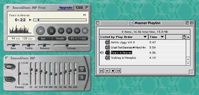
iTunes didn’t appear out of thin air. It was the result of Apple purchasing SoundJam MP, a Mac-compatible jukebox app that allowed users to encode CDs, stream and store MP3s and even sync them to Diamond Rio MP3 players.

Take a look at the thing:

Image via taptaptap.com

You’ll notice that Brushed Metal is present. Here’s Jim Heid at Macworld:

At first glance, SoundJam MP’s interface evokes the look of Apple’s QuickTime Player, the justifiably maligned movie and music player that accompanies QuickTime 4 Pro (see Reviews, October 1999). SoundJam MP sports the same brushed-aluminum, 1970s-swinger look. But Casady & Greene didn’t mimic Apple’s mistakes as well. SoundJam MP’s volume control is a horizontal slider instead of an awkward virtual knob, and the program lacks QuickTime Player’s gimmicky Favorites drawer.

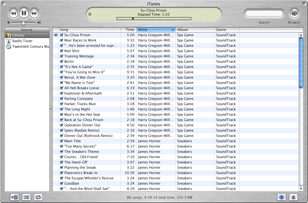
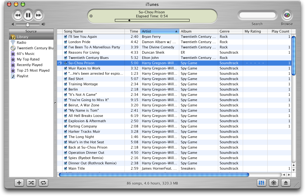
Here’s what iTunes 1 looked like:

All screenshots courtesy of guidebookgallery.org

The initial version of iTunes was pretty basic; the app didn’t even include burning support. While that was added in version 1.1 (alongside the “Rip. Mix. Burn.” ads), the free price tag led to it being downloaded by many more users than were willing to spring the $40 for SoundJam MP. In fact, in nine months, iTunes had been downloaded more than one million times.

Brushed Metal had hit the big time.

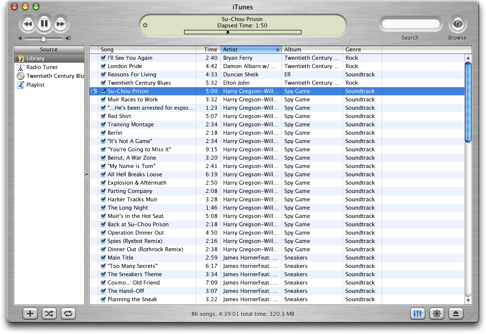
In October 2001, Apple released iTunes 2:

This version kept the UI the same (the above screenshot shows the OS X version, with the Aqua window controls looking awkward on top of the Brushed Metal window), but added MP3 CD burning, a 10-band equalizer with presets, a crossfader and iPod support.

By the time iTunes 3 was released in July 2002, iTunes had been downloaded 14 million times. This update coincided with the release of the iPod (touch wheel), but packed still packed several new features, including track ratings, smart playlists, support for Audible audiobooks and better metadata support. 1

UI-wise, iTunes 3 would end up being a preview to OS X Panther, which would be released 15 months later. As you can see from the screenshot below, the Brushed Metal was smoother on this release, with the text superimposed on it across the bottom of the window was made far more legible:

iTunes 4 was far more than a simple update: it included a store. Launching with 200,000 high-quality songs from BMG, EMI, Sony Music Entertainment, Universal and Warner, the iTunes Music Store turned the music industry upside down. One million tracks were sold the first week, and in four months, 10 million tracks had been sold.

While all that’s fine, it’s not the only reason iTunes 4 is so unique.

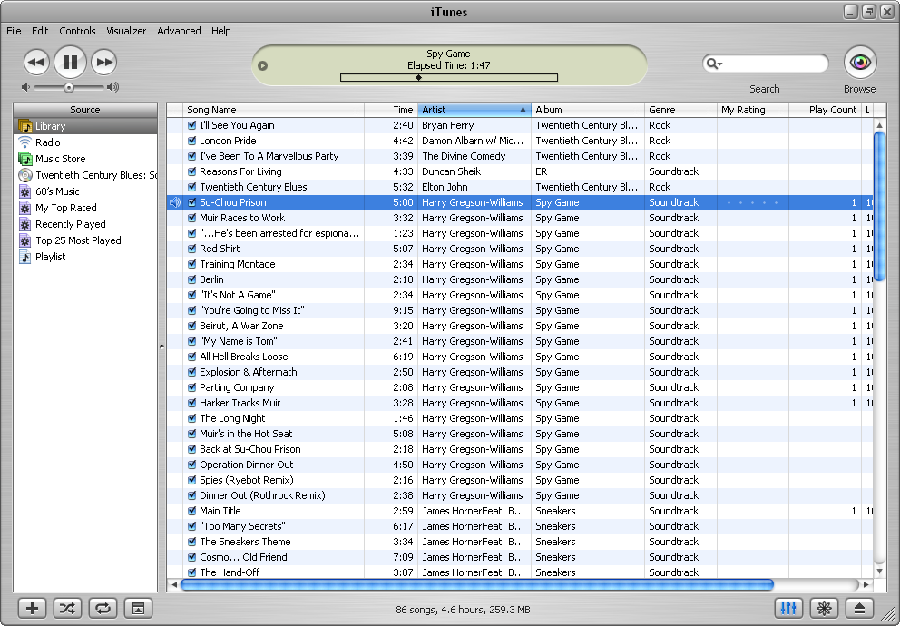
Hell froze over as Apple released a version of iTunes for Windows.

The Brushed Metal UI was out of place on PCs, especially when compared to XP’s blue and green UI. While Apple built a custom window and menu bar for the app, it never was quite right:

While iTunes 4 would be around for over two years, its successor — iTunes 5 — was just around for five weeks. This version was buggy, and the main feature (besides folders for playlists) was a near search tool that worked with the iTunes Music Store.

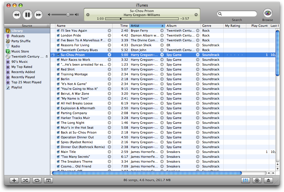
It’s main feature, however, should look familiar to iTunes users:

iTunes 5 was the first major release not to include a logo change, 2 probably to help keep something the same, visually, as for the first time in four years and four major versions, iTunes shipped without Brushed Metal.

iTunes 5 shipped just a few months after Mac OS X Tiger, which undid most of the Brushed Metal found in its predecessor. It is a rare instance in which Mac OS X predated a UI change to iTunes, as iTunes is usually considered as a bit of a UI playground for the company.

Despite versions 1–4 of iTunes looking basically the same, the logo changed numerous times over the years. Versions 1, 2 and 3 all featured new icons, while 4 and 5 sported the green music note before the blue note showed up in 2006 for version 7:


  1. Notably, this was the first iPod to support Windows, but iTunes was still Mac-only, leaving those “other” users stuck with Musicmatch. ↩︎

  2. I just like that they kept screwing around with the reflection on the CD. ↩︎

Kim Jong Un Uses an iMac⇢

..and he may kill us all. But hey, it could be worse: this maniac could be launching nuclear weapons from one of those stupid new thin iMacs.

The Pebble: Is the Time Right for a Smartwatch?

Just shy of a year ago, a Kickstarter project was launched that would take the nerd world by storm. In five weeks, the group raised $10,266,845, even though they needed only $100,000 to launch. The Pebble was born.
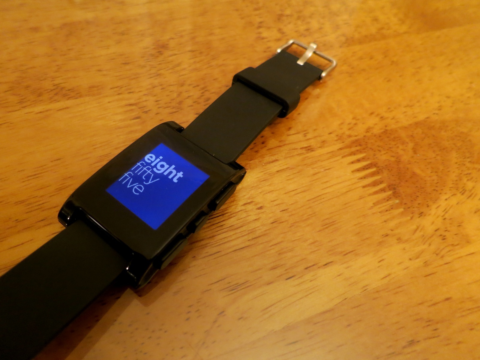
A year later,I’m sitting at my dining room table with the smartwatch next to my MacBook Pro. I’ve had it for a couple of days, and have collected my thoughts on this new-to-me product category.

Hardware

The Pebble’s name is apt. Mine is the “jet black” option, and it is as slick and smooth as a polished stone.

It’s about as light as my normal watch, but taller. As such, it doesn’t sit as nicely against the top of my wrist as my Casio does. It’s bulky, but not heavy. You know how weird the weight of the iPhone 5 felt at first? It’s like that, sort of.

The band is made of soft rubber and feels great.
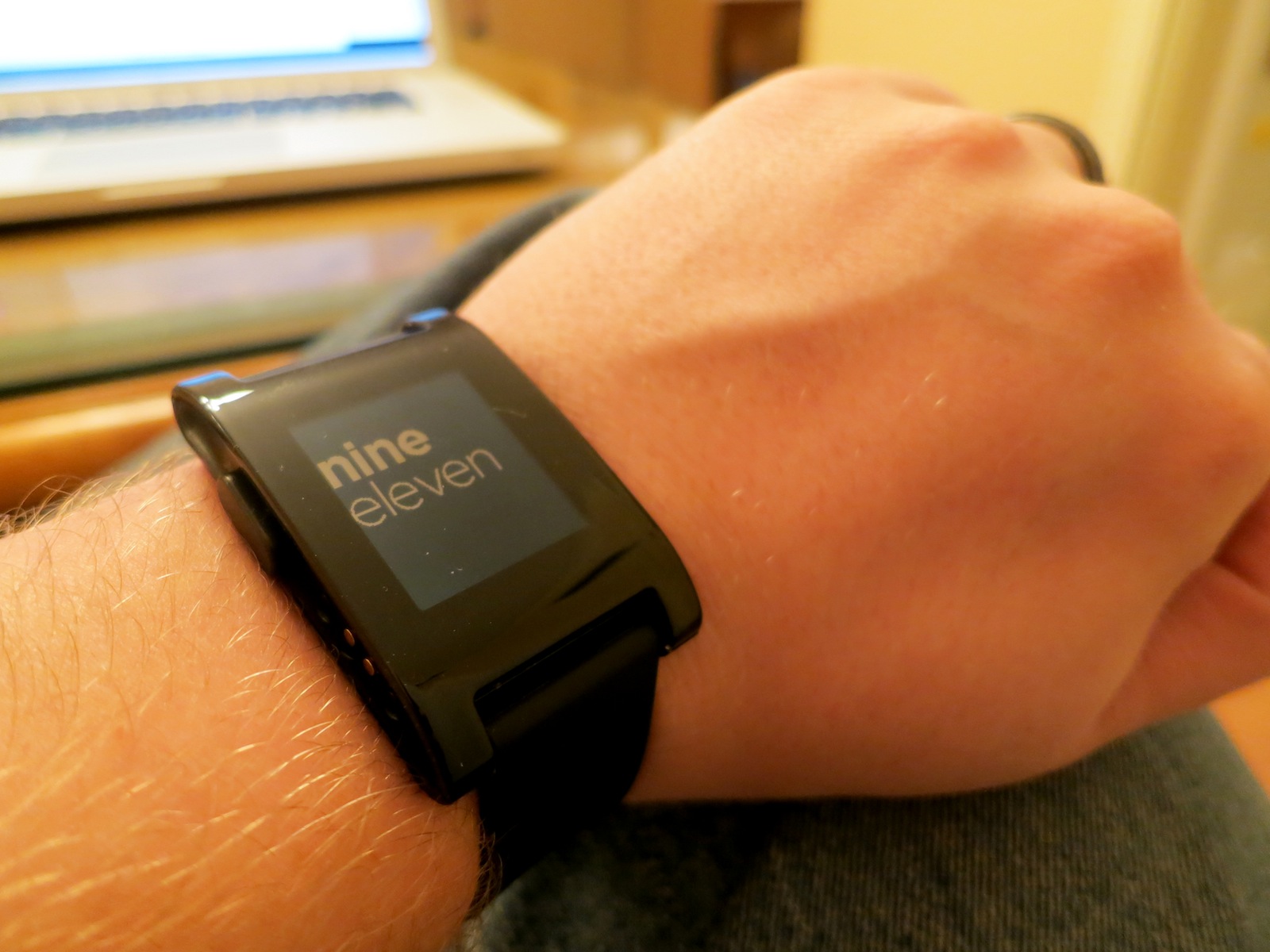
The sides of the Pebble are pretty busy. The left side (shown above) houses the back button and a custom charger. The charger works over USB, and connects to the gold pins show above. While the charger snaps in to place easily enough, I don’t like the exposed pins.

The right side has three buttons. The top and bottom ones are oblong, with the middle one shorter than the others. They feel cheap. Unless pressed directly, they rock a bit, and can depress a fair amount before engaging whatever mechanism is underneath.

The 144 x 168 pixel display black and white e-paper screen is recessed into the watch, and unless it’s in direct sunlight, it’s hard to tell where it ends and the chunky plastic bezel begins. The screen isn’t super sharp, but its usable. I haven’t seen it glitch or slow down while paging through the menus.
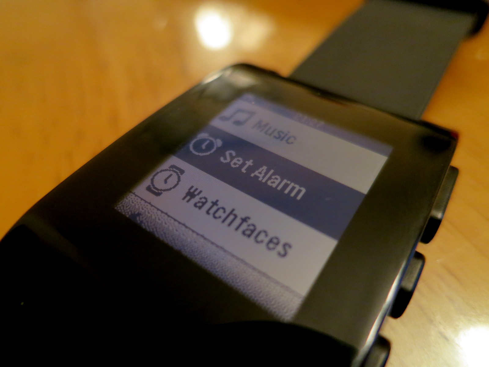
The backlight is a cool white, and works well, but there’s no brightness setting to be found.

Inside, the Pebble packs a vibrating motor, which is great, and a battery that can last a week. I haven’t had it long enough to test it, but since the Pebble UI doesn’t show the battery percentage anywhere, I haven’t found myself worrying about it. Once the watch gives me a low-power notice, I’ll charge it up via my MacBook Pro.

All in all, the Pebble’s hardware is nicer than I was afraid it might be, but it’s far from perfect. It is, however, passable.

Software

The Pebble — like most devices — is all about the software, and like most devices, there was an update ready for me after I unboxed the watch. After I paired the watch, I opened the Pebble app, and it quickly downloaded the update and pushed it to the watch. 90 seconds later, it was done.
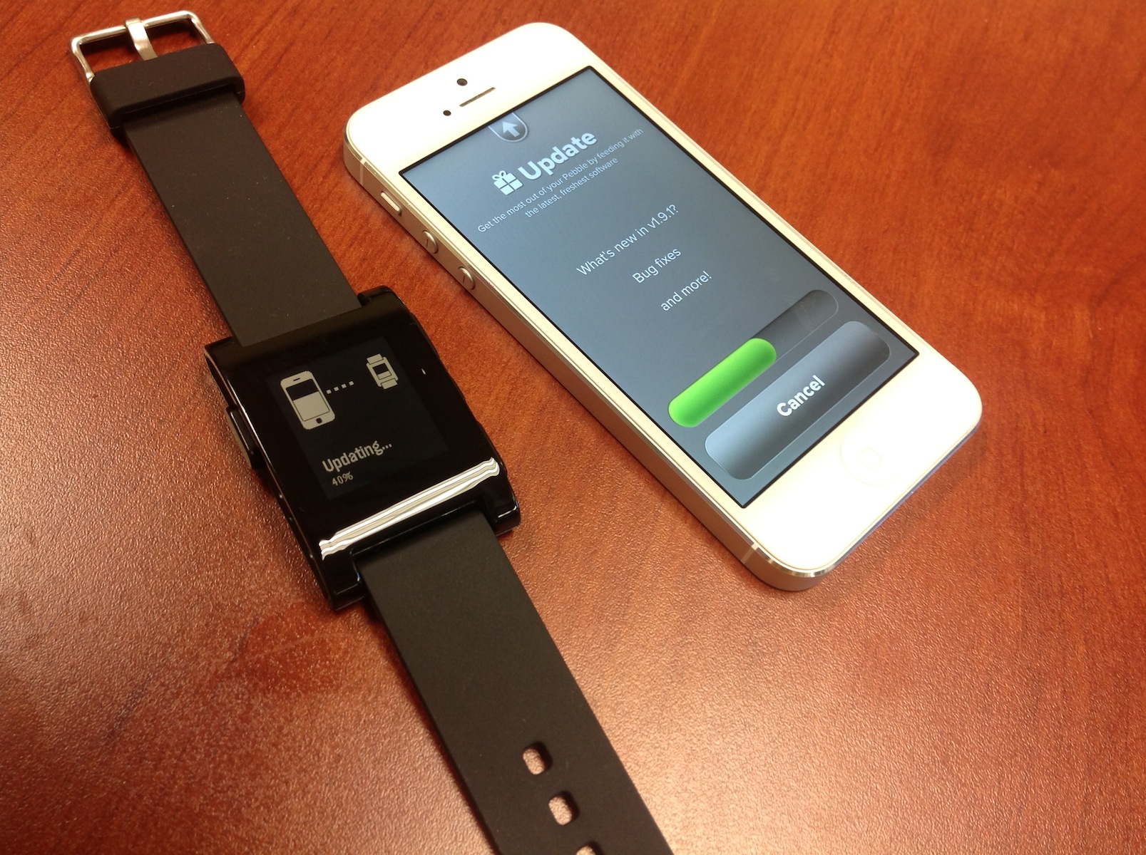
I’m ashamed to report I took that photo with my iPad. Even though I was alone in my office, I was embarrassed to do it.

The software on the watch is pretty simple. Changing watchfaces is easy, and additional ones can be added via the Pebble app. Alarms can be set quickly, and the font size can be changed easily. Past that, however, there aren’t any settings for the thing.

While Pebble has promised that apps are on the way, at this point, there aren’t any available for download. Not a single step tracker or game. Being able to use the Pebble to track my steps throughout the day would be a killer feature, and put the watch on par with something like the FuelBand by Nike. Pebble says RunKeeper is in testing now.

The real magic happens when the Pebble is paired to a smartphone.

The Pebble & iOS

Getting the Pebble set up with iOS is a little fiddly, but it’s not too bad.

The Pebble’s big feature is its ability to show notifications from the iPhone on its screen. Coupled with the vibrator, this makes it easy to check in on a text or email without having to pull out your phone.
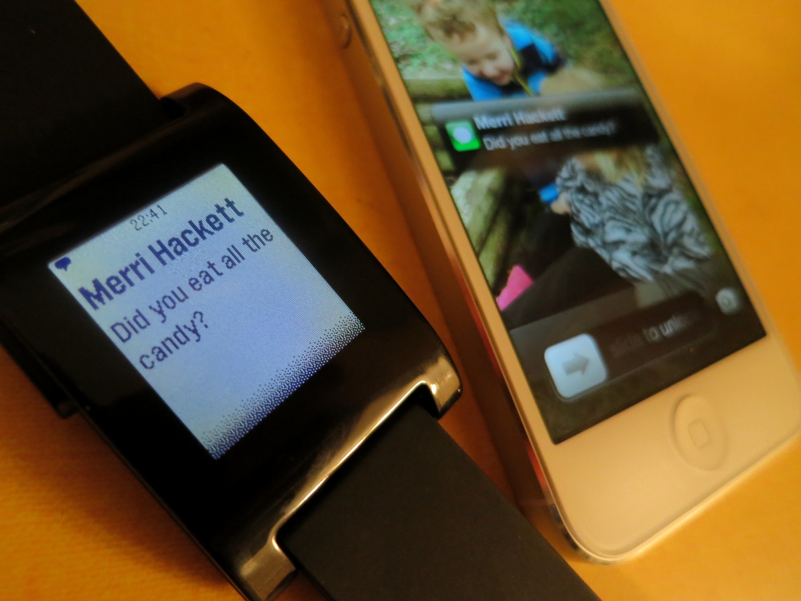
When a notification comes in, it pops up on the screen, staying there until it’s replaced by a newer message or is cleared by the press of a button. Keeping the watch and phone connected all day does impact battery life on the iPhone. While it isn’t draining my iPhone drastically faster, it is a noticeable change.

(The low-power Bluetooth 4.0 standard is supported by the Pebble’s hardware, but is not currently enabled.)

While it’s great to read things as they come in by just glancing at your wrist, having Siri built in to the watch would make it possible to respond to a text without pulling out your iPhone. If Apple’s really doing a smartwatch, I hope this is a feature.

As I’m sure you’ve noticed, iOS doesn’t have a notification setting to “send to Bluetooth” anywhere. To grant an app’s notifications the ability to be pushed to the Pebble, you have to disable then re-enable the notification. It’s clunky, and made worse but the fact that when the Pebble and iPhone lose connection, the Pebble has to be re-setup.

(Pebble’s support says that SMS notifications will stay enabled, but in my testing, that’s been flaky.)

This means turning off the iPhone, flipping it to Airplane Mode or simply leaving it on your desk when you go to lunch means your phone will forget what its supposed to do. Or leaving your watch inside when you mow the grass. Or leaving your phone in your bag when you workout. Or do anything a normal human does, really. It blows.

Assigning the blame for the issues is hard. While it’d be easy to blame Apple for these limitations in iOS 6, the fact is that the Pebble is pushing the bounds of what anyone has done with iOS, and things are rough because Apple hasn’t needed to explore things like notification settings to Bluetooth devices.

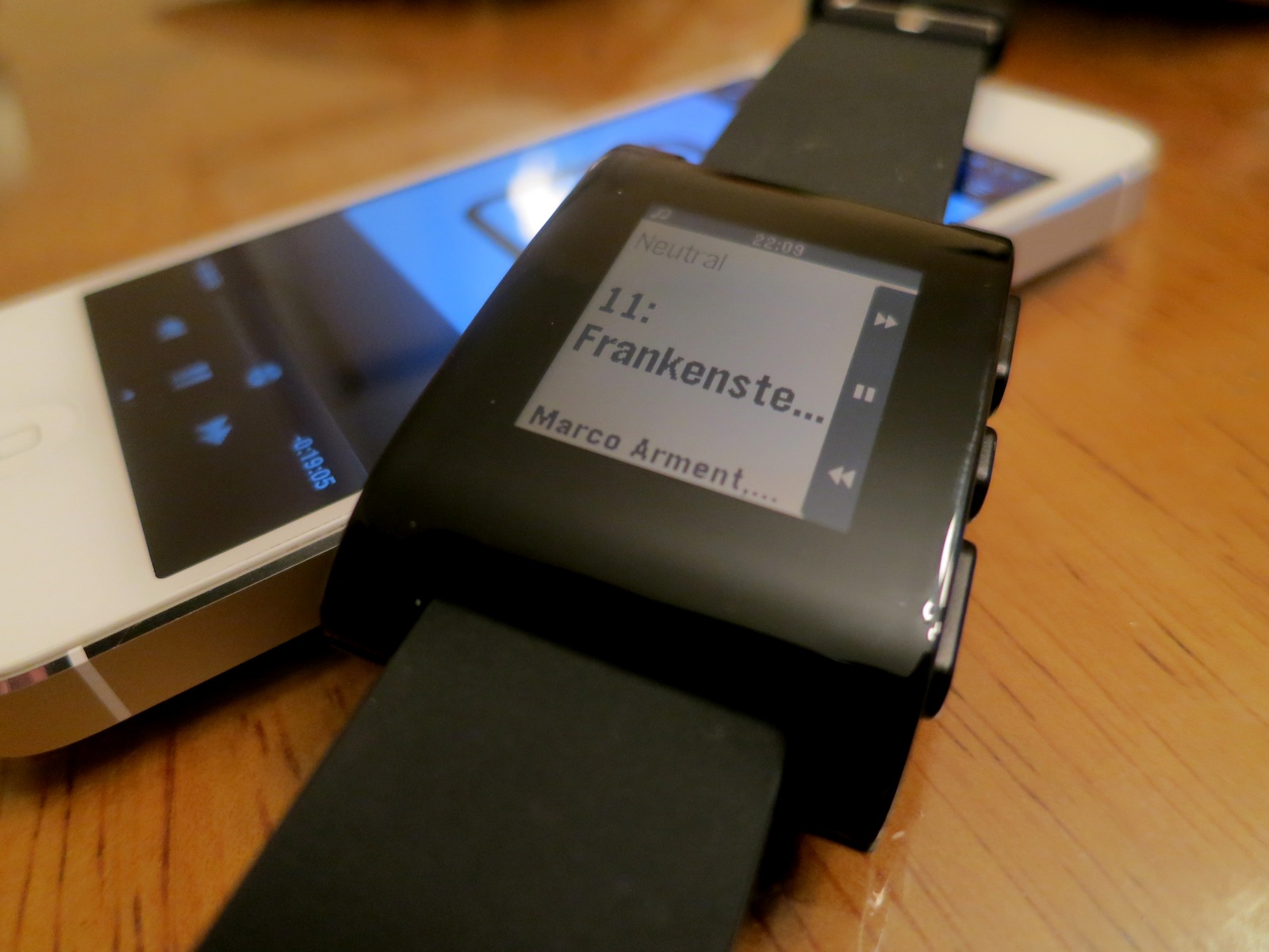
The Pebble also acts as a remote to any media playing on the iPhone. In my testing, the controls work great with the Music app, Spotify, Instacast and more:
Conclusion

So, was the long wait for the Pebble worth it?

When I reviewed the iPod nano as a watch last year, I closed my article this way:

The promise of the iPod nano as a watch is endless. Lots of people would love to see Apple integrate it with the iPhone, giving the nano a true “smart watch” level of usefulness.

As it stands today, though, the iPod nano makes you look like a secret agent, but one who can’t actually do anything all that cool.

As it stands today, I won’t be wearing the Pebble all that much. I might not even keep it. It’s ahead of its time, and while it shows promise, the simple truth is that the Pebble isn’t all that helpful at this point.

Can the team behind the Kickstarter darling fix that with software? Will Apple open the door to Bluetooth-powered notifications? Will the next Pebble’s hardware be something I’m not embarrassed to wear?

The Pebble is like the Model A. When people looked at the Model A, some realized it was the future, and that one day, everyone would drive. Others thought Henry Ford was off his rocker and that his invention was a one-off that wouldn’t ever go anywhere.

The Pebble isn’t great out of the gate, and it may never have the chance to cover the ground it needs to before Apple swoops in. The idea of the smartwatch is cool, but the Pebble is rather simple and — in places — downright crude. But it’s pointing the way forward.

Maybe.

The Apple Pop-Up Museum⇢

The Apple Pop-Up Museum is an effort to display some of the rich history that Apple pretends it doesn’t have.

The displays will be on show in Atlanta April 20–21, as part of the Vintage Computer Festival Southeast.

The group promises an Apple I, the first disk II and controller card, an original Apple II, an original Lisa and a Xerox Alto, among other machines.

If I wasn’t going to be in Florida with Make-a-Wish, I would be in Atlanta for this in a heartbeat. The exhibit and festival sound awesome.

via Ars Technica