The Brushed Metal Diaries: Beyond Software

In the Brushed Metal Diaries, we take a look at one of Apple’s most unique — and most hated — user interface paradigms.


I’ve written about the awful Brushed Metal user interface theme a bunch over the years, but OS X isn’t the only place this scourge on design has left its mark.

Here are some other places where Brushed Metal (or one of its cousins) have popped up over the years:

Original iCloud Marketing Material

iCloud with a Chance of Brushed Metal

iCloud in OS X 10.8

Poor OS X

Original Siri Button

Siri on the iPhone 4S

iPhone OS Dock

iPhone OS Dock

Apple Stores

Beijing Apple Store

The Brushed Metal Diaries: iSync

In the Brushed Metal Diaries, we take a look at one of Apple’s most unique — and most hated — user interface paradigms.

An Intro to iSync

For most Mac users in the early 2000s, the word “sync” conjured up visions of iPods and USB cables. However, while an Apple smartphone was years away, in 2002, Apple introduced a tool to sync contacts and calendar events to mobile phones: iSync.

Just check out all this brushed metal:

iSync — in many ways — was the quintessential brushed metal application. In it’s Human Interface Guidelines, Apple said the UI appearance should be the defacto choice for applications that provided “an interface for a digital peripheral, such as a camera, or an interface for managing data shared with digital peripherals.”

iSync’s History

iSync was introduced in 2002. Here’s a bit of the original press release:

iSync ensures that address books and calendars flow seamlessly from a user’s Mac to all of their digital devices and back. Rather than requiring a separate synchronization application for each type of device, iSync works with the latest Bluetooth mobile phones, PalmOS devices and iPod to keep all these devices up to date. As a result, iSync users will enjoy seamless mobile access to schedules and other crucial information on all the devices they travel with.

iSync would launch as a public beta two months after being announced. It required OS X Jaguar, and would ship built-in with several major versions of Mac OS X.

Steve Jobs spoke about iSync at Macworld Paris in September 2002. “The purpose of iSync,” Jobs said, “is to synchronize our digital lives.”

Here’s what an early version of the iSync page looked like on Apple’s website. On the page, the company boasted integration with these classes of device:

  • iPods
  • Palm OS-powered handhelds (the iSync Palm Conduit was required)
  • GPRS Bluetooth-enabled wireless phones (like the Sony Ericsson T68i)
  • Other Macs (a paid .Mac subscription was required)

iSync passed address and calendar information between these devices. This allowed users to add or edit data from the comfort of their desktop, and provided a backup of data that users would lose if their phones were stolen or lost. This, Jobs said, made the cellphone a peripheral to the Mac. With the iPhone still five years off, it’s another example of Jobs having the uncanny ability to hint at the future when he himself probably didn’t have a fully-formed vision in his mind.

iSync 1 would receive numerous updates, adding support for more devices.

iSync 2.0 shipped with OS X Tiger in April 2005. With this release, Apple made the hard work of syncing data between Macs the system’s responsibility, leaving iSync alone with its ever-growing list of third-party devices.

iSync 2 received updates as part of 10.4.4, 10.4.6, 10.4.7 and 10.4.9, each time adding support for new devices.

iSync 3.0 shipped with Mac OS X 10.5 Leopard, and 3.1 shipped with Snow Leopard, but few new devices were added in the time between.

While Apple supported a decent number of handsets, a growing third-party plugin community sprung up to extend the program even further.

As did all other brushed metal apps, iSync received a new UI with Leopard:

With Mac OS X Lion, Apple removed iSync from OS X altogether.

In Conclusion

While iSync never saw the wide-spread use of some of the other brushed metal applications, it was a critical component to many nerds’ workflows. It’s wasn’t flawless — no sync system ever is, it seems — but it was one I relied on heavily. I used it for years to sync various Palm OS devices and iPods. In today’s world of iCloud and Google’s offerings, local Bluetooth sync seems old-fashioned, but it felt like magic at the time.

The Meaning of the Term “Sherlocking”

In the Brushed Metal Diaries, we take a look at one of Apple’s most unique — and most hated — user interface paradigms.

In our modern, always-on world, finding just about anything online is just a Google search away, that hasn’t always been the case. Today we’re looking at an old app that brought the Internet to Mac users the world over.
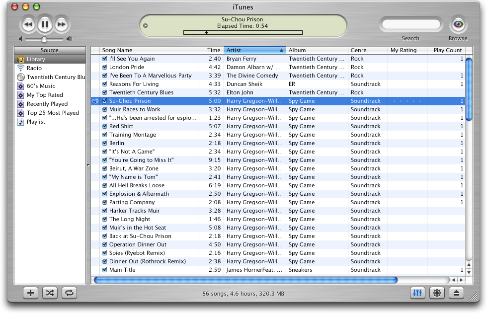
Sherlock 1

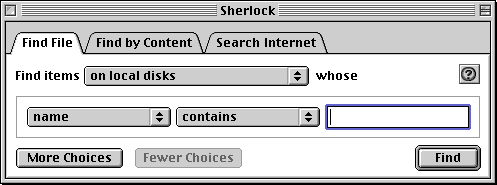
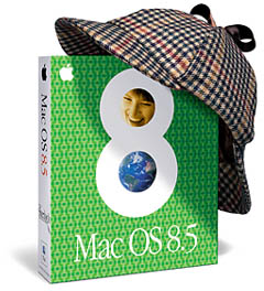
In October 1998, Apple shipped Mac OS 8.5. The first PowerPC-only release of the Mac OS came with a much simpler installer, an improved Help system and Sherlock:

Sherlock 1

The OS 8.5 promo artwork featured Sherlock heavily, showing just how important the software was to the release.

Here’s how Apple introduced the application:

The Find File application, previously located in the Apple menu, has been expanded and renamed Sherlock in Mac OS 8.5. It includes two additional features: Find By Content and Search Internet. In addition, Sherlock allows you to save search settings into a settings file which can be used to quickly perform searches.

Sherlock looked like a regular OS 8 application but packed a punch. Its tabbed interface allowed users to find items on their disk or mounted volumes, find items based on content (think Spotlight’s ability to see inside documents) and find things on the Internet.

That last one was a big deal:

Sherlock Search

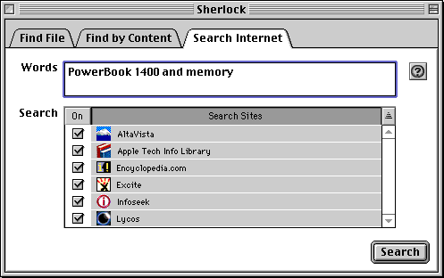
Sherlock wasn’t really searching the actual Internet in some cases. Here’s Apple again:

Internet search site files may be periodically updated for changes in search engines or to take advantage of newer features. When performing an Internet search with a search source file, an automatic check is performed to determine if an updated search source is available.

For 1998, this was forward-thinking — Google was founded just one month before Mac OS 8.5 shipped — and it was clear that Apple was thinking about the Internet. In tandem with the iMac G3, the company was making a bet that the Internet was going to be a critical component to the future of Apple’s products.

Sherlock 2

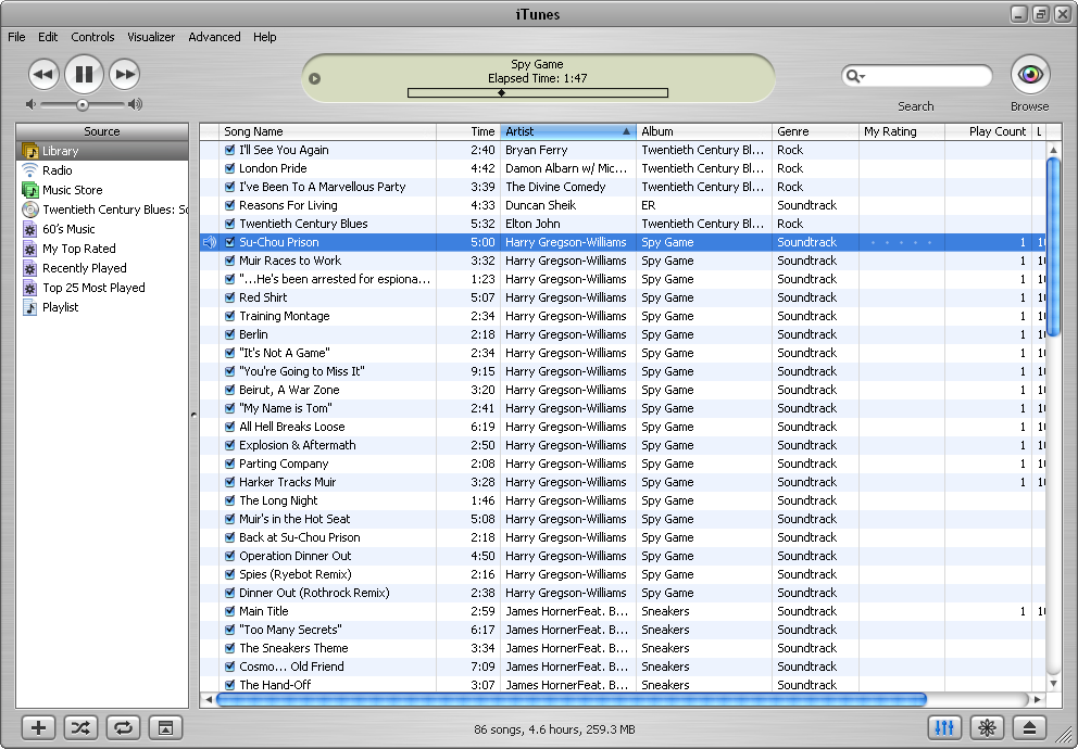
Shipping with Mac OS 9 a year later in October 1999, Sherlock 2 was a major step forward for the application.

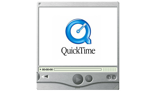
It also came dressed up like our old friend, QuickTime 4:

Sherlock 2

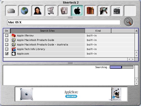
Sherlock 2 was a stand-alone application. Instead of the tabbed interface that was used in OS 8.5 and 8.6, this version of the application had various channels. In addition to file search, the application could find content on the open Internet, contact information, news, Apple news, entertainment and more. In addition to this better organization method, Sherlock 2 auto-updated its search site database.

A Brief — but Necessary Sidebar — on Watson

Many Apple fans will recognize the term “sherlocking.” It comes from the drama sorrowing an application named Watson.

Built by developers at Karelia Software, Watson shipped in November 2001 as an Internet search application for Mac users. Taking advantage of OS X-only technology, Watson won many awards — including an Apple Design Award.1

Watson

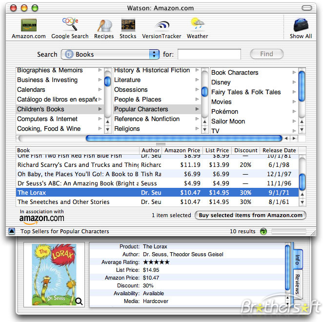
Of course, the devil’s advocates among Apple fans said that Karelia Software designed Watson to infringe on what Apple was doing with Sherlock. The application shipped with an interface that looked like Sherlock, and of course, a name that was probably too similar to Apple’s.

In 2004, Watson was sold to Sun Microsystems. The company announced that it was going to port the application to Java, but not much ever happened with that effort.

In short, Apple copied Watson with later Sherlock versions and killed the third-party app in the process, and a term that remains in the industry remains alive and well today.
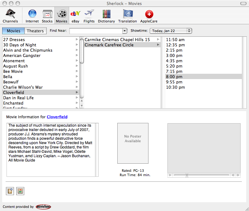
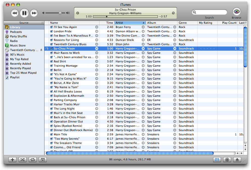
Sherlock 3

Watson was a big deal because of Sherlock 3, which shipped with Mac OS X 10.2. The new app dropped local search, becoming an Internet-focused application. In addition to the previous channels, Sherlock 3 could find data from online services, including databases of flight data, language translation and more.

In the process, Sherlock lost its brushed metal and picked up some pinstripes:

Sherlock 3

Sherlock 3, however, was short-lived. With 10.4 Tiger, Sherlock played second-fiddle to Spotlight, and the app wasn’t included with 10.5 Leopard.

Conclusions

Sherlock is a really interesting app. As it spanned several generations of Mac OS releases, each major release of the application sported a different user interface. Platinum, Brushed Metal and Pinstripe-flavored Aqua all make an appearance.

Past that, Sherlock embodied so much about the Mac and the Internet in this time frame. In the late 1990s, web portals were how people got stuff done on the Internet. Sherlock brought that idea to the desktop.

While Sherlock itself looks and feels dated in a Google-powered world, it shows that Apple hasn’t changed all that much. Just like the Apple of today, Sherlock-era Apple tried to bring the power of the Internet to rich, native apps.


  1. The ADA was given just a few months before Apple shipped Sherlock 3, which is also crazy to me, and doesn’t look good for Cupertino, honestly. 

The Brushed Metal Diaries: Et Tu, iTunes?

In the Brushed Metal Diaries, we take a look at one of Apple’s most unique — and most hated — user interface paradigms.

While QuickTime 4 served as Apple’s Brushed Metal Trojan Horse, the most famous piece of software to wear the look is iTunes.

At MacWorld Expo in 2001, Apple introduced iTunes with its normal language:

Apple today introduced iTunes, the world’s best and easiest to use “jukebox” software that lets users create and manage their own music library on their Mac. iTunes lets Mac users import songs from their favorite CDs; compress them into the popular MP3 format and store them on their computer’s hard drive; organize their music using powerful searching, browsing and play list features; watch stunning visualizations on their computer screen; and burn their own audio CDs — all in one easy-to-use application.

iTunes didn’t appear out of thin air. It was the result of Apple purchasing SoundJam MP, a Mac-compatible jukebox app that allowed users to encode CDs, stream and store MP3s and even sync them to Diamond Rio MP3 players.

Take a look at the thing:

Image via taptaptap.com

You’ll notice that Brushed Metal is present. Here’s Jim Heid at Macworld:

At first glance, SoundJam MP’s interface evokes the look of Apple’s QuickTime Player, the justifiably maligned movie and music player that accompanies QuickTime 4 Pro (see Reviews, October 1999). SoundJam MP sports the same brushed-aluminum, 1970s-swinger look. But Casady & Greene didn’t mimic Apple’s mistakes as well. SoundJam MP’s volume control is a horizontal slider instead of an awkward virtual knob, and the program lacks QuickTime Player’s gimmicky Favorites drawer.

Here’s what iTunes 1 looked like:

All screenshots courtesy of guidebookgallery.org

The initial version of iTunes was pretty basic; the app didn’t even include burning support. While that was added in version 1.1 (alongside the “Rip. Mix. Burn.” ads), the free price tag led to it being downloaded by many more users than were willing to spring the $40 for SoundJam MP. In fact, in nine months, iTunes had been downloaded more than one million times.

Brushed Metal had hit the big time.

In October 2001, Apple released iTunes 2:

This version kept the UI the same (the above screenshot shows the OS X version, with the Aqua window controls looking awkward on top of the Brushed Metal window), but added MP3 CD burning, a 10-band equalizer with presets, a crossfader and iPod support.

By the time iTunes 3 was released in July 2002, iTunes had been downloaded 14 million times. This update coincided with the release of the iPod (touch wheel), but packed still packed several new features, including track ratings, smart playlists, support for Audible audiobooks and better metadata support. [1]

UI-wise, iTunes 3 would end up being a preview to OS X Panther, which would be released 15 months later. As you can see from the screenshot below, the Brushed Metal was smoother on this release, with the text superimposed on it across the bottom of the window was made far more legible:

iTunes 4 was far more than a simple update: it included a store. Launching with 200,000 high-quality songs from BMG, EMI, Sony Music Entertainment, Universal and Warner, the iTunes Music Store turned the music industry upside down. One million tracks were sold the first week, and in four months, 10 million tracks had been sold.

While all that’s fine, it’s not the only reason iTunes 4 is so unique.

Hell froze over as Apple released a version of iTunes for Windows.

The Brushed Metal UI was out of place on PCs, especially when compared to XP’s blue and green UI. While Apple built a custom window and menu bar for the app, it never was quite right:

While iTunes 4 would be around for over two years, its successor — iTunes 5 — was just around for five weeks. This version was buggy, and the main feature (besides folders for playlists) was a near search tool that worked with the iTunes Music Store.

It’s main feature, however, should look familiar to iTunes users:

iTunes 5 was the first major release not to include a logo change,[2] probably to help keep something the same, visually, as for the first time in four years and four major versions, iTunes shipped without Brushed Metal.

iTunes 5 shipped just a few months after Mac OS X Tiger, which undid most of the Brushed Metal found in its predecessor. It is a rare instance in which Mac OS X predated a UI change to iTunes, as iTunes is usually considered as a bit of a UI playground for the company.

  1. Notably, this was the first iPod to support Windows, but iTunes was still Mac-only, leaving those “other” users stuck with Musicmatch.  ↩
  2. Despite versions 1–4 of iTunes looking basically the same, the logo changed numerous times over the years. Versions 1, 2 and 3 all featured new icons, while 4 and 5 sported the green music note before the blue note showed up in 2006 for version 7:
  3. I just like that they kept screwing around with the reflection on the CD.  ↩

Make Your Own Brushed Metal

Got a logo you like, but want to make way better? Add some Brushed Metal to it.

Here’s how to do it in Photoshop, courtesy of Brian Ashe:

  1. Filter –> Noise –> Add Noise: 100%, uniform, monochromatic
  2. Filter –> Blur –> Motion Blur: 30px

And, poof: it’s the early 2000s, all over again:

The Brushed Metal Diaries: An Introduction, a Trojan Horse and a History of Abuse

While most people think of Mac OS X 10.3 Panther or some drunken loser when they hear the term “brushed metal” in the context of UI design, the interface is far older than either of those two things.

Think back to the summer of 1999. People were canning fruits and vegetables in preparation of Y2K, Cher was on the radio everywhere, and people could walk around in denim vests without living in fear of being punched in the face.

1999 was a very interesting time to be an Apple fan. The Five Flavors were the machines of choice for many, and the Newton had been dead for little over a year. Mac OS 8.6 has just shipped, with OS 9 still several months away.

In these days, Apple released Brushed Metal in to the world. While eventually the UI would take over just about everything, its beginnings were quite humble: QuickTime 4.0.

From the technical perspective, QuickTime 4 seems basic now, but at the time, it was a nice little update. Here are the features added in the update:

  • Graphics exporter components, which could write some of the same formats that the previously introduced importers could read. (GIF support was omitted, possibly because of the LZW patent.)
  • Support for the QDesign Music 2 and MPEG–1 Layer 3 audio (MP3)
  • QuickTime 4 was the first version to support streaming. It was accompanied by the release of the free QuickTime Streaming Server version 1.0.
  • QuickTime 4 Player introduced brushed metal to the Macintosh user interface.
  • Support for files larger than 2.0 GB in Mac OS 9.
  • Variable bit rate (VBR) support for MPEG–1 Layer 3 (MP3) audio
  • Support for Synchronized Multimedia Integration Language (SMIL)
  • Introduction of AppleScript support in Mac OS

Additionally, QuickTime 4.1 dropped support for Motorola 68k Macintosh systems. Many users complained that the new application was slow, but with some fancy footwork, QuickTime 2.5 users could use all of the above features.

The feature that’s most remembered, of course, is its UI. Gone was the Platinum look that graced almost every single window in MacOS, replaced with a slick UI with embedded buttons, dials and more:

Image via Daily Apple Quiz

In hindsight, QuickTime 4 might be one of the best trojan horses Apple ever released. Everyone was so distracted by the new look, no one noticed when it crept in and killed everyone.

To be fair, mass murder was never Apple’s plan when it came to Brushed Metal. In its Human Interface Guidelines, Apple laid out its expectations when it came to Brushed Metal:

Windows have two distinct looks in Mac OS X. There is the standard default look of windows, as shown in the examples so far. There is also a brushed metal look available, shown in Figure 8–11. You can use a brushed metal window if your application:

  • Provides an interface for a digital peripheral, such as a camera, or an interface for managing data shared with digital peripherals — iPhoto or iSync, for example
  • Strives to re-create a familiar physical device — Calculator or DVD Player, for example
  • Provides a source list to navigate information — for example, iTunes or the Finder

Don’t use the brushed metal look indiscriminately. Although it works well for some types of applications, some applications appear too heavy when using this look. For example, it works well for the iSync application window, but it does not work very well for the TextEdit document window.

Of course, over time, developers — and Apple itself — ignored the HIG and went crazy with the stuff. I mean, just look at this screenshot of Panther:

Over the coming months (years), I’ll be looking at the growth of Brushed Metal, as well as its eventual demise. It should be fun. Hopefully, we won’t re-popularize the look.