Hide macOS Tahoe’s Menu Icons With This One Simple Trick

I really dislike Apple’s choice to clutter macOS Tahoe’s menus with icons. It makes menus hard to scan, and a bunch of the icons Apple has chosen make no sense and are inconsistent between system applications.

Steve Troughton-Smith is my hero for finding a Terminal command to disable them:

Here’s one for the icons-in-menus haters on macOS Tahoe:

defaults write -g NSMenuEnableActionImages -bool NO

It even preserves the couple of instances you do want icons, like for window zoom/resize.

Your apps will respect this change after relaunching. I ran this a few minutes ago and already appreciate the change. I really think Apple should roll this change back in macOS 27, or offer a proper setting to disable these icons for those of us who find them distracting.

3D Print Your Own Lil Finder

After a week of tinkering with design files and babysitting my 3D printer, I have an adorable new coworker. The final print took 20 hours, but I’m enamored with the results:

Lil Finder Print

I was thrilled to collaborate with Basic Apple Guy on bringing Lil Finder to life. We both hope the Mac community enjoys this project.

If you want to print your own, I’ve uploaded a .3mf file here.

I ran mine on my Bambu P2S, with some fuzzy skin to give the final version a softer finish. On my example, the bright blue is Bambu’s Cyan PLA; the darker color is Overture’s Gray Blue PLA+. You may need to do some adjusting to get things dialed in for your setup.

We would love to see what you do with this, so be sure hit us up on social media:

To head off some feedback: We are offering this file as-is, for free, and without any support. Feel free to make your own changes as you see fit! I’m just not in the position where I can help you with your own print, nor can I print one for you. Find a nerdy buddy with some free time and a 3D printer.

Jony Ive Designed a Car Interior

It’s not every day that supercar news makes it onto the page of tech-centric websites, but the Ferrari Luce has done just that. The upcoming EV has made huge waves due to its interior design:

Luce

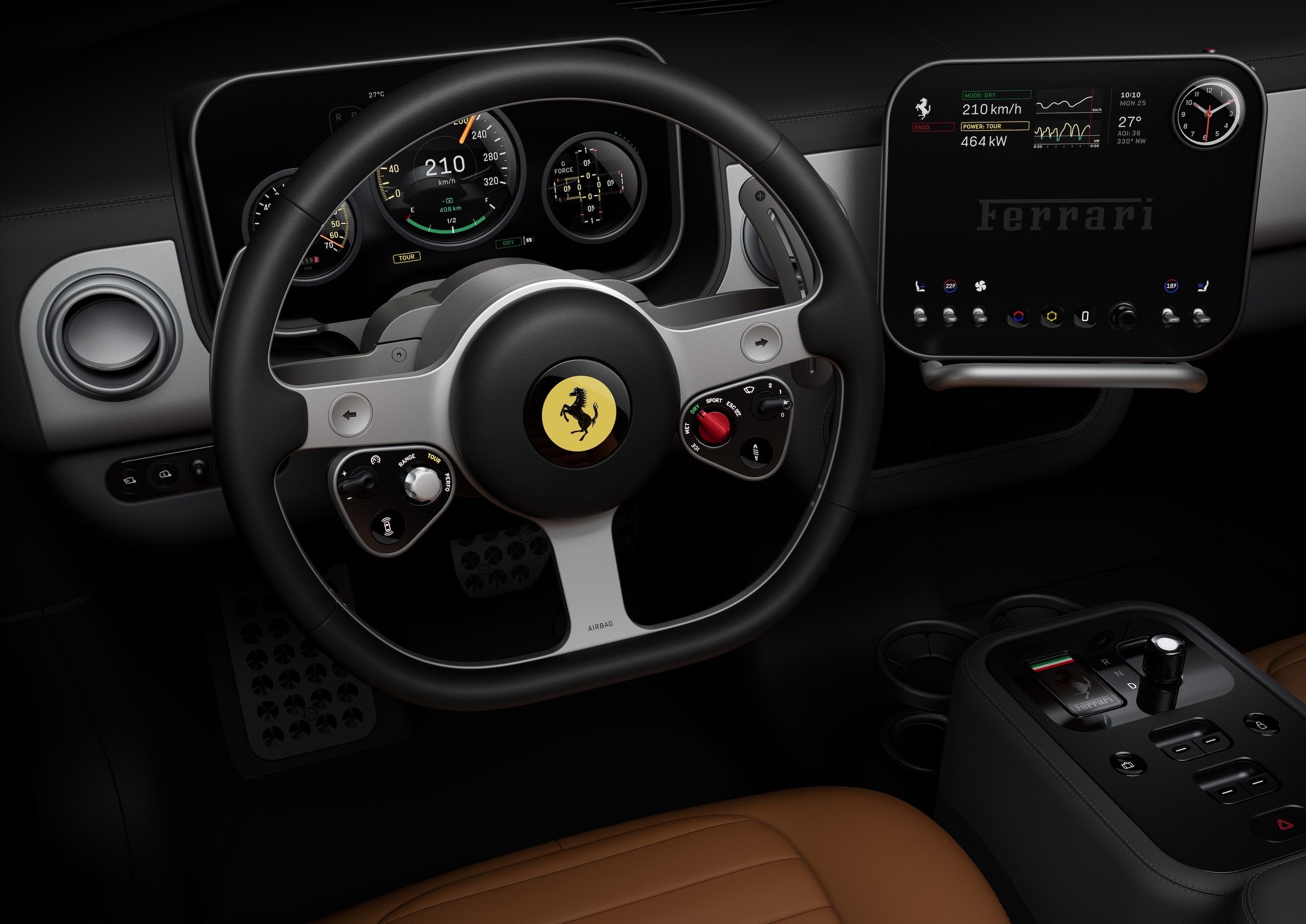
Of course, this cockpit is designed by Jony Ive and his collaborators at LoveFrom. Here’s how Ferrari describes it:

Ferrari has always been ready to innovate. The Ferrari Luce project with Jony Ive, Marc Newson and LoveFrom began with a mutual interest in learning, in understanding the future – and a deep understanding of and appreciation for Ferrari heritage. This work is motivated by excellence, and by creating something extraordinary.

And:

The Ferrari Luce’s interface is designed with clear organisational principles. Controls and displays are grouped functionally, with the most essential commands and feedback directly in front of the driver.

That webpage is worth scrolling through. The precision of the components reminds me of something like the iPhone 4. That’s the same product that came to mind for Tim Stevens:

If you’re familiar with the designs that Apple produced under Ive’s tenure, particularly in the era beginning with the iPhone 4, you’ll feel right at home here. The overall aesthetic is one dominated by squircles and circles, all with absolute, minute perfection and symmetry.

At first blush, it’s a bit clinical, but dig deeper, start poking and prodding, and you’ll see there’s a real sense of charm here. Fun little details and genuinely satisfying tactility begin to reveal themselves. The key, for example, has a yellow panel with an E Ink background. Push the key into the magnetized receiver in the center console, and the yellow on the key dims, moving across to glow through the top of the glass shifter. It’s meant to symbolize a sort of transference of life.

The shifter isn’t the only thing that’s glass. There are 40-odd pieces of Corning Gorilla Glass scattered throughout the cockpit, everything from the shifter surround to the slightly convex lenses in the gauge cluster. What isn’t glass is aluminum, much of it anodized in your choice of three colors: gray, dark gray and rose gold.

Yes, all that sure does sound like I’m writing about a new iPhone and not the latest Ferrari. But where Apple has been pruning every physical control it possibly can from its devices lately, LoveFrom will insert some great tactility in the Luce. The shifter moves through its detents satisfyingly, the air vents open and close with a clear snick and the paddles behind the steering wheel pop with a great feel.

I love the pushback against the Tesla-inspired everything-is-on-a-big-display-and-you’ll-like-it design that has taken over the car industry. I suspect more would-be buyers will struggle with the fact that this is Ferrari’s first all-electric car than they will with the interior design.

Apple’s Rumored Foldable May Be Smaller Than We Think

Jason Snell at Six Colors:

If many years-long rumors are true, 2026 will be the year when Apple’s long-gestating folding iPhone becomes a reality. But there are a lot of different approaches to folding phones out there, and there’s no guarantee that the folding iPhone you imagine is the one that Apple is imagining.

Leaks from Apple’s supply chain have begun to strongly suggest the shape and size of the product we’ll call, for lack of a better name, the iPhone Fold. And since it’s likely going to be nine months before anyone holds one of these things in their hands, this seems like as good a time as any to consider the story Apple is likely to tell when it’s selling this device.

I 3D printed a model that someone put together based on current rumors, and I don’t know if I love the size. Who knows if this is real, but in taking some photos for Jason’s article, I pulled some old friends out of the drawer.

Closed, this rumored size is much closer to to the original iPhone than I would have guessed:

Original iPhone

Original iPhone, opened

Uhhhhh…

Fat Nano

State Department Goes Back to Times New Roman for… Reasons

I promise this is not from The Onion, but rather Michael Crowley and Hamed Aleaziz at The New York Times:

Secretary of State Marco Rubio waded into the surprisingly fraught politics of typefaces on Tuesday with an order halting the State Department’s official use of Calibri, reversing a 2023 Biden-era directive that Mr. Rubio called a “wasteful” sop to diversity.

While mostly framed as a matter of clarity and formality in presentation, Mr. Rubio’s directive to all diplomatic posts around the world blamed “radical” diversity, equity, inclusion and accessibility programs for what he said was a misguided and ineffective switch from the serif typeface Times New Roman to sans serif Calibri in official department paperwork.

In an “Action Request” memo obtained by The New York Times, Mr. Rubio said that switching back to the use of Times New Roman would “restore decorum and professionalism to the department’s written work.” Calibri is “informal” when compared to serif typefaces like Times New Roman, the order said, and “clashes” with the department’s official letterhead.

They continue:

Mr. Rubio’s directive, under the subject line “Return to Tradition: Times New Roman 14-Point Font Required for All Department Paper,” served as the latest attempt by the Trump administration to stamp out remnants of diversity initiatives across the federal government.

Then-Secretary of State Antony J. Blinken ordered the 2023 typeface shift on the recommendation of the State Department’s office of diversity and inclusion, which Mr. Rubio has since abolished. The change was meant to improve accessibility for readers with disabilities, such as low vision and dyslexia, and people who use assistive technologies, such as screen readers.

Update: John Gruber has published the entire memo, writing:

It seems clear to me that The New York Times did Rubio dirty in their characterization of the directive.

Having read the full memo, it’s hard to disagree.

iPhone Pocket

iPhone Pocket

Apple Newsroom:

ISSEY MIYAKE and Apple today unveiled iPhone Pocket. Inspired by the concept of “a piece of cloth,” its singular 3D-knitted construction is designed to fit any iPhone as well as all pocketable items. Beginning Friday, November 14, it will be available at select Apple Store locations and on apple.com in France, Greater China, Italy, Japan, Singapore, South Korea, the UK, and the U.S.

iPhone Pocket features a ribbed open structure with the qualities of the original pleats by ISSEY MIYAKE. Born from the idea of creating an additional pocket, its understated design fully encloses iPhone, expanding to fit more of a user’s everyday items. When stretched, the open textile subtly reveals its contents and allows users to peek at their iPhone display. iPhone Pocket can be worn in a variety of ways — handheld, tied onto bags, or worn directly on the body. Featuring a playful color palette, the short strap design is available in eight colors, and the long strap design in three colors.

I’m a professional writer, but I have no words for this.

On Tahoe’s Terrible Icons

Paul Kafasis has looked into the abyss of Tahoe icons:

On the new MacOS 26 (Tahoe), Apple has mandated that all application icons fit into their prescribed squircle. No longer can icons have distinct shapes, nor even any fun frame-breaking accessories. Should an icon be so foolish as to try to have a bit of personality, it will find itself stuffed into a dingy gray icon jail.

While Apple had previously urged developers to use squircle icons on our apps, they’ve now taken things much further to ensure compliance. It’s a shame.

Apple updated their own app icons on Tahoe, for both the squircle shape as well as the new “Liquid Glass” interface. Mostly, these icons seem dumbed-down, with a loss of detail.

Almost all of these new icons are a step backwards, but I think the updated icons for DVD Player and Image Capture are an improvement:

DVD Player

Image Capture

Steven Aquino on that Liquid Glass Toggle in Beta 4

Steven Aquino, writing at Curb Cuts, bouncing off my post about the new Clear/Tinted toggle that appeared in this week’s betas:

Hackett notes Apple’s placement of the Liquid Glass control is surprising as he believed “a control like this would land in Accessibility.” However a logical presumption, it’s not really a hardcore accessibility feature. Here’s the thing about accessibility features, on iOS or Android or anywhere else: they’re a discrete, specialized—and admittedly esoteric—suite of settings intended to meet highly specific needs. While it’s true “accessibility is for everyone” for the most part, the majority of the options under Accessibility are decidedly opinionated in their target demographic.

Take the AssistiveTouch pointer, for instance. AssistiveTouch is itself a subset of specialized features aimed at aiding those with motor disabilities; as such, the pointer has been expressly designed to serve that greater purpose. This focus is why, as one anecdote, the response to the AssistiveTouch pointer rankled me a few years ago. Apple added it for a reason. Indeed, the company’s senior director of global accessibility policy and initiatives Sarah Herrlinger told me in an interview at the time it “isn’t your traditional pointer,” yet the iPadOS power users were so desperate for proper pointer support, many in the community appropriated the AssistiveTouch pointer and lamented how it doesn’t work like your aforementioned traditional pointer. But it wasn’t conceived to be conventional… my understanding is Apple’s Accessibility group “handed off” the AssistiveTouch functionality to the wider OS team to be further massaged into the mainstream pointer feature that exists today. I got pushback from a lot of people for explaining all of this under the notion AssistiveTouch isn’t perfect and warrants criticism… to which I still say, sure, but it isn’t meant for you and your nerdy whims.

His point that this toggle is about personal presence, and not providing a one-switch-does-it-all Accessibility settings makes a lot of sense to me. As Aquino points out, features like Reduce Transparency do much more to change the UI to make it more readable for those who need it. He goes on:

As I wrote following the WWDC keynote, I sat with Herrlinger for a few minutes after the presentation, and while I didn’t conduct a full, on the record interview, I was able to attribute to her that the Accessibility team worked “closely” with the Design team to make Liquid Glass as visually accessible as possible. Reduce Transparency will always be there if you really and truly require the extra oomph it offers, she said to me.

A bunch of folks ran around this summer claiming that Liquid Glass flew in the face of Apple’s Accessibility work, but that take never sat well with me. Apple takes this stuff really seriously.

iOS 26.1 Beta 4 Adds Liquid Glass Transparency Toggle

If you go to Settings > Display and Brightness on iOS, or System Settings > Appearance on the Mac, you’ll find a new toggle that lets you swap between two looks: Clear and Tinted. Clear is the look of Liquid Glass since iOS 26 launched, while Tinted adds opacity and contrast.

Here’s how the options look on the Lock Screen and in Photos:

Lock Screen

Photos

This toggle being in the display settings with things like Dark Mode is interesting to me. I would have thought that a control like this would land in Accessibility…

“I Will Solve Your Problem for You and You Will Pay Me”

After seeing my buddies at Studio Neat launch an amazing new patch, I fell down the rabbit hole that is the NeXT logo.

Dan and Tom linked to this video, which shows Paul Rand delivering his work to Steve Jobs and his team at NeXT. I hadn’t seen this before, and boy, I wish it were longer than a mere 80 seconds in length:

Rand did powerful and authoritative work when it came to corporate logos, as reflected upon by Jobs in a 1993 interview:

I asked him if he would come up with a few options, and he said, “No, I will solve your problem for you and you will pay me. You don’t have to use the solution. If you want options go talk to other people.”

Nick Heer, on Liquid Glass

Nick’s long column on Apple’s new design language is probably the best thing I’ve read on the subject. This line about the glass material switching from light to dark as content scrolls behind it really jumped out at me:

It is Apple’s clever solution to a problem Apple created.

I like a lot about Liquid Glass, but there’s no arguing that there are issues that still need work, and I think Nick is pretty fair about what those are.