Apple’s first desktop operating system was Tahoe. Like any first version, it had a lot of issues. Users and critics flooded the web with negative reviews. While mostly stable under the hood, the outer shell — the visual user interface — was jarringly bad. Without much experience in desktop UX, Apple’s first OS looked like a Fisher-Price toy: heavily rounded corners, mismatched colors, inconsistent details and very low information density. Obviously, the tool was designed mostly for kids or perhaps light users or elderly people.
Credit where credit is due: Apple had listened to their users and the next version – macOS Sequoia — shipped with lots of fixes. Border radius was heavily reduced, transparent glass-like panels replaced by less transparent ones, buttons made more serious and less toyish. Most system icons made more serious, too, with focus on more detail. Overall, it seemed like the 2nd version was a giant leap from infancy to teenage years.
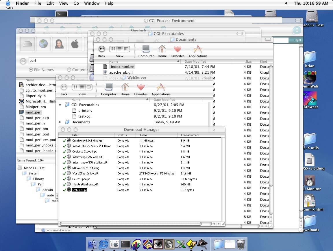
512 Pixels reader Brian sent me a screenshot they took way back on Mac OS X 10.0, showing that Apple’s current struggle with transparent user interface elements isn’t anything new:
I mostly like Liquid Glass on iOS and iPadOS, but it feels like macOS got a lot less time in the oven than the mobile operating systems did. For example, toolbar buttons still really stick out, and I wish app icons weren’t all in squircle jail:
Like previous years, I have various sections of screenshots for you to check out, but with a new addition this year: Icon & Widget Styles.
The macOS Screenshot Library is sponsored by Rogue Amoeba. Head to rogueamoeba.com to learn more and download their free trials today.
Identity 4 has had a Macintosh Plus for years, but was unhappy with its bulk and heat generation, so they did something wild:
I ought to make a rack-mounted version of this computer so it can fit cleanly in my studio rack cabinets along with all my other conveniently packaged gear. I will even give it a sleek look and a clever name, something like Racintosh Plus… Hahaha yeah that’s pretty funny.
The amount of work that went into this is really something else.
I’ve been running iOS 26 for a while now, and there’s something that has been bugging me. The Messages app in CarPlay is a disaster:
I took some time to edit my friends and family out of this screenshot, but the layout and conversation names are exactly as they appear in real life.
Here are some of my issues:
It’s great that CarPlay’s Messages app now respects pinned conversations, but displaying them in anything but the 3-across grid from iOS, iPadOS, watchOS, and macOS breaks muscle memory in the one context where muscle memory is the most important.
Truncated names look terrible. I understand it on the Apple Watch, but even on the 7-inch screen in my Tacoma, there should be room to see first and last names. Making the favorites larger — and preserving their order — would help fix this.1
The unread badges should be in a consistent location. CarPlay shows badges for favorites to the upper-right of the image, whereas conversations in the list below have them on the left. This is something done only in CarPlay; every other Messages app shows unread dots to the left of the conversation name.
The “Messages” label at the top of the screen is off-centered.
All of this adds up to an interface that feels mostly forgotten. Messages should be consistent across platforms, and I hope Apple takes some time to readdress this before shipping iOS 26 this fall. Right now it looks like an Android phone app that got installed on a tablet.
I believe the Messages UI could more or less copy what the folks working on Phone have done. A place for favorites and recents, in two different views, could work nicely:
The existing icon still resembled a hard disk drive, but the new icon looks like a modern solid state drive. Apple’s Macs stopped using hard disk drives starting more than a decade ago. The low-cost 21.5-inch iMac was the last Mac that had a hard drive component, as it used Apple’s SSD + HDD Fusion Drive. All current Macs use SSDs.
I will miss the old icon, but as Clover points out, spinning drives are long gone for most Mac users. The new icon feels more modern and fits in much better with the rest of Tahoe’s icons:
The Blue Screen of Death (BSOD) has held strong in Windows for nearly 40 years, but that’s about to change. Microsoft revealed earlier this year that it was overhauling its BSOD error message in Windows 11, and the company has now confirmed that it will soon be known as the Black Screen of Death. The new design drops the traditional blue color, frowning face, and QR code in favor of a simplified black screen.
The simplified BSOD looks a lot more like the black screen you’d see during a Windows update. But it will list the stop code and faulty system driver that you wouldn’t always see during a crash dump. IT admins shouldn’t need to pull crash dumps off PCs and analyze them with tools like WinDbg just to find out what could be causing issues.
His post includes an example of the new Black Screen of Death:
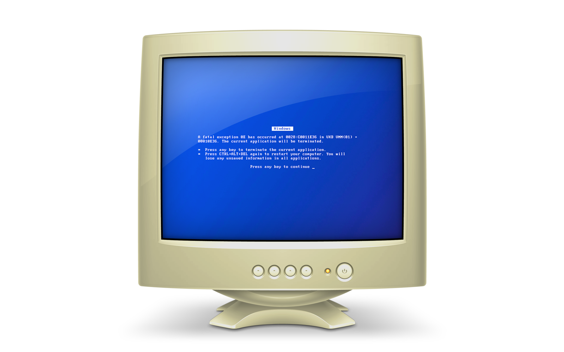
For years, Apple has used a beige CRT with a Blue Screen of Death on it to show “generic PCs” on the user’s local network:
I’m going to strongly disagree here. The Tahoe beta 2 Finder icon is slightly better, but seeing it this way makes it obvious that the problem with the Tahoe Finder icon isn’t whether it’s dark/light or light/dark from left to right. It’s that with this Tahoe design it’s not 50/50. It’s the appliqué — the right side (the face in profile) looks like something stuck on top of a blue face tile. That’s not the Finder logo.
The Finder logo is the Mac logo. The Macintosh is the platform that held Apple together when, by all rights, the company should have fallen apart. It’s a great logo, period, and the second-most-important logo Apple owns, after the Apple logo itself.
Reading through the articles (and the replies to those articles) about Beta 2’s icon, I realize I may be in the minority in liking the current icon:
I see what John and others are saying, though: Beta 2’s icon does break the meaning of the Finder icon. My assumption from the start of all of this is that Apple wasn’t going to go back to previous look with the lighter color going all the way to the edges of the icon, so I had written that off as a possibility.
If Apple does want to align the new new Finder icon with its history even more, they should mimic Michael Flarup’s design that John linked to:
I don’t know if Apple is going to revise Tahoe’s Finder icon again. I would happy if they do, but I am also okay if they don’t. The appliqué design fits pretty well with what Apple is doing with Liquid Glass, and the colors being on the correct side was the biggest sin of the original Tahoe design.
“Mac OS X will delight consumers with its simplicity and amaze professionals with its power,” said Steve Jobs, Apple’s iCEO. “Apple’s innovation is leading the way in personal computer operating systems once again.”
The new technology Aqua, created by Apple, is a major advancement in personal computer user interfaces. Aqua features the “Dock” — a revolutionary new way to organize everything from applications and documents to web sites and streaming video. Aqua also features a completely new Finder which dramatically simplifies the storing, organizing and retrieving of files—and unifies these functions on the host computer and across local area networks and the Internet. Aqua offers a stunning new visual appearance, with luminous and semi-transparent elements such as buttons, scroll bars and windows, and features fluid animation to enhance the user’s experience. Aqua is a major advancement in personal computer user interfaces, from the same company that started it all in 1984 with the original Macintosh.
On the page for the OS X Public Beta, Apple wrote:
The Aqua interface brings your Mac to life with color, depth, translucence and fluid motion — and keeps you on top of things with continuous visual feedback.
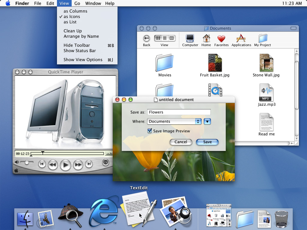
Here are a couple of Apple’s press images from the release of Mac OS X:
By the time OS X actually shipped a year after Aqua’s introduction, Apple had made some changes to the interface, including an updated Dock.
Liquid Glass feels like it harkens back to this era, but it is amazing how well Aqua has held up over time. The overall structure of OS X’s user interface is basically intact today, some two and a half decades later. The Dock, menu bar, and the various views in Finder are all still here today. They have evolved over the last 25 years, but not as much as you might have thought they would back in 2000.
Beyond the sheer consistency of the Mac’s interface, what really struck me about this video is how relatable it all feels. Steve Jobs is clearly proud of the work his team had done, but his comments are about how their work was going to make users’ lives better. They took what was great about the Mac’s previous interface and married it with what was great about OPENSTEP, all with a new look and feel. There was a reason for everything, even it was just because something was cool.
Jobs was at his best in these moments, and while I like a lot about Liquid Glass, it’s hard to argue that its introduction holds a candle to Aqua’s.
In this video, Alan Dye explains a lot about how the new design works, but is light on the why. I think part of it is the pace. The video is less than four a half minutes long. Nothing has any room to breathe, and at no point does Dye show any emotion about the work.
This all makes me miss live keynotes. I know Apple likes the control it has over pre-recorded introductions, but its announcements deserve live demos, off-the-cuff remarks, and the humanity that was once more prevalent at things like WWDC or iPhone introductions.
If you missed my previous post on the topic, the first version of Tahoe had the dark blue on the right side of the Finder icon, which was criminal.
Our 14-day national nightmare is over. As of Developer Beta 2, the Finder icon in macOS Tahoe has been updated to reflect 30 years of tradition:
Now, the background material is blue, with the face on the right side of the icon using a white glassy material. I think this looks pretty good:
I know some folks (cough, cough, John Siracusa, cough) want Apple to go even further and make the lighter color on the right extend all the way to the edges of the icon, which would look something like this very rough mockup I did in just a few minutes:
I can understand that, and the desire for the line between the two halves of the icon to be more rounded as it is in macOS Sequoia. However, Apple’s current Finder icon works well for me, and it fits in nicely with the rest of the Dock1 on my Tahoe test machine:
Apple heard my feedback as it echoed around the Apple world and acted upon it, and I’m thankful for that. I’m going to count this as a win for the Mac, for blogging, and for myself personally. That original blog post is the most-read thing on 512 Pixels in years. It clearly hit a nerve with a lot of folks, including people inside Apple.
Mission accomplished.
Poor Chrome and Notion, stuck in Squircle Jail. That’s still pretty rough. ↩