
Ben Brooks, on why the iPad 2 probably won’t have an iPhone 4-level rear camera.
Category: Design
On the Helvetica Documentary #pastblast
This evening I watched “Helvetica: A Documentary Film by Gary Hustwit.” I was, admittedly, rather skeptical about whether I would enjoy a film about a type face; truth be told, I didn’t think it would be particularly interesting. On the contrary, it was one of the best films I’ve seen in some time.
I too loved the film, but I foolishly tried making my wife watch it with me. She got up and went to bed about 15 minutes after it started.
Anthropomorphized Brushed Metal #pastblast
EXT. MORNING, TUESDAY 5 JUNE 2007. 1 INFINITE LOOP, CUPERTINO.
A cab pulls in front a building. BRUSHED METAL exits the cab, stands tall, and walks to the door. He waves a badge at the door’s identification sensor. A red light flashes.
He tries the door. It’s locked. He rubs the badge directly against the sensor. Red again.
BRUSHED METAL: What the fuck?
Be sure not to miss the theme’s response to iTunes 5 and to iLife 06. These are probably the funniest things you’ll ever read about UI design.
More on the Home Button
These gestures do mean that you don’t have to use the Home button. But there’s a serious discoverability problem with them. The physical Home button is impossible to miss. That it is the one and only button on the faces of these devices is a big part of why normal people are able to pick them up, start playing with them, and figure out how to get around with no help. How in the world would a normal person figure out or guess that they need to do a “five-finger pinch” to get back to the home screen?
On What’s Left of the HIG
But the HIG is dead. It died long ago. And it was Apple that killed it. In Mac OS 9 (and prior), no one’s apps were more uniformly consistent to the HIG standards than Apple’s own. In Mac OS X, Apple began experimenting — especially in their flagship apps. Whether this change has been for better or for worse is certainly debatable, but there can be no debate that the mores of Mac UI designers have changed. Apple sets the tone, for better or for worse. Always has, always will.
‘Read the Fucking HIG’
From my new favorite tumblelog:
Shit from the fucking Mac App Store, ‘designed’ by people who think they get interface design.
[via @Cocoia]
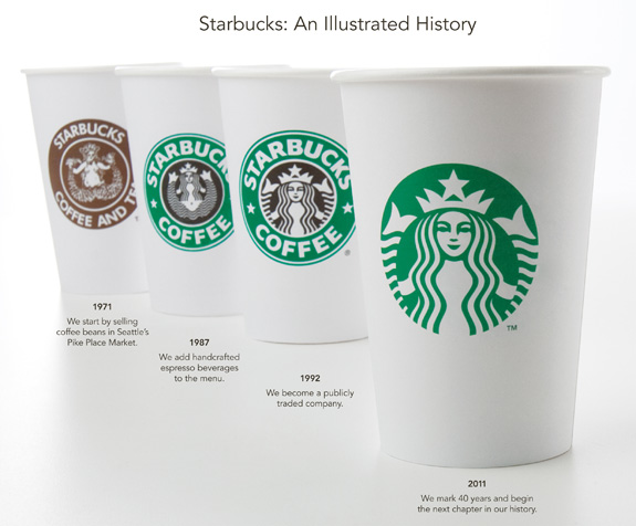
Starbucks Introduces Revamped Logo
 [via
[via Pixelated ‘Empire Strikes Back’
Ripoff Express
Reeder for Mac Beta 1 Out
Reeder for Mac — a desktop version of the poplar iOS Google Reader app — is here, in beta form at least.
The app looks like its mobile counterpart, complete with a services menu and big buttons. It is quick, stable and easy on the eyes, which is wonderful. However, I’m not certain that Mac apps should be look so much like iOS apps. I guess the Mac App Store and OS X Lion will probably prove me wrong here. Until then, go check it out.
History of Apple Tablets
This is a great walkthrough of some forgotten and interesting Apple concepts that have come about over the years.
Word Count Eye Candy
Patrick Rhone on PlainText’s word count feature, which the developer hid in the Copy/Paste UI:
It is quite lovely. Tapping the Word Count gives you even more information including number of paragraphs and characters. Also, now you can see why I have such a geek crush on Jesse at Hog Bay Software. His thoughtfulness and attention to detail are impeccable.
I recently switched to PlainText, replacing Simplenote on my iPad. Since PlainText and Notational Velocity (on the Mac) can sync .txt files via Dropbox, I’ve been able to simplify, cutting out Simeplnote as the middleman.