The original NASA insignia is one of the most powerful symbols in the world. A bold, patriotic red chevron wing piercing a blue sphere, representing a planet, with white stars, and an orbiting spacecraft. Today, we know it as “the meatball.” However, with 1970’s technology, it was a difficult icon to reproduce, print, and many people considered it a complicated metaphor in what was considered, then, a modern aerospace era.
Enter a cleaner, sleeker design born of the Federal Design Improvement Program and officially introduced in 1975. It featured a simple, red unique type style of the word NASA. The world knew it as “the worm.” Created by the firm of Danne & Blackburn, the logo was honored in 1984 by President Reagan for its simplistic, yet innovative design.
NASA was able to thrive with multiple graphic designs. There was a place for both the meatball and the worm. However, in 1992, the 1970s brand was retired – except on clothing and other souvenir items – in favor of the original late 1950s graphic.
Until today.
NASA Administrator Jim Bridenstine:
The worm is back! When the @SpaceX Falcon 9 lifts off carrying @NASA_Astronauts aboard #CrewDragon, it will sport the iconic symbol to mark the return of human spaceflight on American rockets from American soil. More: https://t.co/jQQv5ZcTY0 #TheWormIsBack pic.twitter.com/9Ltk1nMa8j
— Jim Bridenstine (@JimBridenstine) April 2, 2020
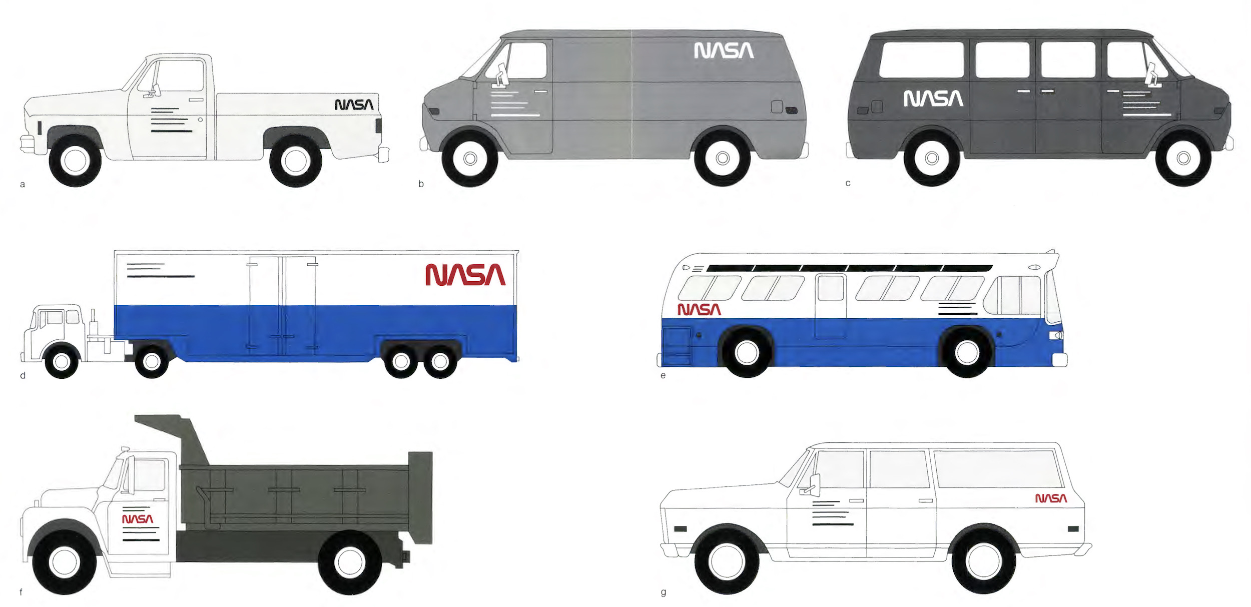
Don’t miss the 1976 NASA Graphics Standards Manual linked on that page. This page is my favorite: