
Developer Beta 6 of the 27 OSes is out today, and the macOS build has something I didn’t really expect this late in the game: redesigned window controls!

Like before, hovering over the “stoplight” controls with the cursor reveals the close, minimize, and junk drawer that has become the former maximize button.
Tahoe is on the left; Golden Gate Beta 6 is on the right:

(Trying to line up screenshots between a MacBook Neo and a MacBook Pro using a Pro Display XDR was …fun. Click the image to enlarge it.)
Apple has moved away from the solid colors it has used since Yosemite, applying Liquid Glass to one of the most fundamental parts of the macOS interface.
Over the last year, people have joked that Liquid Glass is a bad ripoff of the original Aqua. I haven’t really bought into that, but these window controls certainly echo the past. Here’s a screenshot from Mac OS X 10.1 Puma:

I like the whimsy in these new window controls, and from what I have already seen online, I’m not alone.
But I don’t immediately love everything Apple has done here.
The new controls strike me as too bright, particularly in dark mode:
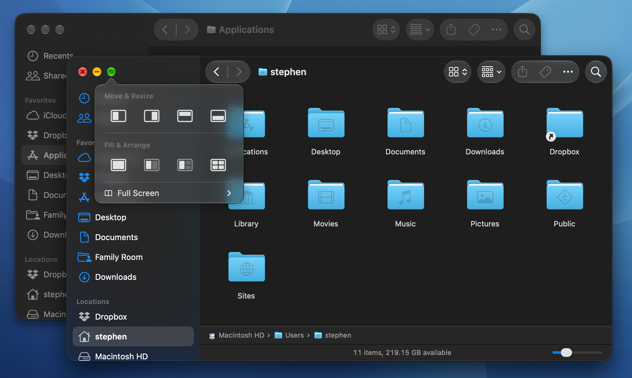
Why does each traffic light have highlights at the top and bottom when the rest of the items in the toolbar don’t?
These highlights make the icons look slightly oval, and the reflections don’t really make sense if these are supposed to be little pieces of glass.
Previous background windows were far less distracting, as they should be. At the very least, background windows should drop the highlights.
It’s akin to the highlights Apple puts on the edges of Home Screen widgets and folders on iOS 26, but somehow makes even less sense here.1
I would like to see the color turned up on the controls for the active window. The new ones are the least saturated stoplights macOS has ever had.
In a post on Mastodon, Jeff Nadeau shared an animation in which the selected control slightly animates:
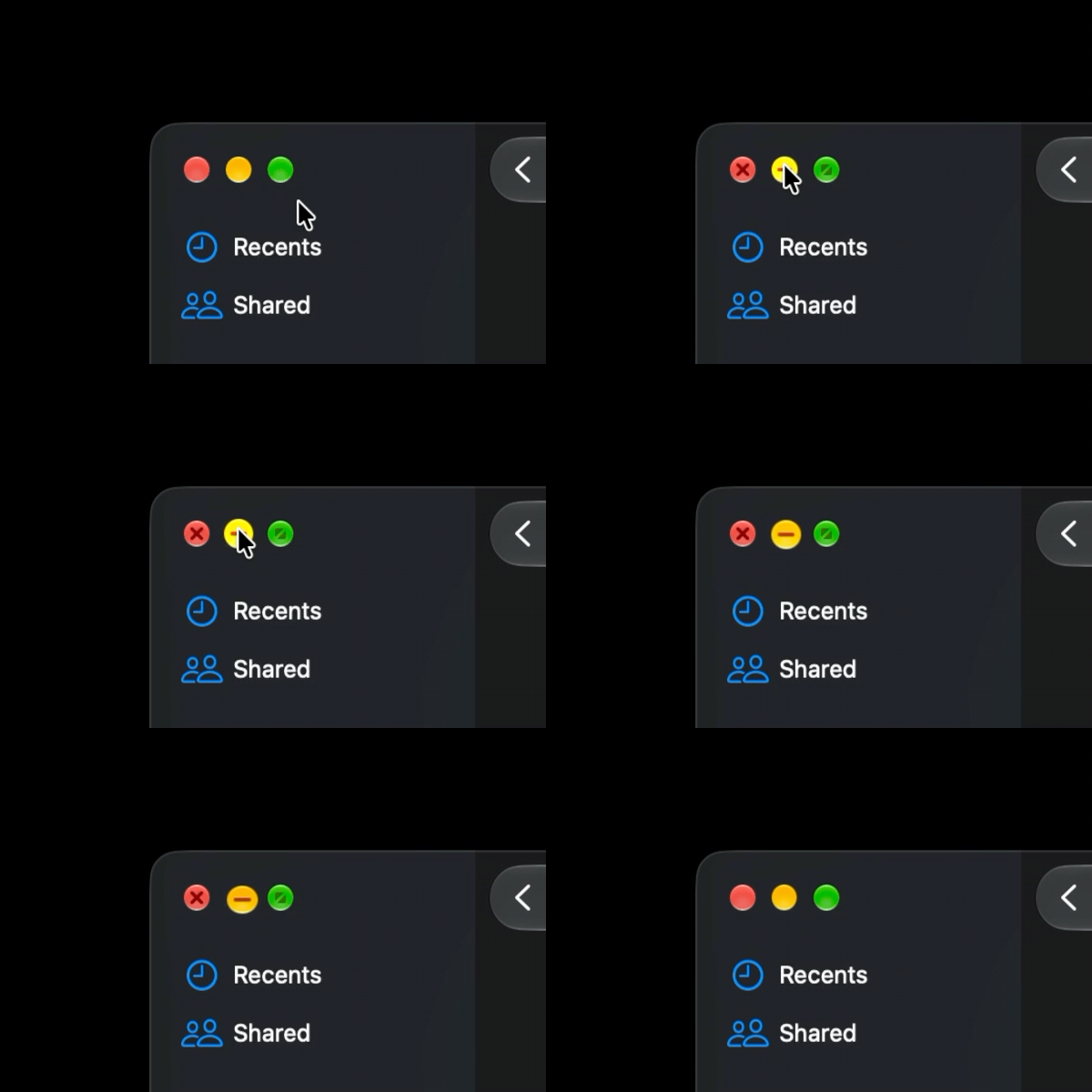
I’m not sure how I feel about this one; a little movement here is unlike anything else in the macOS interface. I’m not sure that’s the right call.
The trick with whismy is using just the right amount of it, and I hope Apple works on this more before Golden Gate ships this fall.
Just for kicks, here’s how the stoplights have changed over time, looking at the Home folder:


-
Another issue is with the sharpness of the edges of the controls themselves. These pieces of glass atop a background look like they could slide right off their windows, as if they were gemstones placed on a sheet of ice. After using Tahoe for a year, I am all for clearer separation between windows and controls, but I think Apple has overshot here.
Not everyone agrees with me on this point, so I’m hiding it in a footnote so people don’t @ me. Think it will work? ↩︎