I don’t keep text-based social media apps installed on my phone, but if I did, this would be this one I’d use for Mastodon and Bluesky.
Category: Apps
Pedometer++ 8.0 ⇢
Today, we shipped a huge update to Pedometer++. We have full details over on the Pedometer++ blog, and David has a post up as well:
Today I’m beyond delighted to announce the release of Pedometer++ version 8. I worked with legendary designer Rafa Conde to re-design the appearance and layout of the watchOS app to make it the most capable, yet intuitive, walking app on the App Store.
Pedometer++ has been on the Apple Watch from day one twelve years ago. Over that time I’ve built dozens of designs and features, today’s redesign learns from that journey and arrives at an incredible place.
The all-new step counter is both familiar and modern:
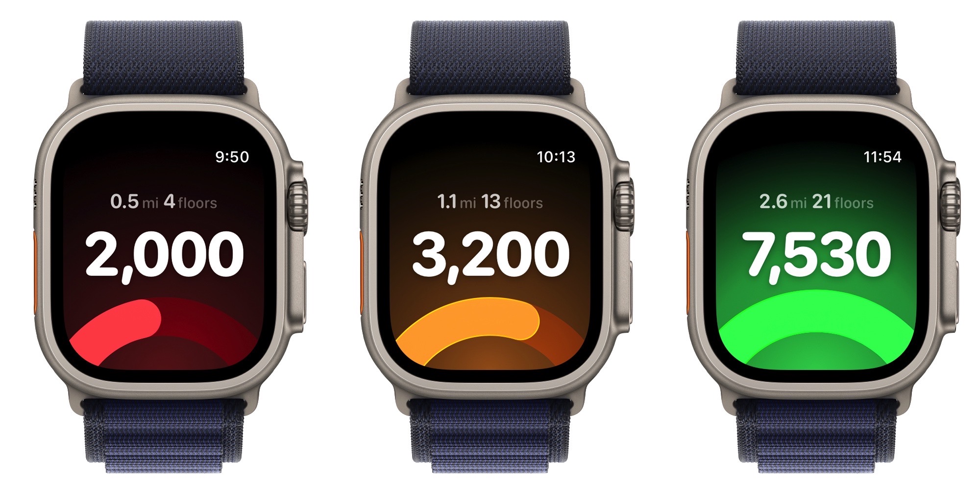
Expedition Mode is a new way to extend your Apple Watch’s battery life when on longer walks, hikes, or runs by disabling constant heart rate tracking and instead relying only on the basic heart rate tracking the Apple Watch provides. Based on our long-term testing, you can expect up to a 40 percent improvement in battery life with Expedition Mode. It’s wild.
The rest of the watchOS app has been overhauled as well. The workout screens have been redesigned, and the new maps are great. Here’s David again:
If you’re a premium subscriber when you start a workout you’ll be immediately brought to your new maps screen which shows your workout on a live updating map. This map will overlay your planned route, if selected.
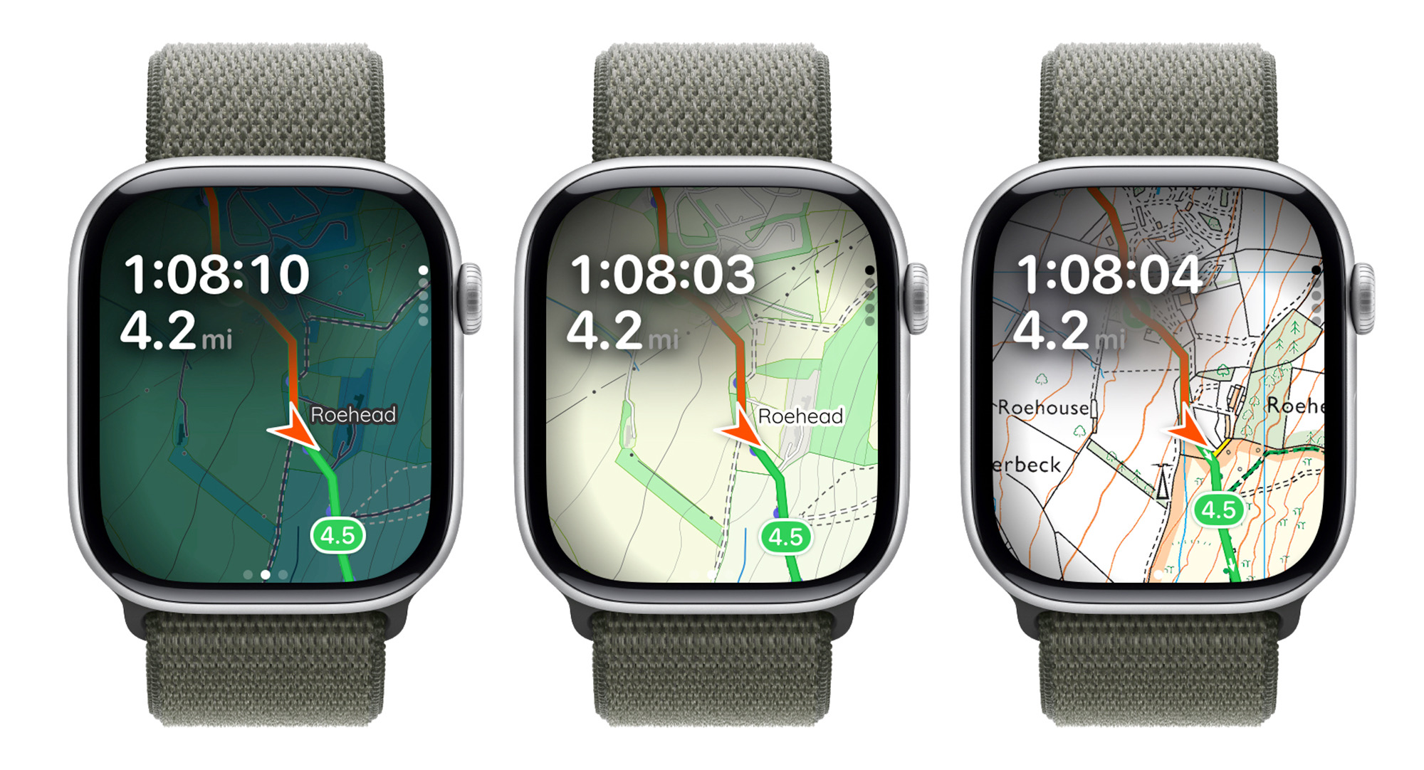
This screen now features our completely custom dark mode map. I worked with a cartographer to design a map which looks perfectly at home on the Apple Watch, which is highly legible even at arms length and includes all the topographic and wayfinding information you need to keep you on track.
I mean… come on:
Over on MacStories, John Voorhees wrote:
Apple is due for an Apple Watch renaissance. It’s a great device, but my use of it hasn’t changed a lot over the years. I track workouts, check notifications and the weather, and, well, check the time.
What Pedometer++ shows is that there’s untapped potential there. Even before WWDC, there’s more room to experiment and delight Apple Watch users than most developers are taking advantage of. I wouldn’t be surprised if David senses an opportunity on the horizon, too.
David has been working on parts of this update for years, and it really shows. We couldn’t be prouder of how it turned out. Pedometer++ 8.0 is in the App Store now.
I Have Done a Vibe Code
For the last couple of years, I have used Apple’s Reminders app, but over the last few months, it has become clear I needed something with planned dates to better map out future work. Last fall, OmniFocus 4.7 shipped with just that feature, so after years away, I have returned to the venerable application.
When using Reminders, I was also using InstaRemind to add tasks quickly using natural language processing. OmniFocus’ Quick Entry tool is pretty great, but I have found it to be error-prone as you have to tab between multiple fields to enter a task with metadata such as a project, due date, etc:

I took the chance to complete my first project with Claude. Over a few days, I went back and forth with it to create a webpage that would accept input as I described and pass it to OmniFocus. I can trigger this webpage with Keyboard Maestro:

You can see two text fields. The top section is for my task and its data, with the bottom text field reserved for any notes to be saved with the task. Tokens get broken out under the text, with reminders across the bottom of the window.
You may wonder why I chose these symbols. Turns out, I still had the Remember the Milk Smart Add shortcuts in my brain, and they came to the surface when working on this. (I used RTM heavily 10-15 years ago!)
I can even click on any metadata to edit it:

Once I’m ready, I can type Command+Return, and the task is sent to OmniFocus:

Like many people, I have very complex feelings about AI. It brings both good and bad into the world, and even this little tool makes me feel a little strange, but I am glad I got to explore what Claude can do. At times, it seemed real dumb; I had to tell it several times that I was using Planned dates and not Defer dates. Other times, it felt like I was working with a knowledgeable web developer. That is… weird.
If you want to play with this, I have the HTML file and Keyboard Maestro macro for calling it zipped up here. Since it’s just a local webpage, there are many ways you could use it.
Note that you will need to hard-code your OmniFocus projects at line 260 in the HTML file. I left an example project in the code for you to see.
I am not offering any support for this, nor am I making any promises about whether it’s a good idea to use it. All it’s doing is passing data to the OmniFocus Mac app via a custom URL. It doesn’t make any web calls or rely on external APIs, but if it suddenly springs to life, please tell someone.
Unlock Mac-Specific Accent Colors ⇢
Accents is an app that lets you use the iMac/MacBook Neo accent colors on any Mac.
This is really clever. The iMac and MacBook Neo come with custom accent colors that are only available on those machines. Thanks to Michael Tsai for linking to this little gem of a macOS app.

Apple Creator Studio Announced ⇢
Back in the day, Apple had three suites of applications:
- iWork, which started with Keynote and Pages, then Numbers
- iLife, which included iTunes, iPhoto, iMovie, iDVD, GarageBand, and for a short time, iWeb.
- Final Cut Studio, which was home to Final Cut Pro, Motion, Soundtrack Pro, DVD Studio Pro, Color, Compressor, Cinema Tools, and Qmaster.
Apps like Aperture and Final Cut Express were also around for a while. Meanwhile, Logic and MainStage are just out there doing their own things. I don’t even know what’s going on with Freeform, as it’s updated with OS releases, not as a standalone app like the others.
Over the years, this slowly broken down. iTunes became it’s own thing. The only iLife apps left are iMovie and GarageBand, even if Photos is the successor to iPhoto. The iWork apps all moved out to their own places years ago.
Starting on January 28,1 the bundle is back. Here’s a bit from the press release announcing Apple Creator Studio:
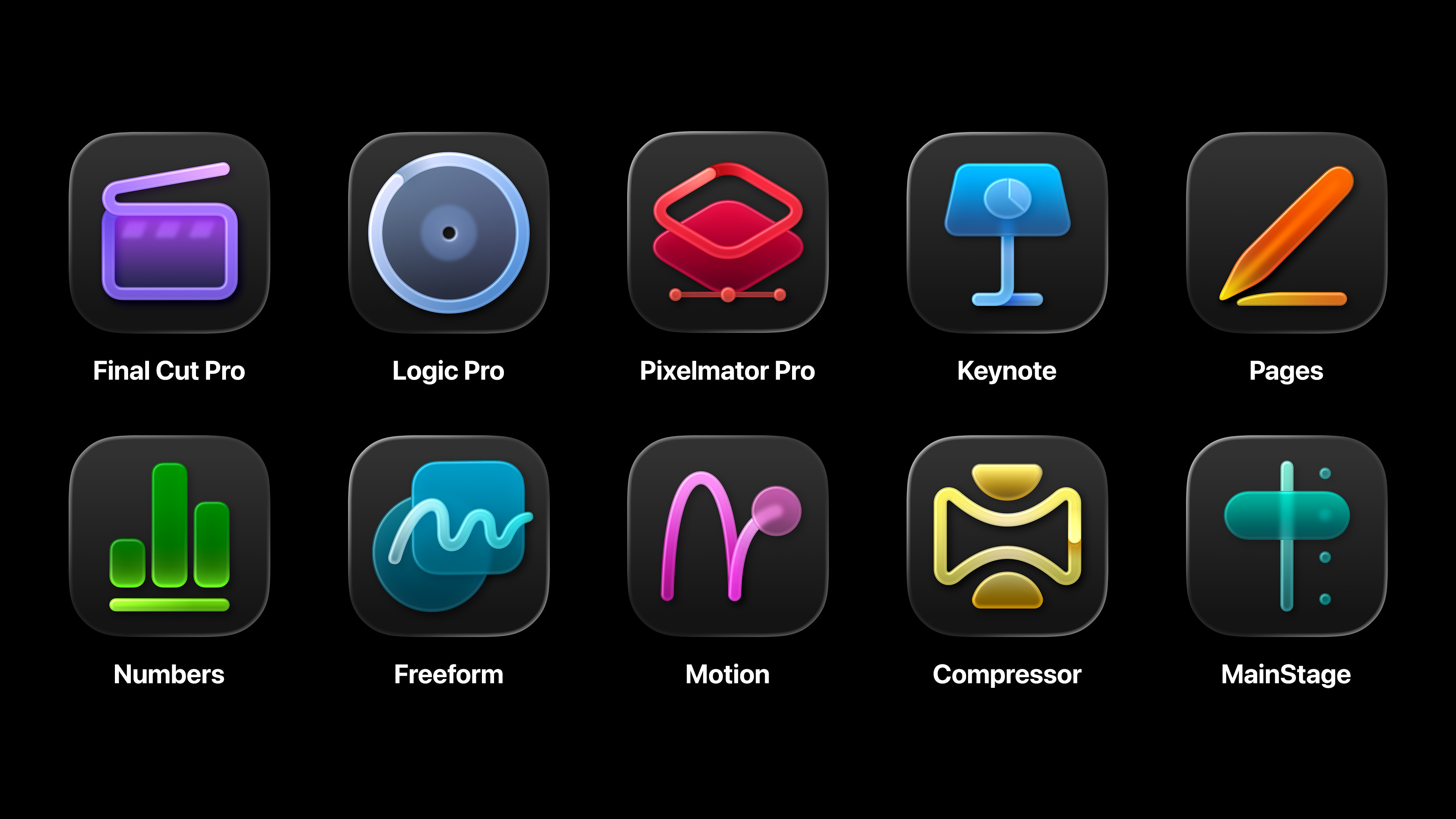
Apple today unveiled Apple Creator Studio, a groundbreaking collection of powerful creative apps designed to put studio-grade power into the hands of everyone, building on the essential role Mac, iPad, and iPhone play in the lives of millions of creators around the world. The apps included with Apple Creator Studio for video editing, music making, creative imaging, and visual productivity give modern creators the features and capabilities they need to experience the joy of editing and tailoring their content while realizing their artistic vision. Exciting new intelligent features and premium content build on familiar experiences of Final Cut Pro, Logic Pro, Pixelmator Pro, Keynote, Pages, Numbers, and later Freeform to make Apple Creator Studio an exciting subscription suite to empower creators of all disciplines while protecting their privacy.
The new bundle also brings new branding to these apps:
(I love the icons.)
This bundle is clearly designed for prosumers and professionals, as these apps are going to be included in Apple Creator Studio:
- Final Cut Pro (macOS and iPadOS)
- Logic Pro (macOS and iPadOS)
- Pixelmator Pro (macOS and iPadOS)
- Motion (macOS)
- Compressor (macOS)
- MainStage (macOS)
Apple Creator Studio will cost $12.99/month or $129/year, with a one-month free trial. New Macs and “qualifying” iPad purchases will come with a three-month trial. (Family Sharing is supported.)
According to Joe Rossignol at MacRumors, Apple Creator Studio isn’t eating all of Apple’s creative apps:
Final Cut Pro, Logic Pro, Pixelmator Pro, Motion, Compressor, and MainStage will each remain available for one-time purchase, and free versions of the Numbers, Pages, Keynote, and Freeform apps will continue to exist. However, only Apple Creator Studio subscribers will receive access to some of the premium new AI features and content.
Ah yes… premium content and AI features… back to the press release:
With Apple Creator Studio, productivity gets supercharged with all-new features that bring more intelligence and premium content to creators’ fingertips so they can take their projects to the next level. The Content Hub is a new space where users can find curated, high-quality photos, graphics, and illustrations. A subscription also unlocks new premium templates and themes in Keynote, Pages, and Numbers.
In addition to Image Playground, advanced image creation and editing tools let users create high-quality images from text, or transform existing images, using generative models from OpenAI.12 On-device AI models enable Super Resolution to upscale images while keeping them sharp and detailed, and Auto Crop provides intelligent crop suggestions, helping users find eye-catching compositions for photos.
To help users prepare presentations even more quickly in Keynote, Apple Creator Studio includes access to features in beta, such as the ability to generate a first draft of a presentation from a text outline, or create presenter notes from existing slides. Subscribers can also quickly clean up slides to fix layout and object placement. And in Numbers, subscribers can generate formulas and fill in tables based on pattern recognition with Magic Fill.
I don’t love features in apps like Keynote, Numbers, Pages, and Freeform being put behind a paywall. These apps are used by millions of people every day, and make Apple’s ecosystem better for each of them.
However, I totally understand that professional apps have moved to a subscription model. Heck, I pay Adobe over $60/month for access to its suite of creative applications that I rely on almost every day.2 Compared to that cost, Apple Creator Studio at $12.99/month or $129.99/year looks like a deal. If you’re a college student, it’s even better: just $2.99/month or $29.99/year.
- Which will be my 40th birthday. Woof. ↩
- A large part of this is due to Adobe’s various bundles. I really only need Photoshop, Illustrator, and Audition, but they can’t be combined on a less expensive plan. Such is life in the 2020s. ↩
Five Apps I Used in 2005
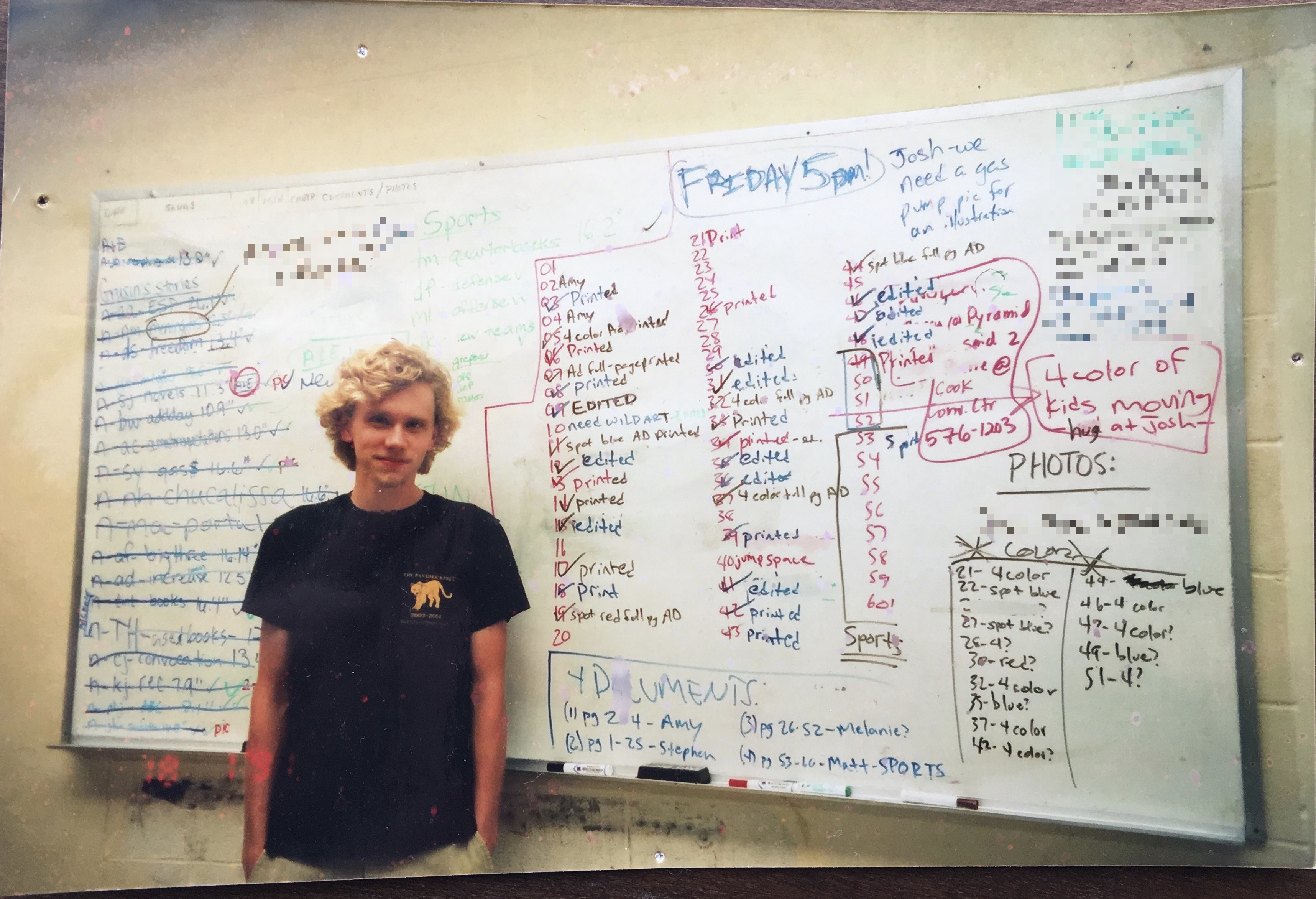
Yours truly in The Daily Helmsman newsroom as a freshman in August 2004. Names and phone numbers have been redacted to protect people who probably don’t remember me at all.
Twenty years ago, I was halfway through my first sophomore year of college1 and loving it. Moving into the dorm in August 2004 marked the first time I had access to the real Internet (not just AOL or Juno), and I dove into being a Mac nerd. I spent time on the Apple Discussion Boards and OS X forums across the web to learn everything I could about the PowerBook on my desk and what it could do.
Reflecting on that time, here are some of the apps I was using:
Adium
One of the first things I did when I got to college was set up an AOL Instant Messenger account. I was the last of my friends to do so, but I quickly jumped in. I chatted with friends and classmates, and set some super emo away messages.
iChat had launched in 2002 with Mac OS X Jaguar, but it took until Leopard for Apple to add tabbed chats. This meant that every open chat you had spawned its own window. Even on a 15-inch PowerBook, that would quickly spiral out of control.
Chax was a third-party app that added a bunch of functionality to iChat — including tabs — but I had stability issues with it. So, instead, I turned to Adium.
If you used a Mac in the early 2000s, Adium probably holds a special place in your heart. It worked with AIM and a wide range of other chat services and offered tabbed chat windows.
Adium’s real strength was its customization options. Users could change the icons, emoticons, sounds, chat styles, buddy list layout, and much more. As you can see in this one terrible photo of my dorm desk, you can see that I had online buddies in green, away buddies in red, and offline buddies showing up in black:

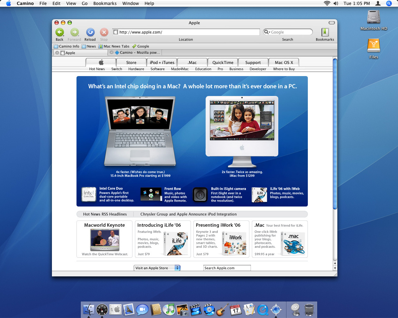
Camino
Safari was a few years old by the time I was in school, but I wasn’t a huge fan. Instead, I used the beloved Camino, which was described by its creators like this:
Camino combines the awesome visual and behavioral experience that has been central to the Macintosh philosophy with the powerful web-browsing capabilities of the Gecko rendering engine. Built and tested by thousands of volunteers, Mozilla’s Gecko brings cutting-edge innovations and capabilities to users in a standards-friendly and socially responsible form.
Sure, you can use a typical web browser, with typical features. Or you can use a browser that “also” supports the Mac. Or you can use a browser you have to pay for. What if there was one that offered everything, for free?
That browser is Camino. Camino makes your web experience more productive, more efficient, more secure, and more fun. It looks and feels like a Mac OS X application should, because it was designed exclusively for Mac OS X and the high standards set by Mac users. You’ll see the entire internet the way it was intended. Camino is the browser that gets out of your way, and that means Camino users need not worry about things they shouldn’t have to.
With an Aqua interface and the heart of Firefox under the hood, Camino was fashionable and fast. Here’s a screenshot of version 1.0.3 or so:
Chicken of the VNC
When I said that I used a PowerBook in my early college years, that is only part of the truth. I also had a Blue and White Power Mac G3 under my desk that I used as a “server.”
I put server in quotes because I really just used it as a backup target for my laptop; it didn’t run Mac OS X Server or provide any real services.
I ran it headless, so to access it, I used a VNC client called Chicken of the VNC. That is the best name any application has ever been given other than CalZones (RIP). It let me quickly access the Blue & White from anywhere on campus with just a few clicks.
Microsoft Entourage
Student email at the University of Memphis ran on Exchange, and connecting to the mail server via IMAP in Apple Mail was pretty janky. Since I refused to use webmail, I turned to a cracked version of Microsoft Entourage, the company’s email and personal information manager for the Mac.
This let me access my email in an actual application, like a gentleman. Later in college, I experimented with various hand-me-down Palm Pilots and even a PocketPC. I used various versions of Palm’s HotSync and The Missing Sync to get data in and out of Entourage.
Vienna
Being a young nerd in the early 2000s meant that I loved reading the web via RSS. To do so, I would have turned to NetNewsWire, but I couldn’t afford the commercial version, so instead, I used the freeware RSS client Vienna. It wasn’t nearly as nice as NetNewsWire, and as soon as I came across the free — and awesome — NewsFire in 2008, I jumped ship to that. That was the beauty of RSS, and why it’s still special today.
The More Things Change…
It was wild to think about this list and consider the fact that I still have solutions for all of these categories today. Now it’s Messages/Slack/Discord instead of Adium, Safari instead of Camino, and Apple’s built-in screen sharing features instead of Chicken of the VNC.
Entourage has been replaced by a set of apps including Mimestream, Calendar, Contacts, Notes, and Reminders. Vienna is still around, but now I read RSS with ReadKit.
I even still have that old Blue and White G3. It’s sitting on a shelf in my office across from my desk.
- I was in college from August 2004 until May 2011, and I have a Bachelor of Fine Arts in journalism to show for it. I changed majors from graphic design after two years, which meant basically starting over. After the fall semester of 2007, I went to school part-time until I finished, slowly chipping away at my degree. My official transcript from the University of Memphis is six pages long. ↩
My Control Center
Here is how I have Control Center set up on my iPhone 17 Pro:

At the top, I’m using the stock Connectivity and Now Playing controls.
Down from there are switches for Silent Mode and Orientation Lock. I don’t touch these very often, but want them handy for when I need to hear my phone or rotate it into landscape mode. Next to these two switches are slides for Screen Brightness1 and Volume.
I don’t use Focus Modes very frequently. Only Do Not Disturb, Sleep, and Reduce Interruptions live behind that button. On the other hand, I use Alarms and Timers all the time, and like having an easy way to get to them quickly.
Up next are two actions. The first is built with Widgetsmith, tapping it fires an action within the app to go to my iMessage thread with my wife Merri.
The second is a simple Shortcut named Fast Tasks that lets me type into a box and have it land in my Inbox in Reminders, with a due date of today. This Shortcut is also tied to my Action button, and its name and icon are in honor of Casey’s now-retired app, Fast Text.
The last two rows are pretty straightforward:
- Screen Recording
- Recognize Music
- Quick Note
- Calculator — I use PCalc like a gentlemen for actual work; this is here for super quick things I don’t care about.
- Flashlight
- Low Power Mode
- A Shortcut named App Settings that jumps you to the Settings screen for the foreground app. I’m pretty sure Quinn Nelson built the version I’m using.
- Camera
- For the record, I use Light Mode during the day and let my phone switch to Dark Mode automatically at sunset. This is the same for my iPad, but my MacBook Pro is always in Light Mode. I use True Tone on my iPhone and iPad, but again, the Mac is left out since I am old. ↩
Tahoe 26.1 Updates Spotlight Options ⇢
Previously, Spotlight could optionally retain clipboard contents for up to eight hours, but the latest update expands that flexibility with three options – 30 minutes, 8 hours, or 7 days. There’s also a new “Clear Clipboard History” button in System Settings ➝ Spotlight, giving users the ability to manually wipe stored clipboard data without having to wipe Spotlight search history wholesale.
Clearly, Apple heard the feedback from power users that 8 hours wasn’t enough.
A Little Update on My RSS Setup
I’m always surprised at just how often I’m asked about how I read RSS. For years, this was a very stable setup, but has recently changed.
I’ve used Feedbin for ages. It is widely supported by RSS clients, and has the ability to receive emails newsletters and put them inline with articles coming in via RSS. As someone who doesn’t like reading newsletters in his inbox, this is great.
For years, I was using what is now known as Reeder Classic on all of my devices. It looked great, worked well, and was super customizable. However, as the developer has moved on to the new version of Reeder, Classic has begun to get a bit creaky, and its future doesn’t seem very bright, unlike the blank screens I would often get as the app tried to load articles on iOS.
The macOS version was still holding up, so several months ago, I switched to NetNewsWire on the iPhone and iPad. It’s lean, fast, and I love the fact that it’s a community project. It has a handful of customization options, but I struggled to get it to look the way I wanted. This wasn’t enough to go looking for a new app, however, until Jason mentioned ReadKit on this week’s episode of Upgrade.
I hadn’t used ReadKit in over a decade, and when I checked it out again, I was impressed. It’s looks modern with Liquid Glass support, works with Feedbin, and works as well on the Mac as it does on iOS and iPadOS. I’ve been running it this week and so far, so good!
The State of Nisus Writer ⇢
Nisus Writer is a word processor for the Mac that dates back to 1989. It survived basically every major change the platform has ever seen, but its time as a beloved Mac app may be coming to an end, as Joe Kissell writes:
For more than a year, we’ve heard scattered complaints: problems with Nisus Software’s website, particularly the user discussion forum; slow or absent responses to support requests; assorted bugs; and other issues. But earlier this week, on 22 October 2025, the reports changed to: “Did you know the Nisus website is completely down, and that Nisus Writer is no longer in the Mac App Store? Does this mean they’re out of business?”
On the one hand: The site is back online as I write this. The app still works. I’m writing the first draft of this article in Nisus Writer Pro on a Mac running macOS 26 Tahoe, and it’s fine. You can still download it and buy a license. At least one human being is actively involved in the company. It’s (mostly) alive!
On the other hand: All available evidence suggests that the app, and the company behind it, are on life support, and the prognosis is doubtful. It’s (mostly) dead!
I’m going to tell you what I know.
iWeb in 2025 ⇢
I used iWeb back in the day to make early versions of my personal website, as well as websites for friends, before I started learning more about web development and switched to Adobe Dreamweaver. Apple only released two major updates to iWeb, with the last one arriving in the iLife ’09 package. When the company migrated its cloud services from MobileMe to iCloud, the ability to publish personal websites was removed, and iWeb was finally discontinued in 2011.
Even though Apple’s web hosting services are long gone, you can still use iWeb and save your finished site to a local folder or FTP server. The last versions were Intel-native Mac applications, so iWeb should work all the way up to macOS 10.14 Mojave, released in 2018. It can’t run in newer macOS releases because Apple ripped out support for 32-bit applications.
The web has changed dramatically since 2011, so I thought it would be a fun experiment to revisit iWeb and see how its websites hold up to modern standards. I installed iWeb 3 on my old Mac Mini running Snow Leopard and got to work.
I have wanted to do this for years, and major props to Corbin for diving deep on this project.
Glider for Macintosh ⇢
Classic Mac Gaming on YouTube has a great video about a true classic for Mac OS: