On Ember for Mac

There are lots of ways to gather and organize files and information on the Mac. For photos and images, however, there’s not a great option. Dropbox is great for files, but Finder is Dropbox’s UI, which isn’t always the best option. Evernote is well-liked, but can be overkill for some.

Now there’s Ember.

Ember is a digital scrapbook. Like a real scrapbook, it’s easy to add photos and images, but because it’s digital, the data can be organized easily and quickly. There are tags and collections, as well as metadata and smart folders. There are some great built-in editing and annotation tools, as well.

Here’s a collection I threw together pretty quickly:

Ember isn’t a lazy app. In addition to being able to create screenshots — and automatically import them — it comes with plug-ins for the major browsers and a menu bar utility, making it easy to snap something for collection and move on with your work. You can even give Ember RSS feeds for it to automatically crawl. Ember shows just the images found in the feeds, and offers a single-click interface to add those images to your local library.

Currently, Ember doesn’t sync with anything, and there’s no mobile counterpart for the Mac app. Ellis Hamburger at The Verge mentions these features are coming in the future, however.

Ember is on the Mac App Store for $49 and is built by the fine-looking people over at Realmac Software. If you want a clean, easy way to capture and sort screenshots and images on a Mac, it’s worth the pricetag.

A Look at the BlackBerry Z10

While I spoke on Bionic this week at great length about it, I wanted to share some photos and thoughts about the BlackBerry Z10 here, too.

It’s important to note that I’ve never been a BlackBerry user. While I know of the company’s history and deep ties in the enterprise, I’ve approached this phone like I do others that I review: as someone who has used iOS and Android extensively. For example, I didn’t spend any time with the security settings or the phone’s ability to separate work and home data.

The Z10’s hardware is fantastic. It’s a tad larger than the iPhone 5 and weighs 23.4 more grams, but it is very well built. Up front is a 356 PPI 1280×768 4.2-inch screen, and around back is a comfortable soft-touch rubber that’s grippy but not cheap. The buttons all feel good, and there’s no squeaks or cheapness anywhere.

The rear-facing 8 megapixel camera (that shoots 1080p video) and front-facing 2 megapixel camera which can do 720p video are much better to what I’ve seen on most Android devices.

(Speaking of Android devices, the Z10 has a LED indicator on the front. I’ve always liked that on Android phones, even though it’s a tad old-school.)

This is world-class hardware that gives the iPhone 5 a run for its money, even if Apple has BlackBerry beat when it comes to battery life.

My Verizon-supplied review unit runs on the network’s LTE, which is excellent here in Memphis. The coverage was what I’ve come to expect from my iPhone 5.

The lock screen shows previews of what’s waiting for you inside, but no real previews, like iOS does. Swiping up unlocks the phone.

The home screen is the multi-tasking UI. While at first I thought the software was using this view to hide the time it took apps to launch, or to show how powerful the OS is. In reality, however, BlackBerry 10 assumes you are in and out of the same apps often, and tries to make that an easier thing to do.

In reality, however, it’s confusing. The homescreen can only show the last 8 apps opened, and since it’s impossible to pin things, apps are never where you left them. It’s great if you’re bouncing between a couple of apps over and over, but past that, I found myself swiping to the left, to the app launcher:

The launcher is very much like iOS’ springboard. You can re-arrange icons and drag things in to folders, but there are no widgets or other customizable features. Flipping around this screen — and all others for the most part — is fast and fluid.

The app situation for BlackBerry 10 is pretty bleak. While the company bundles Twitter, Facebook and LinkedIn apps, there’s no Spotify or Evernote, for example, in BlackBerry World.

Evernote, however, does enjoy deep integration with the built-in “Remember” notes app. Likewise, while there’s no Dropbox app, the company added support for the service in the phone’s built-in file manager app. While it’s hard to tell if BlackBerry did this themselves because these companies wouldn’t support the platform, it’s well done and works smoothly.

Apps on BlackBerry 10 enjoy a wide range of abilities. The OS had Android-like sharing between apps that make it easy to move text and photos around the device.

(Speaking of Android apps, the Z10 can emulate Android apps. It’s clunky, complicated and not worth messing with unless you have a mission-critical app. Even then, it’s painful.)

BlackBerry 10 includes Hub, an all-in-one tool for managing messages. On my review phone, I had two Gmail accounts, Twitter, Facebook, SMS and BBM all set up. The Hub app — which lives to the left of the home screen, and can be entered with a gesture from anywhere — makes short work of reading incoming messages, but interacting with them can be clunky. Multiple message management is sluggish, and replying to some things can be done within the Hub, while others require a trip to another app. I like the idea, but in practice, it lacks a certain amount of polish I’d expect from something that looks so good.

In short, the Z10 is a confusing product in many ways.

The truth is that BlackBerry — the company — is in trouble.

Instead of deciding to double-down (sigh) on the enterprise, the company’s bread and butter, or going after the mainstream smartphone market to gain new customers, BlackBerry has decided to try to do both. I’m not sure they’ve pulled it off. The Z10 is a fine phone, but history shows there’s no room for a third platform in this space.

Would I go buy a Z10 today? No. But if I were handed one at work, I’d be far better off than I would be with an old-world RIM device. Is that enough to save the company? Time will tell.

The Pebble: Is the Time Right for a Smartwatch?

Just shy of a year ago, a Kickstarter project was launched that would take the nerd world by storm. In five weeks, the group raised $10,266,845, even though they needed only $100,000 to launch. The Pebble was born.

A year later,I’m sitting at my dining room table with the smartwatch next to my MacBook Pro. I’ve had it for a couple of days, and have collected my thoughts on this new-to-me product category.

Hardware

The Pebble’s name is apt. Mine is the “jet black” option, and it is as slick and smooth as a polished stone.

It’s about as light as my normal watch, but taller. As such, it doesn’t sit as nicely against the top of my wrist as my Casio does. It’s bulky, but not heavy. You know how weird the weight of the iPhone 5 felt at first? It’s like that, sort of.

The band is made of soft rubber and feels great.

The sides of the Pebble are pretty busy. The left side (shown above) houses the back button and a custom charger. The charger works over USB, and connects to the gold pins show above. While the charger snaps in to place easily enough, I don’t like the exposed pins.

The right side has three buttons. The top and bottom ones are oblong, with the middle one shorter than the others. They feel cheap. Unless pressed directly, they rock a bit, and can depress a fair amount before engaging whatever mechanism is underneath.

The 144 x 168 pixel display black and white e-paper screen is recessed into the watch, and unless it’s in direct sunlight, it’s hard to tell where it ends and the chunky plastic bezel begins. The screen isn’t super sharp, but its usable. I haven’t seen it glitch or slow down while paging through the menus.

The backlight is a cool white, and works well, but there’s no brightness setting to be found.

Inside, the Pebble packs a vibrating motor, which is great, and a battery that can last a week. I haven’t had it long enough to test it, but since the Pebble UI doesn’t show the battery percentage anywhere, I haven’t found myself worrying about it. Once the watch gives me a low-power notice, I’ll charge it up via my MacBook Pro.

All in all, the Pebble’s hardware is nicer than I was afraid it might be, but it’s far from perfect. It is, however, passable.

Software

The Pebble — like most devices — is all about the software, and like most devices, there was an update ready for me after I unboxed the watch. After I paired the watch, I opened the Pebble app, and it quickly downloaded the update and pushed it to the watch. 90 seconds later, it was done.

I’m ashamed to report I took that photo with my iPad. Even though I was alone in my office, I was embarrassed to do it.

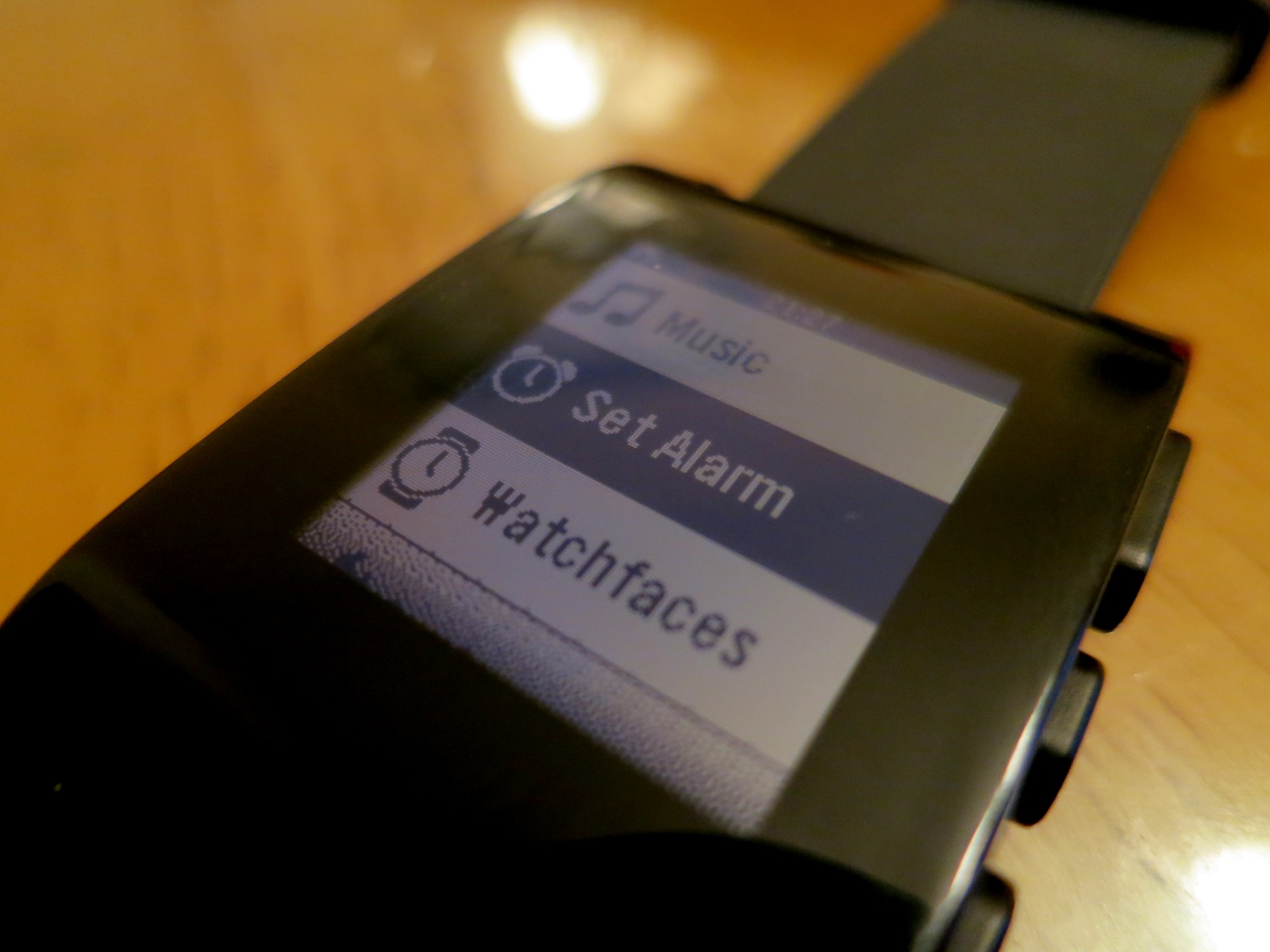
The software on the watch is pretty simple. Changing watchfaces is easy, and additional ones can be added via the Pebble app. Alarms can be set quickly, and the font size can be changed easily. Past that, however, there aren’t any settings for the thing.

While Pebble has promised that apps are on the way, at this point, there aren’t any available for download. Not a single step tracker or game. Being able to use the Pebble to track my steps throughout the day would be a killer feature, and put the watch on par with something like the FuelBand by Nike. Pebble says RunKeeper is in testing now.

The real magic happens when the Pebble is paired to a smartphone.

The Pebble & iOS

Getting the Pebble set up with iOS is a little fiddly, but it’s not too bad.

The Pebble’s big feature is its ability to show notifications from the iPhone on its screen. Coupled with the vibrator, this makes it easy to check in on a text or email without having to pull out your phone.

When a notification comes in, it pops up on the screen, staying there until it’s replaced by a newer message or is cleared by the press of a button. Keeping the watch and phone connected all day does impact battery life on the iPhone. While it isn’t draining my iPhone drastically faster, it is a noticeable change.

(The low-power Bluetooth 4.0 standard is supported by the Pebble’s hardware, but is not currently enabled.)

While it’s great to read things as they come in by just glancing at your wrist, having Siri built in to the watch would make it possible to respond to a text without pulling out your iPhone. If Apple’s really doing a smartwatch, I hope this is a feature.

As I’m sure you’ve noticed, iOS doesn’t have a notification setting to “send to Bluetooth” anywhere. To grant an app’s notifications the ability to be pushed to the Pebble, you have to disable then re-enable the notification. It’s clunky, and made worse but the fact that when the Pebble and iPhone lose connection, the Pebble has to be re-setup.

(Pebble’s support says that SMS notifications will stay enabled, but in my testing, that’s been flaky.)

This means turning off the iPhone, flipping it to Airplane Mode or simply leaving it on your desk when you go to lunch means your phone will forget what its supposed to do. Or leaving your watch inside when you mow the grass. Or leaving your phone in your bag when you workout. Or do anything a normal human does, really. It blows.

Assigning the blame for the issues is hard. While it’d be easy to blame Apple for these limitations in iOS 6, the fact is that the Pebble is pushing the bounds of what anyone has done with iOS, and things are rough because Apple hasn’t needed to explore things like notification settings to Bluetooth devices.

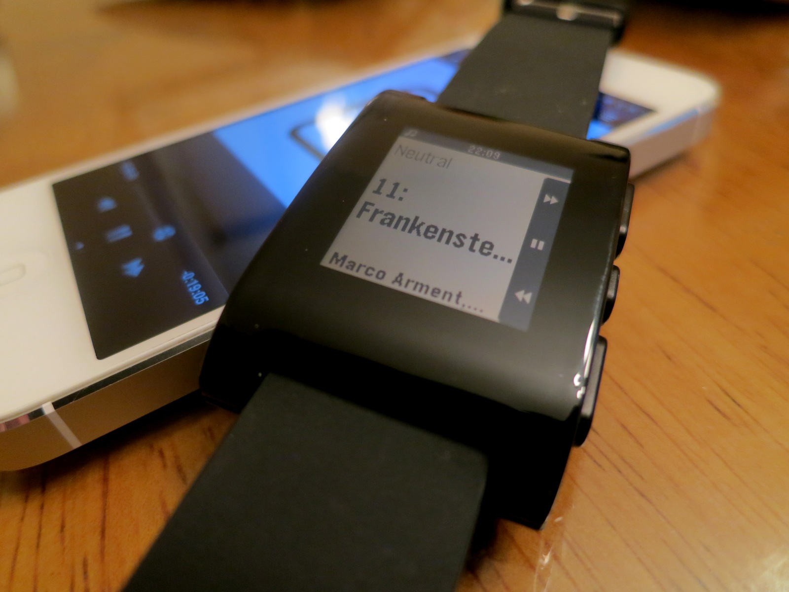
The Pebble also acts as a remote to any media playing on the iPhone. In my testing, the controls work great with the Music app, Spotify, Instacast and more:

Conclusion

So, was the long wait for the Pebble worth it?

When I reviewed the iPod nano as a watch last year, I closed my article this way:

The promise of the iPod nano as a watch is endless. Lots of people would love to see Apple integrate it with the iPhone, giving the nano a true “smart watch” level of usefulness.

As it stands today, though, the iPod nano makes you look like a secret agent, but one who can’t actually do anything all that cool.

As it stands today, I won’t be wearing the Pebble all that much. I might not even keep it. It’s ahead of its time, and while it shows promise, the simple truth is that the Pebble isn’t all that helpful at this point.

Can the team behind the Kickstarter darling fix that with software? Will Apple open the door to Bluetooth-powered notifications? Will the next Pebble’s hardware be something I’m not embarrassed to wear?

The Pebble is like the Model A. When people looked at the Model A, some realized it was the future, and that one day, everyone would drive. Others thought Henry Ford was off his rocker and that his invention was a one-off that wouldn’t ever go anywhere.

The Pebble isn’t great out of the gate, and it may never have the chance to cover the ground it needs to before Apple swoops in. The idea of the smartwatch is cool, but the Pebble is rather simple and — in places — downright crude. But it’s pointing the way forward.

Maybe.

App Review: Check the Weather

I’m a huge weather nerd. In high school, I got certified via Skywarn. Some buddies and I almost got killed one night chasing a tornado an hour or so east of Memphis.

That said, I’ve never been really happy with a weather app on my iPhone, until I came across the simply-named Check the Weather.

The app uses GPS (or pre-saved locations) to pull up the correct weather information. The main screen shows the current state of things, with a look ahead at the day, as well as the next three days.

There’s a lot more to the app than just that, however.

Gesturing in from the left shows an hourly forecast, complete with sunrise and sunset times, while pulling in from the right reveals an extended 16 day outlook.

The real magic, however, occurs when pulling in from the bottom, which reveals a Dark Sky-powered radar.

Here’s the app, laid out in separate screenshots:


The gestures work perfectly, and the panes slide in and out very smoothly, but Check the Weather is as handsome as it is useful. The app can be set in a number of color schemes, with numerous font choices, but I think most nerds will choose Futura or Helvetica.

All in all, David Smith did a great job building this app, and it’s enjoyed a place on my homescreen for some time. If you like weather and well-designed apps, it’s well-worth the 99¢.

Review: The Fitbit One

In my Nike+ Fuelband review, I wrote:

Over the last few months, I’ve seemed to fallen out of love with the FuelBand. It’s a little too bulky for my taste, and it’s rather limited in what it captures, not to mention it doesn’t seem to be holding up well.

I closed my review saying I had pre-ordered the Fitbit One.

They are very different devices, the Fuelband and Fitbit One. Here are my thoughts.

(Insert the DUN-DUN music from Law and Order here.)


The Fitbit One is a small device. It’s probably best used in the rubber case it comes with, as it includes a sturdy clip to attach the Fitbit to a pocket.

It weighs next to nothing, has a nice screen and it easy to handle.

I’ve been using it out of the case, in the little iPod nano pocket on my jeans.

The downside of the size is that it’s easy to lose track of the device. I started putting the wristband on my night stand, reminding me to make sure the Fitbit isn’t in the hamper with my pants.

The wristband is comfortable, which is good, as it’s how the Fitbit does its thing while you sleep. Pop it in, press and hold the button to enter sleepy time mode and the device will track your sleep.

In my few weeks of usage, this has become my favorite thing about the Fitbit. I don’t sleep all that well, and it’s been fascinating to see that on a chart.

Past the sleep tracking, however, the Fitbit One doesn’t do all that much more than the Fuelband — on its own.

While the Fuelband basically stands alone, the Fitbit is just part of an entire system — one that can track your weight, food and water intake. While the Fitbit is useful without this information entered on the website or iOS app, it really shines if the time is taken for all this input.

And that’s why the Fitbit One isn’t for me. While I bemoaned the Fuelband’s simplicity, I’ve come to miss it. In fact, I’ve given the Fitbit to my wife, and I’m wearing the Fuelband now.

Go figure.

iPad mini Review: Good Things Come in Small Packages

It’s become a familiar cycle, these things. First, we see a single rumor, then photos of camera cables leak from China, then a Best Buy employee sends a screenshot to 9to5Mac with price points. Back housings and screens pop up, and before we know it, someone’s assembled a product that hasn’t been announced.

Then, Apple gets on stage, announcing the very thing we all know is coming, leaving some people underwhelmed and disappointed at the lack of anything surprising.

The iPad mini came in to the world last month under these circumstances. While it was less documented than the last several iPhones, Apple nerds pretty much knew what to expect from Phil Schiller’s time on stage in San Jose.

I — like a lot of nerds — ordered an iPad mini on day one. I’ve been using it consistently since, and these are my impressions.

Hardware

Above: An iPhone 5, Kindle Paperwhite, iPad mini, Moleskine notebook and iPad 3

The iPad mini takes Apple’s category-leading tablet and makes it just a tad bit smaller, but a lot lighter. This weight decrease is one thing I’ve really come to enjoy using the mini, especially in bed or on the couch.

The iPad mini is also thinner than its bigger cousin, but the difference doesn’t make a big impact, day to day, like the weight does.

Like all iOS devices, the iPad mini experience is all about the screen. Like the larger iPad 2, the mini sports a 1024×768 display, but unlike the iPad 2, it does so with a 7.9-inch panel.

This puts the iPad mini at 163 pixels per inch, right in between the iPad 2 at 132 ppi and the iPad 4 at 264 ppi.

When I unboxed the iPad mini, the screen turned me off right away. It’s less clear than the Retina iPad, and the pixels aren’t as close to the glass.

However, I — like most other reviewers — have already grown accustomed to this step backwards in quality. Yes, it’s not as good as the Retina display, but it’s also totally usable. I haven’t had to adjust the text size in any apps, and it doesn’t generate any eye strain, either.

For Apple to include a Retina display in the iPad mini, the company will have to get the price down, and be able to support it in a chassis this thin, with a battery this small. While I’ll be stoked to see it, I don’t think we’ll get a Retina mini any time soon.

The screen’s colors and viewing angles are just great. The thin bezel on the sides is weird to get used to at first, but iOS 6 does a good job at ignoring a “resting” thumb. I think I’ve already adjusted.

The rest of the iPad’s construction is stellar. My model is of the “Black and Slate” variety and resembles an iPod touch in iPhone 5 skin. The full-sized iPad really does seem like its due for an overhaul sometime soon.

The buttons on the iPad mini are metal, not plastic like on the larger tablet. While the feel is much-improved, I miss the volume rocker. It was much easier to use without much thought.

The stereo (!!) speakers flanking the Lightning connector are the best I’ve heard on an iOS device. Of course, that’s not saying much.

Performance wise, the iPad mini is no slouch. As it has the same internals as the iPad 2, and same CPU as the iPad 3 (but not the “quad-core” graphics), I don’t have any concerns about this thing slipping in to obsolescence as quickly as the first iPad did.

The only time I notice the iPad mini’s 512 MB of RAM is in Mobile Safari. It loves to dump tabs quickly. I really wish Apple would work on that, as it’s annoying to have to re-load a page after leaving it for just a few moments.

Software

Even though all of the iPad apps in the iOS App Store work on the mini out of the box, iOS can be weird at this resolution. I haven’t come across anything that’s unusable, but the smaller touch targets do take some getting used to. I’d like to see Apple address this in an update to iOS, but I can see that the company doesn’t want to fragment the OS anymore than it already has.

I was initially concerned about typing on the iPad mini. Turns out, this really hasn’t been an issue for me. I have larger hands than some, but I can type easily in portrait mode with my thumbs, since it’s just like typing on the iPhone 5 in landscape.

While I can thumb-type on the iPad mini in landscape, it’s not super comfortable. I can hunt and peck pretty quickly, though. Like before, I’ll be pairing this thing with an Apple Bluetooth keyboard when I need to get some serious words down.

In Conclusion…

The iPad mini doesn’t add anything to the iOS experience feature-wise, but it does make using iPad apps out in the real world far more likely. I never felt comfortable using my iPad outside the office or house, but I think I’ll be taking this smaller, lighter iPad with me more often.

That said, I’m returning mine and upgrading to an LTE model. The size makes the iPad mini feel much more like a digital notebook than the regular iPad ever could. I see myself carrying it with me far more often than I did with any previous iPad.

Lots of people have compared this iPad to the iPod mini, which was famous for being a huge seller for Apple thanks to its smaller frame, despite it’s decreased storage space. With the iPad mini, Apple has come up with something that’s as full-featured as the larger product, in a smaller package for less money. It’s a win all the way around. I won’t be going back to the larger iPad.

Review: The Nike+ FuelBand

I’m in pretty decent shape. Like most nerds who spend all day in front of a computer, I could stand to lose a few pounds, but I try my best to stay active.

Back in July, I ordered a Nike+ FuelBand. after reading several reviews online. I thought that if I could gamify being active, I would be more prone to get up and move through out the day.

Hardware

The FuelBand is a plain black bracelet, with a silver clasp. Coming in three sizes with two additional “links”, it’s not hard to get a FuelBand to fit comfortably. That said, it’s a little clunky for my taste, but I wear a very thin watch.

Across the top of the band, there’s two banks of LEDs, both controlled with an ambient light sensor. The larger one is made up of 100 white LEDs. This panel will show time, NikeFuel earned, calories burned, etc. Below it, there’s a line of LEDs that fade from red to green as you inch closer to your daily activity goal. The band can be worn on either wrist, the software will let you flip the text on the LED display over.

I’ve noticed that my FuelBand doesn’t seem to be aging very gracefully. The four hex screw heads on the inside of the band are rusting, presumably from sweat. Likewise, the black rubber already seems to be fading.

The battery life is pretty great. If I don’t sit and play with the LEDs all day, I can get two days worth of usage pretty easily. The band comes with a USB cable, and charges quickly.

Software

The FuelBand will track steps, calories and the number of active minutes in your day. While these numbers can be seen individually, FuelBand wraps them all up in something called your “NikeFuel.”

NikeFuel is a number derived from all sorts of activities — walking, jumping, running and more. (As a cyclist, I found that sticking the FuelBand in my pocket let it do a decent job at tracking my activity.)

The FuelBand will hook up to your iPhone over Bluetooth, and sync the number of steps it has recorded. The app keeps up with your trends, so you can see your activity over the course of a week, month or all time.

The software also will “reward” you when your meet your goals by having a robot dance around. No, I’m not making that up. More usefully, the app can push a notice to Twitter or Path when you meet your daily goal.

(All of the data is also available on Nike’s website.)

Wrap-Up

Over the last few months, I’ve seemed to fallen out of love with the FuelBand. It’s a little too bulky for my taste, and it’s rather limited in what it captures, not to mention it doesn’t seem to be holding up well. I want a more complete look at my fitness level, so I’ve pre-ordered the Fitbit One. I’ll be sure to share my thoughts on it after some use. I think it will out-shine the FuelBand pretty easily.

Update: Here’s my Fitbit One review.

Review: The Kindle Paperwhite

A year ago, I reviewed the $79 Kindle. Here’s what I said:

The $79 Kindle is very much a contender in the e-ink reader space. While it might not be as fancy as the new Kindle Touch or as large as the Kindle DX, its low price and high build-quality are a tough combination to beat. I’m thrilled with my purchase.

In the 12 months sense, I’ve used the heck of my Kindle. I ended up buying the Amazon case with the built-in light to read more at night, in bed, after my wife is asleep.

When Amazon announced the Kindle Paperwhite with built-in front-lighting, I pre-ordered right away. Here are my thoughts.

Hardware

The Paperwhite returns to the soft-touch back found on the Kindle with Keyboard, and thus shows off fingerprints like crazy. While it feels and looks great in black, over time, I fear my Kindle is going to look greasy. Even the hard black plastic used on the front shows fingerprints. Ick.

The power button and micro-USB port remain on the bottom of the device:

This year’s model drops the audio support found in the Kindle Touch, but coming from the low-end model, I won’t miss it. I will miss the buttons on the side of the device, however. I would have loved the option to use buttons to turn the page, but alas, Amazon has decided to get rid of them in favor of the new touch-ready screen.

Unlike the Touch’s weird-ass IR-blasting “touch” screen, the Paperwhite uses a fully-integrated touch panel. The nasty side effect of the Touch’s super deep bezel isn’t found here. The screen is still depressed in to the device on the Paperwhite, but it’s not uncomfortable to look at anymore.

Touches are precise and register quickly, but in my brief time using the device, I haven’t gotten used to poking the screen. But that’s not the fault of the Kindle, but rather my own years of use.

Speaking of the display, it’s far better than the one on the previous Kindle. Fonts look crisper, and book covers look nice, too. This is thanks to the increase resolution of the panel itself.

(Speaking of fonts, there are now several nice options for reading.)

Then there’s the light.

Oh my, it’s glorious. The light is bright white, but not hard to look at. On my model, it’s rather even, with slight hotspots across the bottom of the display. Overall, the lighting is far more even than what I’m used to with the in-case light I’ve been using. Early reviews state that many people will probably use the Kindle with the light on all the time. I don’t disagree.

Software

The Paperwhite’s software is vastly different that what I am used to. Like some crazy mashup with the Kindle Fire, the new Paperwhite (by default) shows books by their covers, with an easy toggle to see what’s in the Cloud. However, I like the “list” view far better:

The Paperwhite includes a control bar, that’s brought up with a single tap across the top of the display. This area includes a home and back button, as well as search field, link the Kindle Store and a button to show additional menu items. The brightness is also controlled from the bar:

The Search function is interesting. Depending on context, it will search local items, previously-purchased items or the Kindle Store.

The Experimental Browser is still here, and still … well … terrible:

Conclusion

All in all, the Paperwhite acts more like a tablet any other e-ink Kindle I’ve used, and it’s not a bad thing. It feels much more modern than the $79 Kindle ever did, and the ability to see what’s in the cloud easily is simply great. Coupled with a much better display that still retains the benefits of e-ink, this thing is a must-have for people who are serious about ebooks.

Some quick thoughts on Apple’s new EarPods

I’m an over-the-ear kinda guy — my Sennheiser HD–280 PRO headphones are never far away.

The older Apple earbuds simply don’t fit well in my ears, leaving me with a distaste for earbuds in general. When I do use earbuds, I use a pair of the original high-end Apple ones, with the smallest fitting.

I might have girly inner-ears. Don’t judge.

The EarPods are a huge improvement for me. They are comfortable and fit in my ears quite comfortably.
Sound-wise, they seem on-par with my nice Apple ‘buds, and a good bit better than Apple’s previous built-ins. Mids and bass sound far more distinct than before, and highs sound less tinny.

The volume rocker is far bigger and sturdier, which is a great improvement. Likewise, the stems and buds are made of hard plastic, with the rubber to be found being the cables. That — coupled with the cool acrylic case they come with — makes these seem like a more premium product than they really are.

The EarPods aren’t going to stand up very well with more expensive hardware, like my 280s, but for free, built-in earbuds, they’re not shabby at all. Apple’s three years of work seems to have paid off.

Mountain Lion: The Next Big Cat From Apple

Intro

The new version of OS X from Apple — dubbed Mountain Lion — is now ready for download from the Mac App Store for $19.99.

Lion, the OS it replaces, was in many ways a new chapter when it comes to OS X versions. Lion was the first version to be available as a digital download. Requiring 10.6 Snow Leopard to be installed, Lion was a $29 download from the Mac App Store.

(Apple did offer Lion on a USB key in-stores for $69, but I digress.)

Notably, Lion brought many iOS features “back to the Mac,” as Apple claimed. Features such as Launchpad, the App Store, full-screen mode, gestures and more made the Mac feel more like home to the legions of iOS users considering Apple’s desktop platform for the first time.

(For kicks, check out my Lion review from last year over on Macgasm.)

So, does 10.8 carry that theme forward? Or does Mountain Lion back away from the “iOS-ification” of OS X?

Continue Reading → “Mountain Lion: The Next Big Cat From Apple”

On the Nexus 7: My Nerd Life Has Never Been More Confusing

Overview

With rumors of a 7.85-inch iPad circulating, Google’s announcement of the Nexus 7 has perhaps suffered a little. That said, the Google-branded, Asus-built tablet has many nerds intrigued. Offering a stock Android experience on a $200 device, Google is trying to set the bar when it comes to smaller tablets.

Have they done it? Let’s find out.

Hardware

The Nexus 7 is a little lighter (and a tad thicker) than the iPad 3, and (as such) is great to hold in one hand. While the size difference between them isn’t that big, the Nexus 7 feels far more portable than the iPad.

The front-facing camera is great for video chatting, but that’s about it. I’m not sad about the lack of a rear-facing shooter, though. Taking pictures with a tablet is dumb.

It’s easy to imagine how big the Nexus 7 is. If it’s in landscape, it takes up half the iPad, if Apple’s tablet is in the portrait orientation.

When I reviewed the Kindle Fire, I wrote this:

I really dislike the 7″ screen size. In portrait, it feels awkward, and in landscape, there’s not enough screen real estate to really see anything — especially if the keyboard is on the screen.

As many other reviewers have stated, the build quality on this device really is great. The back is made from a leather-like material that feels great in-hand. While the screen isn’t “Retina” quality, it is pretty good. Colors and viewing angles are great, and the brightness is impressive.

The 7-inch Nexus 7 feels weird in landscape, but thanks to its higher resolution, it feels better than the Fire. I for one am really enjoying the form factor of the Nexus 7. It’s changed my mind about smaller tablets, and I can see really enjoying an iPad mini in the future.

Spec-wise, the Nexus 7 has a Tegra 3 processor with 8 or 16 GB of storage. Thanks to the chipset, it’s fast. Looking at the Nexus 7, one might think its wimpy, but it isn’t.

Software

Here’s what I have on my home screen at the moment:

Almost all of those apps are also present on my iPhone or iPad. The big missing piece for me is task management, which I do with the excellent OmniFocus for Mac and iOS.

Android 4.1 — Jelly Bean — is vastly improved over Android 2.3, which is the last version of the OS I spent any real time with. Almost everything feels cohesive, and for the first time, I don’t feel surprised when the OS does something. It all just flows the way one would think it should.

That’s not to say Android is perfect. The OS gives users enough freedom to get themselves in trouble with apps in the background, for example. Also, Google assumes you want to be signed in to services like Google+ and Google Talk all the time. With iOS, I always know what I’ve got going on; with Android, I feel at times like the OS is in charge. It’s unsettling from time to time.

The plus side is that services like Google Drive work way better on Android than iOS.

With its new Play store, Google is attempting to enjoy the same profits — and offer the same experience — as Amazon and Apple do with their content offerings. While Play doesn’t have the same range of content yet, it’s status on the Nexus 7 cannot be overstated or ignored.

Conclusion

Is the Nexus 7 an iPad killer? No.

Is it an iPad mini killer? No.

But it doesn’t have to be. Android has — in many people’s mind — offered an alternative to iOS for those who don’t want to be in Apple’s ecosystem.

As an Apple nerd, I ordered a Nexus 7 as an easy way to keep up with what Google’s up to. I didn’t expect to enjoy using it, but I have. I can’t tell if it’s the form factor, the fact that’s it’s still new, or Android 4.1, but I really haven’t found much that this thing can’t do in my normal workflow. I use my iPad for reading, surfing, email and Twitter. That’s about it. The Nexus 7 does all of these things well.

As a card-carrying member of the Apple Fanboy Brotherhood (TM), I’ve never found my nerd life so confusing.

A Review and Walk-Through of ‘Steve Jobs: The Lost Interview’

Note: This post contains spoilers. Hence, the page break on the homepage of the site. — SH


I just finished watching Steve Jobs: The Lost Interview.

While (like Marco), I can’t shake the feeling that the whole thing is a money-grab, after watching it, I’m happy I dropped the $4 to rent the hour long video.

Here are some thoughts, written up as I watched the interview.

Continue Reading → “A Review and Walk-Through of ‘Steve Jobs: The Lost Interview’”