
This week on MPU, John Siracusa returns to the program to discuss his iPhone usage, window management philosophies, best practices for troubleshooting and a lot more.
512 Pixels
The History of Cover Flow
Over the last decade or so, Apple has been hard at work in simplifying the user interfaces that power its myriad platforms. I’ve welcomed most of that work, but it’s hard to deny that we’ve all lost some things along the way.
Today, we look at a UI element that started life in iTunes, but spread to the iPod, iPhone and Mac over time: Cover Flow.
Cover Flow’s Early Days
We’ll get to that in a moment, but first we should recognize Andrew Coulter Enright, the inventor of Cover Flow. In December 2004, he published a blog post proposing a new way to skim media in iTunes:
Like paper cards flipping within a bar jukebox, I pictured each cover flipping in and out of the illuminated center position, revealing the subsequent album/song as the user browsed through the current library. The faster you scrolled, the faster the covers would shuffle in and out of the spotlight.
Enright went on to talk about why such an interface was important to him:
Like LPs in a bin, you could see which records you had just passed and which ones you’d get to in a minute. You could flip past lousy records the second you recognized that tell-tale graphic element on the edge of the sleeve.
Like LPs in a bin, cover art displayed within an interface like this feels far more like a “real” object than identical cover art displayed as a flat graphic (the way iTunes does currently).
In other words, the cover image isn’t a feature of the album/song, the image is the album/song and consequently the cover is the music. It becomes a true signifier as opposed to a decoration. Music and its consumption by humanity haven’t always been just about the waveform. Let’s restore some of the elements that were created both to satisfy our non-aural senses, and to be signifiers for Music itself.
The images in the blog post are shockingly close to what the feature would become when Mac developer Jonathan del Strother implemented it in an app called “CoverFlow” that let users flip through their non-iTunes MP3 collections in a much more visual way than scrolling folders in Finder. Here is how it was pitched:
Don’t know about you, but I find browsing a list of album names somewhat uninspiring, to say the least. One of the big attractions of a physical album is the beautiful packaging and aesthetic appeal, something that’s sorely missed with the digital equivalent.
CoverFlow aims to bring that aesthetic appeal to your mp3 collection. It allows you to browse your albums complete with beautiful artwork pulled from any sources it can find, whether that’s buried in your song tags, collected via Synergy, or looked up on Amazon.
You can see a video of CoverFlow in action here:
CoverFlow was purchased by Apple1 in 2006, as the app’s website still reports:
We are pleased to announce that all CoverFlow technology and intellectual property was recently sold to Apple. It has been incorporated into the latest version of iTunes.
That version was iTunes 7, released in 2006. As you may have already guessed, it included a new way to quickly skim larger media libraries:
Apple today announced iTunes 7, the most significant enhancement to the world’s most popular music jukebox and online music and video store since it debuted in 2001. iTunes 7 delivers stunning new features such as the new album and Cover Flow views of music, TV shows and movies, enabling users to quickly find titles in their library as well as casually browse through and re-discover titles they already own.
Here’s what Apple’s version looked like:
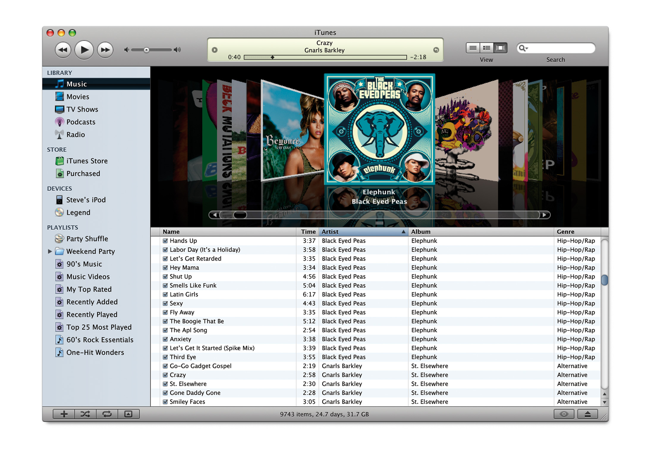
In its heyday, iTunes was often a bit of a UI playground for Apple. Some features never made it out of the application — like vertical window controls — while others took flight across the ecosystem.
Cover Flow Eats the World
Cover Flow’s biggest moment came in January 2007, when Steve Jobs introduced the original iPhone. (You can jump right to the iPod section with this link.) When the user rotated their device into landscape orientation, the Music app would show all of the library’s albums in Cover Flow, and scrolling through them was as easy as the swipe of a finger. Tapping the center album would reveal a track list:
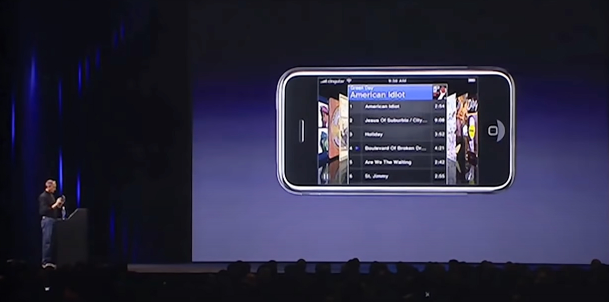
In the fall of 2007, Apple revised its entire iPod line, bringing Cover Flow to the iPod classic, third-generation iPod nano and the iPod touch. The latter worked just like the iPhone, while the traditional iPods used the click wheel to move back and forth in Cover Flow.

On the Mac side of things, Leopard brought Cover Flow to Finder. This iteration allowed users to see a list of files and folders and a nicely-sized preview at the same time.
Here’s a bit from the press release:
Scheduled to ship in October, Leopard introduces over 300 new features, including a new Desktop and Dock with Stacks, an intuitive new way to organize files; an updated Finder featuring Cover Flow and a new way to easily browse and share files between multiple Macs; Quick Look, a new way to rapidly preview most files without opening an application; Time Machine, a new way to easily and automatically back up and restore lost files or a complete Mac; Spaces, a powerful new feature to create groups of applications and instantly switch between them; and enhanced iChat and Mail applications, which easily allow users to communicate even more creatively.
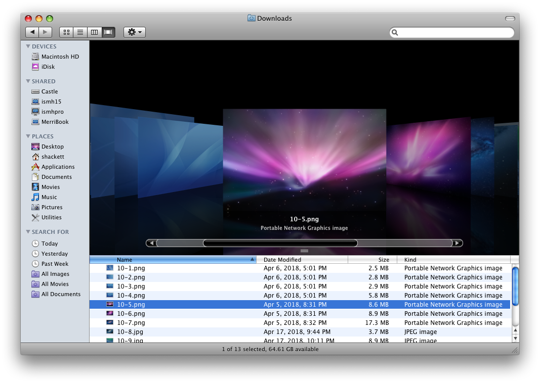
Two years later, in 2009, Safari 4 launched with many new features, including our old friend:
Safari 4 makes browsing more intuitive and enjoyable with innovative features, such as Top Sites, Full History Search and Cover Flow, and support for modern web standards like HTML 5 and advanced CSS Effects.
“The successful beta release helped us fine tune Safari 4 into an even better, faster version that customers are going to love,” said Philip Schiller, Apple’s senior vice president of Worldwide Product Marketing. “Safari is enjoyed by 70 million users worldwide and with its blazing fast speed, innovative features and support for modern web standards, it’s the best browser on any platform.”
That beta included Safari 4’s infamous “Tabs on Top” design, but that’s a story for a different time.
Safari’s version of Cover Flow impressed Jim Dalrymple, who wrote about the feature for Macworld:
I visit a lot of Web sites a day, doing research for stories as well as visiting some of my favorite music sites. Sure, I could use the old way of viewing my history as a list, but it’s not nearly as efficient or accurate as this Cover Flow view.
For example, when I’m researching a story, I often come across obscure references to my topic. Unfortunately, I don’t always bookmark those pages for reference. The end result is that they are lost in the mire of Web links in my browser history. It gets even worse if you factor in a few days’ worth of browsing to wade through.
Having an enhanced search via Cover Flow gives me a way to narrow down my search and then scroll through windows with a thumbnail of the Web site. Even if I don’t recognize the Web link in the list, I’ll more often than not recognize what the site looked like with the Cover Flow thumbnail.
Cover Flow on its own probably wouldn’t be that useful in a Web browser. However, just like in iTunes, having the combination of Cover Flow and the search functionality makes finding things much faster. Ultimately, that makes my experience using the software better.
Like transparent plastic years earlier, Cover Flow popped up in various places around the world beyond Apple’s own products, like in some VW models.
A Slow Fade Into History
Cover Flow’s heavy use of animation and reflections were never going to be a good fit in the great flattening that took across Apple’s design work in the mid 2010s.
Up first was iTunes’ version of Cover Flow, which was removed with version 11 in 2012.
The next year, iOS 7 dropped Cover Flow from the music app, replacing it with an interface of tiled album artwork.
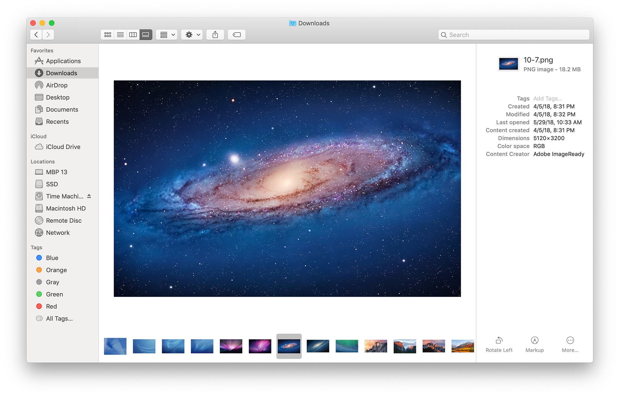
The final blow came with macOS Mojave in 2018, which swapped out Cover Flow for a new Gallery view:
My Take
Even though it took many different forms over the years, Cover Flow never really clicked for me. I often value efficiency over visual flair when it comes to how I like to work, and Cover Flow didn’t offer me enough to switch away from more traditional views of my music, files or Safari history.
However, Cover Flow still holds a special place in my heart. I get the sense that Steve Jobs loved it, and that counts for something.
-
Over the years, there were a handful of lawsuits over Cover Flow, none of which I’m going to cover here, as they would mess up the flow of this article. ↩︎
Twitter Wasn’t Worth the Effort ⇢
Gabe Bullard at Nieman Reports, reporting an internal memo from NPR, which left Twitter back in April:
Six months later, we can see that the effects of leaving Twitter have been negligible. A memo circulated to NPR staff says traffic has dropped by only a single percentage point as a result of leaving Twitter, now officially renamed X, though traffic from the platform was small already and accounted for just under two percent of traffic before the posting stopped. (NPR declined an interview request but shared the memo and other information). While NPR’s main account had 8.7 million followers and the politics account had just under three million, “the platform’s algorithm updates made it increasingly challenging to reach active users; you often saw a near-immediate drop-off in engagement after tweeting and users rarely left the platform,” the memo says.
There’s one view of these numbers that confirms what many of us in news have long suspected — that Twitter wasn’t worth the effort, at least in terms of traffic.
I can confidently say that leaving the platform has not been the disaster I once feared it would be for Relay FM or 512 Pixels. The core Apple community landed on Mastodon, while the rest of the world is slowly moving to Threads.
The lesson to learn here is that when those two platforms implode — and at some point they will — everything will be okay then, too.
The Story of a 22-Year-Old Firefox Bug ⇢
Kevin Purdy, writing at Ars Technica about a fun Firefox story:
Back in June 2002, Ubuntu founder Mark Shuttleworth was experiencing space for the first time, the Department of Justice’s antitrust case against Microsoft was reaching its final arguments, and Adam Price, using what was then called Mozilla on a Mac, had an issue with persistent tooltips.
“If I mouseover a toolbar link, and wait for a second, a little yellow box with the description of the link appears. If I now use command-tab to move Mozilla to the background, the little yellow box stays there, in the foreground. The only way to get rid of it is to put mozilla in the foreground again, and move the mouse off the toolbar,” Price wrote on June 2. There were a few other bugs related to this issue, but Price set down a reproducible issue, confirmed by many others in the weeks to come—and months to come, years to come, and more than two decades to come.
This bug remained in place until a month ago, when a 23-year-old named Yifan Zhu patched it.
Connected #471: Nightcore Titanium ⇢
It’s October, and Myke brings two mysteries to the show to enhance the spooky vibes. In other news, Federico is slipping into the future with the XREAL Air glasses and Stephen is keeping an eye on Spotify.
On Connected Pro, beach and environmental reports were heard. Connected Pro is the longer, ad-free version of the show and it’s pretty great.
Kbase Article of the Week: Mac Computer Status Indicator Light Behavior ⇢
The status indicator light (SIL) on Mac mini, Mac Studio, and Mac Pro has different patterns based on the state of your Mac. These patterns also occur on some earlier MacBook, MacBook Pro, MacBook Air, and iMac models, though not all Macs have a SIL. If you have a Mac Pro, learn about the status indicator light behavior on Mac Pro (2023) or Mac Pro (2019).
I still wish Macs would show a pulsing LED when asleep. Even the machines listed in this document just show a solid LED when running and sleeping. I miss that little touch of useful whimsy.
Sponsor: TextExpander ⇢
TextExpander’s customizable and shareable snippets of text allow your team to fly through repetitive tasks quickly by expanding the things you type regularly — all you have to do is type a short abbreviation and TextExpander does the rest of the work for you.
Here’s How It Works:
- Create It: Collect your most commonly used emails, phrases, messaging, URLs, and more to create snippets and templates in TextExpander that are always accessible with a quick search or abbreviation.
- Share It: Give your team or different departments across your company access to the content they need to use every day.
- Use It: Expand the content you need with just a few keystrokes on any device, across any app you use — no APIs or integrations needed.
- Optimize It: Add customizations like fill-ins and optional sections to keep that human touch. Anytime you make changes to snippets they update everywhere so your team is always on the same page.
It’s that easy!
Check out TextExpander and say goodbye to repetitive typing.
$775,375.54
We just closed down Relay’s annual St. Jude campaign, at an all-time high of $775,375.54. That puts our total over the lifetime of the campaign at $2.98 million.
I’ve said for a long time that Relay has the best community on the Internet, and each September, y’all prove it.
Thank you.
How Sonoma’s Web Apps Work ⇢
Howard Oakley, writing at The Eclectic Light Company:
Safari’s new Web Apps in macOS Sonoma are a convenient way of gaining ready access to your most-used websites in the Dock. They’re deceptively simple to make, and apparently work without all the fuss and overhead of Safari itself.
I love the details behind this feature.
The Six Colors iPhone 15 Pro Review ⇢
Jason Snell, writing on Six Colors:
iPhone designs change at a glacial pace. It’s rare that a new iPhone looks completely unlike the previous model. They’ve all looked more or less the same since the iPhone X ditched the home button back in 2017. Careful observation indicates that the iPhone 15 Pro design is different from the iPhone 14 Pro, which is different from the iPhone 13 Pro—but the external differences are extremely subtle.
This is okay. The iPhone is clearly on a multi-decade trajectory toward becoming a thin, featureless slab of glass. In the meantime, Apple keeps varying materials and colors and upgrading the processors and cameras in order to ensure that people buying a new iPhone will find it at least somewhat different from the ones in their pockets.
It may not be logical, but it’s absolutely true that after spending around $1000 on a new phone, I don’t want it to be exactly like the one it’s replacing. What’s the fun in that?
I always look forward to Jason writing about new iPhones, and I really enjoyed this review and the consumer advice at the end of it.
In a CEO Popularity Contest, Tim Cook Does Well ⇢
X CEO Linda Yaccarino’s rating is shockingly bad.
Connected #470: Senior Vice President of Worldwide Nibbing ⇢
Stephen puts his Mac collection on the line for the kids, Myke has things to say about tvOS 17 and Federico asks the guys which Apple executive they would like to take over for… via an unusual method.
On Connected Pro, I talked about my recent project to put a MagSafe charger in my truck.