The Blue Screen of Death (BSOD) has held strong in Windows for nearly 40 years, but that’s about to change. Microsoft revealed earlier this year that it was overhauling its BSOD error message in Windows 11, and the company has now confirmed that it will soon be known as the Black Screen of Death. The new design drops the traditional blue color, frowning face, and QR code in favor of a simplified black screen.
The simplified BSOD looks a lot more like the black screen you’d see during a Windows update. But it will list the stop code and faulty system driver that you wouldn’t always see during a crash dump. IT admins shouldn’t need to pull crash dumps off PCs and analyze them with tools like WinDbg just to find out what could be causing issues.
His post includes an example of the new Black Screen of Death:
For years, Apple has used a beige CRT with a Blue Screen of Death on it to show “generic PCs” on the user’s local network:
This week on the podcast: Federico has been experimenting with KVMs, I have been fixing macOS between dreams, and Myke finally experienced iOS 26. After those conversations, we turned to a list of questions from listeners about WWDC, Apple’s app strategy, and more.
On Connected Pro, we had Federico judge some American “pizza” and then discussed Apple’s sending of promotional notifications. Connected Pro is the longer, ad-free version of the show for just $7/month.
After months of reporting and community concern, the city of Memphis has released its findings of air quality testing that took place near xAI’s two data centers. The PDF of those results can be seen here, and for more, we turn to Samuel Hardiman:
The city tested at Macedonia Missionary Baptist in Boxtown, which is near xAI’s first Memphis data center; The Links at Whitehaven, located near xAI’s second Memphis data center, and City Hall. Both xAI facilities as well as the nearby locations tested are also close to the Tennessee Valley Authority’s natural gas plants, which also emit pollutants.
There are no air-monitoring stations anywhere near either xAI facility, so it is not clear how air-quality levels have changed in time and what the levels of chemicals were before xAI arrived in Memphis. The results are for just two days: June 13 and 16.
The testing was conducted by an independent, accredited laboratory and targeted key pollutants known to impact public health, including benzene, toluene, formaldehyde, nitrogen dioxide, sulfur dioxide, carbon monoxide, and particulate matter.
The findings were definitive and reassuring.
At every site and for every pollutant tested, levels were either too low to detect or well below established safety thresholds. Only one sample – formaldehyde at City Hall on June 13 – slightly exceeded the lab’s Limit of Quantitation (LOQ), yet even that result remained far beneath any level of health concern.
City officials emphasized that while this initial data provides important insight, it represents only a snapshot in time. Continued monitoring is planned, and future results will be made publicly available.
(Emphasized text quoted as it appears in the original post.)
This testing was clearly limited in scope, but is encouraging. In a statement released to press outlets — including 512 Pixels — xAI said:
xAI welcomes the independent third-party data showing no dangerous pollutant levels at test sites near our Memphis data center. We have built a world-class data center in Memphis and we couldn’t have done it without the support of the local community and its leaders.
The Southern Environmental Law Center, which is preparing to sue xAI, pushed back on the results, according to Hardiman:
Not everyone welcomed the results. SELC said the city’s release of the results was misleading and failed to take into account some smog-causing chemicals the city tested in nearly enclosed spaces and didn’t take wind into account.
“The city’s flawed air quality analysis creates a misleading narrative that serves as a distraction from the air pollution problems that Memphians face every day,” SELC’s Patrick Anderson said in a statement.
I hope that the city — and other groups — continue to test air quality around all of the data centers that are springing up around the “Digital Delta.” This will continue to be an important issue, especially once xAI’s massive second site comes online.
I’m going to strongly disagree here. The Tahoe beta 2 Finder icon is slightly better, but seeing it this way makes it obvious that the problem with the Tahoe Finder icon isn’t whether it’s dark/light or light/dark from left to right. It’s that with this Tahoe design it’s not 50/50. It’s the appliqué — the right side (the face in profile) looks like something stuck on top of a blue face tile. That’s not the Finder logo.
The Finder logo is the Mac logo. The Macintosh is the platform that held Apple together when, by all rights, the company should have fallen apart. It’s a great logo, period, and the second-most-important logo Apple owns, after the Apple logo itself.
Reading through the articles (and the replies to those articles) about Beta 2’s icon, I realize I may be in the minority in liking the current icon:
I see what John and others are saying, though: Beta 2’s icon does break the meaning of the Finder icon. My assumption from the start of all of this is that Apple wasn’t going to go back to previous look with the lighter color going all the way to the edges of the icon, so I had written that off as a possibility.
If Apple does want to align the new new Finder icon with its history even more, they should mimic Michael Flarup’s design that John linked to:
I don’t know if Apple is going to revise Tahoe’s Finder icon again. I would happy if they do, but I am also okay if they don’t. The appliqué design fits pretty well with what Apple is doing with Liquid Glass, and the colors being on the correct side was the biggest sin of the original Tahoe design.
“Mac OS X will delight consumers with its simplicity and amaze professionals with its power,” said Steve Jobs, Apple’s iCEO. “Apple’s innovation is leading the way in personal computer operating systems once again.”
The new technology Aqua, created by Apple, is a major advancement in personal computer user interfaces. Aqua features the “Dock” — a revolutionary new way to organize everything from applications and documents to web sites and streaming video. Aqua also features a completely new Finder which dramatically simplifies the storing, organizing and retrieving of files—and unifies these functions on the host computer and across local area networks and the Internet. Aqua offers a stunning new visual appearance, with luminous and semi-transparent elements such as buttons, scroll bars and windows, and features fluid animation to enhance the user’s experience. Aqua is a major advancement in personal computer user interfaces, from the same company that started it all in 1984 with the original Macintosh.
On the page for the OS X Public Beta, Apple wrote:
The Aqua interface brings your Mac to life with color, depth, translucence and fluid motion — and keeps you on top of things with continuous visual feedback.
Here are a couple of Apple’s press images from the release of Mac OS X:
By the time OS X actually shipped a year after Aqua’s introduction, Apple had made some changes to the interface, including an updated Dock.
Liquid Glass feels like it harkens back to this era, but it is amazing how well Aqua has held up over time. The overall structure of OS X’s user interface is basically intact today, some two and a half decades later. The Dock, menu bar, and the various views in Finder are all still here today. They have evolved over the last 25 years, but not as much as you might have thought they would back in 2000.
Beyond the sheer consistency of the Mac’s interface, what really struck me about this video is how relatable it all feels. Steve Jobs is clearly proud of the work his team had done, but his comments are about how their work was going to make users’ lives better. They took what was great about the Mac’s previous interface and married it with what was great about OPENSTEP, all with a new look and feel. There was a reason for everything, even it was just because something was cool.
Jobs was at his best in these moments, and while I like a lot about Liquid Glass, it’s hard to argue that its introduction holds a candle to Aqua’s.
In this video, Alan Dye explains a lot about how the new design works, but is light on the why. I think part of it is the pace. The video is less than four a half minutes long. Nothing has any room to breathe, and at no point does Dye show any emotion about the work.
This all makes me miss live keynotes. I know Apple likes the control it has over pre-recorded introductions, but its announcements deserve live demos, off-the-cuff remarks, and the humanity that was once more prevalent at things like WWDC or iPhone introductions.
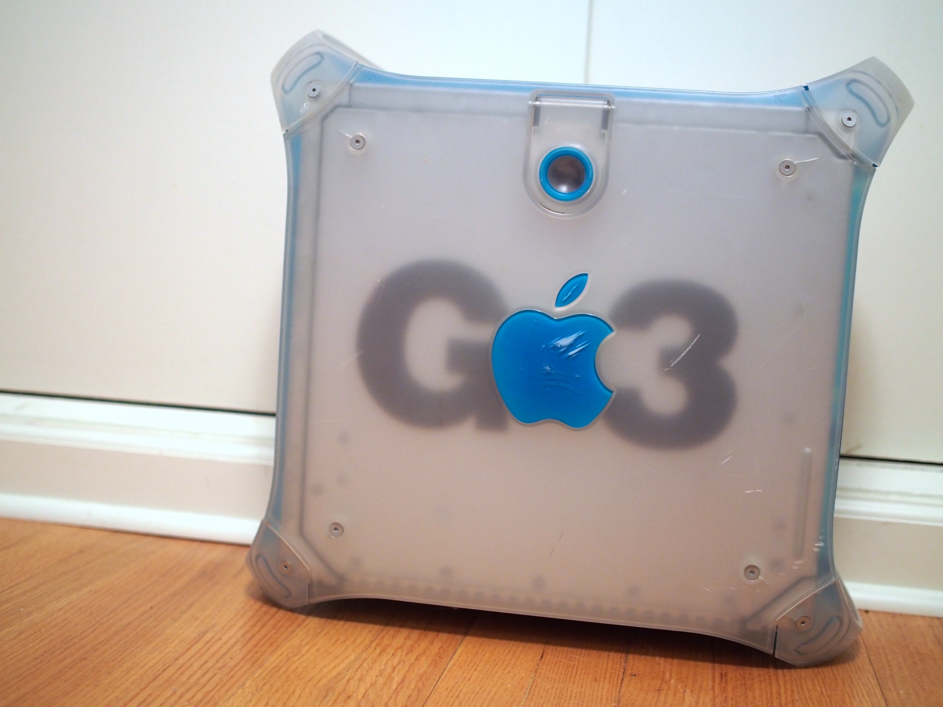
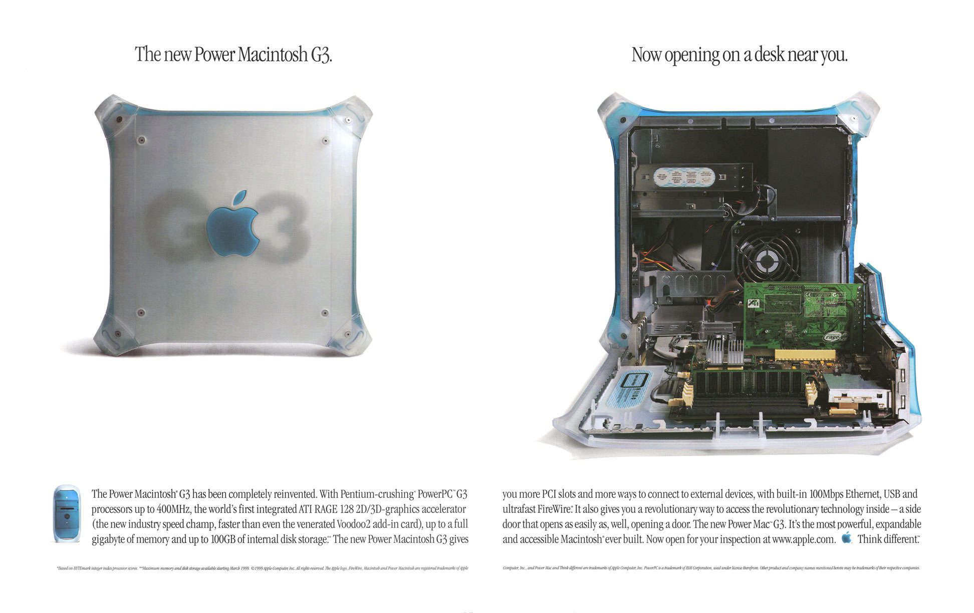
I was recently poking around inside the original Power Macintosh G3’s ROM and accidentally discovered an easter egg that nobody has documented until now.
This story starts with me on a lazy Sunday using Hex Fiend in conjunction with Eric Harmon’s Mac ROM template (ROM Fiend) to look through the resources stored in the Power Mac G3’s ROM. This ROM was used in the beige desktop, minitower, and all-in-one G3 models from 1997 through 1999.
If you missed my previous post on the topic, the first version of Tahoe had the dark blue on the right side of the Finder icon, which was criminal.
Our 14-day national nightmare is over. As of Developer Beta 2, the Finder icon in macOS Tahoe has been updated to reflect 30 years of tradition:
Now, the background material is blue, with the face on the right side of the icon using a white glassy material. I think this looks pretty good:
I know some folks (cough, cough, John Siracusa, cough) want Apple to go even further and make the lighter color on the right extend all the way to the edges of the icon, which would look something like this very rough mockup I did in just a few minutes:
I can understand that, and the desire for the line between the two halves of the icon to be more rounded as it is in macOS Sequoia. However, Apple’s current Finder icon works well for me, and it fits in nicely with the rest of the Dock1 on my Tahoe test machine:
Apple heard my feedback as it echoed around the Apple world and acted upon it, and I’m thankful for that. I’m going to count this as a win for the Mac, for blogging, and for myself personally. That original blog post is the most-read thing on 512 Pixels in years. It clearly hit a nerve with a lot of folks, including people inside Apple.
Mission accomplished.
Poor Chrome and Notion, stuck in Squircle Jail. That’s still pretty rough. ↩︎
A January report fromNOLA.com said that the the state had rewritten zoning laws, promised to change a law so that it no longer had to put state property up for public bidding, and rewrote what was supposed to be a tax incentive for broadband internet meant to bridge the digital divide so that it was only an incentive for data centers, all with the goal of luring in Meta.
But Entergy Louisiana’s residential customers, who live in one of the poorest regions of the state, will see their utility bills increase to pay for Meta’s energy infrastructure, according to Entergy’s application. Entergy estimates that amount will be small and will only cover a transmission line, but advocates for energy affordability say the costs could balloon depending on whether Meta agrees to finish paying for its three gas plants 15 years from now. The short-term rate increases will be debated in a public hearing before state regulators that has not yet been scheduled.
The Alliance for Affordable Energy called it a “black hole of energy use,” and said “to give perspective on how much electricity the Meta project will use: Meta’s energy needs are roughly 2.3x the power needs of Orleans Parish … it’s like building the power impact of a large city overnight in the middle of nowhere.”
As an efficient, high performance and native Safari ad blocker, Magic Lasso blocks all intrusive ads, trackers and annoyances – delivering a faster, cleaner and more secure web browsing experience.
Magic Lasso Adblock is easy to setup, doubles the speed at which Safari loads and also blocks all YouTube ads; including all:
video ads
pop up banner ads
search ads
plus many more
With over 5,000 five star reviews; it’s simply the best ad blocker for your iPhone, iPad and Mac.
And unlike some other ad blockers, Magic Lasso Adblock respects your privacy, doesn’t accept payment from advertisers and is 100% supported by its community of users.
Stephen leads David through the maze of Ubiquiti’s Unifi networking offerings. The company offers a wide range of equipment for home and business users, including routers, switches, access points, cameras, and more, but it can be confusing to navigate.