It’s fall again, so it is time to consider yet another new version of macOS. This year, it is macOS Catalina, named for a small island off the coast of California.
Apple has pretty much dropped version numbers from its marketing materials, but Catalina is macOS version 10.15, the 16th major release since Mac OS X 10.0 Cheetah shipped way back in March 2001.
Like Mojave before it, Catalina support both Light and Dark Modes, but Apple has added an “Auto” appearance that changes the desktop wallpaper, mode and Night Shift white balance as the day progresses. There are actually eight variants of the default wallpaper, which you can see here.
To see a lot more of macOS Catalina, be sure to check out its page in my Aqua Screenshot Library. Over on Mac Power Users, David and I have published a bonus episode all about Catalina, so be sure to check that out, too.
Catalina is an important version of macOS, both in what it adds, but also in what it leaves behind.
Before we get to that, let’s knock out some of the basics. Like the past several versions of macOS, it’s available for free in the Mac App Store. It supports the following machines:
- MacBook (Early 2015 or later)
- MacBook Air (Mid 2012 or later)
- MacBook Pro (Mid 2012 or later)
- Mac mini (Late 2012 or later)
- iMac (Late 2012 or later)
- iMac Pro (2017)
- Mac Pro (Late 2013 or later)
This list is the same as Mojave’s, with the exception of the 2010 and 2012 Mac Pros. Farewell, old Cheese Graters; long live the new Cheese Grater.
For the past several releases of macOS, it was generally okay to just hit the upgrade button and jump in without much homework,1 but with Catalina, upgrading may mean serious disruptions to your workflow.
The Death of 32-bit Apps
Let’s just get this over with.
Catalina is the end of the road for all 32-bit applications and frameworks on the Mac.
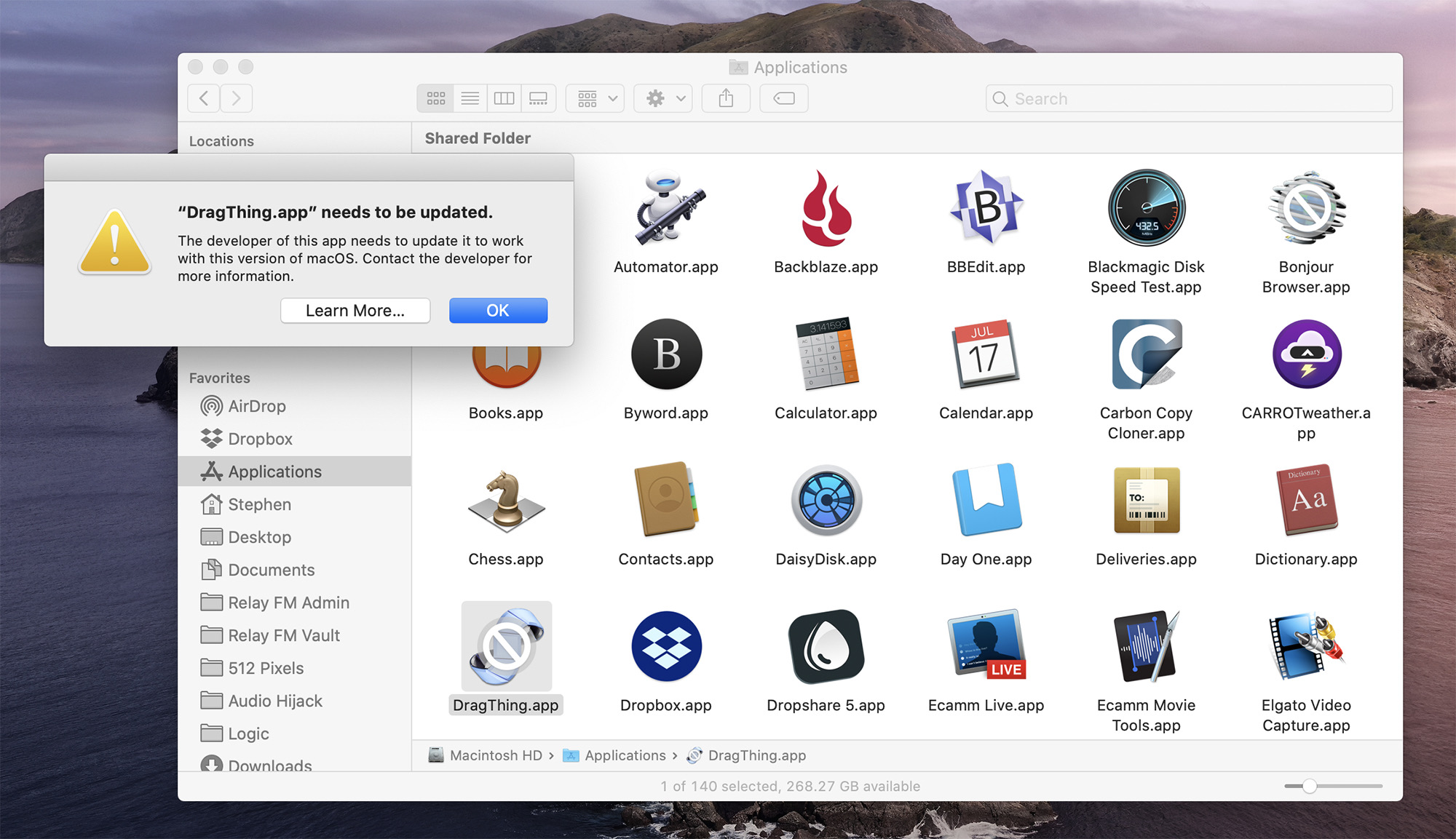
Stop reading this and go download Go64, a free app that will show you how many 32-bit apps are on your system. If you’re like me, you’ll be surprised how many may be hanging out in your Applications folder.
(I’m looking at you, Adobe…)
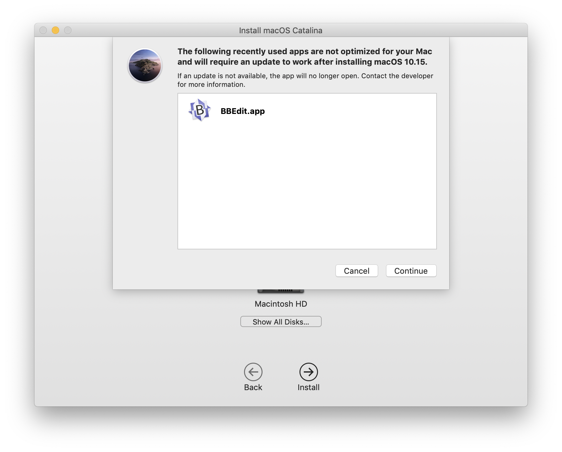
Thankfully, the Catalina installer will warn of you apps that will not be compatible before the upgrade process begins. Here, Catalina worries me about a years-old version of BBEdit:
The death of these applications is the final step in what has been a long road. As of High Sierra 10.13.4 in the spring of 2018, macOS has been warning users when launching 32-bit apps:
Apple began the transition to 64-bit hardware and software technology for Mac over a decade ago, and is working with developers to transition their apps to 64-bit. At our Worldwide Developers Conference in 2018, Apple informed developers that macOS Mojave is the last version of macOS to run 32-bit apps.
While developers optimize their apps for 64-bit compatibility, Apple is notifying customers when they are using an app based on 32-bit technology. This is done via a one-time alert that appears when you launch a 32-bit app. In macOS Mojave, this alert appears once every 30 days when launching the app.
This all started ages ago. The PowerMac G5 was Apple’s first 64-bit system, and the company starting adding 64-bit support in Mac OS X Panther. In Tiger, things got more serious, as John Siracusa wrote in his review at the time:2
Panther introduced rudimentary 64-bit support to Mac OS X. It expanded the virtual address space (in the kernel, anyway) to 64 bits and allowed the use of 64-bit registers and the instructions that manipulate them (i.e., 64-bit math). But processes other than the kernel still saw a 32-bit address space. A single process could work with more than 4GB of memory (remember, the Power Mac G5 can hold up to 8GB RAM), but doing so required the programmer to manually juggle several 32-bit-addressable chunks of memory at once.
Tiger takes Mac OS X another small step in the 64-bit direction by allowing any process to see a 64-bit address space. Such a process must use 64-bit pointers in its code, of course, and that means that any libraries it uses must also be compiled to use 64-bit pointers.
Over the years, more and more of the subsystems in OS X made the transition to 64-bit, including the Cocoa APIs underneath the OS and many Mac apps.
Carbon, however, never made the jump. The API that allowed developers to cross the chasm from the classic Mac OS to OS X never gained 64-bit support, despite it bring promised for Mac OS X Leopard. Here’s John Gruber on the subject, in a 2008 piece about Photoshop CS4 being 32-bit for the Mac, after going 64-bit for the PC:
64-bit Carbon wasn’t promised to be coming “sometime”, like with, say, resolution independence. It was promised for 10.5.0. And it existed — developer seeds of Leopard up through WWDC 2007 had in-progress 64-bit Carbon libraries, and Adobe engineers were developing against them. Several sources1 have confirmed to me that Adobe found out that Apple was dropping support for 64-bit Carbon at the same time everyone else outside Apple did: on the first day of WWDC 2007.
If Apple had shipped Leopard with the 64-bit Carbon support promised at WWDC 2006, Photoshop CS4 would run in 64-bit mode on the Mac.
The unfortunate coincidence is that WWDC 2006 — when 64-bit Carbon was announced — was right around the time when Adobe was hitting the home stretch on CS3 and planning for CS4. (Photoshop CS4 is currently in beta testing, and so the CS4 suite is probably slated to ship soon-ish.) If Apple had announced then that the only 64-bit path was going to be Cocoa, would it have made a difference? It probably wouldn’t have made a difference for CS4, given that it was only nine months, but it would have saved Adobe nine months of wasted time.
Adobe got the message, and two years later, Photoshop had been ported to Cocoa. Microsoft, Panic, Bare Bones and pretty much every other Mac development shop and indie dev has to do the same for their apps.
However, some developers have been unable — for whatever reason — to update their applications, and those programs that weren’t updated are now dead.3 This is in spite of the fact that Apple deprecated Carbon in 2012’s OS X Mountain Lion, putting the writing on the wall a long time ago.
So where does this leave general users? If you have something you absolutely rely on that isn’t 64-bit, you’re going to need to hang out on Mojave for the time being. If the developer isn’t going to be updating the application in question, at some point, you’re going to need to find an alternative.
I suspect many Mac users are going to be caught by surprise by this, sadly.
A Brave New World
Just as macOS is cutting its ties to the past, it is reaching into the future.
Apple’s vision for its products was laid out at WWDC 2019, where the company announced both Catalyst and Swift UI. Both are technologies designed to bring Apple’s various platforms closer together in meaningful — albeit drastically different — ways.
Catalyst
Catalyst — or “Mac Catalyst,” as Apple refers to it on its website — is a set of tools designed to allow developers to update their existing iPad apps for use on the Mac. Catalyst Macs app make use of the same frameworks and UI elements as traditional Cocoa Mac apps, despite being written for the iPad first.
To get this working, an iOS app must support drag and drop, multitasking and keyboard shortcuts on the iPad. Naturally, some iPadOS features like HealthKit and ARKit aren’t present on the Mac, but many general-purpose iPad apps and games can live at home on the Mac quite comfortably.
When building an iPad app for the Mac, developers who have met the above requirements will get these features for free:
- System Preferences
- Keyboard, trackpad, mouse, and Touch Bar input, including key focus and keyboard navigation
- Window management
- Rich text interaction, including copy and paste and contextual menus for editing
- File management
Meanwhile, these iOS features are automatically converted into their Mac-based cousins:
- Split view
- File browser access
- Activity view
- The form sheet
- Contextual actions
Some developers will probably be tempted to stop at this point, but to make an iPad app really feel native on macOS, additional time will be needed to polish them for an environment without a touchscreen present.4 Here’s a bit from the section of Apple’s Human Interface Guidelines that address this:
iOS and macOS each define design patterns and conventions for user interaction that are rooted in the different ways people use their devices. For example, iOS conventions such as swipe to delete, action sheet commands, and controls at the bottom of the screen are optimized for touch interactions on a handheld device. In a similar way, macOS conventions such as dedicated keys and keyboard shortcuts, menu commands, and controls at the top of the window are optimized for keyboard, mouse, and trackpad interactions and a separate display.
At this point, I have only played with a couple of beta apps built with Catalyst,5 and I think it may be some time before we see a meaningful number of iPad apps show up on the Mac. I am hoping a set of best practices form and developers get on board to build good Mac apps, not merely passable ports that feel only partially native.
For examples of both good and bad Catalyst apps, look no further than the ones Apple has shipped. Mojave’s Home app is still a joke on Catalina, while Podcasts is a far better example of what this technology can do. It’s just all over the map right now.
However good they end up being, Catalyst apps will grant the Mac user base access to apps that have been iOS only for years. For example, Twitter for Mac is expected to make a return, and I’m somewhat hopeful that Mac apps written in Electron may be replaced with native ones over time.
For Catalyst to succeed, Apple will need to do a few things.
Thankfully, Catalyst apps can be distributed outside of the Mac App Store, as long as they are notarized by Apple. More on that in a bit.
However, Apple needs to work to make Catalyst — and its developer documentation — more robust. In its current state, it’s less than ideal for games, for example:
Games with Catalyst:
You can’t launch fullscreen
You can’t capture mouse cursor/use mouse for camera movement
You can’t hide the mouse cursor
You can’t have keyboard controls/there are no keyup eventsAll of these are blockers that can be mitigated with undocumented AppKit API
— Steve Troughton-Smith (@stroughtonsmith) September 12, 2019
Catalyst apps can utilize AppKit to mitigate some of these issues, but the future of this technique is full of questions, especially if you want to go through the Mac App Store.
It’s unclear if Catalyst will be a success, or how developers should prioritize it in relation to SwiftUI. Apple has not done a good job explaining how it thinks about these things, and because there are so few first-party apps built with it, it’s hard to read the tea leaves here.
Whatever happens, it would be unfair to judge Catalyst based on the first apps out of the gate. I’m hopeful this will prove to be a shot in the arm for the Mac platform, but time will tell if that pans out. A lot of it depends on how much work developers put into these programs; if most of the early examples are bad, it’s going to leave a bad taste in everyone’s mouths for a while.6 The ball is also in Apple’s court here, though. If this is the future of Mac development — even for just a few years — the company should come out and say it. If most Catalyst apps are bad, it’s partially the company’s fault.
SwiftUI & Combine
While Catalyst is a bridge to get iPad apps to the Mac, SwiftUI (and Combine, the SwiftUI framework) is the longterm play.
In short, an app written in SwiftUI can run natively on everything from the Apple Watch to the Mac Pro, and everything in between, including the iPhone, iPad and even Apple TV.7 SwiftUI and Combine will work to make your app fit the platform it happens to be running on, not bothering the developer with too many of the details.
This is a big deal, and it feels like Apple is going to be leaning into this hard over the next few years decade. I have no doubt that AppKit and UIKit still have years of relevancy left in them, but SwiftUI is the future the company wants.
It is not every day a company like Apple publishes a press release about its developer tools:
The vision for Swift has always been about making development faster, easier and more interactive, and a modern UI framework is a huge part of that vision. SwiftUI provides an extremely powerful and intuitive new user interface framework for building sophisticated app UIs. Using simple, easy-to-understand declarative code, developers can create stunning, full-featured user interfaces complete with smooth animations. SwiftUI saves developers time by providing a huge amount of automatic functionality including interface layout, Dark Mode, Accessibility, right-to-left language support and internationalization. SwiftUI apps run natively and are lightning fast. And because SwiftUI is the same API built into iOS, iPadOS, macOS, watchOS and tvOS, developers can more quickly and easily build rich, native apps across all Apple platforms.
SwiftUI isn’t going to change Apple’s ecosystem overnight, or even in the next several years, but eventually, most developers may opt to target multiple Apple platforms at once. At some point, projects will only dip back into AppKit for the Mac for special cases … until one day it is deprecated and fades away.
This may strike fear in the hearts of some old-school Mac folks, but the truth is that for the Mac to remain relevant it needs to be easy to write software for it … and not just for those who remember what NeXTSTEP was. Apple sees the current generation of iOS and Mac developers as the gateway to a generation of Apple developers in the future.
This, of course, is not a new idea. Microsoft, for example, has been in this space for some time with Universal Windows Programs:
Windows 10 introduces the Universal Windows Platform (UWP), which provides a common app platform on every device that runs Windows 10. The UWP core APIs are the same on all Windows devices. If your app only uses the core APIs, it will run on any Windows 10 device no matter whether you are targeting a desktop PC, Xbox, Mixed-reality headset, and so on.
Clearly, this sort of thinking is the future, and I think Apple can pull its platforms together while keeping what makes them all uniquely special present. I imagine Apple will be more successful at this than Microsoft has been, but check back in five or ten years, I suppose.
Security Changes
In addition to the massive big-picture shifts it brings, macOS Catalina comes with several security-focused changes. While iOS started life as a locked-down operating system, the Mac has a rich history of being extremely easy to tinker with for those who knew where to turn the screws. Over time, Apple has worked to make the Mac more secure, and this year those efforts are more noticeable than ever.
Data Access & Protection
When Windows Vista rolled out, users complained about its aggressive User Account Controls, which interrupted the flow of work in Windows with pop-ups when programs requested elevated permissions.
The new access system in Catalina isn’t as aggressive, but it will draw complaints as well.
In short, when an app requests access to any of these sources of information, you’re going to see a permissions panel:
- Desktop
- Documents
- Downloads
- iCloud Drive
- Folders of third-party cloud storage providers
- Removable media
- External volumes
Additional consent is requires by applications that want access to:
- Calendars
- Contacts
- Keyboard input
- Screen capture
Here, I installed Transmit on a clean Catalina install and was suddenly bombarded with requests:
![]()
![]()
![]()
I don’t blame Panic for this; Transmit by its very nature as an FTP client needs this access, but I think it’s a good example of what’s wrong with this feature. Users are going to tire of this system very quickly and click through without reading after the first several examples.
That doesn’t make anyone safer.
I have a couple of proposed solutions:
- Combine multiple requests into one pop-up. In the case of Transmit, I should see one warning showing every single thing the program is requesting.
- If a user’s account type is Standard, they should see these warnings, but those users logged in as Local Administrators should have a way to turn these off.
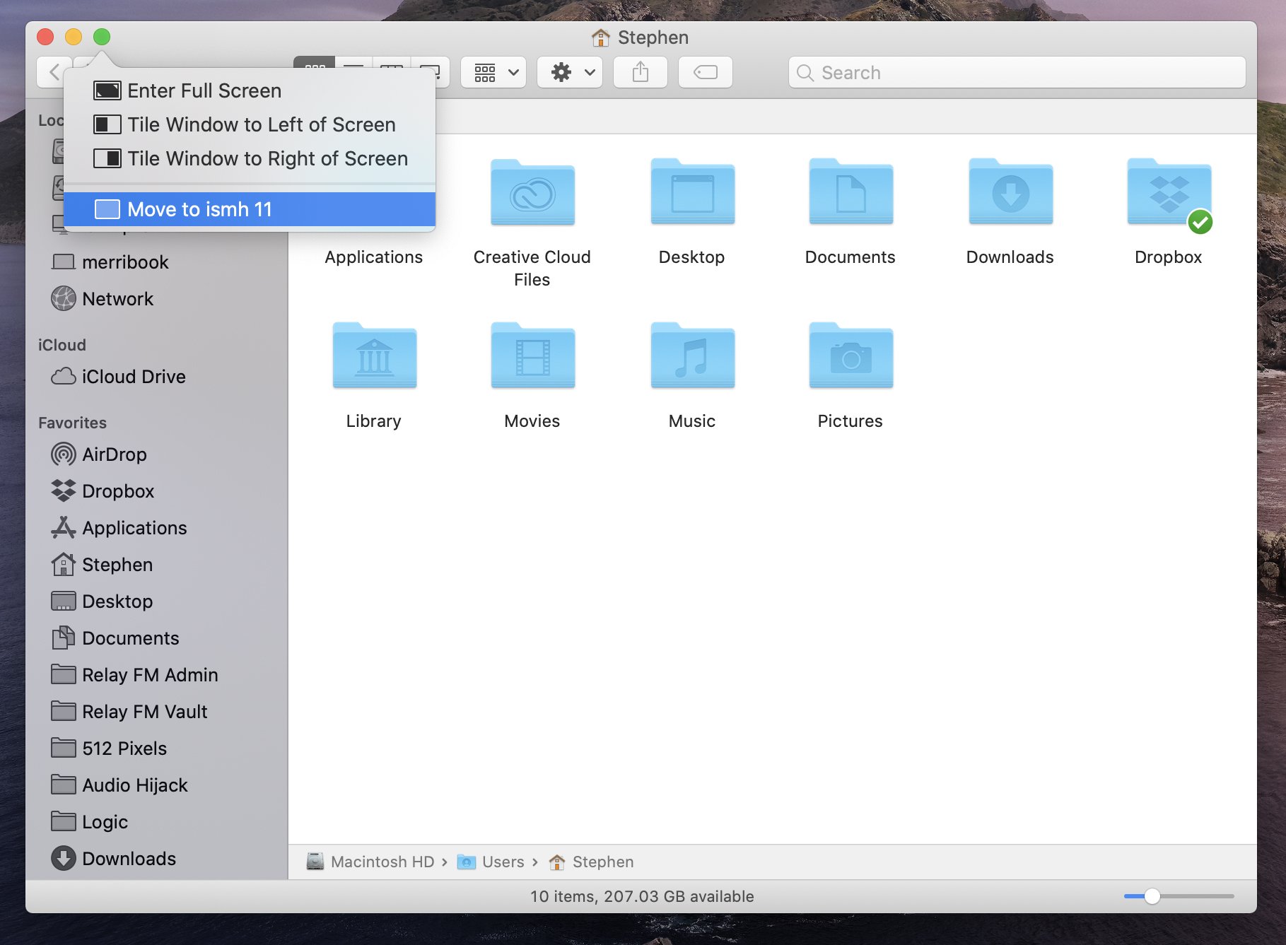
Dedicated System Volume
In Catalina, macOS itself is now on its own volume, separated from user data and third-party applications. Through the magic of APFS, it all appears as one volume, just as things always have, but opening Disk Utility tells the whole story:
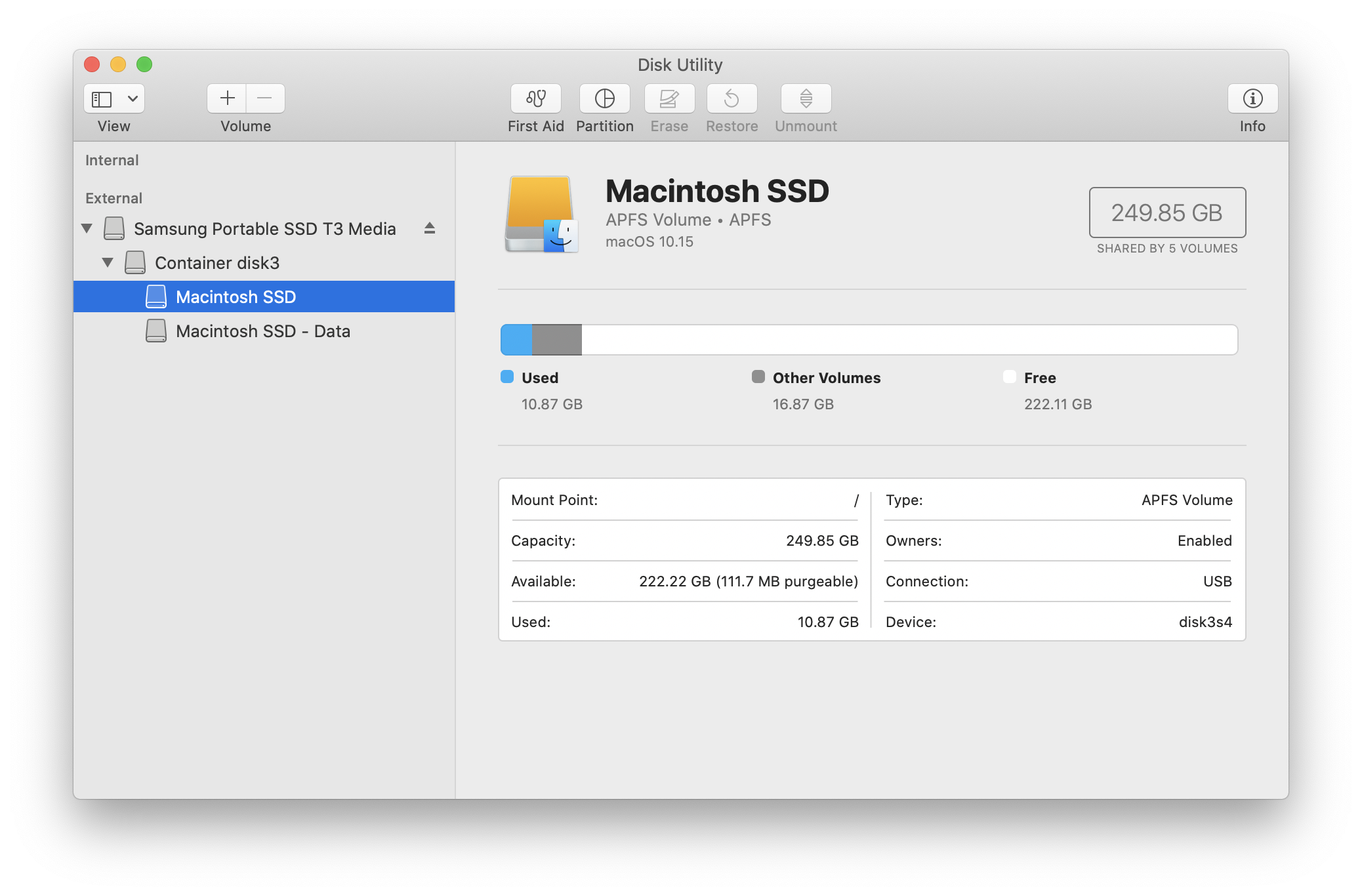
The system volume is read-only, so users cannot mess with macOS directly. This means that any third-party apps that worked by putting a file higher up than the user folder will need to be updated to support Catalina.8
In practice, I have no real issues with this change. It hardens macOS against outside attacks, and developers should be able to operate just within the user space. 9
DriverKit
Back in the day, Mac users would need to install kernel extensions for all sorts of things from external hardware device support to haxies that changed the look of the Aqua user interface, like ShapeShifter.
Apple has slowly clamped down on these sorts of things, and users have become more aware of the possible dangers associated with kernel extensions. Software running at this level has access to all sorts of things it probably doesn’t actually need, and bugs here can lead to system-wide issues.
Now, kernel extensions are being replaced entirely with DriverKit, which is a system for user space system extensions that act more like regularly-installed applications. This means checking with developers like VMWare or Parallels before upgrading to Catalina.
Notarization and GateKeeper
As mentioned above, Notarization is designed to let users feel more confident about programs on their Macs that may have been downloaded from outside of the Mac App Store:
Notarization gives users more confidence that the Developer ID-signed software you distribute has been checked by Apple for malicious components. Notarization is not App Review. The Apple notary service is an automated system that scans your software for malicious content, checks for code-signing issues, and returns the results to you quickly. If there are no issues, the notary service generates a ticket for you to staple to your software; the notary service also publishes that ticket online where Gatekeeper can find it.
Notarization will required by default for all software starting January 2020. To make this easier, Apple has a list of prerequisites on its developer website. If this isn’t for you, a trip to the Security Preferences Pane will make your Catalina install act like Mojave.
Gatekeeper has been around for a few years now, ensuring that downloaded software is safe to run the first time. In Catalina, Gatekeeper will periodically check download software on your system to ensure that nothing’s changed with their status.
Activation Lock
Lastly, we come to Activation Lock, lifted straight from the world of iOS devices. If your Mac has a T2 chip in it and it’s ever stolen, no one but you can get in and erase or reactivate it.
User Features
In addition to the above changes to the operating system itself, Catalina comes with several new system-level features that continue to make the Mac a better sibling to the iPhone and iPad.
Sidecar
The first example of this is Sidecar, which will allow you to mirror or extend your Mac’s display on an iPad or use the iPad like a traditional external display. Additionally, any window can be sent to the iPad’s display via a new contextual menu item available when hovering over the green stoplight button on any macOS window. Which is … weird. I don’t love this addition to the UI:
Once up and running, your iPad looks like a Retina Mac display, with some shortcuts and the Touch bar lining the edges:
(A trip to System Preferences will allow you to change where the sidebar and Touch Bar appear.)
Remember earlier when I wrote about touchscreen Macs? This feature complicates that conversation a bit. This is not adding touch access to macOS.
No actions are available with a single finger tap or swipe; tapping any UI elements requires the Apple Pencil, while two fingers are required for scrolling content like webpages, documents, etc.
The Pencil does pack some fun tricks, like swiping text for selection, but in short, the Apple Pencil acts like the mouse cursor on macOS, and scrolling on the iPad mimics how things work on trackpads.10
These gestures are weird to get used to in the context of working on an iPad, but they seem like they are this way due to the inherit limitations — and foundations — of macOS, an operating system born in a time of mice and trackpads, not touch screens. As such, some elements in macOS are comically small on an iPad, and are way too small to be hit with any sort of precision by a finger.
This leaves the Touch Bar in an interesting spot. Many see it as a hedge against touch screen Macs, and while its adoption in third-party apps can be hit or miss, Apple is including it in the Sidecar UI to surface quick actions within Mac apps. I didn’t expect to see the Touch Bar ever show up in a non-physical form, but it works in this context.11
I don’t know how widely-used Sidecar will become — even for me — but it does raise questions about the future of the Mac. When Microsoft started adding touch support to Windows, it was awkward at first, but over time, the company enlarged common UI elements to make them more finger-friendly. Sidecar shows that Apple will need to do similar work if we ever expect to see a MacBook Pro with Multi-Touch support.
Continuity Markup and Sketch
Markup has been part of iOS and macOS for a while now, giving users simple tools to quickly make notes, add signatures and edit files.
This year, the iPad and Apple Pencil can be used to Markup files on the Mac. Simply open the document in question in Preview, and drag the window onto the iPad and you’re off to the races.
I like this feature. It’s a lot fewer steps than putting a PDF or other file on Dropbox or iCloud Drive, just to open it in an iPadOS app to add a signature or make comments with the Pencil.
I could not get it to work in my testing, however … so there’s that.
Screen Time
Catalina brings the Mac into the fold of Screen Time, Apple’s suite of tools for monitoring and managing usage across your devices.
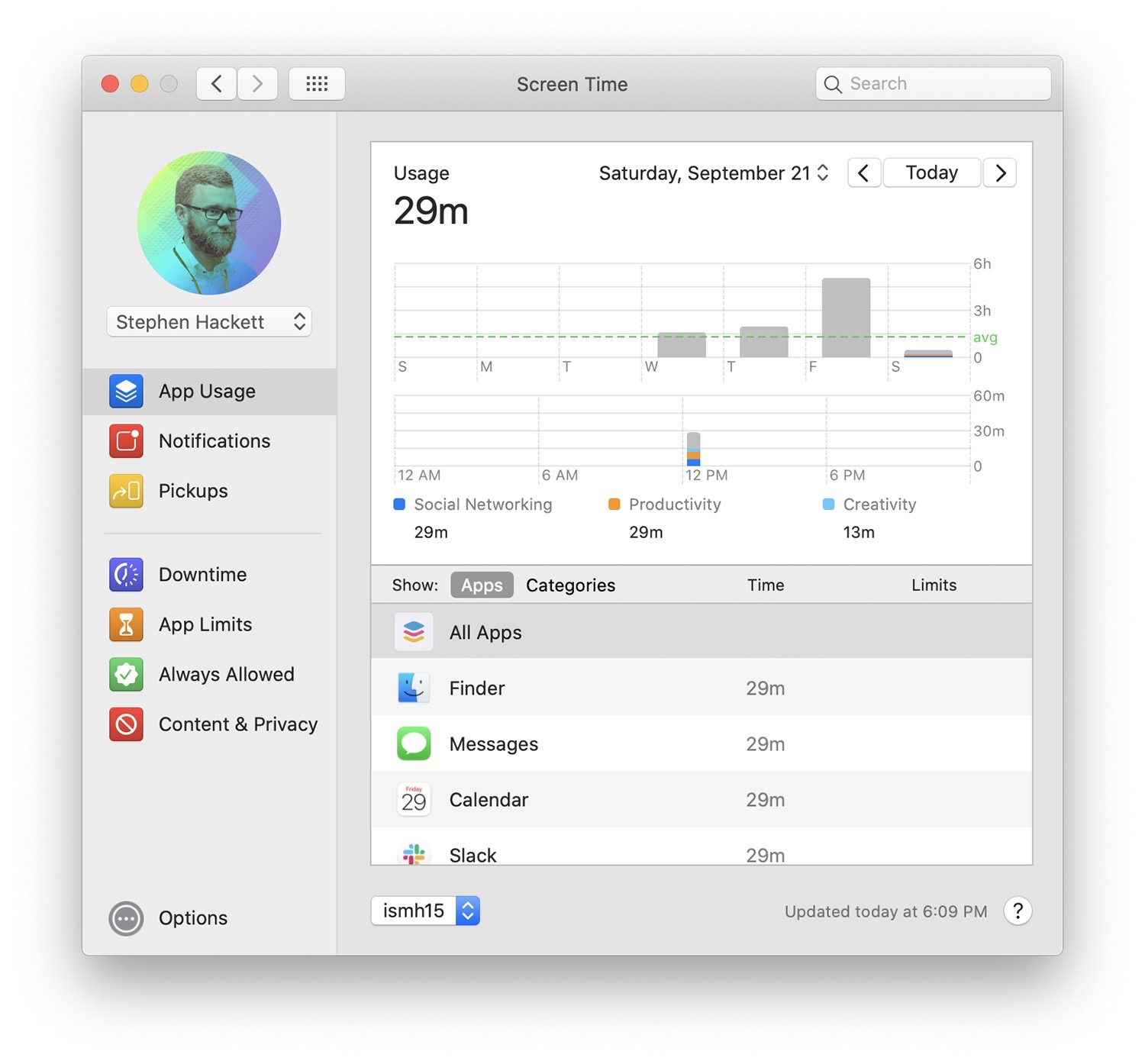
The Mac implementation looks very similar to what is on iOS, and comes complete with the Downtime, App Limits and Content & Privacy settings iPhone and iPad users have grown accustomed to since iOS 12 shipped last year.12
Screen Time on the Mac can share and blend data with your iOS devices, but in my testing of Catalina, that never worked consistently, but I expect that to improve now that Catalina and a couple of versions of iOS 13 have shipped.
I wish that Screen Time was smarter about counting time. It seems that the counter is running whenever an app is open — regardless of its in the foreground or not. If Tweetbot is hidden, my opinion is that my “Get off Twitter” App Limit shouldn’t be creeping ever closer.
I understand why all of this is built into System Preferences, but the inability to expand the window is frustrating. I kind of wish this had shipped as its own app with full-blown window support.
Voice Control
New to iOS 13 and Catalina, Voice Control is part dictation tool, part accessibility tool. I’ll just point you in Steven Aquino’s direction to learn more about this amazing technology:
The essence of Voice Control is this: you tell the computer what to do and it does it.
Apple describes Voice Control as a “breakthrough new feature that gives you full control of your devices with just your voice.” The possibilities for what you can do are virtually endless. Pretty much any task you might throw at your MacBook Air or iPad Pro, chances are good Voice Control will be able to handle it.
There is somewhat of a learning curve, insofar as you have to grasp what it can do and how you speak to it. By the same token, harnessing Voice Control is decidedly not like using a command line. The syntax has structure, but isn’t so rigid that it requires absolute precision. The truth is Voice Control is flexible; it is designed to be deeply customizable. And of course, emblematic of the Apple ecosystem, the fundamentals of Voice Control work the same way across iOS and macOS.
Drift, a New Screensaver
What’s not to love about this?
Drift is the default screensaver on clean Catalina installations, as it should be.
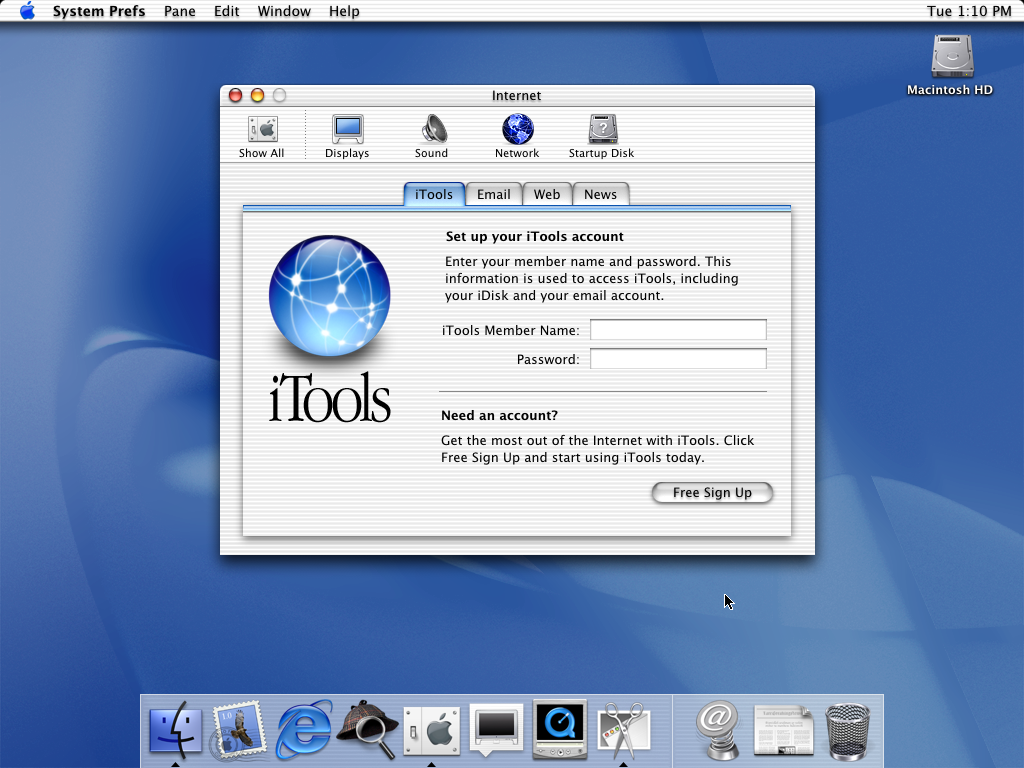
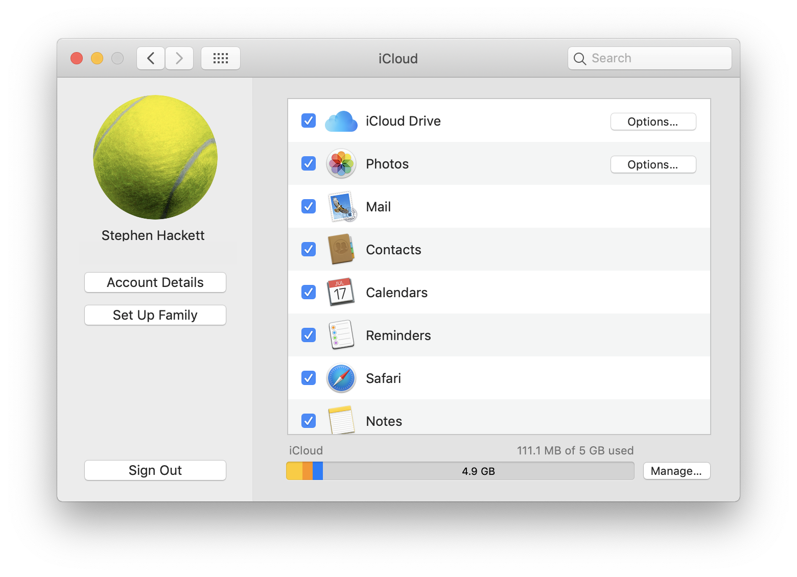
Revised iCloud Account Management
Like on iOS, iCloud account management now enjoys a prominent place at the top of Settings System Preferences. As you can see, iCloud and Family Sharing have been split up into two separate panes:
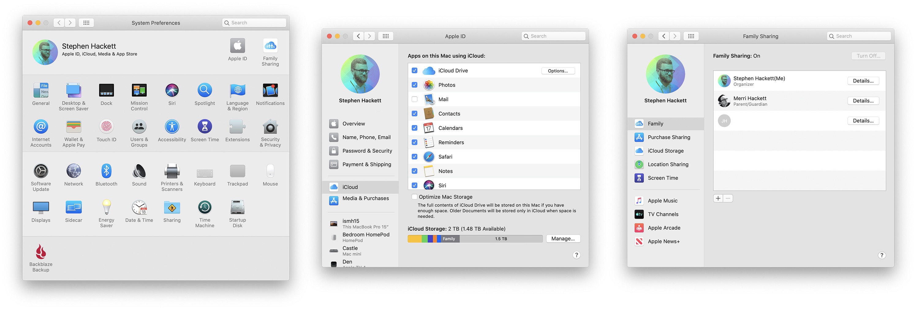
click to enlarge
The new panes are a vast improvement over the old one, which found its roots in the iTools days. I like the new design quite a lot.
The Ghost of iTunes
In addition to the death of every Carbon app ever, Catalina marks the end of iTunes.
The long history of iTunes is a story for another time, but needless to say that over its 18 year run, the app had transformed from a lightweight music player to a bloated media management nightmare.
As had been rumored for some time, Apple has finally broken iTunes down into several discrete apps. Out of the four new or re-branded apps in Catalina, three of them are here to take over parts of iTunes:
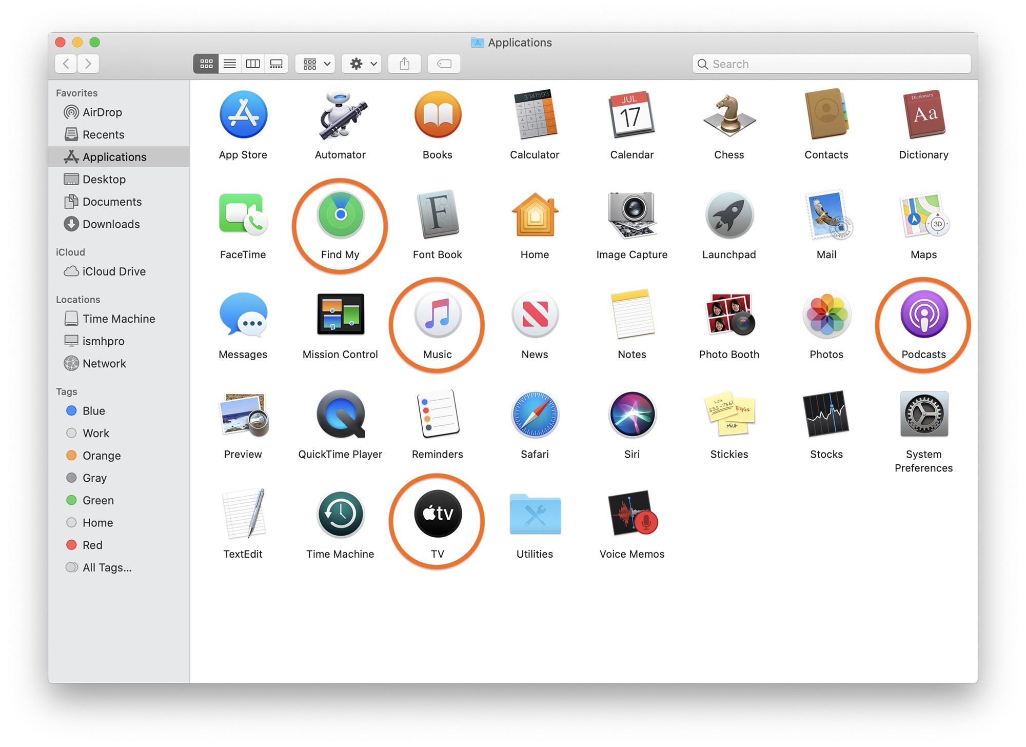
Music
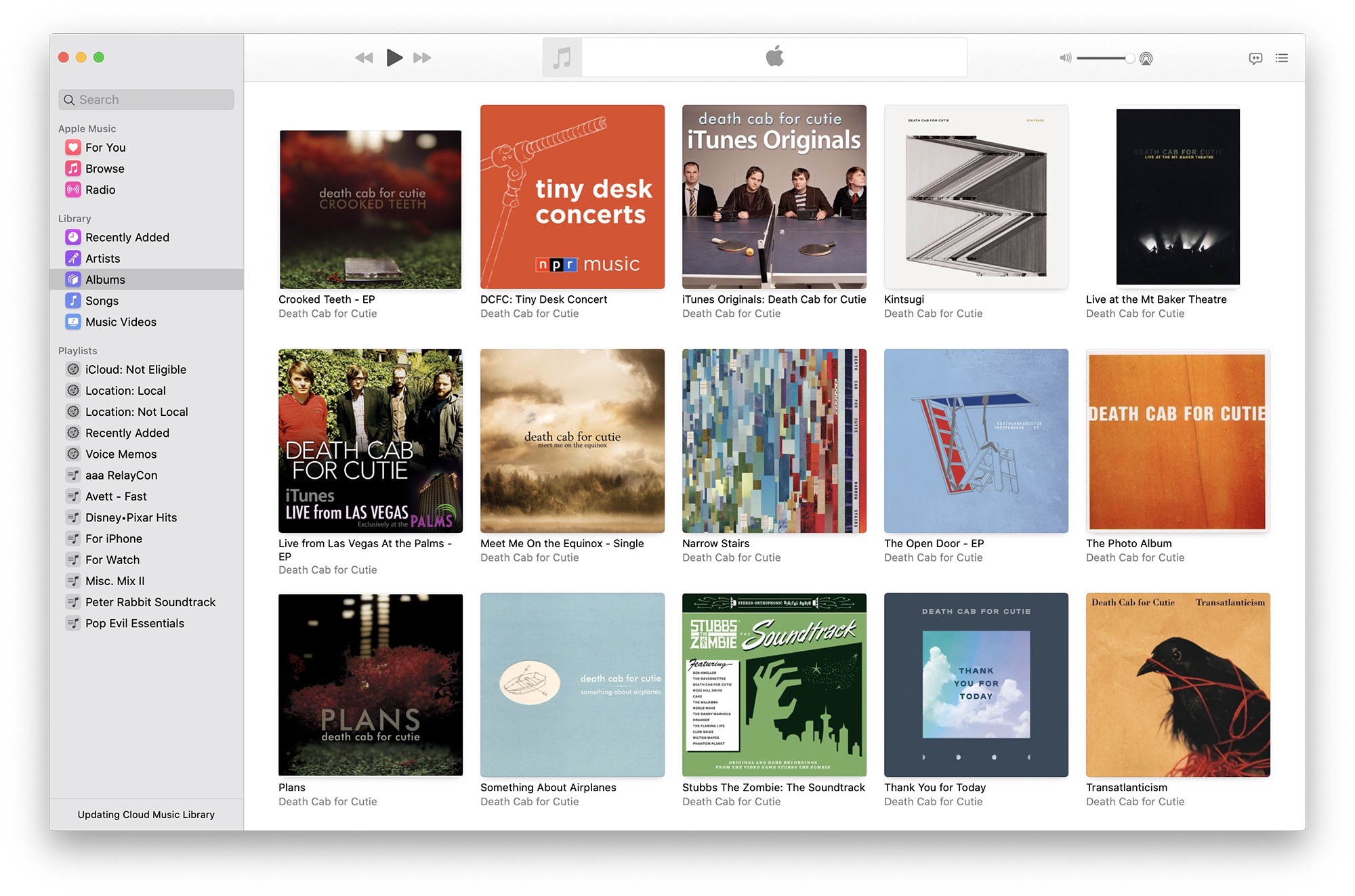
With the new Music app, Apple Music and your library finally feel like they are on equal footing. The streaming service’s For You, Browse and Radio sections are in-line with your library, and it’s easy to navigate between them, which was not the case in iTunes.
The app has a new design, with a crisp, modern feel, but there are still some issues as Jason Snell pointed out earlier this summer at Six Colors:
Music feels like a version of iTunes that’s been heavily influenced by Apple’s decisions on iOS. Up Next and Lyrics panes now slide out over the interface, obscuring what’s behind—essentially the inverse of the old drawer metaphor in the early days of Mac OS X. It’s a decision that makes sense if you’ve got a single-window interface, but I don’t use my Mac in full screen mode and I didn’t mind the popover approach that iTunes took with those windows. The deck chairs have been rearranged on the top-level play bar — Now Playing content is now aligned left, with controls moved to the center and volume to the right.
As someone who uses iTunes every day to listen to music, I’m disappointed to report that some features I use have failed to make the transition to Music. The venerable Column Browser in the Songs view, which was once the primary way users interacted with iTunes, seems to be gone. This isn’t great, because I liked having easy access to a list that let me focus down to a specific album or artist by typing a few letters. I also would often select an artist in the Column Browser, then select a few of their albums, and shuffle through them in a temporary, impromptu playlist.
Some of those features can be mirrored using different parts of the Music interface, but none are as fast or convenient.
I think for most users, Music is an improvement over iTunes, but power users of the old app may be frustrated by the new one at times.
Music is not a Catalyst app, despite looking very similar to the new Podcasts app. In fact, this is a phoenix from iTunes’ ashes. Don’t believe me? Just open its preferences window. I won’t ruin the surprise with a screenshot.13
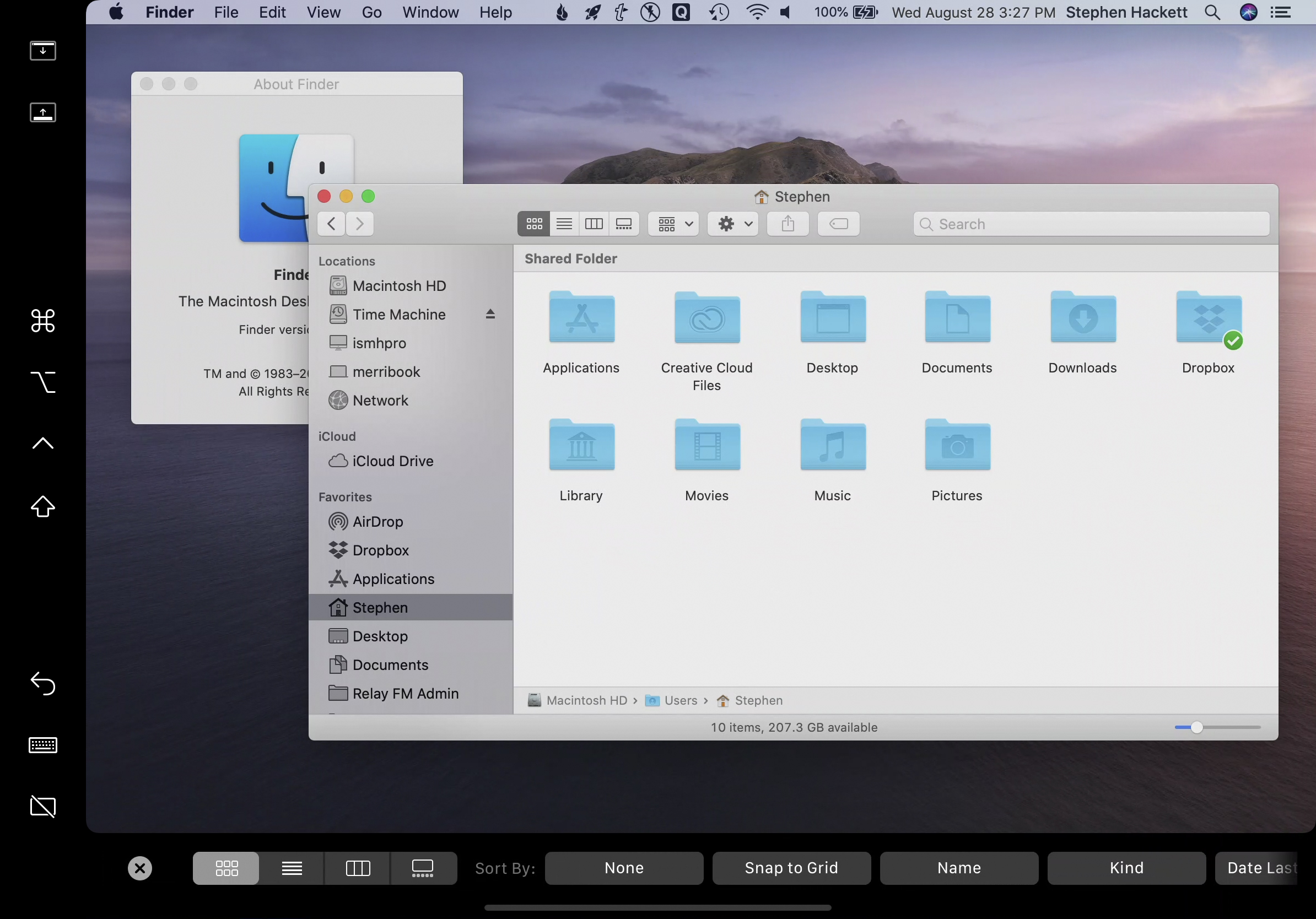
If you still need it, syncing with an iPod or iOS device is now handled by Finder:

Podcasts
Podcasts is a new Catalyst app on the Mac, and if you use the Apple Podcasts app on an iPad, this is going to be very familiar to you:
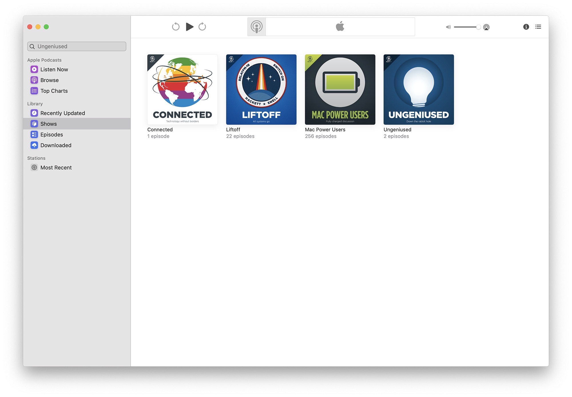
It all works pretty much exactly how you’d expect, and I’m excited to see this and other podcast players make their way to the Mac.
I have to give it to Apple, despite Music and Podcasts being built on drastically different foundations, the two apps really do feel like siblings.
TV
Like Music, the new TV is app is built on the foundation of iTunes,14 but feels far more modern. It blends local media and old iTunes purchases and rentals with streaming content pretty seamlessly, and even takes advantage of Apple TV channels, which bring paid streaming content into the app.
I don’t watch much media on my Macs, but I think Apple’s done a good job here. It feels like the Apple TV experience, in a window on the Mac. When Apple TV+ launches this fall, it’s going to be a big deal, and now the Mac can be part of the party.
Other Bundled Apps
As it does every year, Apple has updated many of the built-in apps that come with macOS. What follows is not a comprehensive collection of those changes, but the ones that have jumped out at me this summer.
Photos
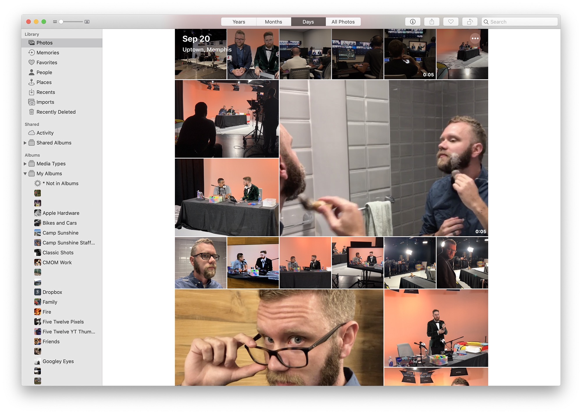
I’m a big iCloud Photo Library user. As of this writing, I have nearly 47,000 photos and 1,300 videos in my library. While I am very good at making albums and keeping things organized, it is easy to lose track of things over time.
Like its iOS 13 sibling, Photos on the Mac has gained new views and tools to deal with the challenges of ever-expanding photo libraries.
(In fact, this section of Federico Viticci’s iOS 13 review does a really good job at outlining the new automatic organization in Photos, so I will leave this to him.)
One nice touch I want to mention here is the automatic playback of Live Photos and videos as you scroll through your library. The whole thing springs to life as you go exploring. That, and the larger image previews seen above, really make Photos a more enjoyable place to be.
Sadly, Apple has yet to do much about the fact that people in families want easier ways to share their photos with each other. My kingdom for iCloud Family Support to come to photos.
Safari 13
Safari 13 shipped in late September for users of Mojave and High Sierra, as Apple views its browser as a way to keep users of older operating systems as secure as possible.
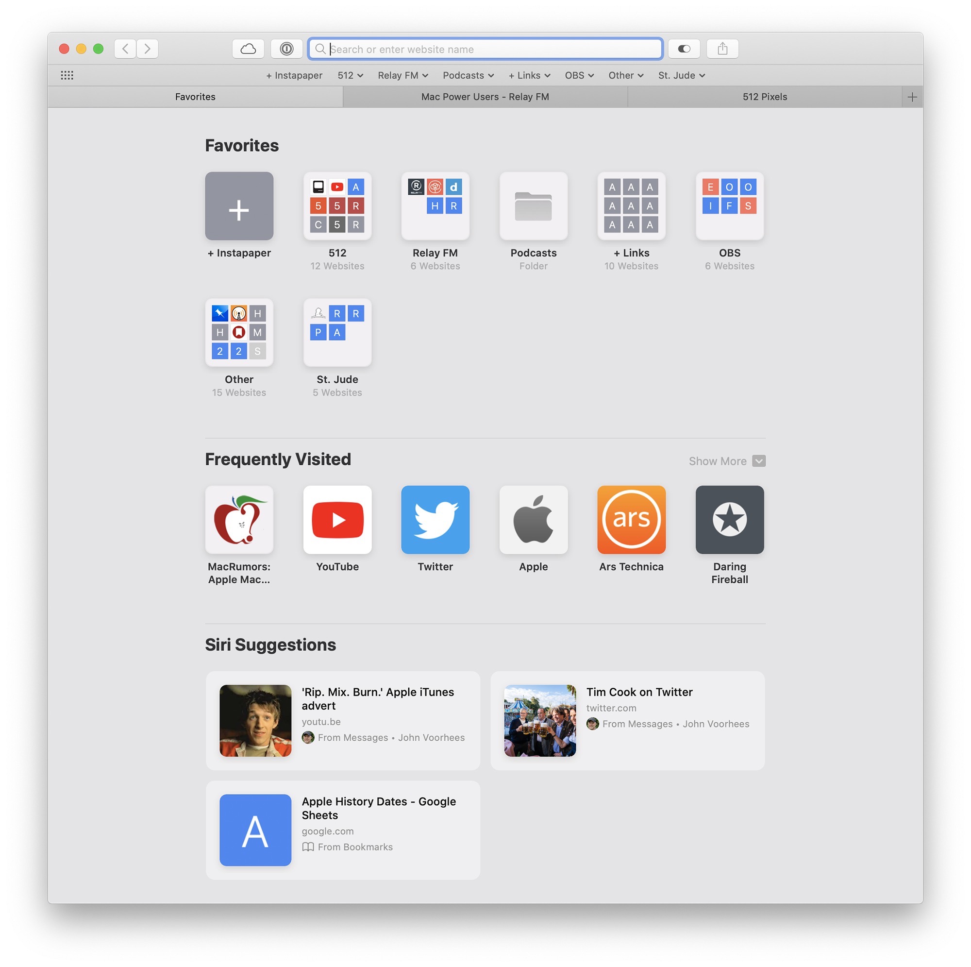
Sign in with Apple, smarter password creation tools and the ability to switch to an open tab when you start typing its URL all make Safari 13 a nicer place to be. Even if the Start Page is nice and full of useful things:
Safari 13 also brings big changes to the browser’s extension model. Like 32-bit apps, this extension change means the end of the road for several bits of software you may have depended on up until now, including the likes of uBlock Origin.
New extensions are built with Xcode in JavaScript, CSS and Objective-C or Swift. In short, they are in of themselves small Mac apps, and come bundled with parents apps. Apple says this will make Safari safer and more stable, and while I never had any issues with “legacy” Safari extensions, I do like safety and stability.
Notes
In Catalina, Notes gains the ability to share an entire folder of notes with others, which is fantastic. For years, I’ve had a “Stephen + Merri” Notes folder, but had to share each note within it with my wife individually. No more.
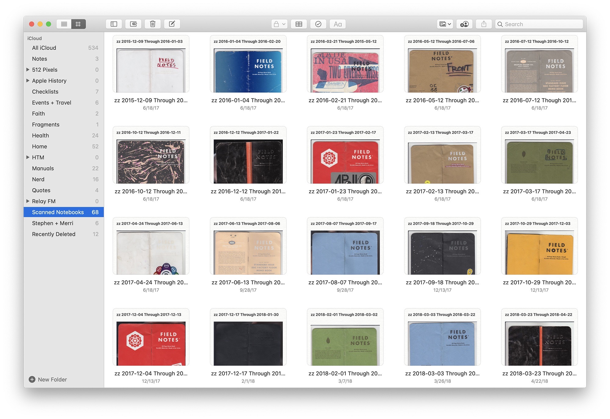
Also new is a gallery view, which I love for notebooks full of PDFs:15
Thanks to the power of machine learning and computer vision, Notes’ search function now can located objects within images and text within scanned documents. I had mixed luck with this in testing, however.
Checklists have received a makeover this year, too. Items in a list can be reorganized via mouse or keyboard, and checked items can even move themselves to the bottom of the list if you so desire, and an entire list of checked items can be marked as unchecked at once. As someone who uses a Notes checklist every time he packs for a trip, I welcome this change.
Since its major refresh a few years ago, Notes has become better and better. I have over 500 notes in it, and use it for all sort of things. It has become integral to the way that I work, even if it still has the weird textured paper background…
Reminders
Reminders has finally gotten a Notes-like overhaul. Just look at this UI:
I am going to give Reminders a real shot at becoming my new task manager, instead of Todoist, which I’ve been running for the last few years. Reminders is faster, has loads of native integrations and looks nicer.
For the most part, the new Mac app matches the iOS 13 version in features, including one that I really like. You can tag someone in a reminder and next time you send them an iMessage, the Messages app with show you that reminder. So, so smart.
I have a couple of issues with the new Reminders, however, that may keep it from being my daily driver.
First, the new UI is not flexible enough. I should be able to adjust the text size of items in a list, because right now, it is tiny. While I appreciate the ability to sort a list by due date, tasks without a date should go at the bottom of the list, not the top. The current sorting is madness.
Secondly, I’d like to see Reminders adopt even more natural language processing. Systems like Todoist, Remember the Milk and others let you type a task’s name, due date, parent list, priority and more all without ever leaving the keyboard.
Reminders feels slow in comparison. It can detect some metadata, but then requires you to use the arrow keys or the mouse to confirm what it thinks you want. Common things like creating repeating tasks requires too many clicks.
Thirdly, when a list is sorted by due date, tasks without a due date appear at the top of the list, ahead of upcoming dates. This breaks my brain in ways I simply cannot describe with words, as someone who only sorts his tasks by due date.
What is in Reminders this year is a good start, but Apple needs to keep its foot on the gas to make it great.
Find My
Lastly, we come to the oddly-named Find My, which has rolled Find my Friends and Find my iPhone into a new Catalyst app.
This means you can not only see where your friends are, but also locate your devices, and the devices of those in your iCloud Family Sharing plan all in one place.
You can enable “Offline Finding” in Find My, which can detect the presence of offline Apple devices via Bluetooth. In the past, if your iPhone was stolen and not on a cellular or Wi-Fi network, it was invisible to Find my iPhone, and difficult to recover. Now, other Apple devices can be on the lookout for it, using their network connection to report the missing phone’s location. All of this is invisible to the user of nearby devices and end-to-end encrypted, so no one’s personal information is shared with Apple. Pretty cool.
All of this works well and looks great, but the removal of the old Find my Friends Today view widget is a real bummer. It’s going to take me some time to unlearn the muscle memory that I relied on whenever I wanted to check in and see what Jason Snell was up to in California in the pre-Catalina days.
Miscellaneous Tweaks
Here’s a bit of a grab bag of other things that are changing this year:
- With the death of the old 32-bit QuickTime, QuickTime X has picked up some new tricks, including a much more useful Movie Inspector, Picture in Picture support, transparent video support and the ability to interact with timecode data in a movie file.
- A paired Apple Watch can now be used to approve app installations, unlock secured System Preference panes and view locked content in Notes. I’m starting to think we’re not getting Touch ID on the desktop or Face ID anywhere on the Mac anytime soon.
- Mail can now block all mail from specific senders, automatically deleting any incoming messages from them.
- macOS can now be set up to be multilingual, letting you select different languages for keyboard and dictated input.
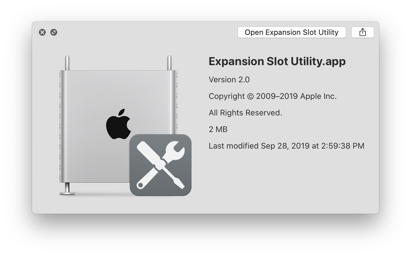
- Catalina includes a program named Expansion Slot Utility, but it won’t run on anything but a 2019 Mac Pro. I love its icon.
- Python, Ruby and Perl are included in Catalina, but won’t be in future macOS releases. Apple recommends developers bundle any needed resources within an app, and nerdy users will need to turn to third-party solutions if they want access to what these languages provide in the future. As Apple was bad about shipping modern versions of some of these languages, many users were already using something like Homebrew to get this job done.
- On new installs, zsh is now the default, not bash.
- The default Catalina wallpaper clocks in at 186 MB and is 6016 pixels x 6016 pixels to support the Pro Display XDR.
- The new “Auto” appearance setting will toggle Light and Dark Modes based on time, and will slowly change the scene in the wallpaper from day to night as the hours tick by.
- The macOS Recovery system is getting smarter with Catalina. It can now restore from a previous snapshot of your system if a point update breaks something. Snapshots are created before installing system updates and are held on your Mac for a day or so, assuming you have the free space. APFS FTW.
- iCloud Drive folder sharing is coming … soon… probably.
Looking Ahead While Shedding the Past
Albert Einstein is credited with a saying I like quite a bit:
Life is like riding a bicycle. To keep your balance, you must keep moving.
This feels like a nice way to sum up where macOS Catalina is. It’s the macOS we’ve all been using for years, but with one step in the future. That comes with costs, and the road is now littered with the dead bodies of 32-bit apps and frameworks. Heck, even a bunch of old video codecs have been murdered in Apple’s desire to move macOS forward.
And yes, this means that Dashboard is finally gone. We should all take a moment of silence for our dearly departed widgets…
The questions are obvious: are all of the broken workflows and inevitable support questions worth it? Can Apple’s platforms be pulled together with tools like SwiftUI and Catalyst? Will consumers notice or care about these sorts of things? Does anyone read the fourth questions in lists like this?
I don’t know the answers, but I do know that Catalina is the most important update to macOS in years, and you should have your ducks in a row before you install it. Once you do, you’ll live in a new world, where the line between the iPad and Mac are just a little more blurred.
Some people think all of this is bad for the Mac, and that by trying to lock things down and force iPad apps to run on Mac hardware, Apple is devaluing the Mac and its user base.
I simply refuse to believe that. Apple has made a huge investment in building these tools for developers, and if the Mac was doomed, the company would be content to leave the platform out of these changes.
Catalina will go down in history as a major release of macOS. That makes me confident that Apple still cares about the Mac, just like many of its users do. I’m excited to see where this new chapter leads.
- Of course, most nerds would never do this, but we all know plenty of people who do. ↩
- I worry the Ars Technica site is just going to barf on these old reviews at some point, so I made PDFs of them a few years ago. Maybe I should print them and make them into a book for John to sign… ↩
- It’s possible that some of these apps get updated in the future, but others are just lost to time… ↩
- Apple’s refusal to put a touchscreen Mac on the market continues is really meaning more work for both Apple and third-party developers. The company would need to sink serious time into the Mac’s UI, as much of macOS is not ready for touch. (Read the Sidecar section of this article for more details.) However, I fear many Catalyst apps are probably going to feel a bit kludgy when interacted with via cursor. ↩
- Seriously, where is TestFlight for the Mac? ↩
- For a lot more on Catalyst apps, don’t miss this article on Ars Technica written by Samuel Axon. ↩
- The future of TV is apps, after all! ↩
- The only real issue I had in the macOS beta process was with Backblaze, but they have an update out to address incompatibilities with macOS Catalina. ↩
- I was a Mac Genius when this was going on and still wake up at night thinking about it. Do you know how long it takes to reinstall Leopard on an iBook G4? I do. ↩
- I am starting to wish Apple’s giant trackpads could be used with the Pencil. ↩
- The virtual Touch Bar sure seems familiar… ↩
- “Pickups” is a weird label, though. In theory, Screen Time will log what Mac app you use first upon the system waking up, but during the beta that was inconsistent for me. The word makes a lot more sense within the context of iOS devices. ↩
- I will in a footnote though. Just like iTunes did in 2001, Music has a modal preferences window. ↩
-
In fact, by default, it stores its files in
~/Music/iTunes/iTunes Media. My guess is that Music and TV were in the works before Catalyst was very far along, and Podcasts got aboard that train late in Catalina’s pre-WWDC development cycle. ↩ - In this case, the notebook is full of notes that contain PDF scans of actual notebooks. Even then, I keep the notebooks around. ↩