Apple Closing Its Infinite Loop Store →

Some sad Apple Retail news broke this afternoon. Here’s Joe Rossignol:

“After many years of serving customers at our stores in the Bay Area, we plan to close our store at Infinite Loop,” an Apple spokesperson said, in a statement shared with MacRumors. “All of our valued team members will have the opportunity to continue their roles with Apple. We look forward to welcoming our customers at our nearby Apple Park Visitor Center and other locations, on Apple.com, and the Apple Store app.”

For years, this location was known as “The Company Store,” and was a place for employees and users alike to pick up merchandise with Apple’s branding on it. I visited the store way back in 2007 when I was training to be a Mac Genius, and it was something special. Since its reopening in 2015, it’s been a fairly typical Apple Store, with the addition of some t-shirts and the lack of a Genius Bar.

In both of its incarnations, the Infinite Loop location was a neat place to visit, but was very clearly just the first floor of a very busy office building, complete with a shortage of parking. For the picky enthusiast, the Apple Park Visitor Center has been a much better place to visit since it first opened in the fall of 2017.

Facades 2 →

Michael Steeber:

Today I’m launching a major update to Facades, the field guide to Apple Retail Stores. I’ve added detailed timelines filled with store history, new ways to track and share your store visits, custom lists, and much more. This update is the product of feedback from readers like you, and I hope you’ll enjoy what I’ve made.

I’ve been using the updated version for a while via TestFlight, and it is delightful. The title design touches are fabulous.

On Flashing 90s Mac ROMs →

Doug Brown:

After I wrote about the possibility of programmable Mac ROM SIMMs in Quadras a couple of months ago, I suspected that there had been a way for developers at Apple in the 68k Mac era to reflash the ROM in their Macs during development, just like BIOS updates on PCs. The reason I believed this is because the ROM SIMM socket in the Quadras brought out pins for 12V (VPP) and write enable (/WE). I had verified that the write enable pin was going into the memory controller chip in several Mac models, so I was pretty confident that in-system programming was possible.

As luck would have it, multiple people pointed out to me that an Apple internal utility used for ROM flashing had been uploaded to the Macintosh Garden. It was recovered from a prototype PowerBook 520 purchased in 2020. Of course, I had to download this utility and figure out how it works.

The Great iMac Realignment

It’s the stuff of lore now, but Steve Jobs’ “Grid of Four” took a messy Mac lineup and made it simple enough for anyone to understand:
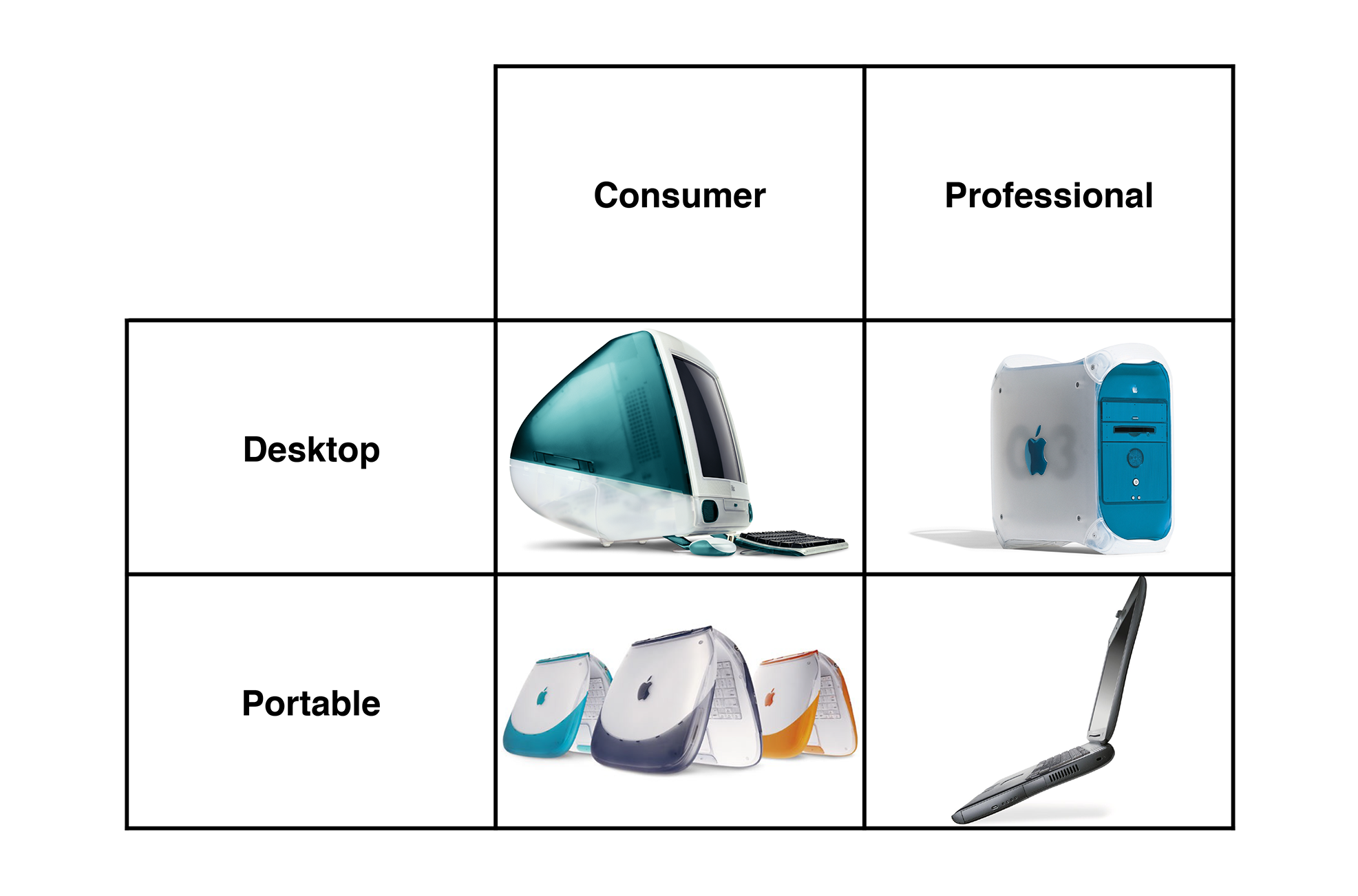
Grid of Four

Trying to cram the Apple of today into something like the Grid of Four doesn’t make much sense. In fact, Apple only used it for a handful of years, but even when the Grid of Four was the product strategy at Apple, the iMac began to creep toward the professional column.

The Slow March of Progress

In October 1999, Apple revised the iMac G3, adding the magic of desktop movie making. I wrote about these machines several years ago, but what’s important to know is that it marked the first time that Apple offered different versions of the iMac:
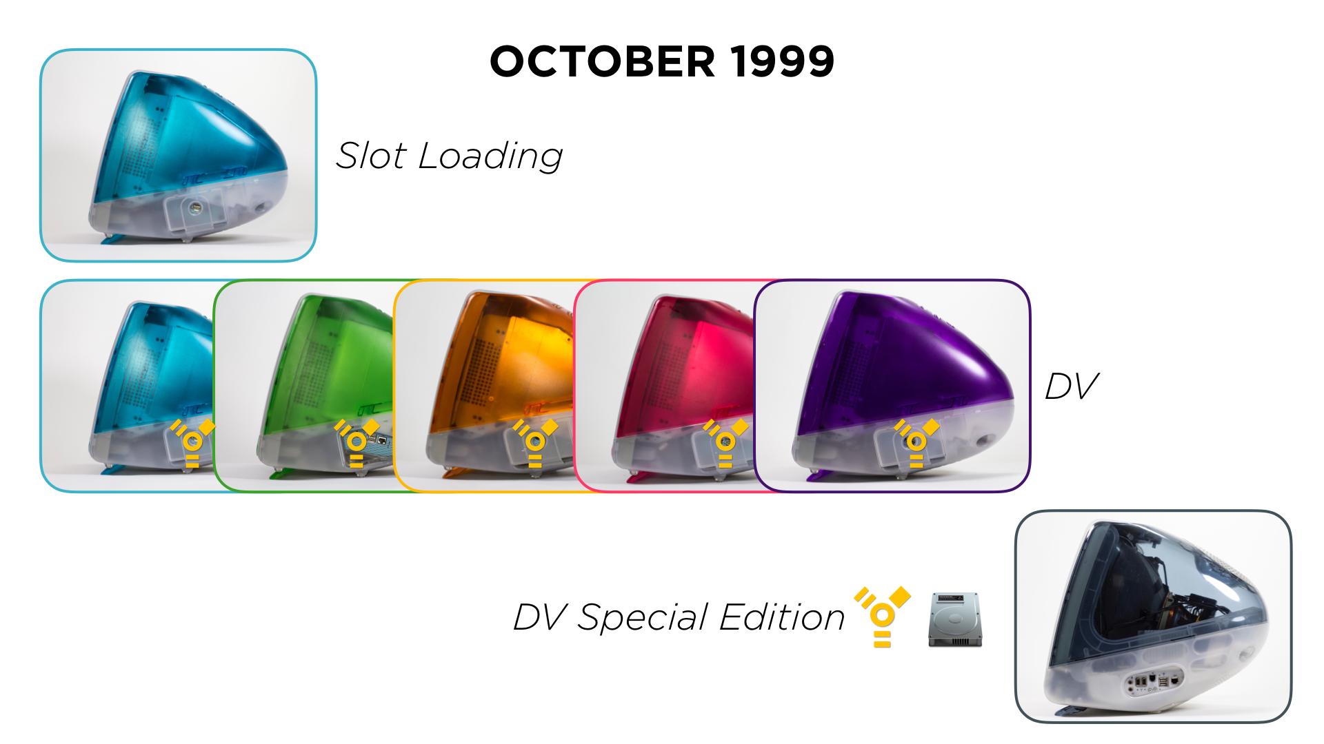
October 1999 iMacs

Suddenly, FireWire and iMovie could be had in the consumer-focused desktop, and were no longer privileges only afford to Power Mac owners.

If you didn’t care about those things, the low-end Blueberry machine could be had for a record-low cost of $999. Most folks got one of the now-revised-and-quite-a-bit-nicer “Five Flavors” colors, all of which sold for $1,299. The Graphite iMac DV Special Edition marked the high end of the line. At $1,499, it offered everything the iMac DV did, but with more RAM (128 MB), a larger hard drive (13 GB) and the stunning Graphite color.1

In January 2002, Apple unveiled the iMac G4. If you skipped over the language in this press release about the iMac, you could have easily assumed Apple had released a new Power Mac:

Inside the new iMac’s ultra-compact base lives the fastest iMac ever, with a Pentium-crushing 800 MHz G4 processor with Velocity Engine; a SuperDrive for playing and burning custom CDs and DVDs; up to one gigabyte of memory; up to a 60GB hard drive; and NVIDIA GeForce2 MX graphics with 32MB of DDR memory, which triples the 3D performance over previous models.

Before this, the only way to get a SuperDrive — and use iDVD, which required a G4 — was to shell out for a Power Mac. The tower was still faster and more flexible, but with the G4, the iMac once again expanded to take on more professional workflows.

The "Sunflower" iMac G4

This continued through the iMac G5 and early Intel eras. As the iMac grew faster and faster, more and more pros could embrace the all-in-one lifestyle that the iMac offered.

In 2007, Apple revised the iMac yet again, replacing the white plastic enclosure with one made of aluminum and glass. Here’s a bit from the press release:

“This new iMac is the most incredible desktop computer we’ve ever made,” said Steve Jobs, Apple’s CEO. “Our new design features the innovative use of materials, including professional-grade aluminum and glass, that are highly recyclable.”

Redefining Apple’s signature all-in-one design, the new iMac integrates the entire computer system into a sleek, professional aluminum enclosure for a striking, clutter-free desktop. An elegant glass cover joins precisely to the aluminum enclosure creating a virtually seamless front surface.

It’s no mistake how many times the word “professional” shows up on that webpage.
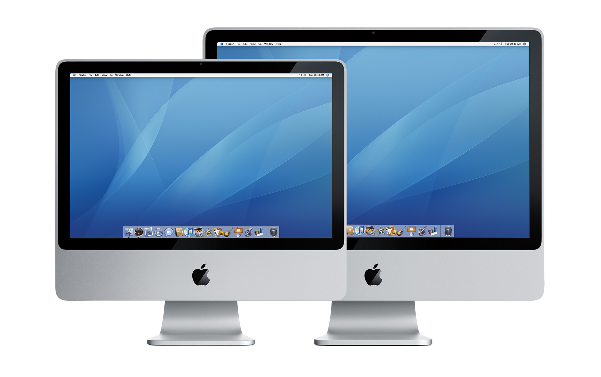
2007 iMac

The new design looked great both at home and at work. It was revised in 2012 with a more modern 16:9 display aspect ratio and even faster internals.

In 2014, Apple released something truly special:

At this amazing resolution, text appears sharper than ever, videos are unbelievably lifelike, and you can see new levels of detail in your photos. With the latest quad-core processors, high-performance graphics, Fusion Drive and Thunderbolt 2, iMac with Retina 5K display is the most powerful iMac ever made—it’s the ultimate display combined with the ultimate all-in-one.

“Thirty years after the first Mac changed the world, the new iMac with Retina 5K display running OS X Yosemite is the most insanely great Mac we have ever made,” said Philip Schiller, Apple’s senior vice president of Worldwide Marketing. “With a breathtaking 14.7 million pixel display, faster CPU and graphics, Fusion Drive, and Thunderbolt 2, it’s the most beautiful and powerful iMac ever.”

For years, this was the best way to experience Retina-level resolution with a desktop, and loads of pros — including me — flocked to the Retina iMac. It was fast and the screen was incredible, especially after Apple added P3 wide color to the machine in 2015. It was top chicken until 2017 when the Mac desktop world changed.

The iMac Pro
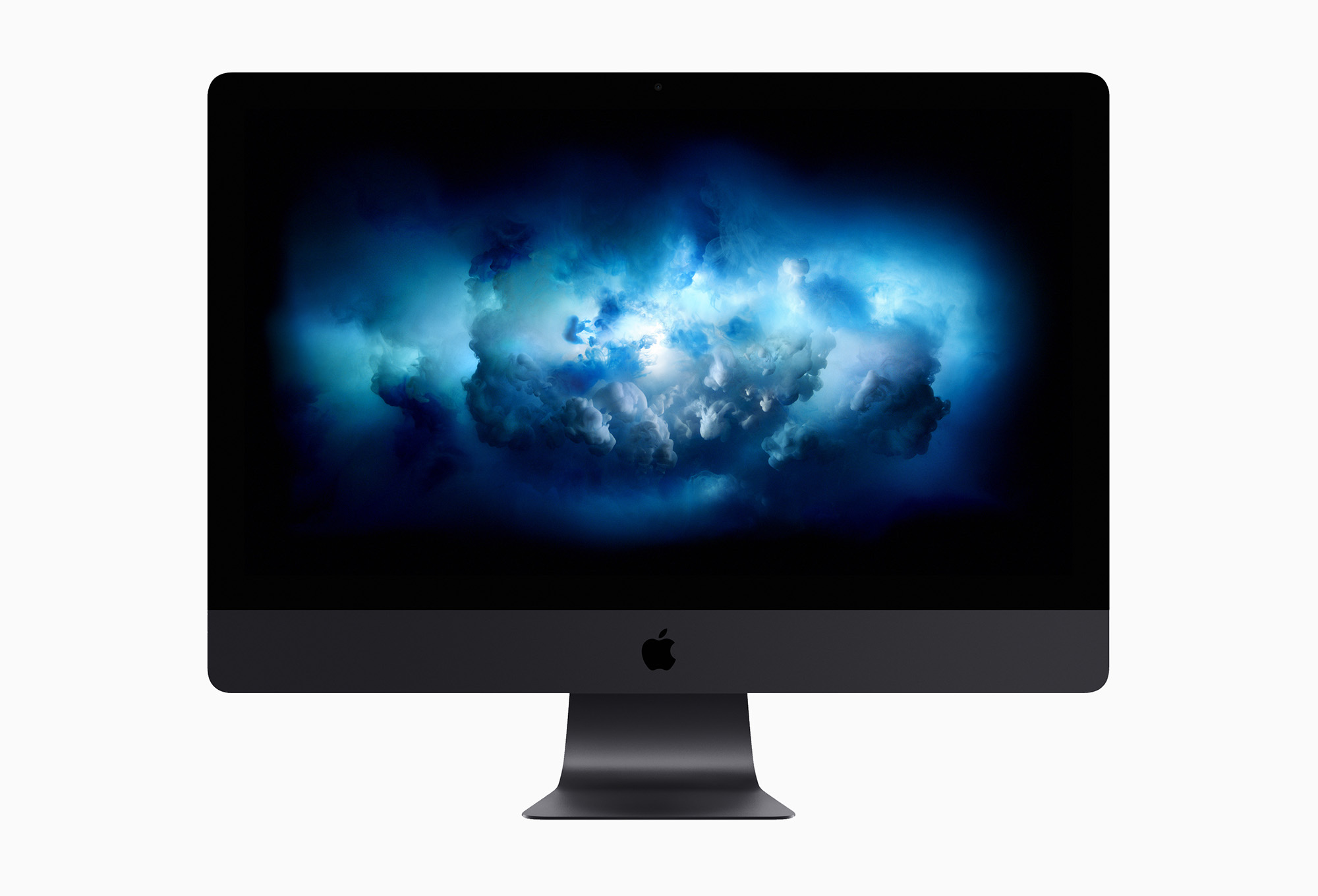
iMac Pro

John Gruber was one of several folks invited out to Cupertino to hear Apple talk about the future of the Mac. By this time, the 2013 Mac Pro was widely panned as a failure, and power users had real concerns about the future of the Mac.

It’s clear that Apple had been on a path which would have resulted in the Mac Pro being cancelled, with a high-end iMac offered in its place. Here’s Gruber, writing about what would become the iMac Pro:

So: only 30 percent of Mac users are in what Apple considers the pro market. Most of those use MacBook Pros (or other MacBooks). Most of those who use desktops use iMacs. None of this is a surprise, really — and this is exactly why so many users who depend on the Mac Pro have been deeply concerned about its future. For Apple to care about the Mac Pro, it requires Apple to care about a small number of users.

Regarding iMacs, Schiller also said that new iMacs are in the works, slated for release some time this year (no specifics other than “this year”), including “configurations of iMac specifically with the pro customer in mind and acknowledging that our most popular desktop with pros is an iMac.”

[…]

What struck me about this is that Apple was framing a discussion in which the big news — the whole point, really — was their pre-announcing a “completely rethought” next-generation Mac Pro by emphasizing that most of their pro users use MacBooks and most of the rest use iMacs — and that they have big plans in store for the pro segment of both of those product lines. It’s exactly what I would have expected Apple to say if they were breaking the news that the Mac Pro was going away: We’re dropping the Mac Pro because its time has come and gone — all but a small percentage of our pro users have their needs met by MacBook Pros and high-end iMacs.

In many ways, the iMac Pro is a relic from a different timeline, but I am so glad that we ended up with both it and the 2019 Mac Pro. I had both, and while I loved my Mac Pro, the iMac Pro it replaced was incredible.

Apple made the right call by keeping the Mac Pro alive, but when using an iMac Pro, it was easy to see how Apple got so far down the road with its plan for the iMac Pro to be its top-of-the-line desktop machine.

A Hard Reset

The entire iMac line — from the lowly 21.5-inch models to the iMac Pro — got a hard reset with Apple silicon. In April 2021, Apple unveiled a totally new iMac:

The new iMac offers powerful performance in a design that’s just 11.5 millimeters thin, with a striking side profile that practically disappears. Available in an array of vibrant colors to match a user’s personal style and brighten any space, iMac features a 24-inch 4.5K Retina display with 11.3 million pixels, 500 nits of brightness, and over a billion colors, delivering a brilliant and vivid viewing experience.

Apple said it was the first Mac designed from the ground up for Apple silicon, and it showed. I adore the design of this machine:
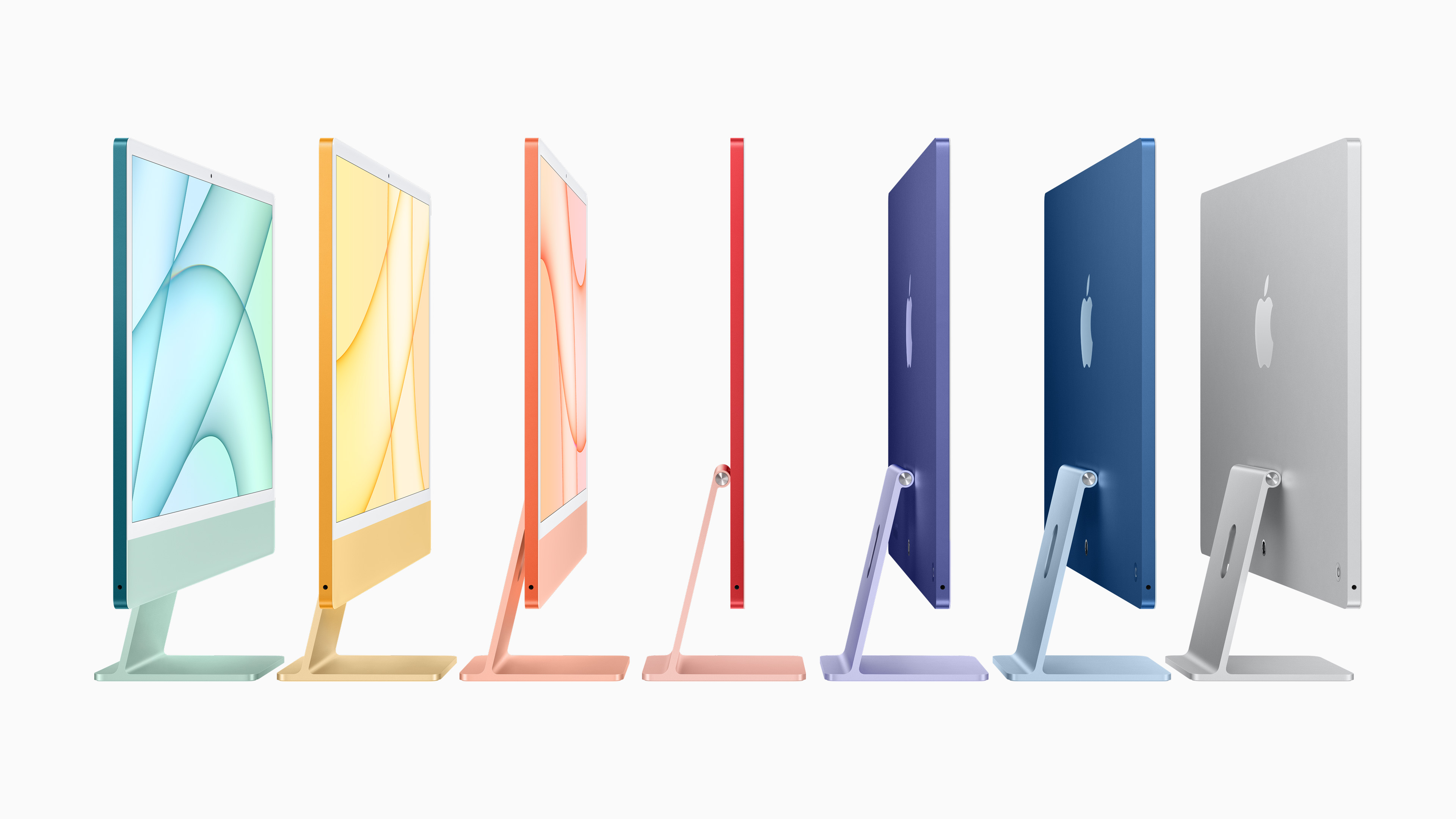
M1 iMac

I think the 24-inch iMac will go down in history as one of the most special computers Apple has ever made, earning a right to sit next to my G4 Cube and 20th Anniversary Mac.

But this computer isn’t for everyone. Many people need more power than the M1 iMac — or new M3 version — can provide. Many more people want or need a larger screen.

As much as I want an orange computer on my desk, the limitations of the current iMac mean it’s not a serious contender the next time I upgrade my computer.

The Strategy is Coming from Inside the House

Many people would love to see Apple make a larger version of the current iMac, more geared toward professionals. Add a larger screen and additional silicon options2 and they’d be sorely tempted to make the jump.

But that’s not the direction Apple is going. It has been reported that the return of the 27-inch iMac isn’t happening, at least for now. Here is Dan Seifert, writing at The Verge:

Apple PR representative Starlayne Meza confirmed the company’s plans to The Verge. The company encourages those who have been holding out hope for a larger iMac to consider the Studio Display and Mac Studio or Mac mini, which pair a 27-inch 5K screen with a separate computer, compared to the all-in-one design of the iMac.

Here’s Jason Snell, in his review of the new iMac:

I should also probably list the iMac’s display size as one of its disappointments, but I don’t think I can. I know there are a lot of people out there who used to use 27-inch iMacs — I’m one of them. Now that the 27-inch Apple Studio Display exists, ready to be attached to a Mac mini or Mac Studio or any laptop you want, I’m not sure the world actually needs an additional size of iMac. And certainly not if the iMac can never be repurposed into a standalone display.

Apple told me that it has no plans to develop a 27-inch iMac again. If the company changes its mind and one day decides to make a bigger iMac, I’ll cheer … but I don’t think I’d go back to an iMac now that I’m able to work with a Studio Display and a Mac Studio.

We should have all seen this coming. Even before today’s news, Apple has been telegraphing this strategy for some time.

As she was introducing the Mac Studio in 2022, Colleen Novielli compared the new machine to the previous generation of iMac:

Mac Studio with M1 Max is up to 3.4 times faster than our fastest iMac. It’s a huge upgrade for 27″ iMac users looking to move to more Apple silicon. And for those looking for the most extreme performance, Mac Studio with M1 Ultra is up to 80% faster than our top-of-the line Mac Pro.

During Apple’s recent Halloween event, everyone’s favorite Senior Vice President of Hardware Engineering was pretty clear about things:

You’ll love seeing everything come to life on the beautiful, large and immersive 24-inch 4.5K Retina display. It’s the perfect size and resolution to replace both the 4K and 5K Intel-based models in an even more versatile and stunning design. Whichever model you’re coming from, you’ll appreciate the enormous amount of screen real estate on the new iMac display.

I assume the hubbub following Ternus’ comments is what led to today’s statement from Apple. Every single word in Apple’s keynotes is completely scripted and vetted by Apple’s crack marketing team, and I thought the message was fairly clear.

I suppose it’s even more clear now. We should once again consider the iMac a consumer machine meant for hundreds of millions of home, office and school users. While you could edit an indie film or score a sitcom on an M3 iMac, there are more great alternatives than ever to consider. Having used my Studio Display with both an M1 Max Mac Studio and an M2 MacBook Pro, I can tell you that the laptop-as-a-desktop lifestyle is easier to pull off than ever. The Mac mini with M2 or M2 Pro offers incredible value for money, and the Mac Studio is incredible. I did not have “New Desktop Design” on my Apple silicon bingo card, but I am so thrilled Apple is (again?) offering something powerful, small and quiet meant to sit atop a desk.

The truth is that if you want a stationary Mac setup, you have a wide range of options when it comes to building it.3

But it’s also true that many want a larger and more capable iMac. Just like many generations before it, the current iMac calls to us as nerds who love this platform.

For years, the iMac became more and more professional in its power, design and very nature. At the end of the Intel era, the computer could be ordered in such a wide range of specs that basically anyone shopping for an iMac could easily have their needs met, from the most basic of home users to folks pushing the bounds of what their computers could do.

That’s just not true anymore, and while it stings, I think the iMac is pretty squarely back in the consumer column … at least for the foreseeable future. Some of the more pedantic folks in the Apple community have read Apple’s statement as ruling out a 27-inch iMac but not a larger machine. After all, a huge iMac has been rumored for some time. Apple is fine going back on its word when it suits it or its products, but my gut says we aren’t going to see a larger iMac.

Then again, maybe the iMac will slowly climb the ranks of the Mac desktop family once again, or maybe Apple will put out a huge iMac Pro in three years and all of this will be water under the bridge. I know a bigger, more powerful iMac would make lots of users happy.


  1. I mean, just look at this thing. I love orange Macs, but the Graphite iMac has a special place in my heart, and in my collection. 
  2. The M3 iMac is reportedly up to 2.5x faster than the 27-inch Intel iMac, but moving beyond the base M3 would unlock additional memory and SSD options for people who just can’t squeeze their work down to the M3 iMac’s most capable configuration with 2 TB of storage and 24 GB of unified memory. 
  3. The Studio Display is a great companion to all of those machines. Its display is straight out of the old 27-inch iMac, but it’s still just fine for professional work, offering bright, accurate colors across its 14.7 million pixels. Thunderbolt offers connectivity and power with just one cable and the industrial design fits right in to a wide range of locations and situations. 

Word Turns 40 →

Microsoft:

From its humble beginnings, Word has gone on to become one of the most popular office tools in the world, and pretty much everyone is familiar with it in one way or another. So, to celebrate its 40th birthday, we decided to take a look at how we got here and also share where we’re going.

Adam Engst:

Tonya and I have a long history with Word. Although we primarily used WriteNow at Cornell University during our undergraduate years from 1985 through 1989, we often helped users with Word while working in Cornell University’s public computer rooms. Two years after we graduated, a college friend of Tonya’s encouraged her to apply for a job at Microsoft. She was hired and spent the next two years doing phone and online support for Word 4 and Word 5. (So many people considered Word 5 to be the pinnacle of the app’s history that Tonya later penned two April Fools’ spoof articles about it: “Microsoft Word 5.1 for Mac OS X,” 1 April 2003, and “Microsoft Word 5.1 Returns… to the iPad,” 1 April 2011.) She also helped edit the manual for Word 6, Microsoft’s first attempt at a cross-platform version. I applied for a position as a Word program manager and got an interview but was not offered the job due to my lack of design skills, a rejection I took as a compliment, given my low opinion of Word’s interface.

Word 5 was indeed perfect.

That Time Apple Gave Mac OS X Jaguar Away to Teachers →

Apple PR, 21 years ago today:

Apple today announced its “X for Teachers” program that gives a free copy of Mac OS X version 10.2 “Jaguar” to every K-12 teacher in the U.S. “Jaguar” combines a stable and robust UNIX-based foundation with Macintosh’s legendary ease-of-use to create the world’s most advanced operating system for teaching, learning and administration. The free copy of “Jaguar” is accompanied by free copies of Apple’s Digital Hub applications–iMovie for digital video editing, iPhoto for organizing and sharing digital photos and iTunes for building a digital audio library.

“Getting Jaguar and a training CD for free makes it easy for teachers to move to Mac OS X, so they can spend more time using technology in the classroom and less time making it all work,” said John Couch, Apple’s vice president of Education. “Apple has delivered innovative products to teachers and schools for over 25 years, and Mac OS X is our best ever.”

I bet school IT admins loved this.

The History of Cover Flow

Over the last decade or so, Apple has been hard at work in simplifying the user interfaces that power its myriad platforms. I’ve welcomed most of that work, but it’s hard to deny that we’ve all lost some things along the way.

Today, we look at a UI element that started life in iTunes, but spread to the iPod, iPhone and Mac over time: Cover Flow.

Cover Flow’s Early Days

We’ll get to that in a moment, but first we should recognize Andrew Coulter Enright, the inventor of Cover Flow. In December 2004, he published a blog post proposing a new way to skim media in iTunes:

Like paper cards flipping within a bar jukebox, I pictured each cover flipping in and out of the illuminated center position, revealing the subsequent album/song as the user browsed through the current library. The faster you scrolled, the faster the covers would shuffle in and out of the spotlight.

Enright went on to talk about why such an interface was important to him:

Like LPs in a bin, you could see which records you had just passed and which ones you’d get to in a minute. You could flip past lousy records the second you recognized that tell-tale graphic element on the edge of the sleeve.

Like LPs in a bin, cover art displayed within an interface like this feels far more like a “real” object than identical cover art displayed as a flat graphic (the way iTunes does currently).

In other words, the cover image isn’t a feature of the album/song, the image is the album/song and consequently the cover is the music. It becomes a true signifier as opposed to a decoration. Music and its consumption by humanity haven’t always been just about the waveform. Let’s restore some of the elements that were created both to satisfy our non-aural senses, and to be signifiers for Music itself.

The images in the blog post are shockingly close to what the feature would become when Mac developer Jonathan del Strother implemented it in an app called “CoverFlow” that let users flip through their non-iTunes MP3 collections in a much more visual way than scrolling folders in Finder. Here is how it was pitched:

Don’t know about you, but I find browsing a list of album names somewhat uninspiring, to say the least. One of the big attractions of a physical album is the beautiful packaging and aesthetic appeal, something that’s sorely missed with the digital equivalent.

CoverFlow aims to bring that aesthetic appeal to your mp3 collection. It allows you to browse your albums complete with beautiful artwork pulled from any sources it can find, whether that’s buried in your song tags, collected via Synergy, or looked up on Amazon.

You can see a video of CoverFlow in action here:

CoverFlow was purchased by Apple1 in 2006, as the app’s website still reports:

We are pleased to announce that all CoverFlow technology and intellectual property was recently sold to Apple. It has been incorporated into the latest version of iTunes.

That version was iTunes 7, released in 2006. As you may have already guessed, it included a new way to quickly skim larger media libraries:

Apple today announced iTunes 7, the most significant enhancement to the world’s most popular music jukebox and online music and video store since it debuted in 2001. iTunes 7 delivers stunning new features such as the new album and Cover Flow views of music, TV shows and movies, enabling users to quickly find titles in their library as well as casually browse through and re-discover titles they already own.

Here’s what Apple’s version looked like:

Cover Flow in iTunes 7

In its heyday, iTunes was often a bit of a UI playground for Apple. Some features never made it out of the application — like vertical window controls — while others took flight across the ecosystem.

Cover Flow Eats the World

Cover Flow’s biggest moment came in January 2007, when Steve Jobs introduced the original iPhone. (You can jump right to the iPod section with this link.) When the user rotated their device into landscape orientation, the Music app would show all of the library’s albums in Cover Flow, and scrolling through them was as easy as the swipe of a finger. Tapping the center album would reveal a track list:

Cover Flow on the original iPhone

In the fall of 2007, Apple revised its entire iPod line, bringing Cover Flow to the iPod classic, third-generation iPod nano and the iPod touch. The latter worked just like the iPhone, while the traditional iPods used the click wheel to move back and forth in Cover Flow.

Cover Flow on iPods

On the Mac side of things, Leopard brought Cover Flow to Finder. This iteration allowed users to see a list of files and folders and a nicely-sized preview at the same time.

Here’s a bit from the press release:

Scheduled to ship in October, Leopard introduces over 300 new features, including a new Desktop and Dock with Stacks, an intuitive new way to organize files; an updated Finder featuring Cover Flow and a new way to easily browse and share files between multiple Macs; Quick Look, a new way to rapidly preview most files without opening an application; Time Machine, a new way to easily and automatically back up and restore lost files or a complete Mac; Spaces, a powerful new feature to create groups of applications and instantly switch between them; and enhanced iChat and Mail applications, which easily allow users to communicate even more creatively.

Cover Flow in Leopard's Finder

Two years later, in 2009, Safari 4 launched with many new features, including our old friend:

Safari 4 makes browsing more intuitive and enjoyable with innovative features, such as Top Sites, Full History Search and Cover Flow, and support for modern web standards like HTML 5 and advanced CSS Effects.

“The successful beta release helped us fine tune Safari 4 into an even better, faster version that customers are going to love,” said Philip Schiller, Apple’s senior vice president of Worldwide Product Marketing. “Safari is enjoyed by 70 million users worldwide and with its blazing fast speed, innovative features and support for modern web standards, it’s the best browser on any platform.”

That beta included Safari 4’s infamous “Tabs on Top” design, but that’s a story for a different time.

Safari’s version of Cover Flow impressed Jim Dalrymple, who wrote about the feature for Macworld:

I visit a lot of Web sites a day, doing research for stories as well as visiting some of my favorite music sites. Sure, I could use the old way of viewing my history as a list, but it’s not nearly as efficient or accurate as this Cover Flow view.

For example, when I’m researching a story, I often come across obscure references to my topic. Unfortunately, I don’t always bookmark those pages for reference. The end result is that they are lost in the mire of Web links in my browser history. It gets even worse if you factor in a few days’ worth of browsing to wade through.

Having an enhanced search via Cover Flow gives me a way to narrow down my search and then scroll through windows with a thumbnail of the Web site. Even if I don’t recognize the Web link in the list, I’ll more often than not recognize what the site looked like with the Cover Flow thumbnail.

Cover Flow on its own probably wouldn’t be that useful in a Web browser. However, just like in iTunes, having the combination of Cover Flow and the search functionality makes finding things much faster. Ultimately, that makes my experience using the software better.

Like transparent plastic years earlier, Cover Flow popped up in various places around the world beyond Apple’s own products, like in some VW models.

A Slow Fade Into History

Cover Flow’s heavy use of animation and reflections were never going to be a good fit in the great flattening that took across Apple’s design work in the mid 2010s.

Up first was iTunes’ version of Cover Flow, which was removed with version 11 in 2012.

The next year, iOS 7 dropped Cover Flow from the music app, replacing it with an interface of tiled album artwork.

The final blow came with macOS Mojave in 2018, which swapped out Cover Flow for a new Gallery view:

Gallery View in macOS Mojave

My Take

Even though it took many different forms over the years, Cover Flow never really clicked for me. I often value efficiency over visual flair when it comes to how I like to work, and Cover Flow didn’t offer me enough to switch away from more traditional views of my music, files or Safari history.

However, Cover Flow still holds a special place in my heart. I get the sense that Steve Jobs loved it, and that counts for something.


  1. Over the years, there were a handful of lawsuits over Cover Flow, none of which I’m going to cover here, as they would mess up the flow of this article. 

Michael Steeber, on Gary Allen →

Michael Steeber, writing something you should take the time to read:

October marks eight years since the death of Gary Allen, a legendary figure in the Apple community. Over the span of 14 years, Gary visited more than 140 Apple Stores and meticulously documented every detail of Apple Retail design and operations on his website, ifoAppleStore.com. I’ve never taken a moment to properly recognize Gary’s contributions to the community and his impact on my life, so today I’m going to fix that.

iTunes Movie Trailers Taken Offline →

As noted by Chance Miller at 9to5Mac, Apple has pulled the plug on its iTunes Movie Trailers website and app after starting the process earlier in August.

This website had been around a long time. It made big news back in the late 1990s when it hosted the trailer for STAR WARS: Episode I. Here’s a press release from that era:

The popularity of the STAR WARS: Episode I trailer has set an Internet record with over 3.5 million downloads since it first premiered on the joint Lucasfilm/Apple web site (reachable through www.starwars.com or www.apple.com) last Thursday, March 11.

Jim Ward, director of marketing for Lucasfilm, said, “We’re thrilled with the fans’ response. Apple’s QuickTime software provided us with the highest quality and enabled us to push Internet video to its limits.”

Steve Jobs, Apple’s interim CEO stated, “Over three and a half million downloads in five days makes this the biggest Internet download event in history. Apple is proud to have participated in this online experience of the new Star Wars movie.”

Visiting trailers.apple.com now redirects to the TV app, complete with a banner that harkens back to the old site:

Trailers in TV app