Corporate Memphis →

Josh Gabert-Doyon, writing at Wired:

Why does every advert look the same?

The illustration style is flat, geometric, figurative, and usually made up of solid colours. Nondescript figures are plastered across train stations and bus stops, from fintech company MoneyFarm, to Trainline, to the Viagra delivery service GetEddie. Even Transport for London’s own branding, with a special place in the history of Modernist graphic design, has started to replicate the style.

I want to be very clear that this isn’t the fault of my beloved hometown. It is, however, Federico’s.

Bruce Blackburn, Designer of NASA’s Worm Logo and the American Revolution Bicentennial Star, Has Died →

Alex Vadukul, writing at The New York Times:

In 1974, his small New York-based design firm, Danne & Blackburn, was barely a year old and eager for a big project when he and his partner, Richard Danne, were approached by the Federal Graphics Improvement Program to rebrand NASA’s classic logo, which depicted a patriotic red chevron soaring across the stars. Known as “the meatball,” it wasn’t exactly cutting edge, instead evoking a vintage sensibility of space travel seen in science-fiction comics like Buck Rogers. With the eyes of the world suddenly upon the agency in 1969 after the moon landing, NASA wanted to embrace a modern image.

In addition to designing the worm, Mr. Blackburn worked on another big federal commission in the 1970s, creating the symbol for the American Revolution’s Bicentennial celebration. His design — a soft star composed of red, white, and blue stripes that combined a modern aesthetic with patriotic themes — was ubiquitous by 1976, appearing on everything from stamps to coffee mugs to government buildings.

While NASA switched back to the “meatball” logo in the late 1980s, the worm has shown up a bit recently and doesn’t seem to be going anywhere anytime soon.

Do not miss the Graphics Standards Manual, which dictated how the worm was to be used on everything from spacecraft and pickup trucks to patches and spacesuits.

Speaking of NASA, another one of Blackburn’s famous pieces of work adorned the side of the Vehicle Assembly Building for over 20 years before being painted over with — you guessed it — the meatball.

VAB

On iPhone Notch Sizes

No spoilers, but on yesterday’s episode of Connected, we had to contend with how big the iPhone’s notch is, and how it may have changed sizes over the years since the introduction of Face ID in 2017.

Just looking at a pile of iPhones isn’t that helpful when trying to investigate such minutiae. What you need is detailed documentation.

Thankfully, Apple provides just that, in the form of a document named “Accessory Design
Guidelines for Apple Devices,” which is freely available on Apple’s developer website.

The document is for companies creating chargers, cases and just about anything else that can be clipped on, paired to or used with an iPhone. Thankfully, it also works for podcasters with ridiculous jobs, as it includes detailed drawings of every iPhone going back to the iPhone 5.

Using that information, I put together these charts showing the size of the notch1 on various iPhones:

Right off the bat, it’s easy to see that the LCD panel used on the iPhone XR and 11 resulted in a larger notch. At the time, Apple made a big deal of being able to use an LCD panel for a design with rounded edges, but this was a trade-off of that work. As you can see, the iPhone 12’s move to OLED brought the mainstream iPhone more in line with its more expensive siblings.

The thing that really surprised me was how much the notch has changed over the years. Side-by-side, notches on OLED iPhones all look the same, but clearly Apple has done a fair bit of tinkering over the years to the design. In fact, the notches on the iPhone 12 line are taller than any other models.

I wonder what that means when it comes to vastly shrinking the notch, which I think Apple really wants to do at some point in the future…


  1. Please note that the last chart showing area doesn’t account for the radiuses found on the notch. I’m not a mathematician. 

Mac OS 9 Wallpapers in 5K Resolution

To go with my 5K renders of default Mac OS X macOS wallpapers, I’ve reworked Mac OS 9’s wallpapers. Some of them are wild:

I pulled the originals out of an OS 9 installer then used Pixelmator Pro’s ML Super Resolution tool, running on a new M1 MacBook Air … which gave my 2019 Mac Pro a run for its money rendering these.

If this can’t heal the world here at the end of 2020, I don’t know what can.

Windows XP Included Incomplete Aqua-like Theme →

Tom Warren at The Verge, writing about some half-finished themes found in this week’s XP source code dump:

One is labeled “Candy” and includes a design that closely resembles Apple’s Aqua interface that was first introduced at the Macworld Conference & Expo in 2000. Although the theme is incomplete, the Windows XP Start button and various buttons and UI elements are clearly themed to match Apple’s Aqua.

On Widget Shaming

iOS 14 and apps like Widgetsmith have unlocked a new world of iPhone home screen customization. Many of us on the nerdier side of things have been a bit surprised when seeing images like this, from 9to5Mac:

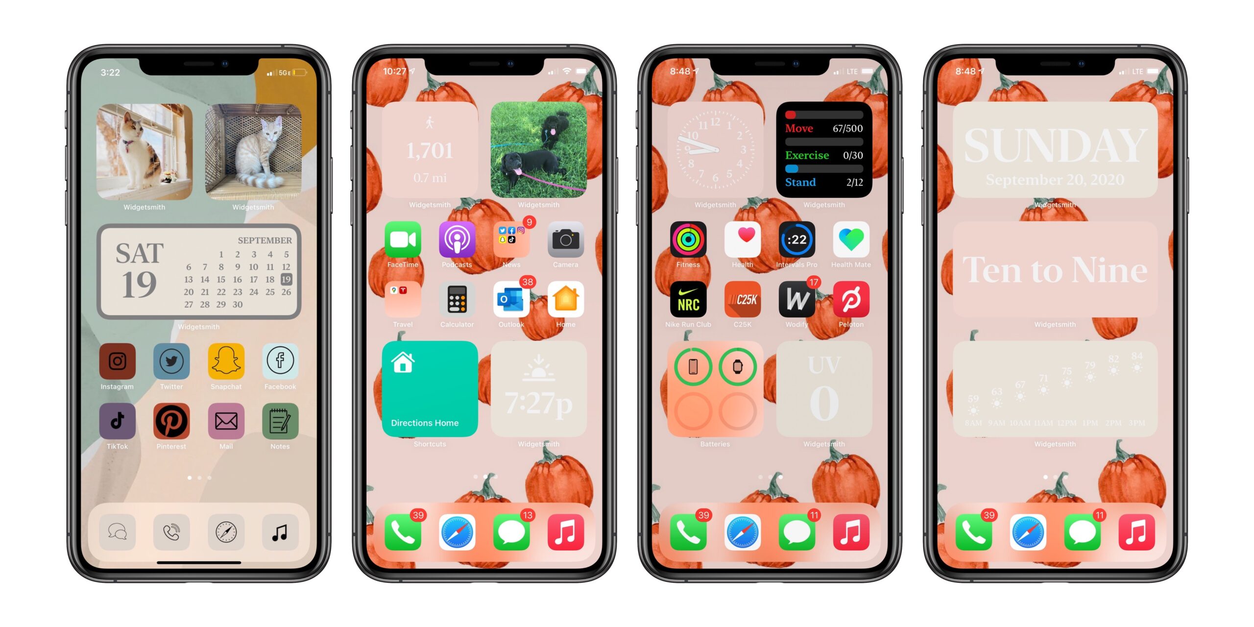
However surprised those in our community may have been, it’s clear that this is a big deal. How-to guides have not just shown up on tech blogs looking for some of that sweet SEO, but users are uploading videos and screenshots across TikTok, YouTube, Instagram and Twitter.

I think this is fantastic, and not just because David Smith is a friend of mine. It’s clear that iPhone users have wanted the ability to customize their home screens, and now that widgets are here in iOS 14, the dam has been broken.1

Not everyone is a fan of this. I’ve seen a bunch of tweets and even messages to Relay’s feedback email addresses bemoaning this new trend. It’s clear to me that some in the Apple world aren’t a fan of the #iOS14AestheticAF movement, and are complaining that these users are ruining what makes the iPhone great in their minds.

Which is ridiculous. Customization and expression has always been part of personal technology, from this, to MySpace, to putting an Apple sticker on your car, to even picking what brand of home computer you bought in the 1980s. People have always used technology to project something about themselves into the world — just like people do with tattoos, clothes, cars and more.

Another take is that this sort of customization is bad for Apple’s brand. I disagree with this point of view as well. Apple’s brand has become too sterile, and I think it could use more color and personality. This does that, and I genuinely think this sort of customization will only make people love their iPhones more, which is great for Apple.

While this may not be for you, complaining that people are going down this road is not a good look. We should welcome more customization and personalization of the technology we spend hours a day with. We should be excited that a developer like David has built something that has gone viral. We should encourage Apple to do more in these areas, and evoking the name of Steve Jobs or rolling one’s eyes at this is short-sighted at best, if not something much worse.


  1. Now do custom watch faces, Apple. 

Face Mask Emojis →

Pat Dryburgh:

I wasn’t surprised to find that there is currently only one Emoji that includes a visible medical face mask. However, I was sad to see that the expression on the faces of every version of this Emoji looked rather gloomy.

No doubt when this emoji was first introduced, face masks in Western society were primarily worn by professionals or those under medical care. However, we have since joined our brothers and sisters in places where medical face masks are worn by everyone and as some people have pointed out, this makes communicating emotions through facial expressions really tough.

Given this, I think we need more expressive face-mask Emojis. I think a suite of Emojis expressing alternate emotions through a face mask would allow us a small opportunity to show solidarity with one another as we brave this new world.

I think this is a great idea.