The History of Cover Flow

Over the last decade or so, Apple has been hard at work in simplifying the user interfaces that power its myriad platforms. I’ve welcomed most of that work, but it’s hard to deny that we’ve all lost some things along the way.

Today, we look at a UI element that started life in iTunes, but spread to the iPod, iPhone and Mac over time: Cover Flow.

Cover Flow’s Early Days

We’ll get to that in a moment, but first we should recognize Andrew Coulter Enright, the inventor of Cover Flow. In December 2004, he published a blog post proposing a new way to skim media in iTunes:

Continue reading ⇢

X206 ⇢

Antonio G. Di Benedetto has an in-depth look at the little buttons on the underside of the Apple Watch that make swapping bands so easy:

While I often prefer a universal solution over a proprietary connector, here’s the thing — Apple’s band release button beats the hell out of fiddling with little spring bars and jeweler’s tools. Instead, you just press a near-invisible button, slide your band out, slide another one in, and get a lovely audible click as it locks in. No fuss, no muss; just a simple swap for a different visual vibe to match your style and wardrobe.

Continue reading ⇢

CarPlay’s UI Needs a Revisit in the Age of Large Screens

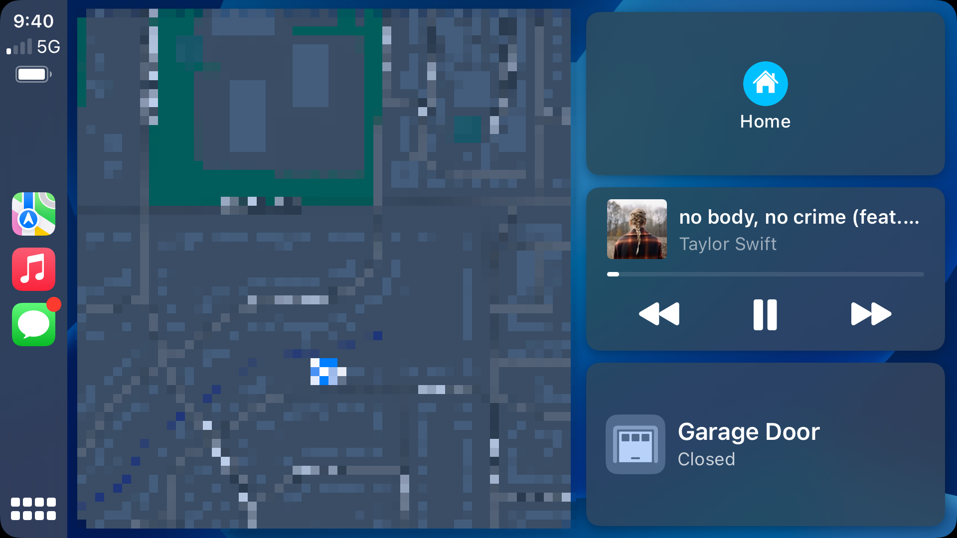
Yesterday, I picked up my new truck, a 2023 Toyota Tundra. Coming from an older Tacoma, this truck is amazing, and that includes the large 14-inch screen. The truck has wireless CarPlay, and I noticed something right away: CarPlay’s UI doesn’t stretch very gracefully for these larger displays.

The home screen actually looks pretty good, with a giant map and nice large buttons:

CarPlay home screen

Sadly, it’s the best-looking screen at this size.

Continue reading ⇢

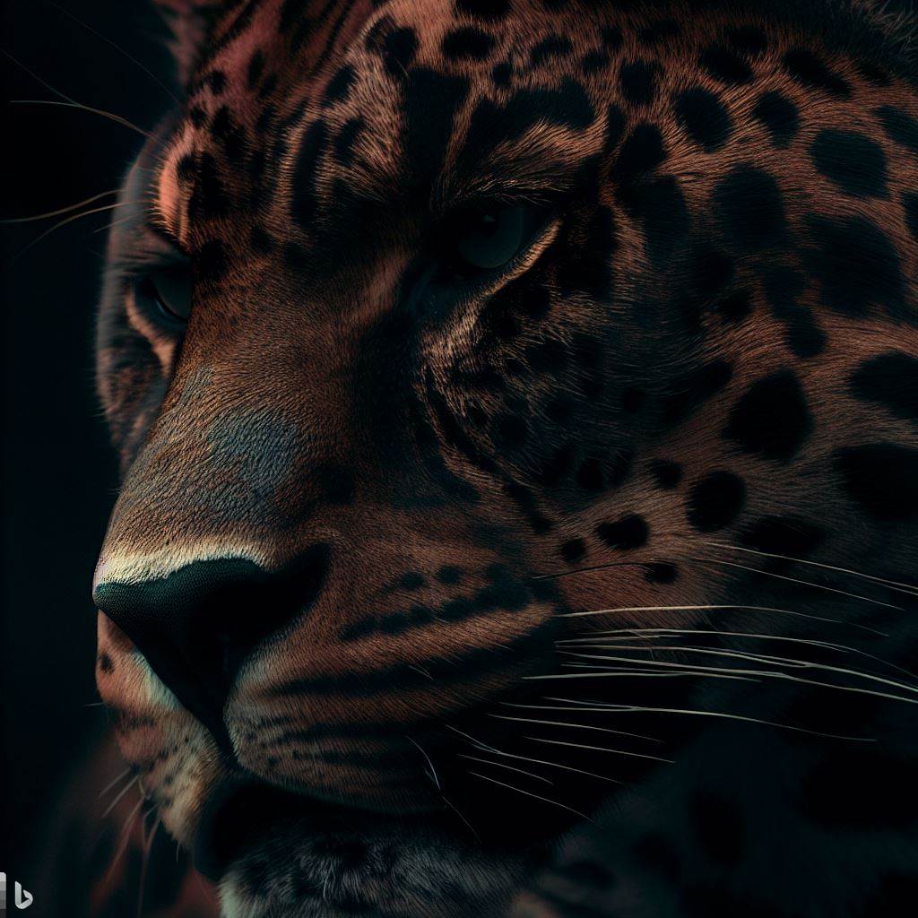
I Asked Bing to Make Some macOS Wallpapers

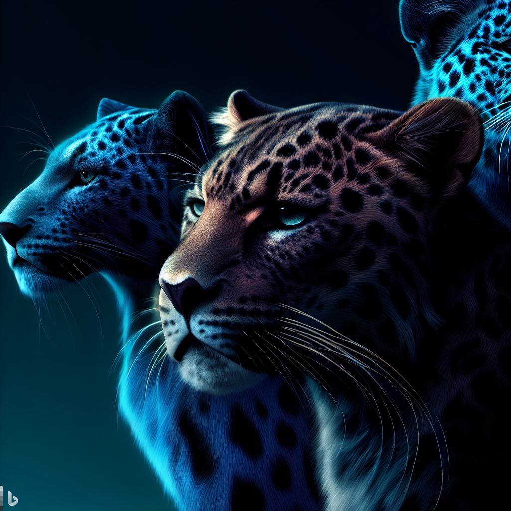
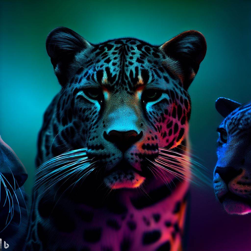
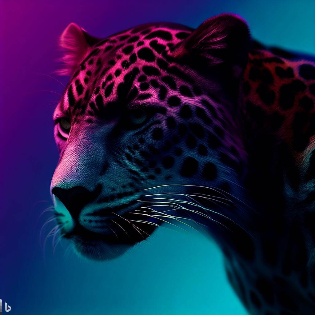
I love macOS wallpapers, so when I saw that Bing had incorporated image creation into its probably-not-going-to-kill-us-all-but-maybe AI tools, I took it for a spin with this prompt:

Make some wallpapers in the style of Mac OS wallpapers from Jaguar, Panther and Tiger

I got these back:

That’s not really what I had in mind, so while the AI’s reading of my prompt made me laugh, I decided to try again:

Continue reading ⇢

On Art and Stage Manager ⇢

Federico Viticci, writing at MacStories:

There is no doubt in my mind that the essence of iPadOS – how menus appear, lists scroll, buttons are tapped, heck, even what a pointer should look like – has been designed with more taste, thought, and care than anything in Windows 11. There is no checklist that can quantify when an interface “feels” nice. The iPadOS UI, particularly in tablet mode, feels nicer than any other tablet I’ve tried to date.

Continue reading ⇢

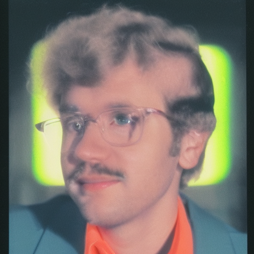
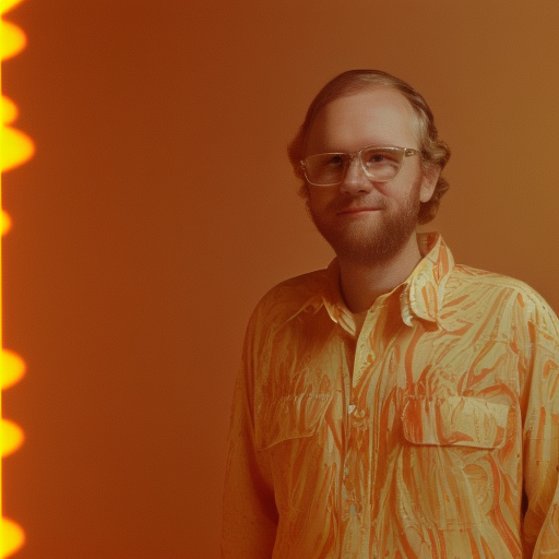
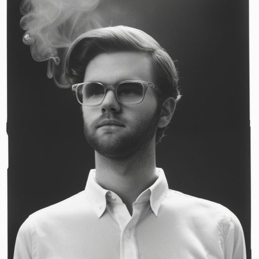
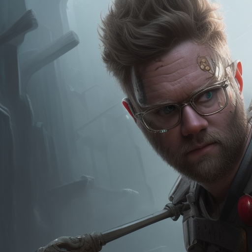
Yours Truly, Through the Eyes of Stable Diffusion

Earlier today, Matt Haughey published a blog post about using a custom instance of Stable Diffusion and using to create self portraits, based on work by Andy Baio and this video on YouTube.

After following the steps in Matt’s blog post, I had everything up and running, and fed the machine about 25 photos of myself. I played around with a bunch of different prompts and got some pretty wild results:

Sidestepping the very complicated subjects related to AI-art, this was a pretty fun way to spend an hour of my day. That last one is true nightmare fuel, though.

Continue reading ⇢

More on Pantonageddon ⇢

Dan Vincent, writing at his excellent Userlandia:

If you’ve been reading some parts of the internet lately, you might’ve seen a brouhaha over the quote-unquote “fact” that Pantone has “copyrighted colors.” They’re forcing Adobe to pay them oodles of money for color swatches, and Adobe said “no you.” Now users have to pay $15 a month just to use COLORS? Madame is outraged!

Well, it’s more complicated than that. The reality is that the world of color is complex, even for those of us that see and feel it every day. Many working designers don’t know all the fiendish intricacies surrounding the tools of their trade. Your real questions are “how does this affect me” and “what can I do about it?” Or maybe you’re used to picking colors from all those swatch books in Photoshop and wondered why it’s such a big deal that they went away.

Continue reading ⇢

More like PAYTONE, Amirite? ⇢

Jess Weatherbed at The Verge:

Last week, Adobe removed support for free Pantone colors across its Photoshop, InDesign, and Illustrator Creative Cloud applications. PSD files that contained Pantone spot colors now display unwanted black in their place, forcing creatives who need access to the industry-standard color books to pay for a plugin subscription (via Kotaku).

“As we had shared in June, Pantone decided to change its business model. Some of the Pantone Color Books that are pre-loaded in Adobe Photoshop, Illustrator, and InDesign were phased-out from future software updates in August 2022,” said Ashley Still, senior vice president of digital media marketing, strategy, and global partnerships at Adobe in a statement to The Verge. “To access the complete set of Pantone Color Books, Pantone now requires customers to purchase a premium license through Pantone Connect and install a plug-in using Adobe Exchange.”

Continue reading ⇢

The Problem with a Piecemeal macOS Redesign

Going from the new System Settings to the ancient System Information — née System Profiler — is quite jarring on macOS Ventura:

Jarring UI Changes

Also, can we talk about why someone centered all the text and the button that ended the up in the footer of this new settings pane?

Also, also, when is the last time any Mac had anything appear in the “Parallel SCSI” section of System Information other than the default text:

Continue reading ⇢