Front and Center

John Siracusa, writing about the move from Mac OS to Mac OS X:

To deal with some of the changes in Mac OS X, I ran apps and system extensions that restored some behaviors from classic Mac OS. Over the years, I weaned myself off most of these, but a few stuck. In particular, I found I did not want to live without the window layering policy from classic Mac OS.

In classic, when you click on a window that belongs to an application that’s not currently active, all the windows that belong to that application come to the front. In Mac OS X (and macOS), only the window that you clicked comes to the front.

My particular style of window management leans heavily on the classic behavior. I also appreciate the Mac OS X behavior in certain circumstances, so I was delighted to find apps that enable both behaviors, using shift-click to override the default.

He goes on to write that the third-party apps he had been relying on to restore this functionally died in the great 32-bit Death Wave of Catalina, so he has re-written a Mac utility named Front and Center:

Front and Center lets you control the window layering policy on your Mac. In “Classic” mode, clicking on a window brings all the windows in that app to the front, just like it did in classic Mac OS. In “Modern” mode, only the clicked window comes to the front. In either mode, Shift-click on a window to get the opposite of the chosen behavior.

Front and Center can be found on the Mac App Store for $2.99, and has a very good app icon:

Connected #276: Symbiosis, Osmosis, Whatever

Connected is back, and we’ve started the year off with quite the episode:

The boys kick off 2020 with a lot of follow-up including clarifying what being a Chairman means, a challenge for the Upgradies and a debate about the iPad Air, then conversations about LaunchCuts and Twitter’s iPad app.

My thanks to our sponsors:

  • Pingdom: Start monitoring your website performance and availability today, and get instant alerts when an outage occurs or a site transaction fails. Use offer code CONNECTED to get 30% off. Offer expires on January 31 2021.
  • Squarespace: Make your next move. Enter offer code CONNECTED at checkout to get 10% off your first purchase.
  • Booz Allen: Integrate. Innovate. Get it done with Booz Allen.

Kbase Article of the Week: Use the LG UltraFine 5K Display with your Mac or iPad Pro

Apple Support:

The new LG UltraFine 5K Display features a 5120 x 2880 resolution, a P3 wide color gamut, 500 nits of brightness and built-in stereo speakers, camera, and microphone. Integration with macOS lets you control your display’s volume and brightness without the need for physical buttons on the display.

You can use the included Thunderbolt 3 (USB-C) cable to connect your MacBook Pro or MacBook Air, or use the included USB-C cable to connect your MacBook or iPad Pro. The display has one Thunderbolt 3 (USB-C) port which delivers up to 94W of charging power to the host device and three USB-C ports that function as downstream USB-C ports (5Gbps) and offer additional connectivity and power to compatible devices and accessories.

(Typed on a Mac Pro hooked up to a LG UltraFine 5K Display.)

Mac Power Users: #517: State of the iPhone

This week on Mac Power Users, we start a new series in which we’ll be looking at each of Apple’s major platforms:

The iPhone has become many people’s primary device for many different types of tasks. On this episode, Stephen and David look at the current state of the hardware, software and services that make up Apple’s most popular product.

  • 1Password: Have you ever forgotten a password? You don’t have to worry about that anymore.
  • Squarespace: Make your next move. Enter offer code MPU at checkout to get 10% off your first purchase.
  • Booz Allen: Integrate. Innovate. Get it done with Booz Allen.
  • Debit & Credit: Get your finances in order this new year. Get a 1-week free trial.

Sponsor: Moderation, a Radically Simple Food Diary App

Moderation is a radically simple food diary, with a beautiful iOS-centric UI that aims to bring the fun back to tracking what you eat.

The app removes the complexity of scanning barcodes or counting calories, and instead presents a simple interface to quickly record if what you have eaten was healthy or not.

People who track what they eat are more aware of their eating choices and Moderation makes this as simple as possible, all from just one tap per meal.

Although Moderation is designed to be simple, it also includes advanced features such as Siri Shortcuts, Dark Mode and the ability to log your meals straight from the notifications.

There is no sign up required, no ads or nasty tracking, and best of all — it is a free download from the App Store.

Check out Moderation now and start tracking your food in a simple and fun way.

Twenty Years Ago, Steve Jobs Showed Off the Aqua Interface for the First Time

At Macworld 2000, Steve Jobs unveiled the user interface for Mac OS X. It was called Aqua.

Aqua, as seen in the Mac OS X Public Beta

I love how Jobs introduced it:

When you design a new user interface, you have to start off humbly. You have to start off saying “What are the simplest elements in it? What does a button look like? And you spend months working on a button.”

He then showed what a button looked like in Aqua, then radio buttons, checkboxes and popups. He took the audience on a tour of building blocks of the UI, including the now stoplight window controls that we are all so familiar with it today.

Apple’s press release wasn’t so humble:

The new technology Aqua, created by Apple, is a major advancement in personal computer user interfaces. Aqua features the “Dock” — a revolutionary new way to organize everything from applications and documents to web sites and streaming video. Aqua also features a completely new Finder which dramatically simplifies the storing, organizing and retrieving of files—and unifies these functions on the host computer and across local area networks and the Internet. Aqua offers a stunning new visual appearance, with luminous and semi-transparent elements such as buttons, scroll bars and windows, and features fluid animation to enhance the user’s experience. Aqua is a major advancement in personal computer user interfaces, from the same company that started it all in 1984 with the original Macintosh.

Aqua is made possible by Mac OS X’s new graphics system, which features all-new 2D, 3D and multimedia graphics. 2D graphics are performed by Apple’s new “Quartz” graphics system which is based on the PDF Internet standard and features on-the-fly PDF rendering, anti-aliasing and compositing—a first for any operating system. 3D graphics are based on OpenGL, the industry’s most-widely supported 3D graphics technology, and multimedia is based on the QuickTime™ industry standard for digital multimedia.

Aqua was a huge leap over the classic MacOS’ Platinum appearance, and far richer than anything on Windows at the time. It felt alive, with subtly pulsating buttons and progress bars that looked like they were some sort of modern-day barber poles, turned on their sides.

In his initial review of Mac OS X Developer Preview 3, John Siracusa introduces Aqua this way:

As anyone who’s seen the screenshots knows, Aqua looks very nice. Even in this very first private release, the attention to detail in Aqua is impressive. Everything appears sharp and polished. All the UI elements look just as good as they do in the screenshots on Apple’s web site. Some even look better.

All of this polish came with a cost in those early days: performance. Aqua was painfully slow on older machines, and it wasn’t really snappy on most Macs for a few years. I remember the first time I used a Power Mac G4, after only having used iMac G3s and thinking, “Oh, this what it is supposed to feel like.”

Today’s macOS is a far cry from earlier versions in terms of power and features, not to mention aesthetic. I mean, just look at how far we have come:

Despite all the changes, the core tenants of Aqua remain. The Dock. Window controls. Sheets. It’s mostly all still here, and that is a real testament to the work done over two decades ago on the original iteration of Aqua. It’s been able to keep up with the times, while still being itself, and that’s a pretty good test of user interface design over the long haul.

Some Bonus Reading:

iPad of the Decade: 2013’s iPad Air

The 2010s are gone, so I thought it would be a good time to talk about what I think were Apple’s most influential products in the last ten years. Time to get some real work down and talk about the iPad.


The iPad 2 was a huge hit, and a big update over the original iPad. The iPad 3 brought with it a Retina display, but it was slower and heavier for it. The iPad 4 — released just seven months later — came with a much-needed improved CPU in the fall of 2012.

A year later, Apple took the wraps off an all-new iPad, dubbed the iPad Air. This tablet cribbed its design from the smaller iPad mini, complete with 43% thinner bezels on the long side of the screen and chamfered edges. It weighed just 1 pound, a full .44 pounds less than the iPad 4. I mean, in Apple’s official press photo, it looks like the thing is floating:

The iPad Air was 20% thinner than the iPad 4, and this new thinness was made possible by several advances. The 9.7-inch screen wasn’t yet laminated to the cover glass, but Apple’s engineers did what they could to shave as much space out as possible between components. The new A7 processor was far more efficient than the outgoing silicon, letting the iPad Air get by with less battery.

This iPad was remarkably different in the hand, something I noted in my review:

All of this adds up to something larger than just numbers. When picking up my wife’s iPad 4, I’m now surprised by how much the thing weighs. In a way that only Apple can, it’s managed to make its year-old product look and feel … gross.

This meant using a full-sized iPad out and about was easier than before. The iPad mini was smaller, but now the 9.7-inch model wasn’t the beast it once was.

That A7 CPU didn’t just mean the battery could be smaller, but it made the iPad Air 2x faster than the iPad 4, which was still struggling a but pushing so many pixels around. The iPad Air was the first iPad that felt fast, all the time, and I remember being really impressed with its performance.

Like the iPhone 6 I chose for the iPhone of the decade, I chose this iPad because it marked a real turning point in the history of its product line. The iPad mini may have pioneered the design used here, but the 9.7-inch iPad was far more popular. With the exception of the current iPad Pro models, every iPad continues to look like the iPad Air. I’m not sure a random person off the street could pick it out of a lineup of more modern iPads, actually. Apple flexed its hardware muscles with the iPad Air, and while it is not supported by iOS 13, the tablet itself still seems modern and fresh.

Connected #275: The Rickies (Early 2020)

This week, on a very special episode of Connected:

Federico, Myke and Stephen review their predictions for 2019 and a new Chairman is named before everyone makes their choices for 2020, including the Risky Picks. Also, one of them gets a very special delivery during the show.

Conspiracies abound, my friends.

My thanks to our sponsors:

  • Booz Allen: Join a forward-looking team backed by a century of experience and fuelled by collaboration.
  • Health IQ: Insurance for the Health Conscious. Save up to 41%. Take the quiz now to see if you qualify.
  • Hover: Make a name for yourself. Get 10% off any domain name.

iPhone(s) of the Decade: the iPhone 6 and 6 Plus

With the 2010s coming to an end, I thought it would be a good time to talk about what I think were Apple’s most influential products in the last ten years. Today, let’s look at the iPhone.


When the 2010s started, the iPhone was still gaining steam, with the iPhone 4 released in June 2010. Today, it’s a juggernaut, and it demands both larger prices and larger places in our pockets.

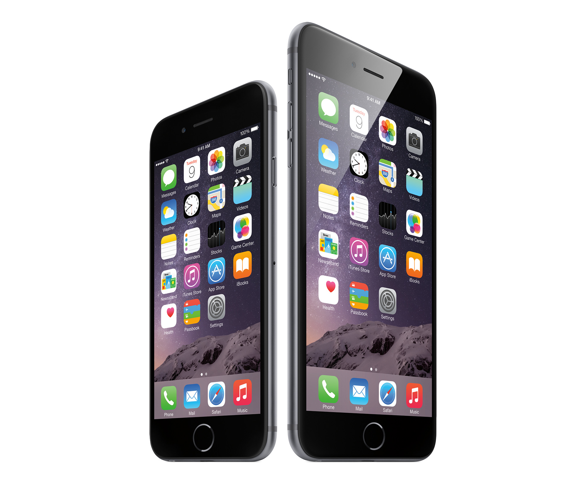
It was hard to pick one iPhone release for this, but I’m going to go with 2014’s iPhone 6 and 6 Plus.

Yes, I can hear you. The iPhone 4 ushered in our age of Retina displays, the iPhone 5 brought LTE and the iPhone X seemed like magic compared to previous models.

Let’s consider the world in 2014. Samsung and other Android OEMs were shipping larger phones, and many in the iOS ecosystem longed for bigger screens and the improved battery afforded by a larger chassis. Apple had made the iPhone taller with the iPhone 5S, but just wasn’t enough.

At its September event that year, Apple delivered the 4.7-inch iPhone 6 and the larger 5.5-inch iPhone 6 Plus. Both came wrapped in a new design with rounded edges, cover glass that slightly curved to meet the phone’s frame and yes, a camera bump.

Ok, so that last one was a bit of a bummer, but the iPhone 6 felt smaller than it had any right to thanks to those smooth edges, as I wrote in my review:

The glass is now rounded at the edges, sloping down to meet the aluminum around the edges. This helps the phone feel smaller, and reminds me of the old “it’s like a river stone” claim Palm made about the original Pre. However, this means the iPhone 6 picks up weird light reflections around the edges. While these don’t affect the usability of the display itself, it can be distracting at times.

Gone are the flat sides and sharp angles where they meet the glass. The 6 has rounded edges, not unlike the iPad mini and iPad Air. This makes the phone feel thinner in hand than it actually is — a trick Apple used with the original iPhone and 3G — but it makes the device slippery. If your eyes are closed, the only way you can tell where the glass ends and metal begins would be the texture. On my phone at least, the seam is flawless all the way around.

To accommodate this larger screen, Apple moved the sleep/wake button to the side of the phone and introduced new gestures to go back and forward in applications, as well as “Reachability” to drop the top of the screen down to make it more … errr … reachable.

The rest of the physical design wasn’t quite as nice. The antenna lines were really noticeable on most finishes, the camera bump made the phone rock awkwardly when on a flat surface and those smooth edges made the phone easy to drop. Thankfully, all of those issues were resolved by slapping the phone in a case, which was probably a good idea, as this was Apple’s thinnest-ever iPhone and it was a bit to prone to bending.1

Don’t let that get you down on my pick, because we owe a lot to the iPhone 6. It sold in record numbers, affirming to Apple that the market did indeed want larger phones. The explosive sales of the iPhone 6 took Apple a little time to get used to, but it catapulted the company to new heights.

Just check out this Six Colors graph of iPhone sales. That big uptick is the iPhone 6 and 6 Plus doing their thing:

Likewise, that teeny-tiny-by-modern-standards camera bump broke the seal, giving Apple the boldness to grow the bump into the monster on the back of the iPhone 11 Pro that lets the phone take amazing photos and video.

The 6 Plus also introduced choice to the iPhone. While we had seen colors before, the addition of a second, even larger screen let Apple reach new customers who craved the largest possible iPhone.2

The design cues of the iPhone 6 are still felt today. The rounded edges are still with us today, and before glass returned to the back of the iPhone, the antenna lines had faded nicely into the aluminum. And of course, iPhones come in more sizes than ever now.

All of this adds up to why I think an iPhone that Apple dropped support for with iOS 133 is deserving of recognition here at the cusp of a new decade. iPhones owe a whole lot to the iPhone 6, and it fundamentally changed the iPhone forever.


  1. The 6 Plus in particular had another issue — it was not the most performant iPhone ever sold. With the 6S Plus, Apple doubled the RAM to 2 GB and things ran much more smoothly. 
  2. I ended up switching to an iPhone 6 Plus mid-cycle. I’ve hit my limit, though, as the iPhone 11 Pro Max is just too big for me. 
  3. To be fair, Apple has released several updates for iOS 12 to let older devices in on security updates.