‘A Family of Products’ ⇢

Speaking of Evans Hankey, she and other members of Apple’s design team chatted with GQ about the new MacBook Air. There’s not a ton of new information in the piece but this jumped out at me:

It’s a workload that she compares to “drinking from the firehouse” but even accounting for that vast portfolio of responsibilities, the Air’s redesign has been a unique challenge. “It was the first time we ever set out to do a family of products together,” she says. “We didn’t design the Air in isolation, but we designed it in tandem with the MacBook Pro.”
Continue reading ⇢

My New Keyboard

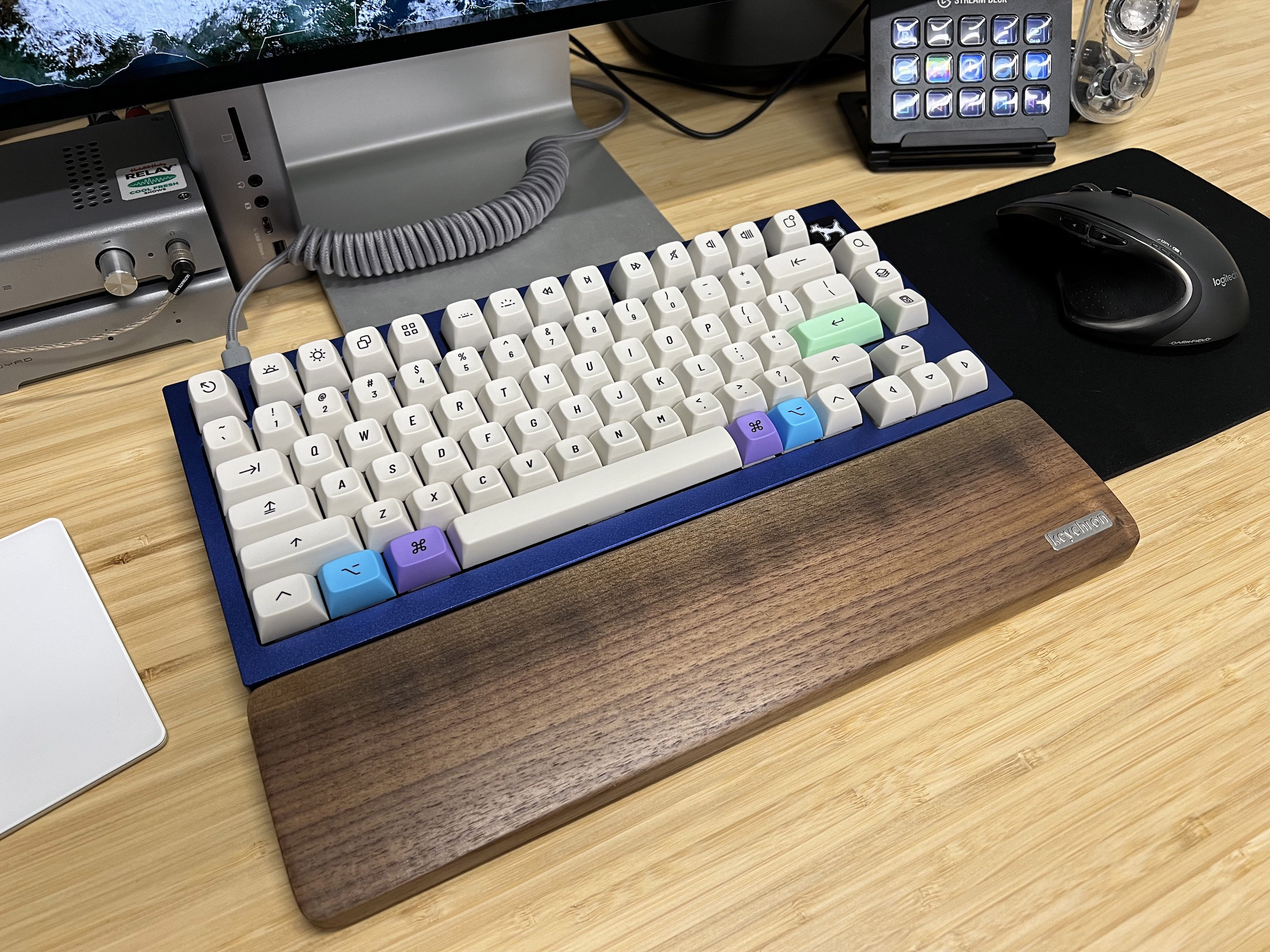
Myke Hurley has been big into mechanical keyboards for over a year now, and we finally got together to build me my first custom keyboard. I have to say, I love how it turned out:

Keychron Q1

I started with the new Keychon Q1 in Navy Blue. To that, I added a full set of NovelKeys_ Silk Red switches. I was worried about how much force the keys would take to press, but these linear switches may be too light. I just have to brush a key for it to register, so I may end up swapping in something more robust.1

Continue reading ⇢

Failed Image Formats ⇢

Ernie Smith:

Around this time 30 years ago, two separate working groups were putting the finishing touches on technical standards that would come to reshape the way people observed the world. One technical standard reshaped the way that people used an important piece of office equipment at the time: the fax machine. The other would basically reshape just about everything else, becoming the de facto way that high-quality images and low-quality memes alike are shared on the internet and in professional settings. They took two divergent paths, but they came from the same place: The world of compression standards. The average person has no idea what JBIG, the compression standard most fax machines use, is—but they’ve most assuredly heard about JPEG, which was first publicly released in 1992. The JPEG format is awesome and culture-defining, but this is Tedium, and I am of course more interested in the no-name formats of the world.

Continue reading ⇢

The iOS App Icon Book ⇢

Michael Flarup has launched a really cool Kickstarter campaign:

I simply love app icons — they continue to be everything that excites me about visual design. App icon design is a carefully balanced discipline with the goal of producing a memorable graphic that sits at the intersection of art and utility. At their best, app icons are design, distilled. This book is a celebration of the art and craft of app icon design and the golden age of icon design that has lived and evolved on our devices this past decade.

Continue reading ⇢