
These things come in cycles.
There’s revolution, followed by evolution. The Apple II, then the IIe. The Macintosh, then the Macintosh SE. The Titanium PowerBook G4, then the aluminum models.
Both sides of the revolution/evolution coin have their winners. The IIe became Apple’s bread and butter for years, introducing an entire generation to personal computing. The SE and SE/30 are among the most-loved early Macs, and it is still hard to talk about the 12-inch PowerBook G4 without smiling.
With the iPod, the cycle sped up. Three years passed between the original 5 GB music player and the iPod mini and the iPod photo with its color screen. The iPod nano came just a year and a half after the iPod mini, and then for many years, was reimagined every 12 months.
That first iPhone was a revolution on par with the first Macintosh or iPod. It improved upon existing technology, but implemented things with an all-new paradigm.
A year after the original, Apple made substantial improvements with the iPhone 3G, but the basic recipe was the same. The radios may have been better, but the new model used the same CPU, display and camera as before. It was evolution’s time to shine.
Then came the iPhone 4.
It was a dramatic departure from the 3GS before it. The plastic shell of the 3G and 3GS felt safe and was extremely utilitarian, while the iPhone 4’s dramatic glass and steel enclosure felt like the first iPhone that was truly designed. In one keynote, the iPhone went from something that was comfortable in the hand but a little boring to something incredible to touch and see.
As iconic as the design was, what it packed in its thin chassis was an even bigger deal. It was powered by the A4 chip from the iPad. It included a front-facing camera that worked with a new service called FaceTime. The display clocked in at a whopping 326 ppi, bringing print-level quality to an iPhone for the first time, giving birth to the Retina era.
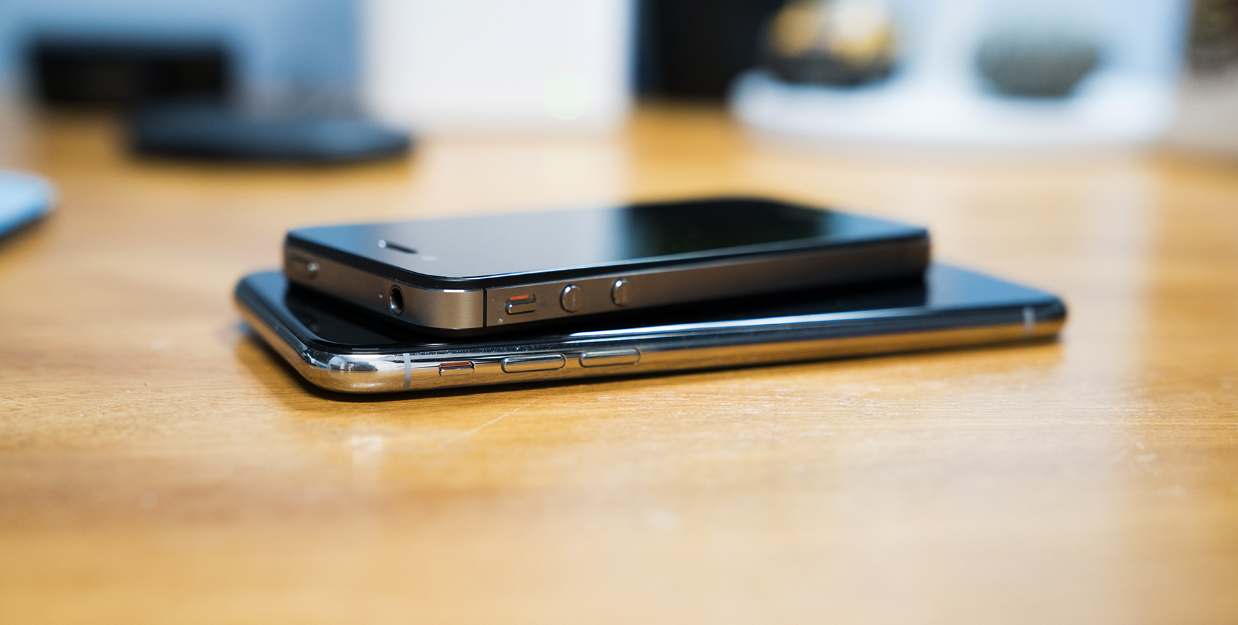
The parallels between the iPhone 4 and the iPhone X are obvious, but are still worth calling attention to, at least if you’re obsessed with this stuff.
Starting with 2012’s iPhone 5, Apple used aluminum on the back of their phones until the iPhone 8, 8 Plus and X. Thanks to the better-late-than-never arrival of wireless charging on this crop of iPhones, the glass back is … well … back.
I really like wireless charging. I have a Mophie charging base on my nightstand and a second on my desk, and simply place my iPhone on the rubbery disc and forget it. The only time I plug my iPhone X in to anything is if I need to charge it in my car. It’s pretty great not to have to deal with Lightning cables, especially if I grab my phone late at night or early in the morning.
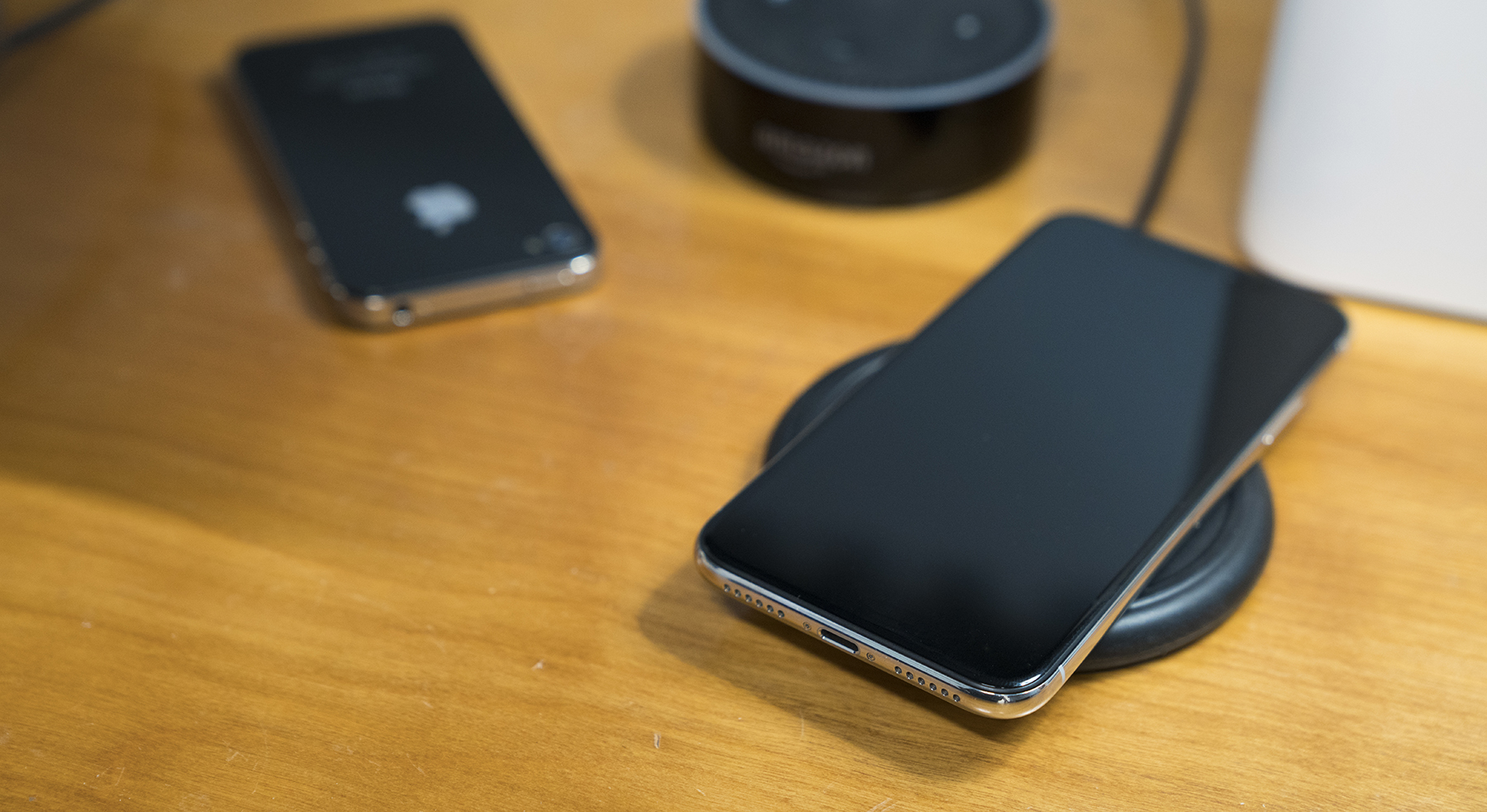
The iPhone X, with its stainless steel band, pays homage to the 4’s industrial design, albeit with a modern twist. They both use slight notches in the metal for the antenna, with far less controversy this time around. The band isn’t flat like the iPhone 4, however; this phone retains the slippery, rounded edges introduced on the iPhone 6.
I’ve never had an iPhone that slides around as much as this one. It wants to slide out of any pocket it is in, and if it’s on the couch, it will find its way down between the cushions as if drawn into the darkness by an invisible magnet.
On my silver model, the stainless steel has already picked up all sorts of scratches and scuffs. Personally, I love the way raw stainless steel ages, including on my Apple Watch.
The back glass is crisp and shiny, and I prefer it over the Space Gray this time around, despite having and loving a matte black iPhone 7 Plus.
Unfortunately, the stainless steel band isn’t the only thing that has picked up scratches on my iPhone X. This phone has picked up scratches across the front and back glass in a way no previous iPhone I have owned has. None of them are particularly long, but they are deep enough that I can catch them with the corner of a finger nail if I try.1
I’m a little nervous as to how banged up this iPhone is going to look by the fall.
The back is home to the largest iPhone bump ever created by Apple. The black glass that surrounds the two camera lenses contrasts with the silver back so sharply, I think it makes the bump look even bigger. The phone rocks around and vibrates loudly on some surfaces thanks to the bump in a more noticeable way than even my 7 Plus did.
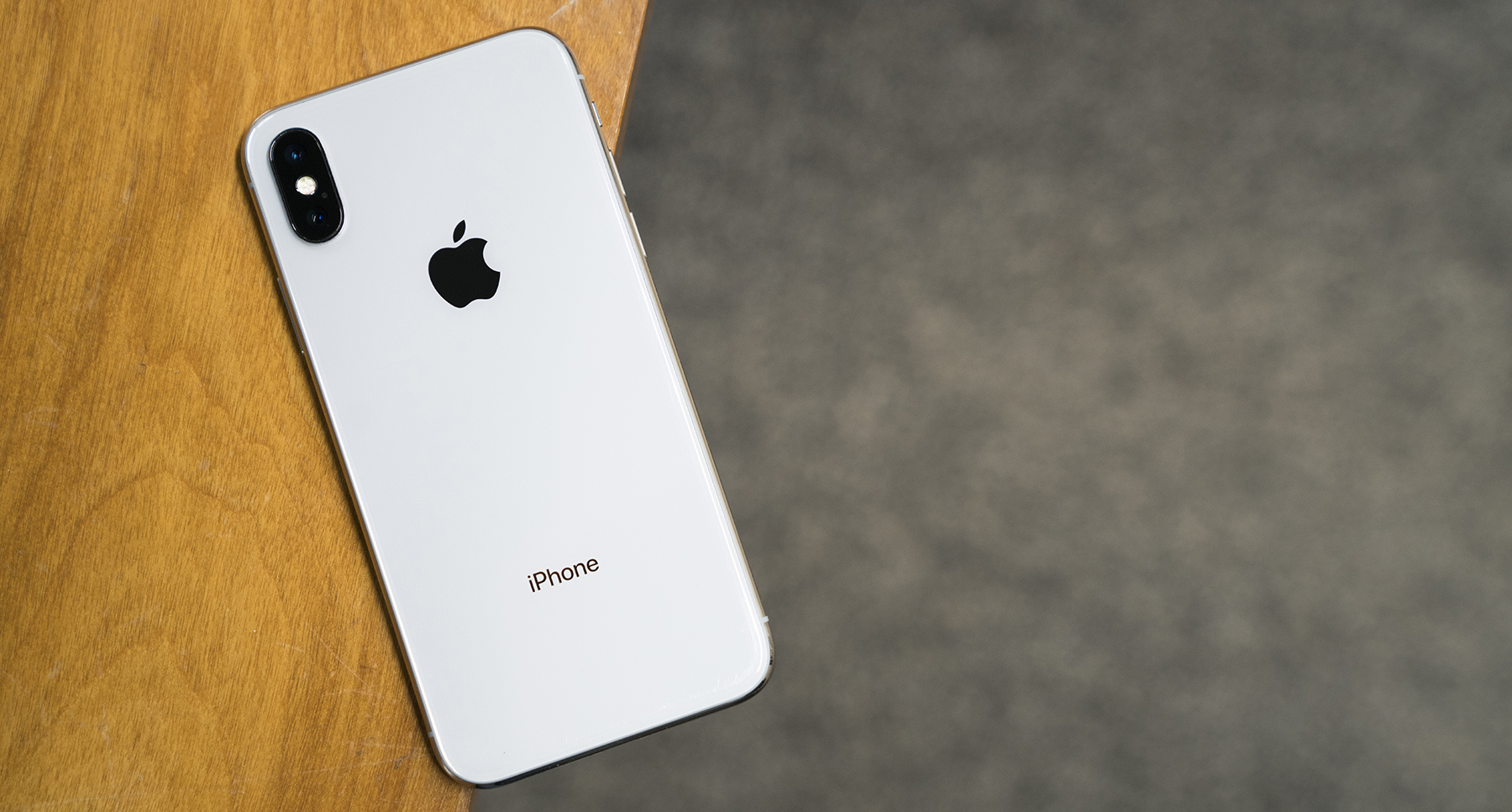
However, what the bump houses allows me to forgive the unsightly nature of the thing. The camera system on the iPhone X is truly great. It’s consistent, fast and continues to impress me, even three months into ownership. The wider aperture and optical stabilization make the iPhone X better in low light situations than it has any real reason to be.
This is the part of this review where most people would bring up Portrait Mode and Portrait Lighting, Apple’s depth-powered effects that attempt to punch up images for more dramatic shots, now from both the rear and front-facing cameras.
I don’t ever use either mode. I own a couple of “real” cameras and just can’t get over how processed and unnatural these images feel to me. I know these modes are popular, but they just aren’t for me.2
Like the iPhone 4 before it, the iPhone X’s design and camera systems raise the bar in very real ways, but like the Retina display, the OLED “Super Retina” display on this phone instantly makes previous iPhones feel older than they actually are.
No doubt, a large part of that has to do with the size of the display itself. The panel measures 5.8 inches diagonal, but it’s been stuffed into a chassis not much bigger than the iPhone 6, which came with a 4.7-inch display. Having used Plus-sized iPhones the last several years, adjusting has taken some time, but I’m really happy with the size of the iPhone X.
Simply put, the screen is the iPhone, and the iPhone is just screen.
The display doesn’t have any hard angles, instead it flows into the corners of the phone, as if it was poured into a mold. It all feels very futuristic, and the forehead and the chin on older iPhones seems ancient in comparison.
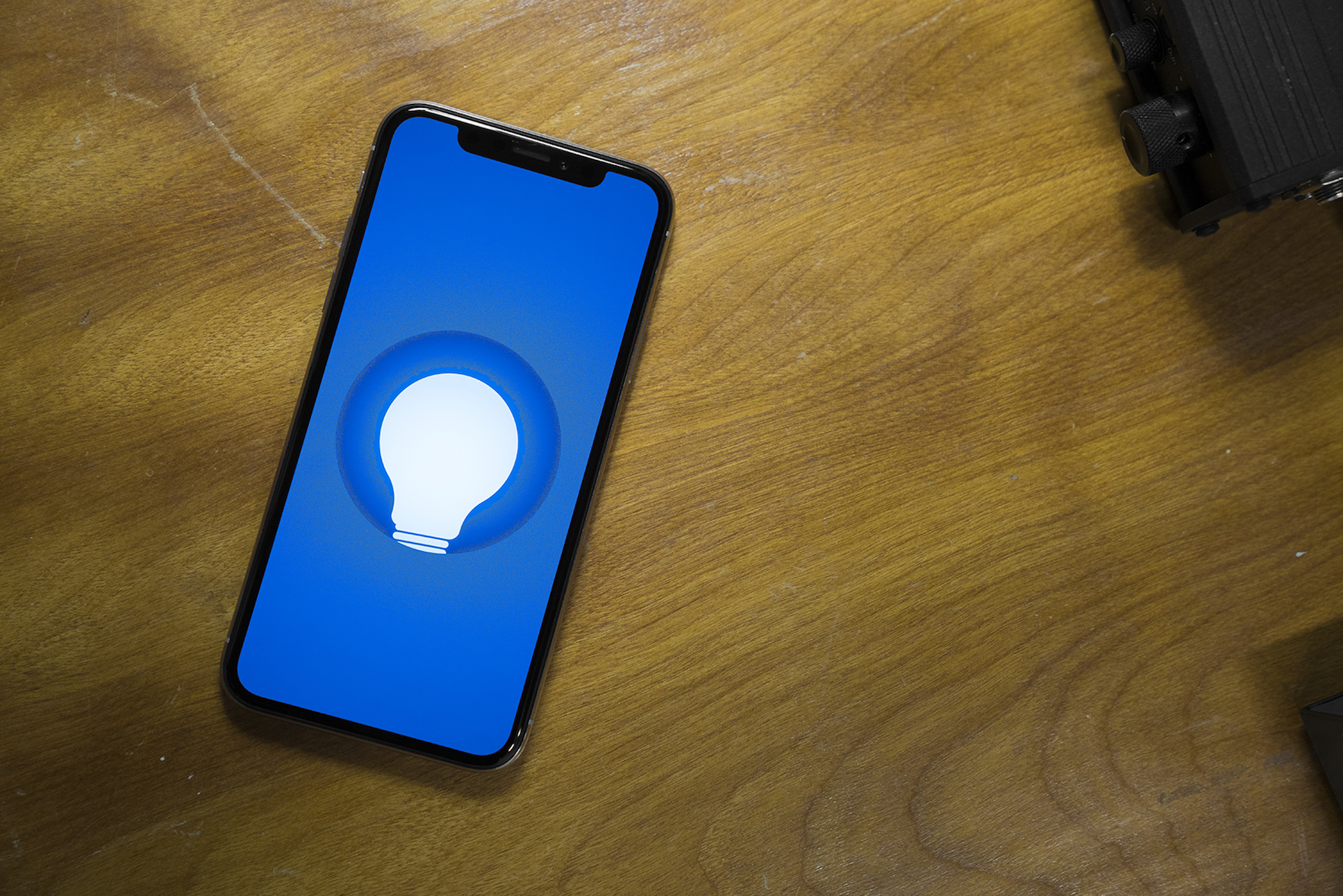
Then there’s the display itself. Now with its pixels packed in at 458 ppi, images and text are sharper than ever. OLED means that black is truly black, making everything feel richer and more vibrant. It’s the most iPhone-y iPhone screen there’s been since the original Retina display.
The top of the screen, of course, is encroached upon by the notch. Under its black glass,3 Apple has packed all the sensors and technology needed to make Face ID possible, but all of that hardware needed a place to live.
Instead of lobbing off the entire top of the display, Apple chose to let it flow up and around the notch, giving the iPhone X an extremely distinctive look.
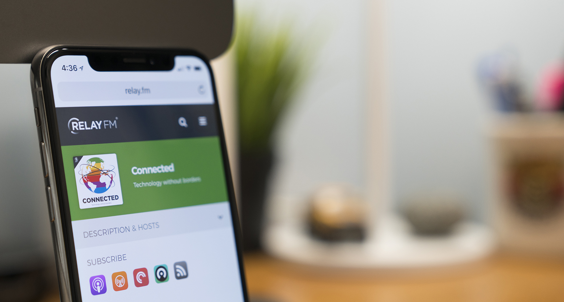
In practice, I rarely think about the notch. It’s just part of the frame, fading away in light of whatever I’m doing on my phone.
Occasionally when moving from an app with a dark UI like Overcast to one of Apple’s apps with the company’s EVERYTHING-IS-WHITE-AND-IT-FEELS-LIKE-THE-PLANET-HOTH design language in apps like Mail and Messages, I’ll be a little surprised when the notch resurfaces.4
That’s not to say the notch isn’t troublesome in some ways. The truncated status bar means iOS now has to hide some critical information, like if the phone is connected to a VPN or is in Do Not Disturb mode:
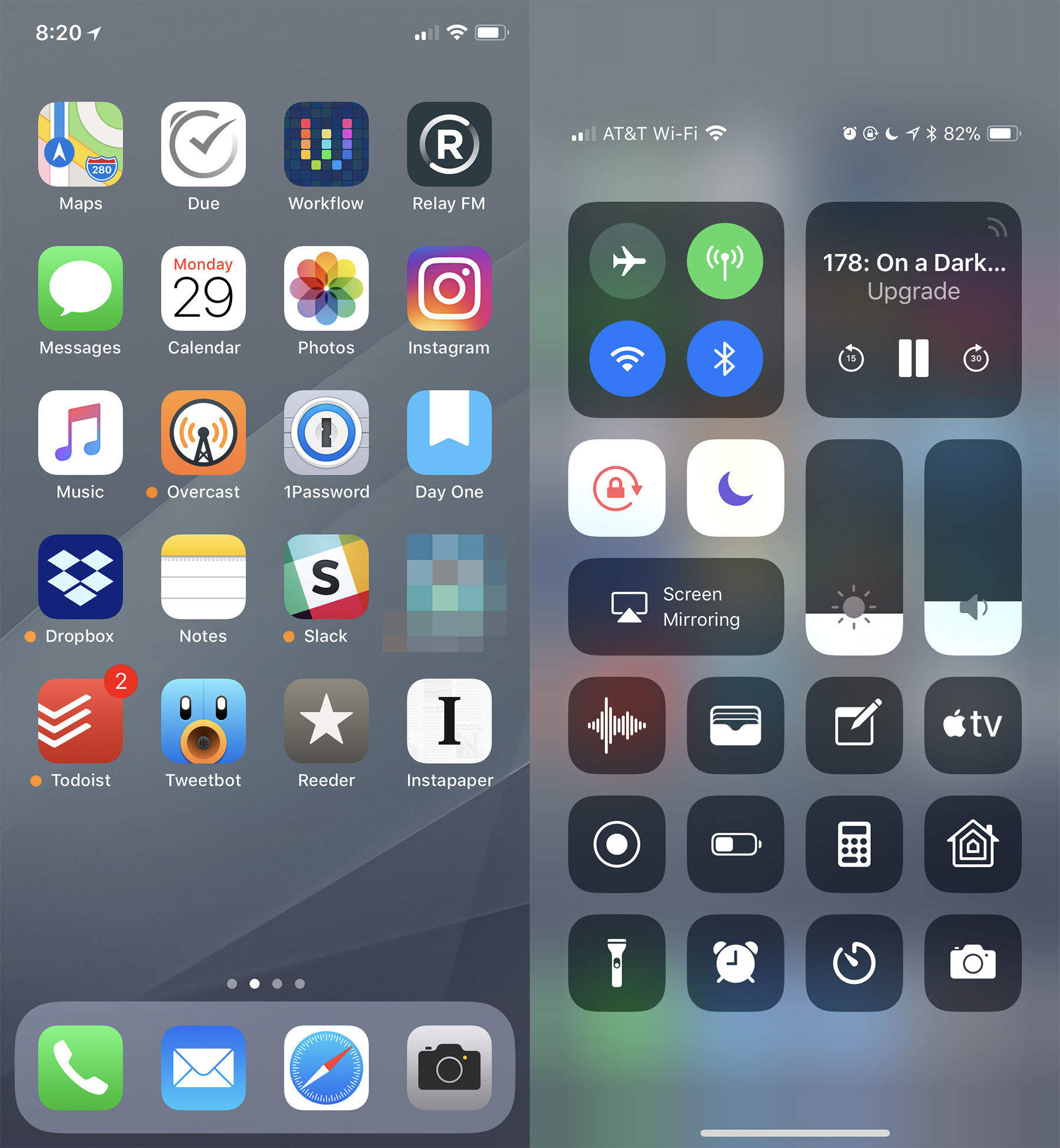
Those things can be discovered only by invoking Control Center, which is in the wrong place on the iPhone X, as I wrote in November:
I understand conceptually why Control Center is where it is. Pulling down on the cell signal, Wi-Fi and battery indicators open the controls for those things. I actually like that linking of those two bits of UI.
The problem is that Control Center is too far away. I use my iPhone in my right hand, and even as someone who carried a Plus-sized phone for three years, I struggle to activate Control Center. Because Spotlight can be triggered with the same gesture — a downward swipe — from about anywhere on the screen, I often am greeted with a search field when all I wanted was to turn down my screen brightness or enter Airplane mode.
For people who use their iPhones with their left thumbs, it’s all but unreachable.
Three months in, and I still hate where Control Center is on this phone. I still accidentally invoke the Cover Sheet when I don’t want it and struggle to do this one-handed. Apple needs to revisit this in iOS 12.
If they release iOS 12 and the only change is putting Control Center in a better place on the iPhone X, it’ll be worth it. https://t.co/dqwkbR4lU4
— Stephen Hackett (@ismh) January 30, 2018
The notch’s effect on iOS is worth what it brings: Face ID really feels like it’s from the future.
With just a tap5 and a glance, I can unlock my iPhone, and a short swipe gets me in. It works with and without my glasses, without caring if I’m wearing a hat or if my fingers are wet. It even works if it’s pitch-black in my bedroom.
Over the last month, I’ve re-grown my beard, and I haven’t cut my hair since late October. Face ID has learned my ever-increasing level of fuzziness and has adapted over time.
It’s not a perfect system, though. The iPhone has to be oriented “vertically” in relation to your face for Face ID to work. If you are lying on your side horizontally, you have to hold the iPhone horizontally, in parallel with your face, for it to register. If you hold it too close or too far away, it can struggle to unlock as well. I suspect some combination of these things is why I find myself needing to enter my PIN code more often in bed than anywhere else.
It’s hard to gauge if I have to unlock my iPhone with my PIN code any more than I did with Touch ID out in the real world, though. It feels like Face ID is the same or better than the old system, though.
Where it really shines in apps that require biometric authentication. To unlock 1Password or log in to my bank, all I have to do is look at my iPhone, which I’m already doing. It makes authenticating feel transparent, which is a good thing.
All in all, with the iPhone X, Apple has dumped a whole lot of revolution on its most important product. The screen, body, cameras and more are all better than before, but the iPhone X is more than the sum of its parts. It’s the first chapter in a new era of iPhone design. The things that seem special about this iPhone will soon be normal, as evolution kicks in again.
That’s how these things go. Evolution may be important, but revolution is where all the fun is, and the iPhone X has plenty of it to go around.
-
The back glass scratches are partially my fault, as I don’t carry my iPhone in a case, but my point stands: the glass on this iPhone seems more prone to scratching than on previous models. ↩︎
-
Please email Myke Hurley with any disagreements over this point. ↩︎
-
Thankfully even on the silver model, the front glass is black, which is the correct color. ↩︎
-
But for real, Apple. Give us a system-wide dark mode. It’s time. ↩︎
-
Tap to Wake may be my favorite hardware tweak with the iPhone X. Being able to reach over and simply tap my iPhone to see the time and notifications has become so engrained in me, I constantly find myself tapping my iPad and thinking it’s broken when the screen doesn’t light up. ↩︎