
At Macworld Expo 1999, Apple’s big news was the Power Macintosh G3, a high-end tower desktop. After introducing it, Steve Jobs played a promotional video, prefaced with a Henry Kissinger quote and featuring Burt Bacharach and Hal David’s The Look of Love on the soundtrack. (If you know who’s singing, please tell me; I’m not sure, and it stumped Shazam.) The video touts lustworthy features such as a 400-MHz processor, up to 1GB of RAM, and USB (“the future of I/O!”).
Category: Design
Happy Birthday, Frog Design ⇢
‘Cheesegraters and Crystals’ ⇢
Dr. Drang, weighing in on the design of the Mac Pro’s air vents:
This isn’t just marketing blather. The hole are a negative-space representation of a common atomic arrangement in metallic crystals, something that most engineers learn about in their introductory materials science class.
While I never took an introductory materials science class, this article helped me visualize the Mac Pro’s design better than anything else I’ve read about it.
Remembering the Cheese Grater ⇢
I thought today would be a good time to dig up this old story of mine about the shared Power Mac G5 and Mac Pro enclosure:

After seeing the new machine yesterday, I suspect the new design will live up to the standard set by this one.
A post shared by Stephen Hackett (@stephenmhackett) on Jun 3, 2019 at 3:49pm PDT
A Bad Take ⇢
I am technically on vacation this week, but I felt like I had to talk about this:
The more I use iPad Pro the more I believe iPads need their own OS. Software on iPad greatly lags hardware. Gestures feel kluged from the phone experience. Split screen/slide over are non intuitive and frankly counterintuitive.
— Michael Gartenberg (@Gartenberg) November 14, 2018
Since the new iPads were announced a couple of weeks ago, there has been a lot of talk about the device and its place in the world.
Reduced Transparency in Mojave is Bad ⇢
Craig Grannell, writing on something that has really been bothering me:
The standard macOS interface has quite a few semi-transparent elements, which like frosted glass provide a glimpse of what’s beneath them. At Apple events, execs go giddy about how pretty this is. In use, these elements vary from being distracting to outright dangerous. For example, if you have a motion-sickness issue and an animating web page is sitting behind a semi-transparent element, it can take a while before you realise it’s affecting you, by which time it’s too late and you’re already dizzy.
Rogue Amoeba’s Past License Windows ⇢
I love this blog post by Paul Kafasis:
Rogue Amoeba’s 16th birthday is coming up this Sunday, so it seems an appropriate time to take a look back into the past. Join us for a quick tour of the evolution of our in-app License window.
Good software is born out of such attention to detail.
Aqua Screenshot Library 1.1: Lots of macOS Mojave, Lion Goes Retina
I have published two big updates to the Aqua Screenshot Library that I wanted to share.
First, I have published a full set of Mojave screenshots. This page has three galleries. You can check out Mojave in Light Mode and Dark Mode, as you may have expected. The more I use it, the more I think Dark Mode isn’t for me, but more on that later. In the mean time, bask in all this dark glory:
On macOS Mojave’s Dark Mode
The most obvious change to macOS coming later this year is in the inclusion of Dark Mode.
When Apple redesigned macOS back in 2014 with Yosemite, it included a less ambitious version of the feature. Here’s a bit from my review:
To say that Yosemite comes with a “Dark Theme” is vastly over-stating the “Dark menu bar and Dock” option found in the “General” preference pane:
As shown above, OS X’s new dark mode only affects the menu bar, Command+Tab UI, drop-down menus, the Dock and Spotlight. Everything else — from Finder windows to built-in apps — remain their normal, bright selves, no matter what System Preferences says.

The Woman Who Gave the Macintosh a Smile ⇢
Alexandra Lange has a wonderful profile of Susan Kare in The New Yorker:
Every fifteen minutes or so, as I wrote this story, I moved my cursor northward to click on the disk in the Microsoft Word toolbar that indicates “Save.” This is a superstitious move, as my computer automatically saves my work every ten minutes. But I learned to use a computer in the era before AutoSave, in the dark ages when remembering to save to a disk often stood between you and term-paper disaster. The persistence of that disk icon into the age of flash drives and cloud storage is a sign of its power. A disk means “Save.” Susan Kare designed a version of that disk, as part of the suite of icons that made the Macintosh revolutionary—a computer that you could communicate with in pictures.
NASA Designing Next-Gen Wheels for Mars Rovers ⇢
Michael Cole at Spaceflight Insider:
Engineers at NASA’s Glenn Research Center in Cleveland, Ohio, are reinventing the wheel in a way that may allow rovers and other future mobile vehicles to traverse the treacherous surface of Mars with greater and longer success. They have developed a woven mesh tire made of a shape-memory alloy, or SMA, that “remembers” its ideal shape and immediately springs back into form after absorbing the bumps and beatings of traversing rocky terrain.
Control Center is in the Wrong Place on the iPhone X
I am convinced that Control Center is in the wrong place on the iPhone X. Here’s a mockup of my iPhone. The touch targets are as follows:
- Green: Cover Sheet
- Blue: Control Center
- Pink: Spotlight
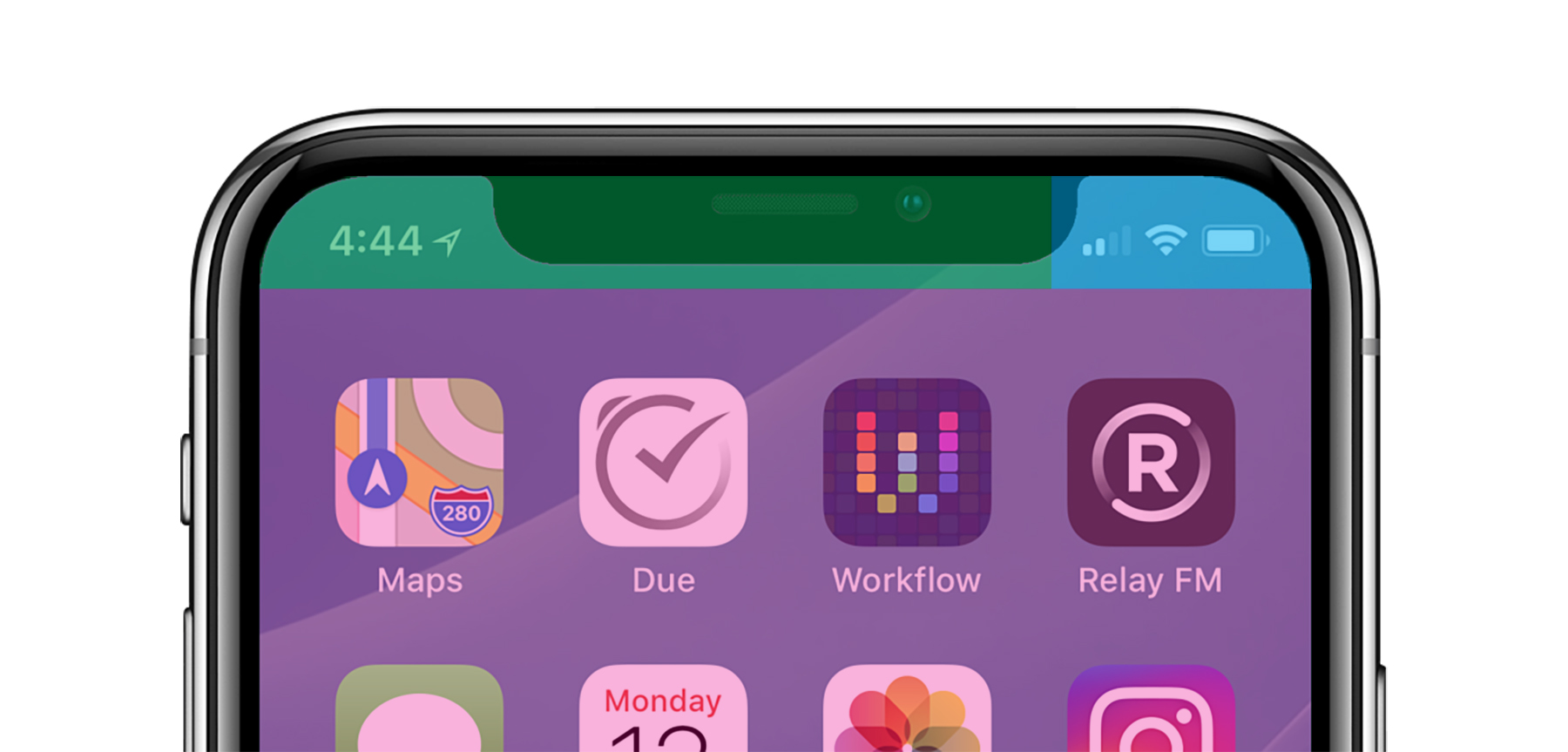
I understand conceptually why Control Center is where it is. Pulling down on the cell signal, Wi-Fi and battery indicators open the controls for those things. I actually like that linking of those two bits of UI.